How to Build a Landing Page

Steps to Create a Landing Page

In the first chapter, you've learned what a landing page is and what it is used for. A quick reminder: a landing page is a one-page website that directs visitors to take a specific action: to download a presentation, to subscribe to a newsletter, or to buy something. A landing page is created for a specific audience. The better you understand your target market, the easier it is to create an offer. The audience and the call to action are at the core of a landing page.
In this chapter, we'll show you how to create such a webpage. We'll gradually go through all the stages and at the end of each stage we'll have practical results. For those of you, who design their first landing page, we strongly recommend not to skip anything and complete all the tasks. Thus, you'll end up with a practically finished website.


The stages of a landing page creation are as follows:
Analyze your competitors
Analyze your target audience
Write your landing page copy
Make a wireframe
1.
2.
3.
4.
Create your landing page
5.
Alex is a fictional character we created for this course. He'll help us complete all the practical tasks. He organizes conferences and now he's working on a landing page for his training course on event management. Alex will teach how to plan and organize events.

Let's get started.

Competitor Analysis

If what you sell or offer is useful, you'll definitely have competitors. People will choose from a variety of offers and you have to make them choose you.
To facilitate your customer's choice or make it more evident at least, it's necessary to be distinguishable and prove that your offer is beneficial and useful.

Find competitors on the Internet

Each product satisfies a certain need. Your competitors are companies, programs, or books that satisfy the same need.

Imagine you sell leather bags.

Customer need: to carry things and look good.
Competitors: similar bags or backpacks manufacturers, other accessories maker.

Or imagine you sell time management courses.

Customer need: to achieve more in less time and not to forget important things.
Competitors: other courses and coaches, books and blogs about time management; task planners and calendars; Zen courses stipulating there is no need to be more productive and that you should just live a peaceful life.
You shouldn't only pay attention to those who offer similar courses or make similar bags. You better ask yourself, "Who else can satisfy the same need?" The larger perspective you have, the better you understand your audience, its motives and doubts.
Alex creates a landing page for his event management course. He satisfies such needs as making workshops and conferences pitch-perfect, finding interesting speakers, attracting guests and making them want to come the next time. This can be achieved in different ways:
1
Search for Alex's competitors who offer similar courses.
2
Get a book about event management.
3
Hire an event planner who'll get things done.
4
Instead of organizing a conference, spend money on advertising to attract new clients.
We suggest you start by doing a research on competitors. Use search systems, context advertising and social networks.
3 ways to learn about competitors
1. Search engines

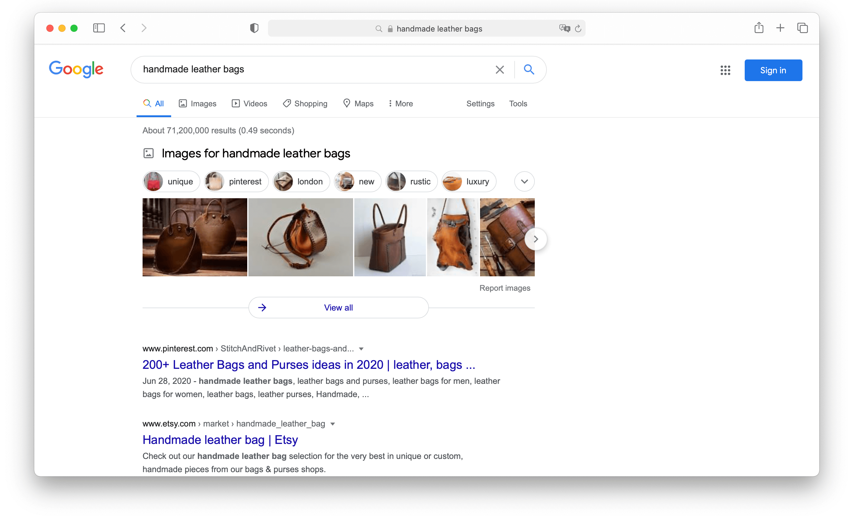
Go to Google and try to find products that are similar to yours. For example, type handmade leather bags. Study 2-3 pages with search results and write down all the companies or people that offer similar products.
2. Social media

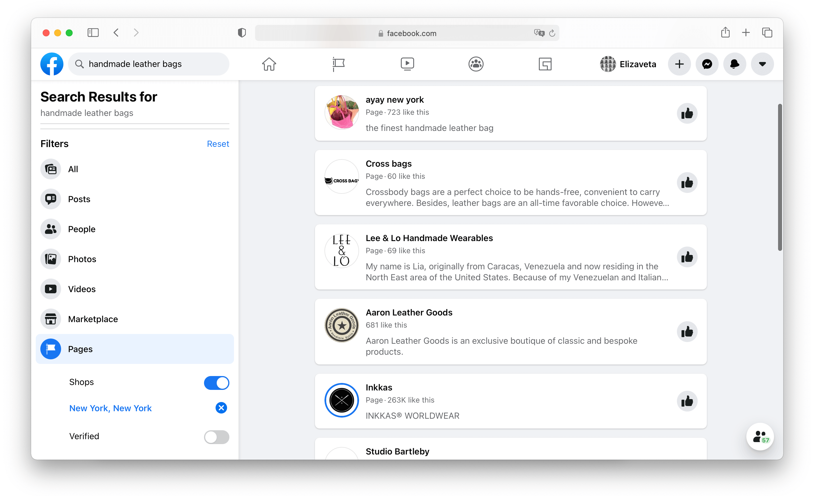
It is possible that your competitors do not have a website. Nowadays, many of them prefer selling via social networks, especially if we talk about consumer goods. You come across them almost every day on social media. It might be a good idea to look for learning courses on Facebook, whereas nice things like leather bags are easy to find on Instagram.

Use social media to discover your competitors. Look at both groups and personal pages, because people often use the latter to sell handmade items.
3. Studying ads

When you use a search engine, ads usually come on top of search results. If you know popular search queries related to your topic, you'll have no problem finding your competitors. The logic is simple: Many would place their ads in the search results by popular queries. Others will be displayed in standard search results.

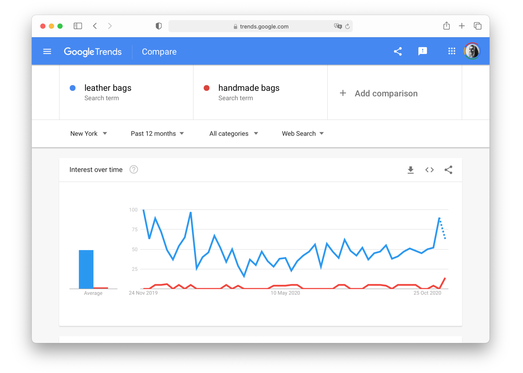
There are plenty of keyword research tools out there. First, check all your keywords with Google Trends: write one or several words or phrases, select a target location, and get the average search volume for a desired period. This small effort may save you from wasting money and time on falling topics.
Practice
Find your competitors in search engines and social media. Try various word combinations and pay attention to the ads you get in the results. Make a table with all the competitors you've identified.
Alex found a similar coach and an online course in search results. He found yet another competitor in social media.

To be on the safe side, he Google-searched all the wordings that could possibly direct him to his competitors: event management classes, how to become event manager, how to organize a conference, how to hold an event. That's how he found a useful post on the blog about event planning and picked up solid argumentation there.

Make a competitor analysis table

It's very unlikely that people who visit your page have no idea about what's being offered by your competitors. They've probably visited some other websites and know your competitors' prices and argumentation. And they'll come to you with this background.

A comparative table will help you understand how potential customers see you compared to your competitors. You'll see the advantages that are to be highlighted and doubts that your customers may have.

Take the list of competitors you made at the previous stage. By which parameters you differ from them? Consider your strengths and weaknesses, price, some particularities of your product. Pay attention to the website, its content and the look and feel. Is everything clear, are there any nice pictures? Any freebies? Write down the things you like or, on the contrary, the things that need improvement.
Identify your weaknesses. These are possible doubts of your customers. Why are the prices higher than average? Why should I pay for the delivery? All these points are to be covered on the landing page.
Identify your strengths. These points should be described in detail on the landing page.
Alex found two competitors and one learning course. After laying out the table, he can clearly see the weak points that his customers might notice as well: the author is not mentioned, the prices are for some reason higher than the average. That should be explained on the webpage.

But he can also see his strengths: a convenient learning format, free stuff, and author's personal practical experience. He noticed that his competitors provided very vague descriptions and none of them mentioned how the learning process is organized.
Alex highlighted the strong points in green—to emphasize them. The issues that may be doubtful are highlighted in red.
The table will show your product in a way your customers see it. They've already visited other websites and understand average prices and particularities of the product. If you understand the questions of your website visitors, you can prepare the answers.
Here is a list of things Alex will include on his website:

  • Emphasize the advantages of online learning. It's cheaper, and people from other cities can participate
  • Explain why the course is more expensive
  • Mention his practical experience
  • Post a detailed course program
  • Offer free stuff: a webinar and blog articles
  • Homework for students
  • Comprehensible website copy
Practice
Think of the main points of comparison between you and your competitors and put them in a table. Write down the doubts that users might have and the strong points that are to be mentioned on your webpage.

Target Audience Analysis

Why chocolates for kids are usually placed on lower shelves in supermarkets? So that kids could see them. It's a good example of working with the target audience.
Target audience: in this case, kids, not their parents who have money. Because a parent would simply pass by, whereas a kid would notice a chocolate and ask for it.

Target action: to be noticed. Chocolates are at the cashier's, and a kid would notice them while standing in a queue.

The same is true for a landing page.
It would be best if you understood what your target audience is and what they need. It might seem that a website is used to introduce a product to customers, but that's not exactly so. A website should introduce a product to particular people.

Identify the target audience of the landing page

Previously, we've mentioned that there's a need your product satisfies. Your target audience includes all the people you can reach who have such a need. If you make bags and deliver them around New York by yourself, your target audience is New Yorkers using bags.

The target audience and website audience might differ.

For example, your audience includes all the people who buy leather bags, either for themselves or as a present. You want to make a landing page to sell bags for Christmas. Then your target audience only includes the people who want buy a bag as a present.

Let's move on. Imagine you sell bags with characters of a famous movie like "Star wars" or "Guardians of the Galaxy", etc. The target audience for this product includes people who need an unusual bag to give as a present. It might be a girl who's dating a fan of these movies.
Audience
"People with bags"
Audience
"People with bags in New York"
Audience
"People looking for a bag to give as a present in New York"
Target audience
"People looking for an unusual bag to give as a present in New York"
We've just narrowed down the audience from "people with bags" to "a girl with a weird boyfriend". The more precisely you specify the target audience, the easier it will be for you to prove the benefits of your product.

To identify the target audience of your landing page, first draft your offer. Later we'll teach you how to write it. Now think of what your offer is and whether there are any limiting factors. Anything can be a limiting factor: a holiday, sales, or a season.
Practice
Try to identify your target audience and the landing page audience. Study your competitors' pages and groups in social networks. Who's following them? To whom your competitors address their offer?
Let's take a look at two popular methods of analysis that are used for website creation: Persona Method and Jobs to be Done. The first one helps understand who buys your product and for what reasons. The second is used at the design stage: you'll see the ways visitors use your website and learn what they expect from it.

Identifying the needs of the target audience: Persona Method

Persona is a "brand champion", a typical (though imaginary) client of yours. A persona incorporates demographic characteristics, lifestyle, and major needs. Designers and marketing strategists use personas to have a better image of their target audience.

The easiest way is to find personas among your clients or on social media (if you don't have any clients so far):
1
Find some groups or events on the relevant topic in social media
2
Look at the subscribers and try to analyze what they have in common
3
Group the subscribers according to their needs and common features
4
Study 3-4 personal accounts of the subscribers from each selected group
5
Make a generalized image of a subscriber of each group
Alex found a FB page dedicated to the organization of events. He checks the subscribers and reads comments. It's clear there are some prevailing types and they write similar comments:

  • A PR specialist in a big company. 25-40 years old. Asks questions about the program.
  • A PR specialist in a state-owned enterprise. 30-40 years old. Asks about the price and documentation to be provided to the employer.
  • A small business owner. 25-40 years old. Wants to know if any case studies are included in the program.
There are people that don't use social networks; that's why it is useful to expand the field of research. Go to blogs and forums, read comments on your competitors' websites.

It is important not only to make a cardboard character, but to analyze their lifestyle, their concerns and think of some practical benefits your product can bring them.
Here is the persona created by Alex:

Helen Madris, a PR manager in a small company. Sometimes she plans industry conferences and lectures featuring presentations made by the CEO.
Goals: Wants to develop her skills in event planning and minimizing budget costs.

Pains: Her managers don't allocate much money or assistants.

Our solution: Mention on the website that we'll teach how to plan an event with no budget in just 2 weeks.
It's OK to think of 3-4 personas. Choose one principle persona to represent your typical buyer. Other two or three are required for testing untypical scenarios on the website. If there are more personas, the scenario will get too complicated and the landing page will lose its precision.
Practice
Create one or two principal personas. These are your brand champions, the people your website is made for.

Create one or two supplemental personas. These are people who might be your clients in the future.

Write down the aims and possible doubts of each persona. What's your way of addressing them?
Alex has two principal personas: a company PR manager and a professional event planner who wants to upgrade his skills. They are the target audience of Alex's website.

There are also supplemental personas: a PR specialist at a state-owned enterprise and a newbie event planner who needs a good career start. These personas will help make the website more interesting and consistent. If the web page looks credible even to them, your brand champion will never skip it.
The persona method provides a vivid image of your target audience. It helps them understand how to address it and formulate their questions.

Alex wrote down possible questions of the brand champions. The answers are to be specified on the landing page in the first place:

Helen, a PR manager

  • What is it?
  • Do I really need to study this?
  • What's the outcome?
  • How the learning process is organized?
  • Do you have free materials?
  • Why should I trust the author?
  • Can you prove the author has practical experience?
  • Can you teach me to make projects with no budget?
James, an event planner

  • What is it?
  • What's the outcome?
  • How the learning process is organized?
  • Will there be any home assignments?
  • Are there any freebies?
  • Why should I trust the author?
  • Can you prove the author has professional experience?
  • How to avoid typical mistakes?
  • Nikita Obukhov
    Tilda Founder and CEO
    Pay special attention to doubts. What can confuse a client? To make it easier, imagine you've published a Facebook post about your product. Unfortunately, there are many fans of your competitor or people who are just impolite in the comments. What kind of comments they may leave? What will they be laughing at? Which faults can they point at? These are the insecurities your clients have. Write them down in advance to cover them on the landing page.
We figured out who might visit the website and why. But each user approaches the purchase under certain conditions. To identify these conditions, there is another method, which is called Jobs to be Done.

Define audience's aims on the landing page: Jobs To Be Done theory

A landing page is used for making people buy your product. However, that's what you need, whereas people will visit your website for other reasons. For example, a person has to find a learning program and show it to the boss. Thus, the aim is to find a program. If they find a detailed description of a course, but cannot download the program, the problem isn't solved. The boss won't waste their time searching the website—they need to see the program, and then they'll pay for it.

Jobs to be Done are tasks to be completed. The method is used by designers and marketing strategists to identify the aims of website users. The more "jobs" are completed with the help of the landing, the higher chances of a purchase you have.

Personas can help define the main tasks of website users. Think of the ways each of them would use it and on which terms they would accept your offer.

Answer the following questions:
1
Think of how people would use the website—whether they'll read everything attentively or just look it through on the subway
2
What are the principle tasks people would solve on the website?
3
Which secondary tasks can help them complete the principle one?
4
What should be added on the website so that all the tasks are completed?
Alex's audience is very diverse, but it's possible to single out the following situations:

Situation 1: everyone's busy working or studying during the day.
The task: find time to watch the webinar.
The solution: the webinar recording should be available so that people could see it at any moment.

Situation 2: a RP manager can't take a day off; a student from another city won't be able to come.
The task: make sure the course is available online.
The solution: show that other groups are already taking an online course with no negative impact on their job.

Situation 3: employees and PR specialists from state-owned companies are not authorized to buy the course by themselves.
The task: selecting the most convincing materials to present to company managers.
The solution: provide a presentation and certificates on the website to print out and show to the boss.
Practice
Single out the main and secondary tasks on the website. Check if the secondary tasks help solving the main task.

It's very likely that all the created personas will have a similar main task and different secondary tasks.
Now take the table of personas from the previous section and add the columns tasks and solutions to it. The final table should describe your audience, their needs and doubts, tasks, and ways to solve them.
Later you'll need the table again. In chapter 5 of the course, we'll boost the performance of the landing page, which directly depends on the website capacity to help users complete their tasks.
The table will help a web developer in case you delegate them to build your next landing page.
Alex adds the personas' tasks and possible solutions to the table. Here you can see a complete portray of one of his personas:

Writing a Landing Page Copy

While creating your first landing page, you might have a strong desire to move to the text part as soon as possible. It often happens when a person has read some articles about writing selling texts.
That's why there are so many standard websites without a solid foundation. It's not clear who they're designed for and how the product differs from similar offers, the text gives no answers to the main questions and provides no argumentation at all.

To avoid these mistakes, we've developed the foundation:
1
A summary table of competitors
2
Buyer personas
3
A list of questions and tasks that people coming to your website would have
4
A list of solutions
The text on such a foundation is basically guiding the user—gradually answering their questions, responding to their apprehensions, and giving arguments if necessary. Such texts are not oversaturated with words that are used for embellishment or just because they were mentioned in some articles.

Some marketing specialists move right on to the stage of a prototype design after the analysis. The prototype is a diagram that shows how the website is organized: here is the text, there's a picture, and that's a button. We recommend starting with text, as each website tells a story.

Landing page for selling bags: a story about a bag that won't tear up, and you can put all your gadgets inside.

Alex's landing page: a story that teaches you how to organize events and reduce costs.

Before shaping your story, think of the way you're going to approach it.

How to write a text for a landing page

There are 4 main stages:
1
Develop the structure
2
Prepare an offer
3
Write a copy
4
Optimize it
Let's take a closer look at each stage.
1. Develop the structure

The text structure is the core, to which you gradually add details.

It's hard to read a text with a poor and illogical structure. If the reasoning is patchy, even the most brilliant arguments will be mixed up. On the other hand, structured texts are easy to read, to navigate through, and to memorize. A reader moves on from one part to another, finding answers to their questions and getting rid of the mental haze. A poor structure will only make the haze "thicker".
Logical

  • The offer: Leather bags
  • For whom: For fashionable people
  • The advantages: Great quality
  • The proof: Handmade
  • And who are you: Professional seamstresses
  • Buy the bag: Well, OK
Hazy

  • Buy the bag: Which bag?
  • And who are you: Professional seamstresses
  • For whom: For fashionable people
  • The advantages: the quality's just perfect
  • The offer: Leather bags
  • The proof: Ot's handmade
To shape the text structure, use the questions of personas. Group them by their meaning, and think of some logical order of answering, so that you finally get a structured narrative. Add mandatory parts: your personal story and your offer briefly described in 1-2 sentences.
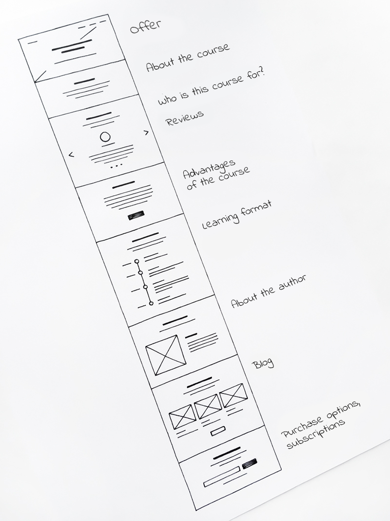
That's the structure of Alex's landing page:
If you want to add some product-related information that was not covered in the questions, don't hesitate to do it. No one knows your product better than you do.
2. Write an offer

Offer is what you're selling. It's the essence of your website described in 1-2 sentences. If you leave nothing but the offer and the "Purchase" button on your website, it would still work.
To prepare an offer, answer the following questions, "What is it?" and "Why do we need it?" Go back to your personas: what are their aims and what benefits do they expect from your product?

Use the competitor analysis table to identify your strongest point and put it into the offer. If there are any time limits or discounts, add them as well.
Alex writes an offer:

How to plan a conference. Online course with home tasks for PR managers and entrepreneurs
A guide to creating a Unique Selling Proposition:
3. Write a copy

The competitor analysis helped us understand your strong and weak points, and the target audience analysis revealed what concerns and questions your website visitors might have. Now we can use this information to write a persuasive text.
  • Nikita Obukhov
    Tilda Founder and CEO
    Don't write your text right on the website. Use Google Docs or Microsoft Word. Working in a text editor is much easier—you can change the layout, swap text sections, delete extra information. Use Google Docs to share the document with your colleagues if you work as a team. They can add comments saying that the text is good or too wordy, and suggest their variants.
While working on a copy, stick to "info style"—delete cliches and subjective assessments, write about the facts. Don't overdo with complicated phrases. Take a question, give the answer, and provide evidence. Don't forget to prove everything you talk about. If you say the product is nice, show some real photos.
Alex starts writing a text by answering the following questions:
  • Ira Smirnova
    Customer Experience Director at Tilda
    Send the final version of the text to some of your friends. It would be perfect if they're part of your target audience. Ask whether the text was easy to read or if they had to read some parts several times to get the sense. Did they want to share it with other people? Were they happy or sad while reading the text? Ask them to describe their emotions. What did they understand? What is the key takeaway?
Check out the guide to writing a landing page copy:
4. Optimize your text for SEO

An optimized website is easier to find on the Internet. Someone types "leather bags with prints " and comes across your landing page with such bags in search results. To achieve this effect, upgrade your website through technical optimization and text optimization.

Technical, or SEO optimization helps search engine robots find and index the webpage. Pages with better indexing are easier to find on Google and other search engines. The Tilda websites optimization is simple, no programming skills are required. Check our guide:
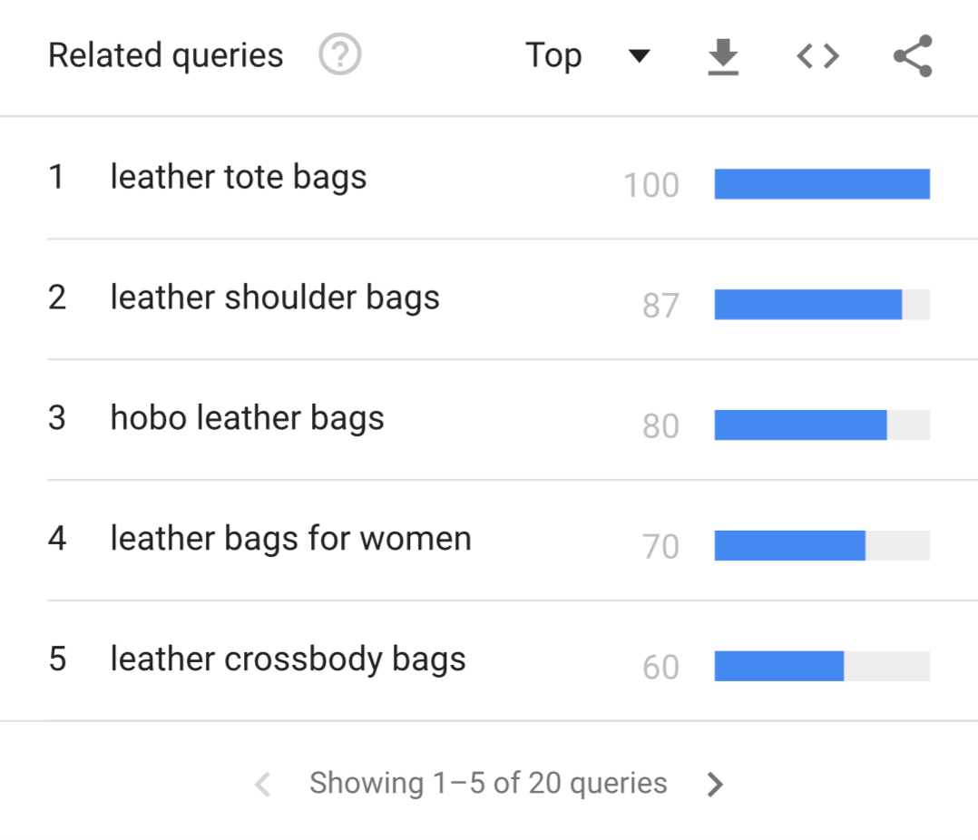
Text optimization implies adding keywords to the text. These are words and phrases that people use to find products like yours on the Internet. They are important for us as keywords can change a visual appearance and a structure of the website. Use Google Trends to evaluate keyword potential. For example, this table shows popular searches for your topic that are worth considering.
The keywords will be noticed faster by search robots if they're added to the headings. "Buy a leather bag", "A leather bag shop", for example. Another good key is "cross body leather bags". If you're selling such bags, you can make a separate section for them on the website.

Single out several popular keys and use them in the text. In this case, the more the better. However, when you see that a keyword appears too often and your text looks unnatural—get rid of it. Neither readers nor search systems like the texts oversaturated with keywords.
SEO might not bring immediate results (if any at all). Writing "buy a bag" ten times in your text would not rate it first in search results. But the chances of finding it via search engines will increase.
All right, we now have the landing page structure and its copy. You've already selected all the images and additional materials, such as videos, presentations, certificates, etc. In the next part, we'll put it all together to make a landing page prototype.
Practice
1. Group the questions of personas and develop a text structure based on these questions.

2. Write an offer. Decide what your offer is and how it can help your clients.

3. Write a text answering all the questions. Think of some proofs to what you write about.

Select the keywords for your website copy using Google Trends.
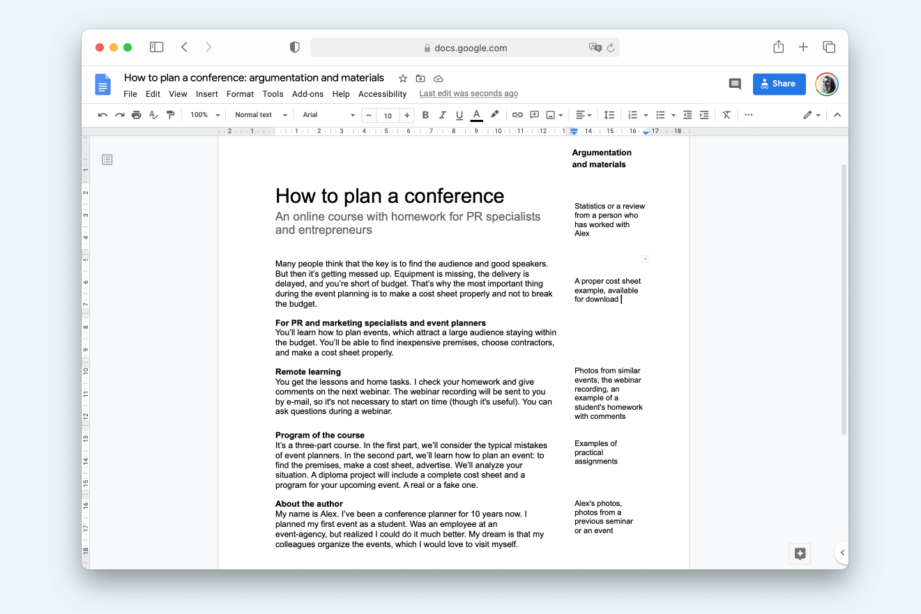
Alex started writing a text. In the margins, he takes notes about additional files he might need to attach.
Click the image to open the document, or open this link

Prototyping

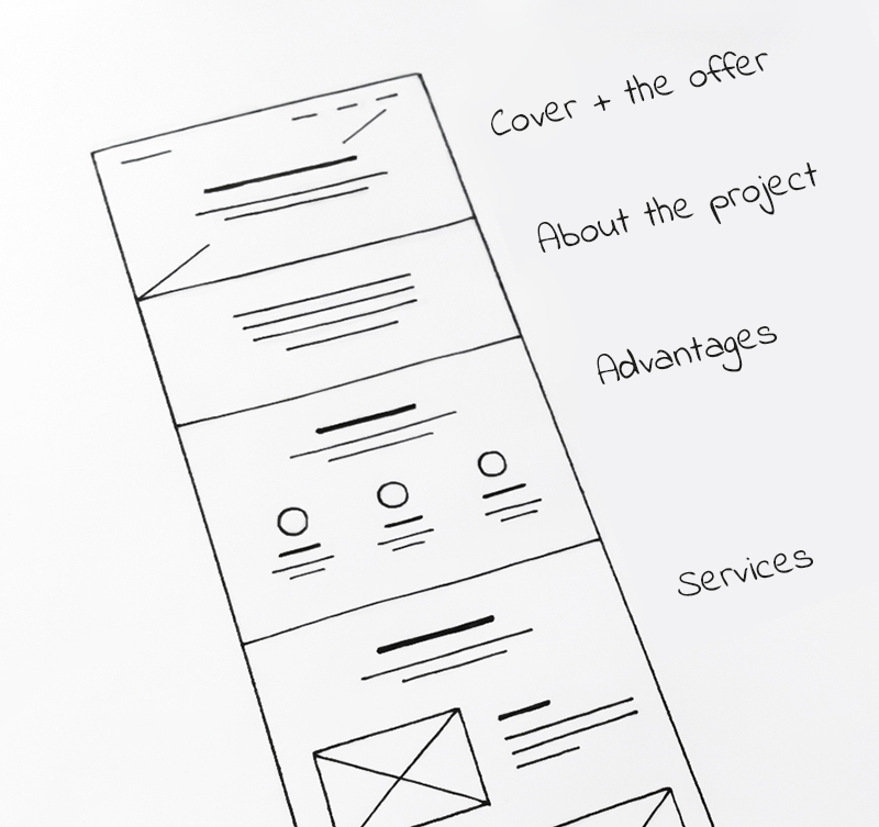
Assume that a prototype, or a wireframe, is a website map. It provides a schematic view of all the content: Structure, text, images, videos, and links.
The easiest way is to lay out a prototype on paper. Also, there is dedicated software for making wireframes, such as a cloud-based Mockingbird (you can use it directly in the browser), or Axure, an app to be installed on your desktop. They are used by professional designers to design and test websites, applications, and programs. But you can easily prototype a one-page website on a piece of paper.

Prototypes have two main purposes:
1
Arranging the content of a webpage to decide where we put the text, where goes the image gallery, and where we attach a link to the presentation. It's impossible to keep it all in mind—you'll definitely forget something.
2
Testing the arrangement of elements: are they logically structured? Is the order of information convenient?
Now it's time to put the structure of our website on paper.
Advice: Don't make a prototype that is too wide. The width should be 5-6 cm (2-2.5 inches) if using A4 paper; this way you'll have the entire webpage depicted on one sheet and you'll clearly see the structure.

Each point in the structure corresponds to one prototype level. On the web page, they'll transform into sections.
  • Nikita Obukhov
    Tilda Founder and CEO
    Think in screens. One screen equals one section and includes one complete idea. It's the easiest way to communicate the essence of your offer to the client.
  • Nikita Obukhov
    Tilda Founder and CEO
    Think in screens. One screen equals one section and includes one complete idea. It's the easiest way to communicate the essence of your offer to the client.
Think of the most appropriate sections where you can add the materials proving the information on the website: photos, stats, videos, blog posts. If it is possible to replace some of the text with images, do so.

Add content to sections indicating the locations of images and text. The text is shown by straight lines, the headline is a bit bolder. The picture is a rectangle with crossed lines.
  • Ira Smirnova
    Customer Experience Director at Tilda
    Not to reinvent the wheel, just check Tilda Blocks Library. It is split into categories: covers, "about the project" sections, team, etc. It'll help you choose the functionality and look of each section. For example, what does the section about the course should look like? Is it a simple heading or a text piece? Probably there should be an image? Or a background photo? Some background color? Draw several options on the page and choose the best one.
  • Ira Smirnova
    Customer Experience Director at Tilda
    Not to reinvent the wheel, just check Tilda Blocks Library. It is split into categories: covers, "about the project" sections, team, etc. It'll help you choose the functionality and look of each section. For example, what does the section about the course should look like? Is it a simple heading or a text piece? Probably there should be an image? Or a background photo? Some background color? Draw several options on the page and choose the best one.
When a prototype's finished, it's time to go back to the task list that you've made using the Jobs to be Done method. Make sure this scheme helps users complete all the scenarios. Pick a persona and try to understand how they'll be searching the website and what information might be missing.
To check if the prototype is convenient and which parts might be confusing, Alex tests it on the persona of James. He's a professional event planner.

Alex understands that a simple announcement of the course will not be sufficient for his target audience. The course program should be placed closer to the beginning where the users expect to find it.
As a result, you should get a comprehensive map of your website, where you can see the text, the order of the blocks, and additional files. The last thing is to color the prototype–and then your website is practically finished.

Changing a prototype is easier that changing the actual website, that's why you shouldn't neglect prototyping.
Practice
1. Lay down a website structure on an A4 page or in a wireframe software: One structural part stands for one section of a page.

2. Indicate the locations of text, photos, videos, and other files.

3. If it is possible to replace some of the text with visual aids—pictures or videos—do so.

4. Choose one persona and guide it through the prototype. Do they have any questions?

Landing Page Design

We finally reached the design stage to find out that design is not the key.
That's right—people will buy your course or bags not because you have a nice website. They'll buy your product as they believe that the course can help them earn more and that your bags are nice and durable. The purpose of design is to demonstrate the product. If something distracts attention from the product, it should be removed immediately as it is bad design.

Chapter 4 of this course is fully dedicated to landing page design as well as some of our blog posts. Check it out before you move on.

That's it. In the next chapter, we'll break down the anatomy of a landing page: Starting with the first website image down to social media icons in the footer.
Homework
1
Make a list of your competitors. Write down their strong and weak points in a table. What are the things you like about their websites and what would you change?
2
Create 3-4 personas for your website. Who are they? In which way is your product useful for them?
3
Make a list of tasks the users can solve on your website.
4
Lay out the structure of your landing page. Check if it meets the needs of personas.
5
Write your website copy. Tell a story about your product in your own words. Why should people buy it?
6
Write an offer.
7
Make a list of keywords for your website.
8
Draw a prototype on paper. Mark the locations of images, video, and links. Check if the prototype is logical and consistent.
9
Choose the cover image for your website.
Did you find this chapter useful?
Share it with friends!
Text: Phillip Brazgovsky
Illustrations and design: Julia Zass

Read other chapters of the coursebook:
Create a Landing Page for Your Business
Build your landing page on Tilda: It's easy, fast, and free