How to Build a Landing Page

Landing Page Design Principles

The previous chapter was dedicated to the typical elements that make up a landing page. In this chapter, we'll break down the design aspect: the overall style, choice of colors, fonts, and images that go into creating a landing page. We'll also pay special attention to some common mistakes in landing page design.
The Internet has made everything simple. It's not that difficult to create a neat landing page that looks professional, doesn't irritate the eyes, and works towards a result. Having grasped the main principles behind designing a landing page, you'll be able to create one yourself and confidently show it off to your designer friends.
Lecture breakdown
Sections
A landing page is a lot like a presentation made up of different slides or sections.
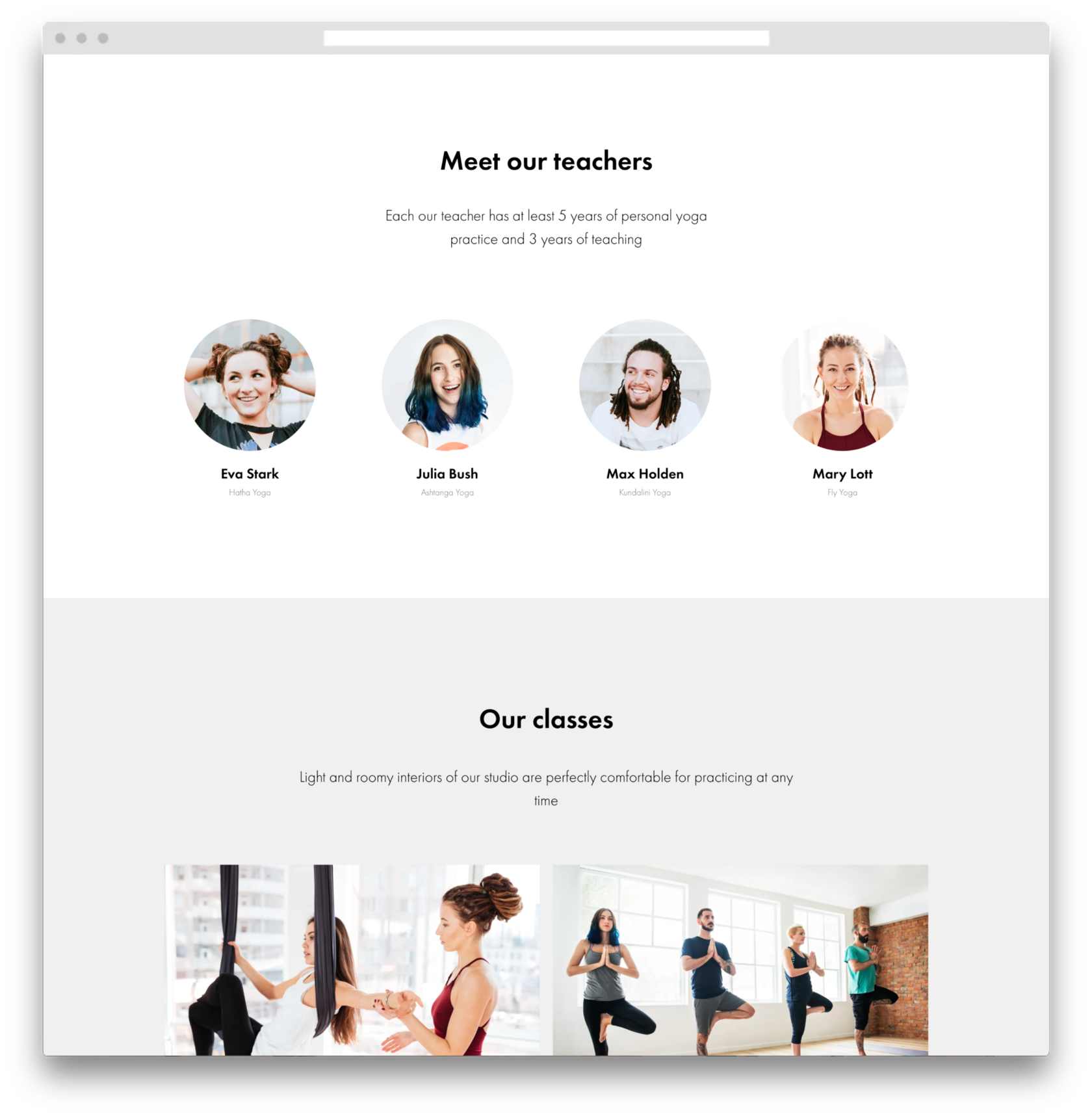
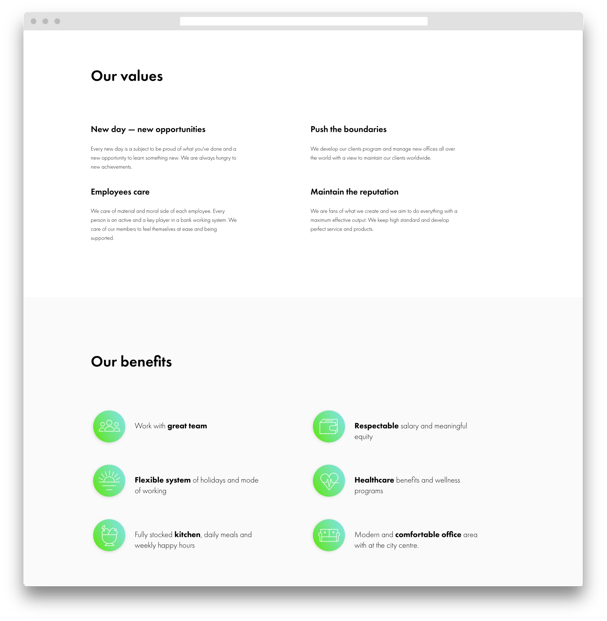
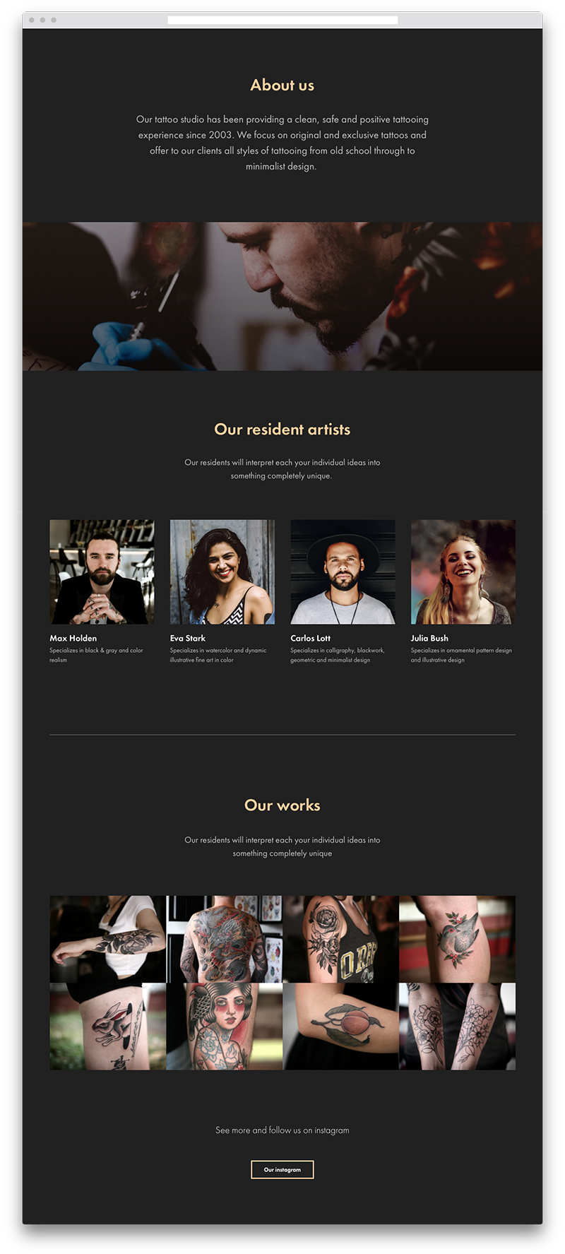
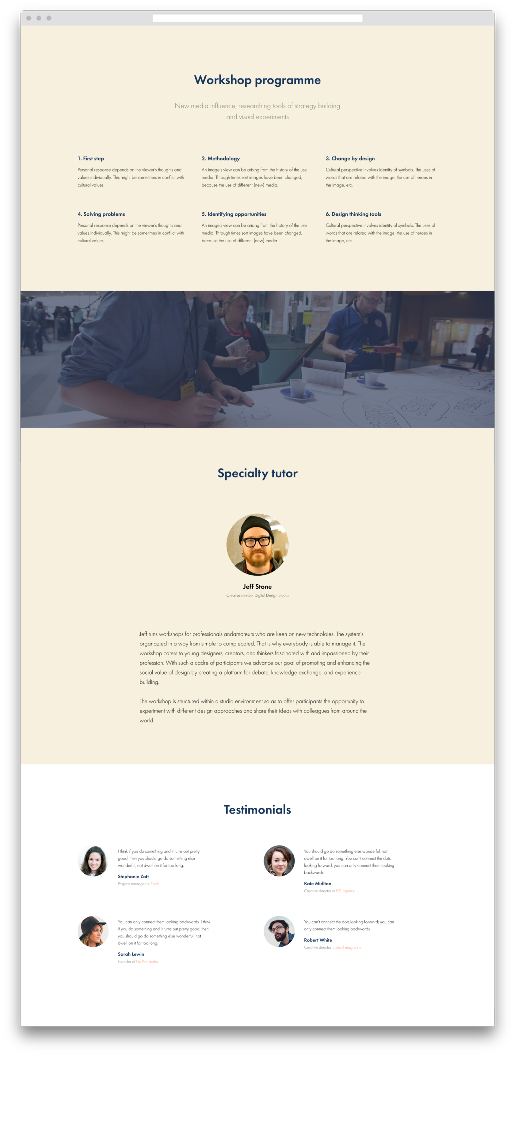
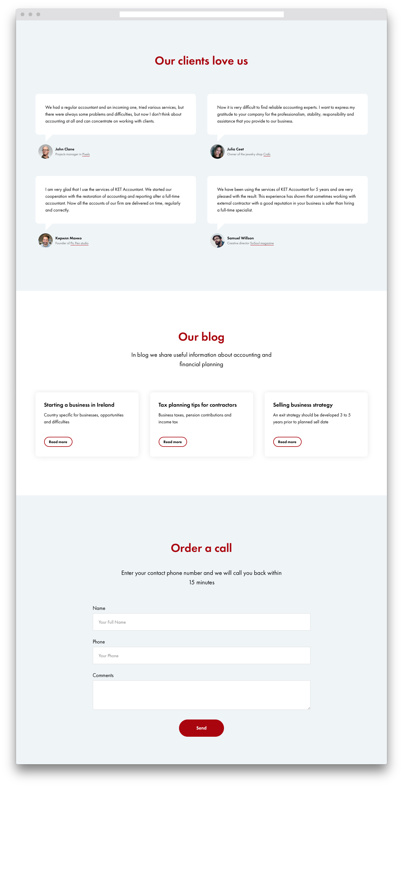
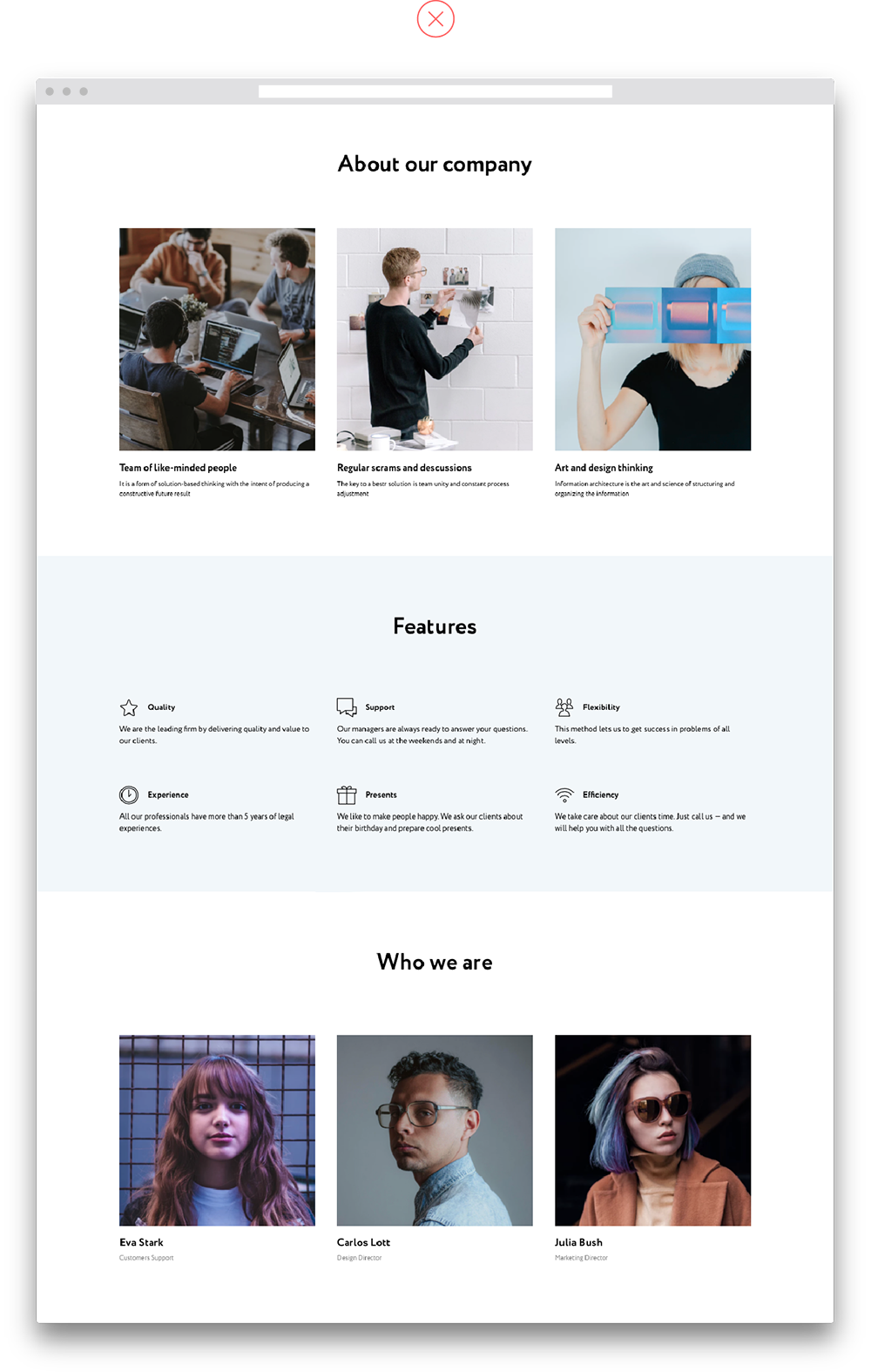
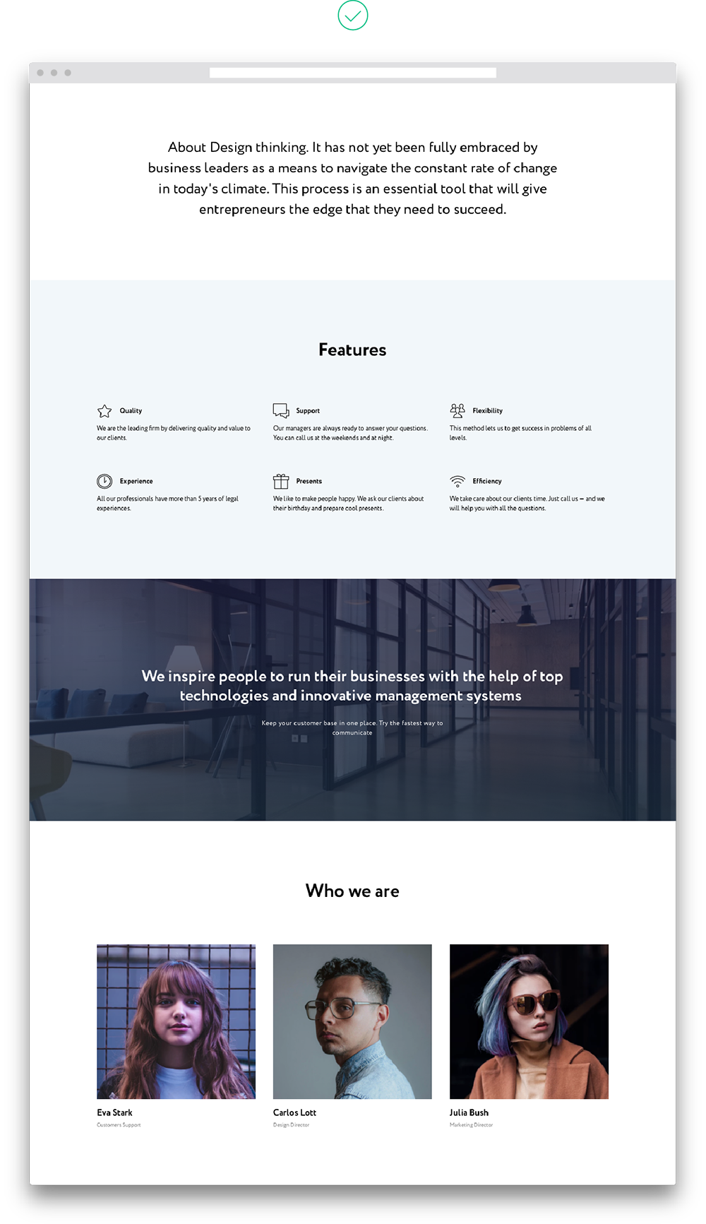
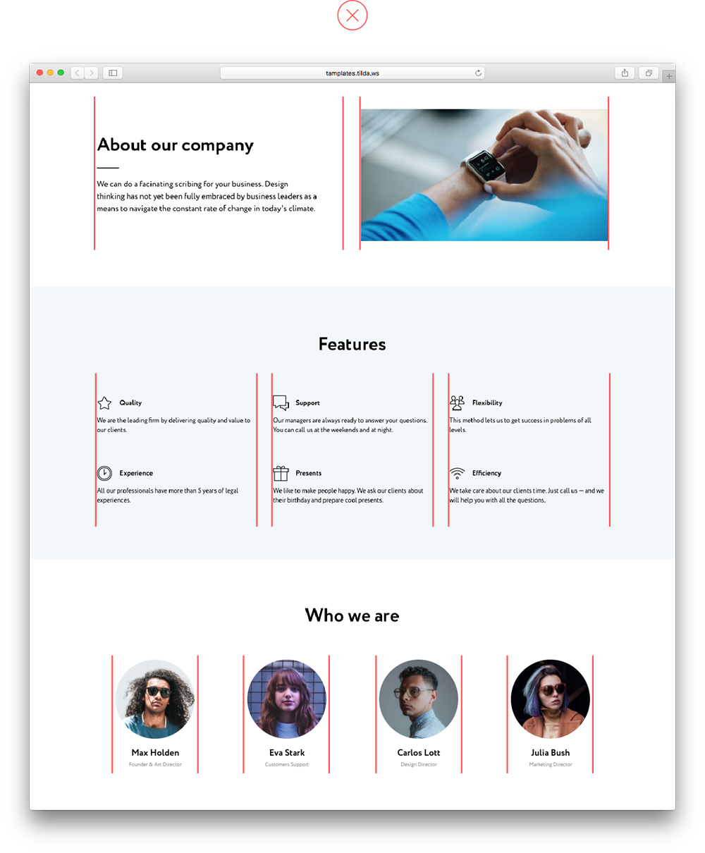
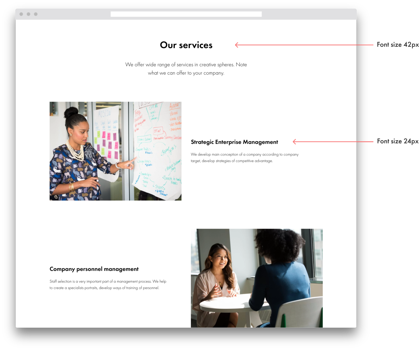
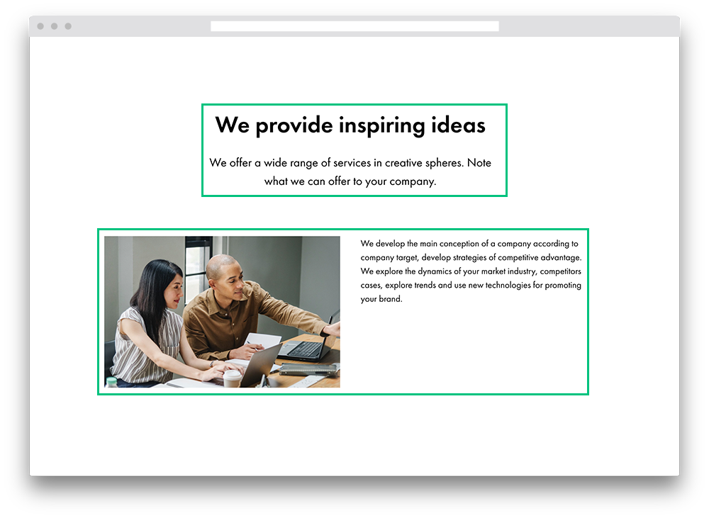
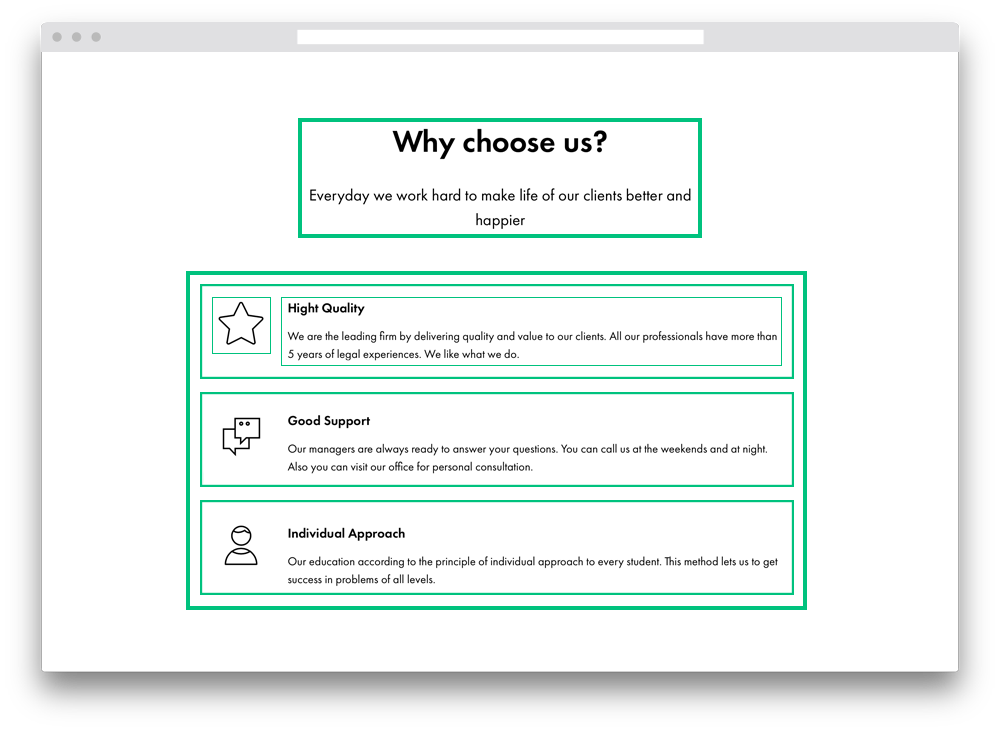
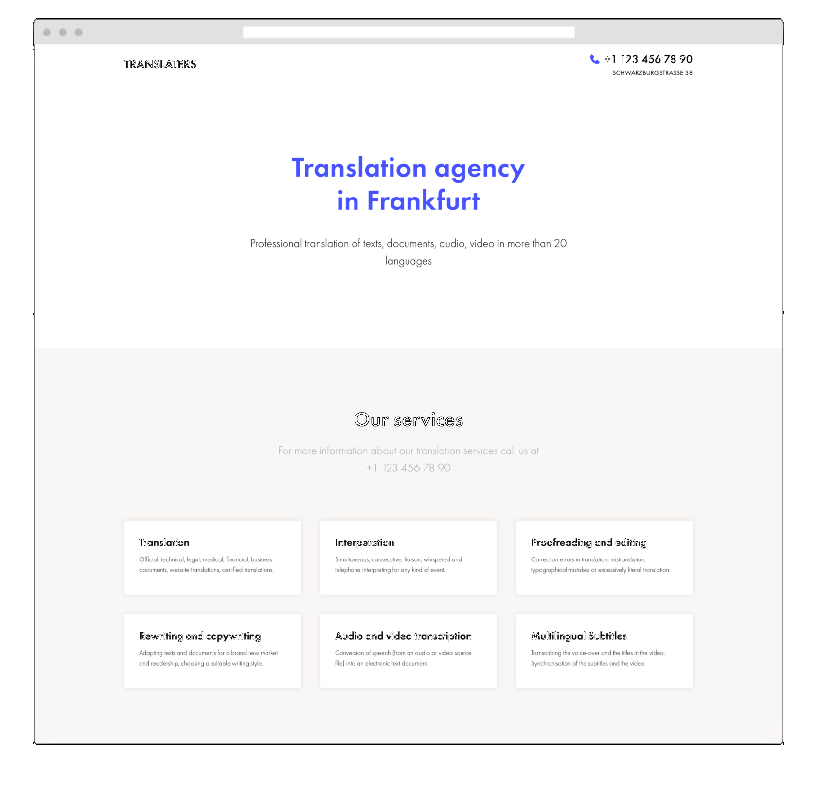
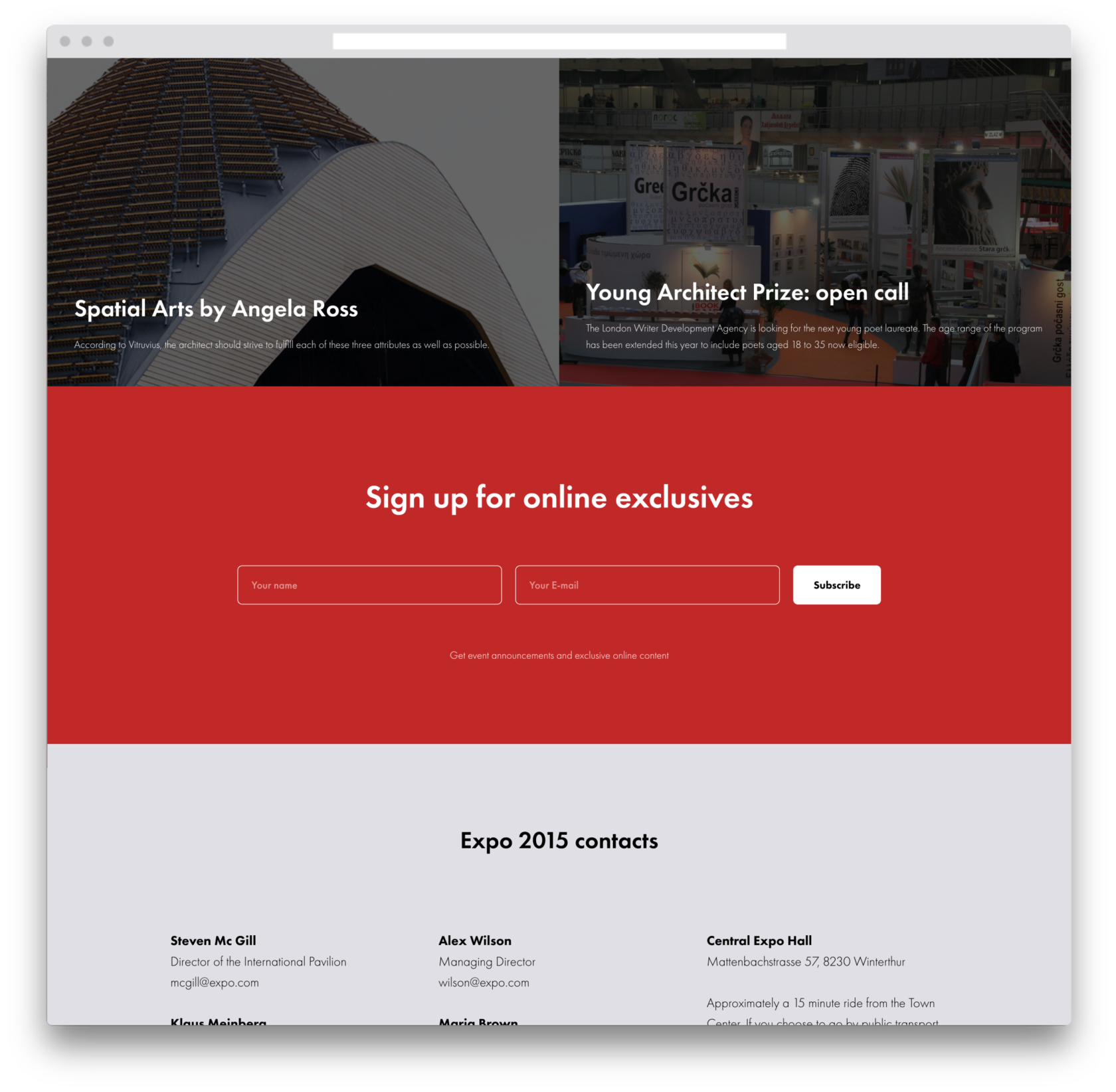
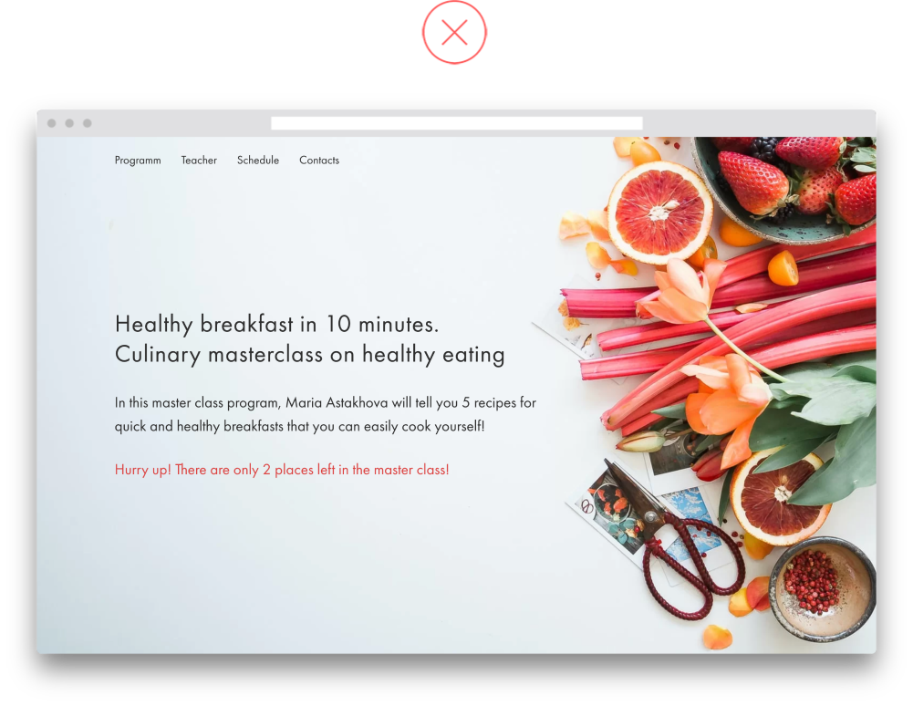
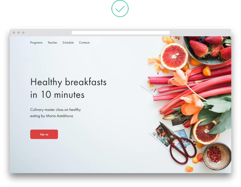
We introduced the concept of sections in the 
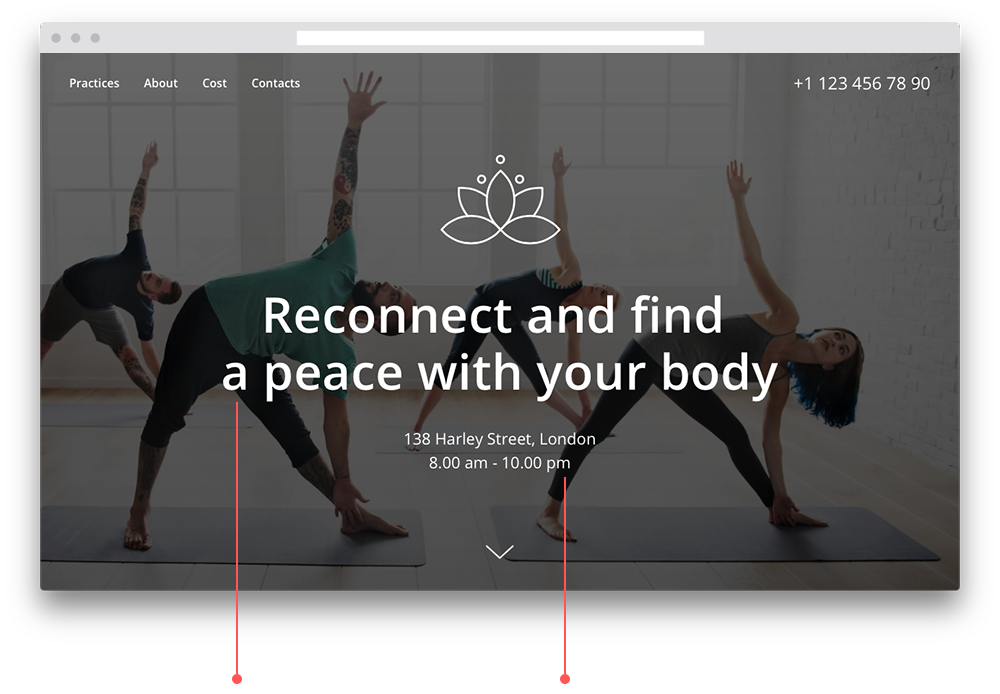
second chapter when we broke down a website's structure—your offer, some info about the project, the feedback, schedule, and call-to-action blocks—all of these are known as sections in a landing page.

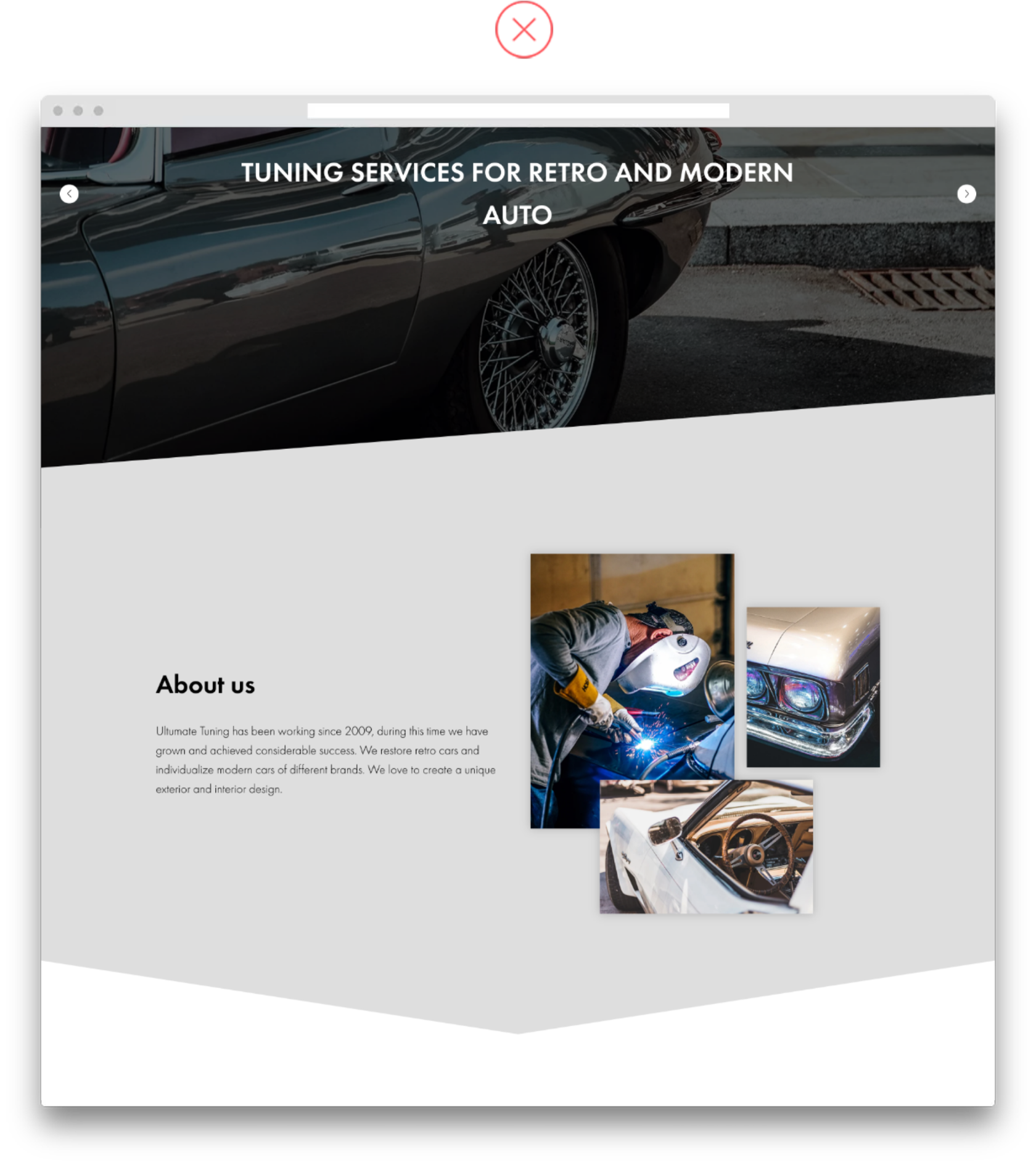
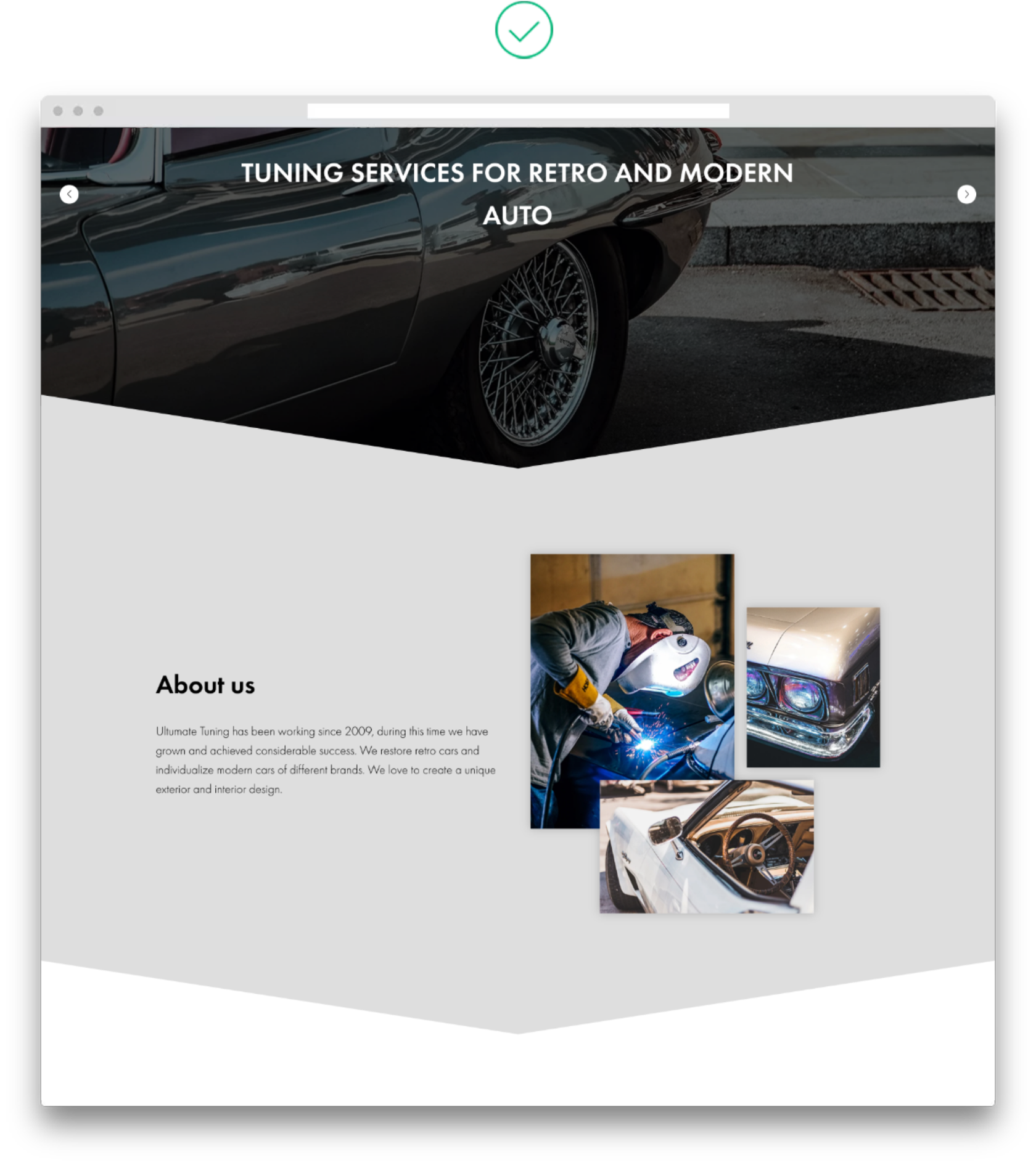
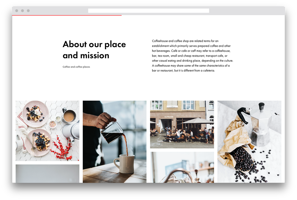
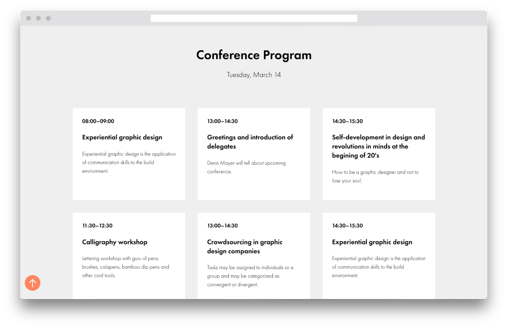
Sections are useful as each one addresses a specific question—how much does something cost, where are we located, why are we the best—meaning they contain one fully-formed idea. This makes it easier for people to perceive information, as you've brought up a subject (e.g., "Who is this course for"), explained it, and moved on to the next one. Consistency and predictability are two things the human brain loves.
One section should answer one question
Landing sections differ from traditional presentation slides in that they're not restricted by screen height. A single section can take up anywhere from several screens to a small part of a single screen.
So what goes into a section?

A section is made up of a heading, subheading (optional), and content: Text, images, videos, and photo galleries.
While the elements within a section may look different, the important thing is to keep them linked by a single theme.
Spaces between sections are important

Spaces are needed at both the top and bottom of each section to prevent them from sticking together. The content of each individual section has to be surrounded by empty space.

Spacing is also important for the overall perception of the page. Regular and adequate spacing between sections makes the page look more structured.

The distance between sections must also be larger than the spaces between the elements inside each section; that will make sure each section is perceived as one whole.
Section background color and page rhythm
Spaces are necessary, but aren't always enough to clearly divide the landing page into different sections.
Rhythm, or the alternation of elements, makes the page less monotonous
The easiest way to improve navigation and set a rhythm for your web page is by alternating the background color between sections, just like in the example on the right.

Another trick you could use is highlighting one of the sections (or two, if you've got a big landing page) with a bright color—yellow, orange, or blue. Don't color all the sections—one in five will do.

Dividers
A divider in the form of a line or a border shape is another way of marking the beginning or the end of a section.

For the landing page to look neat, we recommend that you use one border shape throughout the page. Using different styles—zigzags paired with slanted dividing lines, for example—will make the page difficult to digest.
Two border shapes on one page are too many
One type of border shape makes for a neater look
Section heading size
Sections can either contain headings on their own or feature subheadings. Headings define the rhythm and structure of the page and help users identify the beginning of a new idea.
Headings of different sections should be the same size
For example, if the first heading "About the Course" is 62px, the heading of the next section—"Who the Course is for"—should also be 62px. This will make the page look neat, while each new section (and each new idea) will be easy to read.
Sections with headings
Sections with headings and subheadings
To make the page structure readable not only to humans, but to robots as well, use the H1 tag for the heading on the cover of your landing page, and add the H2 tag to each section heading. Search engines will interpret this as a well-laid-out and correctly structured page.
Section heading color
Section headings don't always have to be black—they can be colored too. This is a fairly rare move, as colored headings are more difficult to fit into the overall style of the page.
Don't color in the header unless you are sure it will work
If highlighting an element with color is necessary, then rely on the same principle we applied to the heading size—keep the color of all section headings identical to make the page easier to read.
Block compatibility
We've noticed that pages that feature sections with columns placed one after the other are hard to read.
The worst-case scenario is when sections with different numbers of columns alternate
It makes more visual sense for neighboring sections to have the same number of columns—three, for example. Such a page will still look unbalanced.

If you're not experienced in web design, it's better to avoid using columns altogether—they're pretty difficult to get right. You can also alternate between sections with columns and sections with text. For example, a column of text can be followed by three columns with icons, then a key phrase with a background image, followed by three more columns or a column of text, and so on.
The page uses sections with 2, 3, and 4 columns in a row—this results in visual chaos
All sections have 3 columns each—this option is tidier, but still hard to interpret
Sections with 3 columns alternate with sections with one wide column—the page looks clear and the information is easy to read
Custom sections
In the beginning, we talked about a section consisting of a heading and content. This is true in most cases. However, sometimes there are sections that don't fit into that definition.

A photo gallery, a central piece of text, or a block of text and a picture with no heading are all examples of "custom" sections. However, if they still contain one idea and answer one question, they are still subject to the same principles, and need to be spaced just like all the other sections, and highlighted using a color background or border shape.

Here are some examples of custom sections:
Visual Hierarchy
Visual hierarchy refers to tools a designer can use to help the visitor tell apart the important elements from the secondary ones on a landing page.
Visual hierarchy is essential to eliminating chaos on a landing page. "What's on offer? How do I use this? Why do I need this?"—these are the questions that a person should instantly get answers to. Visual tools will help you do that.
Tools for creating a visual hierarchy
Size: the bigger the more important
For example, a section's main heading is larger than the heading inside a section. In this case, the visual hierarchy helps one understand that the small headings are similar in meaning, with the main heading uniting them under one umbrella.

But you should pay attention to the contrast. Large elements should be large. If a second-tier heading is 22px compared to a 24px first-tier heading, the visual highlight is too weak, meaning there is no hierarchy. A 1.5–2-fold difference in font size is easier to notice and interpret.
The main section heading is noticeably larger than the headings inside the section
Color: Brightness = visibility
In the context of visual hierarchy, "brightness" refers not to a shade of color, but the contrast and amount of color on the page in relation to the main color scheme.
Turning all the text on the page red will not make it more noticeable
A green header coupled with blue text and an orange button will create visual conflict, and all three elements will eventually be lost. This is an exaggerated example, but you should really think hard every time you want to add another color.

If a contrasting color appears against the background of a more general color, the element becomes more visible, attracting attention and saying: "I'm important."
A blue button on a neutral gray background stands out due to its bright and contrasting color
Grouping: Closer distance = closer in meaning
If several elements are located next to each other, that likely means they're linked by a common theme or meaning. To combine the elements into a group, you need to reduce the distance between the elements inside the group and increase them from the outside.
Let's look at some examples:
The heading refers to the bottom paragraph, but is visually linked to the text above.
This is because the distance between the top paragraph and the title is less than the distance between the title and the bottom paragraph.
Let's move the title closer to the bottom paragraph. We've now formed a group: the title and the text that refers to the title.
Multiple groups of elements can form a single composition within any given section. For example, a heading and a subheading can form one group, while a block of text with an image in two columns can form another.
The space between groups of elements within a section has to be less than the space between two sections
Two groups inside one section: the title and subtitle make up one group, while the image and text form another one
Each group can also have subgroups. Elements within a subgroup are brought together in line with the same principle: the elements that are related in meaning are placed closer to each other than to all the other elements and subgroups.
An icon with a header and its text block make up a subgroup within a larger group of elements
White space: "Air" between the elements
You can highlight an element just as effectively using white space as by manipulating its size or color.
Empty spaces are calming because they eliminate information overload. This allows people to easily find answers to their questions
Densely arranged elements are like your grandpa's shed—you know that the wrench is around here somewhere, but it's impossible to find, so you get angry and waste time looking for it.
Plenty of white space keeps the information in focus, making it easy to read
Call to Action (CTA) & Forms
The call to action (CTA) section is the main functional block on a landing page and is made up of either text and forms or text and buttons.
You can use a bright background or a contrasting button to highlight the block among other sections on the landing page.
The call to action has to be noticeable and easy to understand
The section with the submission form is highlighted by large spacing and a bright background color
To encourage someone to fill out a form, you can specify what'll happen after they click the corresponding button.

"We'll call back within an hour to coordinate the delivery," "We'll send a reminder 2 hours before the webinar," "We'll send the e-book to your email," "We'll only send an educational newsletter once every two weeks,"—these are the examples of simply worded messages with a human touch that encourage trust.
The landing page is sometimes an intermediate link in the sales funnel, with the form acting as a lead magnet.

A lead magnet is the exchange of contact (an email or phone number) for something valuable such as an e-book, a discount, a webinar, a checklist, or research data. This creates the following funnel:

  • Get for free
  • Buy for a reasonable price (purchase a course)
  • Aftersale (personal consultation)
For example, someone signs up and gets the first chapter of an online course for free, which inspires them to buy the entire course and eventually order a personal consultation.
Form styles
1
Classic: heading, input field and placeholder text
2
Brief: the title is placed inside the input field (instead of the hint as seen in the previous example), shrinking and remaining visible when clicked
Click on the field
3
Stylish: Bottom edge only
A general tip for forms is to keep the number of input fields to a minimum. It is better to specify missing information later.
Cover
The cover is the first page of the landing page. It should be both eye-catching and expressive.
Tips for picking suitable cover photos:
  • The text and the events in the photo shouldn't overlap.
  • Aim for photos that have a single color shade.
  • The photo has to contain large and empty objects. For example, text against a mountain background doesn't "wobble," making it easily legible. A concert photo with the artist in one corner and the stage in the other would also make for a good background image.
  • The scale of details in the photo shouldn't coincide with the scale of the font. If the header on the cover is one word in a very large font, the small details in the photo won't interfere with the text.
Here are some examples of how to apply text to the above photos:
The most common mistake is placing the text over the significant object in the photo—two elements neutralize each other, creating a visual mess.
The header prevents you from seeing the person's face, while the text below is difficult to read due to the small details in the background
The image and text create a good composition—you can clearly see the details of the photo and the text is easy to read
Here's how you can make the text readable:
  • Use a dark filter (solid or gradient)
  • Use a color filter. Adding a signature or corporate color will make it more recognizable.
  • Apply a duplex (duotone) or triplex effect to the photograph
  • Add a shadow to the text
Cover illustrations
Illustrations are a good alternative to cover photos, as they set the style for the landing page and make it more interesting.

You can order custom illustrations from an illustrator or find them in a photo bank.

The optimal layout on this type of landing page cover would be to place the text to the left of the illustration. A feedback form or target action button can also be added to the header.
Here's what you can do if you don't have photos or illustrations:
Use a white background
This option isn't any worse than a cover with a photo—sometimes it can be even better. Leave the background white and emphasize the typography—work on the composition, size, and color of the fonts.
Use graphics or a colored background
You can use a monochrome color or gradient as a background. With the help of Tilda Colors, you can copy colors and gradients or download them in PNG format with 1680px resolution suitable for full-screen images.

Another option is using abstract graphics—geometric shapes, waves, lines, or a pattern. The main thing here is keeping the header readable against the graphic background.
Cover text
We covered the wording of the cover text in the second chapter.

As for the length and form of the text, we have to remember that the heading and subheading on the cover shouldn't be overbearing. Ideally, this would mean one simple sentence in the header explaining the essence of the offer and one or two sentences in the subheading that complement and open the offer up. One or two lines for the header and two or three lines for the subheading should be enough.
The text has to be convincing, understandable, and easy to read
Too much text, little contrast between the heading and subheading. The text overloads the cover and is hard to read
The heading and subheading take up two lines each and have a contrasting font size. The text looks neat and is easy to read
Menu as a cover page element
The menu is used on the cover if the page is long and you need to navigate between sections. The menu has a helper function here - in most cases, you can do without it.
A fixed call to action in the menu can often be enough—this can be a "register" or "buy a ticket" button, or simply a phone number
Transparent menu with logo and a CTA
Navigation
Elements that will help you easily find answers to your questions on the landing page:
  • Menu
  • Side navigation with bullet points
  • Page scrolling indicator
  • Scroll-to-top button
  • Logo URL
  • URLs at the end of the page
Menu layout
Menu layout
A general rule for any menu is to avoid overload at all costs. This is even more relevant for the landing page menu, as it should help the user find information without distracting them from the target action.
Keep the menu items to a minimum
A menu is overloaded when there are too many elements. That's why you can safely remove the excess (e.g. social network buttons), reduce menu items to a minimum, and shorten names to one word for each item.

The menu background can be transparent, transparent, or colored.

Transparent menu background. This menu has a lightness to it and is also the most versatile and common style. Covers without small details work best with the transparent menu. Color filters also work well here.
Universal menu with transparent background
Semi-transparent menu. This will do the trick if you want to increase the menu's readability without overburdening the first screen.
A menu with a semi-transparent background improves the readability of the text without overburdening the upper part of the cover
Menu with a colored background. At 100% opacity, the color of the menu becomes a foundation for the text, making it perfectly readable. This method has two disadvantages: firstly, the menu becomes too noticeable and attracts attention, and secondly, it is a rather strong stylistic tool that won't be suitable for all landing pages.
In this example, the opaque white menu works well with the cover and doesn't break out of the overall style
When sorted by type of behavior, menus can either be static, fixed, or can appear when scrolling.

Static menus are located at the top of the page (above the cover or overlapping part of the cover), staying in place and disappearing from the field of view when scrolling.
Static menus disappear from view when scrolling
Fixed menus are pinned to the top of the landing page and remain visible while scrolling. There may also be two menus: one stays at the top of the page, the other one appears on scroll. In this case, the second menu often contains a phone number or registration button to simplify the call to action.
Menu remains fixed at the top of the browser window during scrolling
Combined menus appear when static and fixed menus are used simultaneously. The static menu contains the logo, menu items, and contacts, while the fixed menu contains a call to action button.

You can also create a simple menu for the desktop version of your landing page, and make a hamburger menu with shortened or other information for the mobile version.
The page has a combined menu—both static and fixed elements are used.
Hamburger menu. Typically used in mobile versions to make the menu more compact. Sometimes also used for the desktop version to make the page more concise.
An neat "hamburger" menu
Side navigation with bullet points
A menu in the form of bullet points or dots fixed on the side of the page distracts little to no attention, yet helping users navigate. Indicator points tell the user which part of the page they're viewing—when they hover over the indicator, they'll see a text hint, and when they click it, they'll move to the corresponding section.
Fixed bullet point side menu
Page scrolling and loading indicators
Scroll indicators are a light version of the side navigation bar at the top of the screen. As the progress bar moves from left to right, it represents how far a user has scrolled down the page.
Scroll indicator progress bar
A progress indicator is a staple of good UX. If you click a link and the page isn't loaded instantly, you'll see that the process has started, there's a reaction.
Scroll-to-top button
The scroll-to-top button is used on long landing pages (usually 5 screens or more). This is an auxiliary element that shouldn't be too bright or contrasting so it doesn't conflict with the target action button. The best indents of the button from the sides are 20-30px.
Fixed scroll-to-top button in the bottom left corner
Logo link
Clicking on the logo leads to the beginning of a page or the home page. This action has become fairly common.
Links at the end of the page
When a user is done with scrolling, they shouldn't run into a dead end. Here are some navigation options for the end of the page:

  • Call to action: Form or button
  • Links to additional materials: Recaps of past events, links to other webinars
  • A footer with website navigation if the landing is part of a multi-page website. The scale of the footer shouldn't interfere or distract from the target action.
Placing a call to action form or button at the end is one of the most common-sense things you can do when designing your landing page. In theory, the landing page exists to convert visitors to buyers or potential customers—any extra navigation can distract from this purpose.

On the other hand, if a user doesn't have enough information and has no opportunity to learn something else about your business, the page can be perceived as a dead-end, meaning there's a chance that the user will close your page and move on to a competitor's site.
Color
Color influences human emotions, appealing directly to the unconscious. It creates the mood of the page and conveys the tone of its message.
The boutique rule
The main rule here is that there shouldn't be too many colors on the landing page—just one or two. The highlight color should take up no more than 10% of the overall space, as it merely draws attention to the elements that have to be visible.
90% main color
10% highlights

At Tilda, we call this 90:10 ratio the "boutique rule." In the expensive stores, things are never crowded on a hanger in narrow aisles. On the contrary—each item has enough space around it to be noticed.

Expensive stores don't have to prove or explain why they have high prices. They're confident in their offer, and their customers are confident in them. No fussing.
The same applies to the landing page—the more discreet the design around the button, the sooner the human eye will notice it
A landing page is essentially the offer of a product or service. When people part with their money, they want to make sure that they're paying for either your expertise or excellent quality. Measured use of colors will support their confidence in that.
Picking a color shade
The human brain actively uses stereotypes: It expects a beauty salon's landing page to be light, and a tattoo salon to be black. Green is associated with fresh produce, while technology is typically linked to the color blue. The rules aren't etched in stone, but they simplify communication, like any other pattern.
Shade selection palettes
There are a lot of ready-made palettes on the Internet, but their disadvantage is that they offer complex combinations of 3-5 colors which will look ridiculous on a landing page.

If you need help in choosing a specific shade, it's more reliable to use the following:

Tilda Colors is a color palette collection where you can pick up a color or a two-color gradient and use it in your projects. Click on your favorite color to copy its code to the clipboard.

You can also download any color or gradient in PNG format with a 1680px resolution suitable for full-screen images.
Color and gradient palettes, Tilda Colors
Material UI Colors is a color palette for material design.

Color Claim is a project by designer Tobias Van Schneider, who has been collecting successful color combinations since 2012. His collection mainly consists of two-color combos, which are ideal for designing landing pages.

WebGradients is a free collection of 180 linear gradients and color combinations. Most gradients here are made up of two colors.
There are a small number of landing pages that aim to convey the atmosphere of happiness and joy, convincing people that they will have a good time. Examples include festivals, concerts, and other events. In this case, the "boutique" rule can be put to one side and the color selection can be applied according to the mood you're trying to create using your taste and intuition.
Font
Font weight
Paying attention to font weight is essential when creating a landing page.

Font weight refers to how thick or thin the characters in the text should be displayed. The most commonly known values are normal and bold. Some fonts only support those two options, but the majority have additional thickness settings: light, normal, medium, semi-bold, and bold.
Selecting the right font weight for the title and text will help you set the tone of the landing page depending on the project
The landing pages for a marathon and an expensive cosmetic product have different tonalities, which can each be expressed by various font combinations.
Make it simple, but significant
Weight: Light
Make it simple, but significant
Weight: Normal
Make it simple, but significant
Weight: Medium
Make it simple, but significant
Weight: Bold
Font combinations
Semi-bold header and normal text
A basic combination that will suit any project. Normally used if you need to create a landing page with no additional highlights.
Font: Open Sans
Size: 68px
Weight: Semi-Bold
Font: Open Sans
Size: 22px
Weight: Normal
Bold header and normal text
A popular combination that is both subtle and neutral yet capable of displaying drive and energy. This combo can work for landings related to movement and activity.
Font: IBM Sans
Size: 26px
Weight: Normal
Font: IBM Sans
Size: 102px
Weight: Bold
Light heading and light body text
A font combination for landing pages related to technology or aesthetics that maintains a modern and progressive tone. Requires a lot of white space and small bright highlights.
Font: Open Sans
Size: 72px
Weight: Light
Font: Open Sans
Size: 22px
Weight: Light
This section covered several small, highly practical aspects of font usage. If you want to learn more, head over to "How to choose the right font for a website or article."
Images
Images perform several tasks on a landing page:
1. Help convey information
Images are easier to perceive and faster to read—it is better to put up a picture of the product instead of a detailed description of what it looks like.

Here are some examples of landing images:

  • Book: a spread
  • App: a video or interface screenshots
  • Tour: Landmarks along the route
  • Food delivery service: a box of food
  • Webinar: a portrait of the presenter
  • Conference: an image of the event venue
Use images to show users tangible goods and services
2. Devirtualization
People are generally distrustful of unfamiliar websites, which makes complete sense, as anyone can make a website, and there are more than enough fraudsters on the Internet. Photos are one of the factors that help build trust. This only works if the images are genuine and show your product or real people.
3. Create right mood and vibe
If you can't take your photos, a photo bank can help. Finding original photos is key to making the landing page look good. Marketing has been around for a long time, and there are a lot of image cliches that people find irritating: Piggy banks, pictures of people on top of mountains, and handshakes between people in suits.
Stock images can still do the trick—people are just sick of unnatural, clipart-style photos
There's no need to try and convey an idea using simplistic associations. A picture of someone climbing a staircase doesn't say "I'm a successful coach"—it's probably just a bad photo.

If you're holding a workshop for the first time and you haven't yet got any pictures, you can find close-up images of similar events in a photo bank that will help you get the atmosphere and emotion across.
4. Maintain the style of the project
If you're showing pictures of your team, then it may be best to hire a photographer to make sure the images are uniform and consistent with the landing page style.
Team members photographed against the same black background
A unifying theme—such as everyone wearing black or white in the photos—makes for a cool look
You can also apply a color filter to make your photos look more uniform. If you have a corporate color, that too will maintain the identity of the project.
The color filter both integrates the photos and sets the style of the landing page
The easiest way of balancing out different photos is making them black and white.
Icons
An icon is a simplified graphical representation of an object or action. Icons on landing pages have two primary goals:
1
Facilitate and speed up the perception of information: they replace part of the text, simplify the understanding of sentences, and help structure the text.
2
They supplement the page graphically, make it more interesting and diverse.
Icon types
Line icons
Filled monochrome
thenounproject.com
Mini-illustrations
mricons.com
Rules for using icons
Matching the overall style of the website
Thin linear icons will suit pages with minimalistic design and thin fonts. If the page has large headings or bold fonts, then filled icons or icons with wide outlines will work better.
All icons have to come from the same set
All the icons on a landing page should have the same style. Mixing line icons with colored icons and interchanging thin and filled icons leads to sloppiness. Even the thickness of the lines matters—it should all be the same. Not every person will notice that the icons come from different sets, but they'll still have a hunch that something's not quite right.
Where to find icons
If you're using Tilda to create your landing page, you can use free icons from the Tilda Icons collection embedded in the editor. Open the content block with an image, click the search icon, and go to the Tilda Icons tab.

The icons are divided into 45+ categories by business type and are searchable by keywords. Designers regularly create new sets of icons and the categories become larger. If you need to edit an icon—by changing its color, for example—you can download a set for free following this link:
Tilda Icons — free icons for businesses
This project was created by designer Dario Ferrando. 730 line icons divided into categories are available for free.
A large collection of icons with a convenient search function. Files are downloadable in PNG or SVG format. Icons can be used free of charge if you credit the author.
Exclusive icons, and 3D illustrations. Available for free in low resolution with mandatory attribution.
The average price of a custom icon drawn by a professional illustrator is $10. Ready-made icons are often sold by subscription—about $10 per month—or as part of a set.

Icons are subject to the same copyright laws as photos, so pay close attention to the licensing when you use icons on your landing page—find out if the icons are free or paid, and research under what conditions they can be used.
Animation
Animation makes the page eye-catching and visually stunning. Despite being an attractive tool, it's unnecessary in most cases and is usually added to please the customer or to express oneself.
Animation use should be moderate in order to avoid the page-turning into a high-school PowerPoint presentation.
The main thing is not to animate all elements: 20-30% of the objects should be animated and the rest should be static
Here's how you can avoid excessive animation:
1
Apply the animation to a select number of sections (e.g. the cover and input form or the key phrase inside it)
2
Alternate the animation: keep the text static and animate the icons, or add an animated picture to static text
The animation makes the page more attractive. It has no meaning aside from being a form of entertainment and a way of making the page less monotonous. If you animate everything, the page will become monotonous again—not to mention annoying.
Types of animation
Fade In — the object gradually fades in to the forefront.
Fade In Up — the object gradually fades in from the bottom part of the screen.
Fade In Down — the object gradually fades in from the top part of the screen.
Fade In Left — the object gradually fades in from the right side of the screen.
Fade In Right — the object gradually fades in from the left side of the screen.
Zoom In — the object gradually grows in size and fades in to the forefront.
Website performance is an important part to consider when using animation. Be sure to test animated landing pages on weaker computers, as not all devices are able to quickly load the animation.
Overall Style
With the bulk of the work on your landing page done, it's time to tidy it up and make it look neat. What should you pay attention to? Here's a checklist:
1
Page clearly divided into separate sections
2
Sections are well-spaced with equal distances
3
There's enough space around the text and pictures so they don't stick together and don't interfere with each other
4
Sections stay intact and don't break up into parts
5
Design techniques kept to a minimum
6
No narrow color blocks on the page
7
Headers of the same level are of the same size
8
More important headers are highlighted compared to less important ones
9
Headers with a lot of words are kept at a reasonable size
10
Headers are noticeably larger than the text
11
Headers are all the same color
12
Text on images is easy to read
13
Text is not superimposed on the informative part of the image
14
Columns contain no more than 2-3 lines of text
15
Center alignment not used for a block of text with more than 3-4 lines
16
Buttons are not contoured in
17
Menus are made up of no more than 5 items and short words
18
Menu items stay on one line
19
No more than 2 colors used on the landing page
20
It's clear as to which is the main color and highlight color
Recap
1
Think of a landing page as a presentation. The page is broken down into multiple sections, each of which answers one question.
2
Visual hierarchy helps users perceive information. More important elements should be more noticeable, while less important elements should supplement the main ones without interfering with them.
3
Spaces add "air" to the page, helping divide it into sections and build a hierarchy, making it easier to understand.
4
The text is the main element on the cover. The background and surrounding elements shouldn't interfere with it.
5
Navigation tools help users get around the page without distracting them from the important elements.
6
The number of colors throughout the page should be kept to a minimum. One or two colors are more than enough to highlight the elements you want.
7
The choice of font depends on the tone of the landing page. Paying attention to the font weight is key.
8
Real images help build trust—avoid using stock photos.
9
Careful and discreet design allows a user to concentrate on the offer.
Aside from applying all this knowledge in practice, it's also useful to develop a taste and appreciation of quality design. Learn more by checking out our article on common web design mistakes and draw inspiration from other #madeontilda projects.
Did you like the chapter? Share it with your friends!
Text: Yana Plyushcheva, Ira Smirnova
Illustrations and design: Yulia Zass

Read other chapters of the coursebook:
Create a Landing Page for Your Business
Build your landing page on Tilda: It's easy, fast, and free