How to Build a Landing Page

How to Improve Landing Page Performance

This is the final chapter of the course about creating landing pages. We'll take a close look at how to make the most of what you already have and boost the performance of your landing page. In this part of the course, you'll also learn how to generate more sales or make more people take the desired action on the same landing page.
You've learned how to create top-quality landing pages in the previous chapters. We covered every step from identifying your needs to designing an awesome webpage. The previous chapters guide you through these steps:

Chapter 1. The Basics of a Landing Page. What's a landing page, what makes it different from an ordinary website, and what rewards online marketers can reap from it?

Chapter 2. Steps to Create a Landing Page. How to define your goals and understand your audience, how to create a prototype, and things to write about on a landing page.

Chapter 3. Landing Page Anatomy: Functional Elements. What blocks does a landing page consist of and things that are a must on your website?

Chapter 4. Landing Page Design Principles. How to style a landing page: the overall style, choosing colors, fonts, and visuals. Top mistakes to avoid when designing a landing page.

We've come to the final part of the course. Now, you'll learn how to generate more sales and orders from your landing page. In other words, you'll learn how to increase your conversion rate.
Remember Alex? He is the one who helped you with all the practical tasks in the previous chapters. He has created a landing page for his educational course. Will he manage to boost its conversion rate? Let's see.
How Can You Tell If Your Website Is Effective?
Every website serves a purpose. For example, people buy bags on the landing page of an eCommerce store. The signup landing page aims to drive registrations. This is the main goal of a website (and you're the one to set it).
If users have visited your website, bought a bag, or left an email address, you've achieved a goal.

The ratio between the number of visitors who have completed the desired action and those who haven't is the conversion rate. It's measured in percentage.
Conversion rate is the main metric by which you can judge the effectiveness of your website, but it is different for every business: There is no universal metric by which you can tell if your website's conversion rate is high or low
Alex sells his online course for $50. Without ads, the number of visitors to his website is 100 people a day. On average, 3 of them buy the course. So, his website conversion rate is 3%. Alex doesn't spend money on website promotion but he still manages to generate income.

One day Alex bought costly advertising in a popular blog for $2 000. That drove about 1 000 visitors to his website, 30 of whom finally bought the course. The conversion rate remained the same—3%. Yet, Alex spent $500 more than he managed to make. So, having a high conversion rate isn't enough to get a good return on marketing costs.
If a website fails to generate conversions, it isn't effective. Something stops people from taking the desired action. That's why it's vital to find out what exactly hinders conversions and fix it.

There are common metrics to measure your website effectiveness: people spend loads of time on your website, read texts, click buttons, and browse products.

Also, every website has specific features to gauge its performance. These are the so-called micro-goals. For instance, for a website selling bags, it's important that a visitor browses different bags and reads reviews. Micro-goals depend on the peculiarities of your business. If visitors achieve secondary goals, they are more likely to achieve the primary goal of your website.

There's a lot of text on Alex's landing page—he describes his course and his approach to education in graphic detail. Alex needs to make visitors spend a lot of time on his website and read every block.

Also, there's a top-notch video that features Alex giving feedback to his students' homework. This video often encourages people to enroll in the course. That's why one of Alex's goals is to make most website visitors watch the video.

The amount of time spent on the website and video views are the key metrics to measure how effective Alex's website is.
Practice
Build a list of the key metrics to check how effective your website is. In other words, take a moment and think about the actions visitors need to take to become your customers.
Get Your Website Ready
Before you dig into increasing your website's conversion rate, make sure you get your website ready. To this end, you need to optimize it for SEO and set up analytics tools to measure its performance.
You need to optimize your website to help people discover it through search engines and social media.

Analytics tools allow understand your visitors' on-site behavior. These tools help you track who visits your website, where users come from, and how they interact with your website.
  1. Set up analytics tools
To boost your website performance, you first need to understand who uses it and how they do it. Analytics tools can give you insights into where your visitors come from, what stops people from making a purchase, and how much time they spend on your website. This knowledge can help you tweak your webpage for success. For example, you may learn that Facebook is your main traffic source while very few people come from Twitter. This allows you to focus your marketing efforts on Facebook and reduce advertising costs.

The most popular and effective free tracking tool is Google Analytics.
Also, Tilda websites have built-in statistics providing insights about the most important metrics: the number of website visitors and how they landed on your website, the amount of time they spend on your website, what pages they browse, and what desired actions they take.
Statistics and user behavior allow you to understand what prevents people from making purchase decisions. For instance, your website may be difficult to navigate, there's too much text or users just fail to find the right button. Without these data, you'll be flying blind while trying to improve your website. Analytics tools help you make a strong hypothesis about your website performance and test it.
To assign Google Analytics to your website, you need to have an account in Google Analytics. If you don't have one, register first.
How to add Google Analytics to your website
Before you connect Google Analytics to your Tilda website, make sure you get your Google Analytics Tracking ID. Here's to get it:

  1. Go to your Google Analytics account and click Admin in the left-hand navigation column.
  2. Click Create Property in the Property column or select an existing property from the list.
Make sure you create a Universal Analytics property and use the provided "UA-" ID. For this, click Show advanced options in the Create property tab.
Paste your website URL and click Next.
Once you've created the Property, click Traffic info → Tracking code under Property and copy the Tracking ID.
Then, go to Site Settings in your Tilda account → Analytics, then click Connect under Google Analytics and allow Google to access your data.
The next step is to select a Tracking ID from the list and click Save.

Once you've set up tracking for your website, make sure you republish all pages. The website will start collecting stats several hours after you've set up the Traffic ID.

If you have a Google Analytics 4 property, you can insert its Tracking ID into the HTML CODE FOR HEAD ZONE section. To do this, open Site Settings in your Tilda account → MoreHTML CODE FOR HEAD ZONE. Then, click Edit code, paste the code, and click Save.
Alex uses Google Analytics to track his website performance as the tool is powerful and free. Also, it provides Alex with tons of metrics and insights to tweak his website for success.
Practice
Create a Google Analytics account. Use your email or create a new one to get statistics. Assign Google Counters to your Tilda website.
2. Optimize your website for SEO
People don't always remember the names and URL addresses of the websites they've visited. Having come to your website once, some people then look for it using keywords or some chunks of information. Others are just searching the Internet for the product they need. To help users discover your website, make it SEO-optimized. In other words, make it more visible for search engines. The more SEO-optimized a website is, the easier it is to find in search results.

There are several types of SEO, including Content SEO and Technical SEO. Now, let's take a closer look at the latter. Technical SEO is essential for ranking high in search results. In Tilda, you can work with Technical SEO in your Page Settings.
Title and description
You can see these elements in search results when googling a website. There are many websites on the list competing for users' attention. Users are likely to click websites that are relevant for them and offer them clear value. An accurate title and a pithy description can boost your chances to stand out in search results and entice more clicks.
A good title and description have two key features: They convey a clear offer and contain keywords
A clear offer is exactly what a customer is going to get on your website. You can use one of the numerous online keyword research tools to find relevant keywords. The best ones are Google Keyword Planner, Ubersuggest, etc.
Google Keyword Planner
The title is the name of your webpage and link in search results. You can also see the title when you hover over the tab with the webpage. Titles are the backbone of your website promotion. So, make sure they are precise and contain keywords. Titles should be about 12 words or 70 characters long. For example, "Buy sneakers for men online."

The description is a summary of a page's content. The description usually appears below the website's title in search results. Make sure the description is concise, yet conveys the value your webpage offers. Don't exceed the 180-character limit. For example, "Shop designer sneakers, running shoes, and casual shoes from well-known brands. Buy one pair, get 50% off the 2nd pair."

In the example below, the descriptions provide a clear overview of what a visitor will get on the web page.
Practice
Pick popular searches relevant to your niche in Google Keyword Planner. Create a title and a description for your landing page.
Here's how Alex nailed the task.

Title
Organizing events—online course for PR and marketing managers.

Description
How to organize an event in three days and waste no money. An online course with hands-on tasks and detailed feedback.
Optimize for social media
On social media, entrepreneurs promote their websites and users share helpful links. To get noticed and drive clicks, your website needs to look compelling on users' feeds.

Here's a good example in which both the title and the description convey clear value for the reader. Such a teaser makes it easy to decide whether you need to click the link.
Tilda allows linking your website to different social media accounts hassle-free. You can manage your website's social media previews in the Facebook and SEO tab. Here, you can see how your page will look across social media channels. By default, Facebook will use the title and the description set to be displayed in search results.

To change these settings, go to Page settings → Facebook and SEO → Customize social media preview, and create a new title and description for social media only. You can also customize the image for the snippet in the Badge tab.
Facebook preview settings: Customize the title and description in this tab
Make sure you pick eye-catching and unusual images for social media. Why? Because for many people, social media is a place to unwind, and brands and entertainment groups compete for their attention. So, you must stand out to get a competitive edge.

The way your page looks on social media directly impacts the number of visits. If your page is boring, the title doesn't convey value and the description is cut off, people will not click it. Even if you waste tons of money on advertising.
If the image is compelling and stands out and the title promises value relevant to the user, people are more likely to click and share your link. Then, the social media algorithms will perceive your link as useful and display it to more users.
The same link looks different on different social media. That's why you need to experiment with images to find the most suitable ones for all social platforms.
Alex has made up his mind to change the title and the description for social media marketing. He wants to promote his course in the easy-going crowd of PR and advertising managers with their unique jargon and values.
Here's what he has come up with:

Title
PR manager? Jump in!

Description
We'll teach you to organize events that are to the point and won't lull people to sleep.
Now, your landing page is ready for promotion. It can be searched for and shared on social media.
Practice
Pick an image to share on social media. Create a title and a description. On social media, they can be pretty informal and easy-going.
Web Analytics
We've already set up Google Analytics on our website. Now we can get insights into users' on-site behavior. What should you pay attention to?
The most important metrics to track are visits, traffic sources, session duration. They'll help you learn how many people come to your website, where they come from, and if they spend enough time on your website to take a desired action.
1. Track statistics
Google Analytics Home page provides insights about the key metrics such as overall traffic and conversions. You can also learn about the number of users on your website right now, where your users come from, what pages they visit, etc.

The Reports tab in the left-hand navigation column allows you to get a wide range of reports, including real-time, audience, acquisition, behavior, and conversions reports. Now, let's take a close look at the most useful ones.
Google Analytics Home page
See how your website traffic changes
For this, go to the Audience overview tab and select Users to see how your website traffic changes over a period of time, how many users visited your website last month and today. You can change the time periods and track hourly, daily, weekly, and monthly statistics.
Audience Overview in Google Analytics
How can you interpret the data? The number of visits to a website shouldn't decline. By contrast, in a perfect world, it should be constantly increasing. Take a look at the drops in the number of visits and think about what was happening at that time. Track the number of visits whenever you launch a new campaign. This will help you understand if advertising campaigns manage to drive traffic to your website.
Get insights about your traffic sources
For this, go to the Acquisition overview tab and see how visitors landed on your website. This helps you understand what search engines, websites, and social media your visitors come from.
Aquisition Overview in Google Analytics
How can you interpret the data? Identify what social media drives the greatest part of your website traffic. Perhaps your audience doesn't use other social media or you've failed to discover your target audience correctly.
Discover how much time users spend on your website
Open the Audience Overview tab and select Average Session duration. The report will display how much time users spend on your website.
The Average Session Duration Report In Google Analytics
How can you interpret the data? There is no golden rule about how much time visitors should spend on your website. But usually the more the better. Yet, the rule isn't fixed in stone. Sometimes users spend loads of time looking for information or filling in a form which is a bad sign.

Imagine that you've launched a marketing campaign and managed to attract traffic but users have started to spend less time on the website. Most likely, they are not your target audience. You've created compelling ads driving people to your website but they're not interested in your offer.
People often come to Alex's website from Facebook. Instagram can also boast redirects but not so many. That's why Alex decides to publish on Instagram more. Instagram is popular with its target audience, so it seems reasonable to invest more marketing effort into the platform.

On average, people spend about 3 min 30 sec on his website. This is enough to navigate through the website and read all the info.
Practice
Track the changes in statistics on your website. Where does most traffic come from? Which social media serve best to generate traffic to your website and which ones are not worth the effort.
2. Have a look at the Click heatmap
Click heatmaps to highlight the most-clicked areas of your website. They provide insights about the way people move down the marketing funnel and interact with your pages, and which buttons and links they click or ignore.

There are several free tools to help you collect the data.

Though Google Analytics doesn't have a built-in heatmap feature, it still offers a free tool for creating heatmaps and tracking on-site user behavior. It's the Page Analytics Chrome extension. To start collecting data, you need to install the extension and load the page you want to track. To get the in-page click analysis, click the Color icon. Then, you'll see the percentage of clicks generated by each clickable area of the page.
Another visual tool is Smartlook available both for mobile and desktop. It's an all-in-one solution that allows you to track clicks and scroll depth and provides user behavior recordings.

To install the Smartlook code on your Tilda website, copy the tracking code from your project settings in Smartlook. Then, go to your Tilda account, open Site Settings, click More. There, click the Edit code button in the HTML CODE FOR HEAD ZONE section, insert the code, and click Save. Don't forget to republish all pages after saving the code.
The Smartlook Click overlay provides information about the most clicked areas on your website. To see the number and percentage of clicks, draw a box over certain areas of the heatmap.
Red means that this area is constantly clicked. The dimmer the color, the fewer clicks on the area.
How can you interpret the data? If users don't click a button, perhaps, they don't see it. Later, we'll tell you how to check it.

If users click a link redirecting them to another webpage, they may need the information that page provides, and you should add it to your website. This will help visitors get answers to their questions and keep them on your website.

If users click an area that's neither a link nor a button, they may consider it clickable. So, think about what information they're trying to get here.
Pay attention to the links and buttons that don't get any clicks. If they point to some important information, you'd better place it on your website and remove the button or link. Any element that doesn't help visitors is redundant.
Alex published a post about event management on his website. The website visitors clicked the post often which meant they were interested in the info.

Alex didn't find a proper place for this info on his website. That's why he converted this post into PDF and offered his visitors to download it in return for their email addresses. It was a win-win: People got the info they needed, and Alex managed to boost his subscriber base.
Practice
Create a free Smartlook account and make a heatmap. Take a close look at it and identify links and buttons that don't get clicked. Perhaps some areas are not clickable but they get many clicks. For example, it can be some underlined text that confuses readers.

Make sure you analyze these issues and fix them.
3. Analyze the Scroll heatmap
Scroll maps show how far users scroll on your pages and help you find out what the most popular website areas are. This tool allows you to identify the optimal page length and the areas that get no attention from your visitors.

You can use the Smartlook Scroll heatmaps to discover the most viewed sections of the page. The brighter the color is, the more time visitors spend in this page area. You can also see the percentage of visitors who reached each point of your website.
The Smartlook heatmap
You can also track scroll depth in Google Analytics. For this, go to the Behavior tab in the left-hand navigation column and click EventsTop Events. Here, you can see the percentage of people scrolling 25-100% of your content. Also, you can have a closer look at the particular pages people scrolled.
How can you interpret the data? Few visitors manage to scroll down to the end of the page which is perfectly normal. Yet, if almost no one makes it to the second half of your webpage, think twice about whether you need this part.

If some areas don't get your visitors' attention but contain some important buttons or links, make sure you move them to more popular areas of your website.

Don't forget that scroll maps only show users' behavior and it's up to you to interpret and analyze the reasons behind it.
Alex looks at the scroll heatmap of his website. The top and the bottom of the webmpage are the brightest. This is a good sign for Alex as both areas contain buttons and subscription forms.
Practice
Open the Scroll heatmap and find your page sections users fail to reach. If they contain important info, make sure you move it to another part of your webpage.
4. Study user on-site behavior
Watch the Smartlook recordings to understand the on-site behavior of your visitors and see how your website looks on their screens. The video shows how users move the mouse, where they click, and what parts of the text they highlight.
The Smartlook on-site behavior recording
How can you interpret the data? Smartlook recordings show how users interact with your website. You can get insights from the way visitors move the pointer. As a rule, we subconsciously move the pointer to the areas we look at, highlight important parts of the text, and tap on photos and buttons we like.

Pay special attention to some important website elements people often interact with.

Forms
Identify which forms people ignore and fail to fill in. Make sure users understand what they have to do. Sometimes users fill in two lines and drop off on the third because they are confused about the info they need to give.

Catalogs
Pay attention to the way people browse your catalogs, and where they start from. It's also important to track how they view products, whether they just scroll through them or watch products' details.

Making an order
The reports show at what stage users stop filling in the forms and abandon the cart.

User movements
Watch how users move through your website. Often people return to reread a piece of text. They may not have enough info or they haven't understood it correctly.

If users click from one page to another, and scroll up and down, the website structure may be too complex.
Practice
Take a close look at your visitors' on-site behavior. Write down all the things you need to change to boost user experience and conversions.
Sales Funnel
A sales funnel is the process of leading a customer to a desired action.
Throughout the process, we involve a user, explain the benefits of our product, and deal with customers' doubts. Then, the only thing left for users is to click "Buy." All the previous stages help us understand what prevents a customer from making a purchase and how to fix this.

There are four main stages in a website sales funnel:
1
Getting a customer involved
2
Navigating a customer through your website
3
Buying a product or a service
4
Customer retention
At each stage of the funnel, we can see what actions a customer takes and whether they are the ones we need. Also, we can analyze statistics to improve the sales funnel.
Involve customers from the first screen
The first screen on the website grabs users' attention and explains why they need the product. If this doesn't happen, visitors close the tab. Even though users may need the product offered, they fail to understand its value. Our main task is to make the product's value clear from the get-go.

The first screen consists of two parts: an eye-catching image and an easy-to-understand offer. You can find information on how to write a good offer in Chapter 2 of this course. You can brush up on the information about visuals in Chapter 4.
magneticspeaking.com
The screen is bright and you instantly love it. The title and description reveal the product's value. The advantages are clear and it's easy to understand what you need to do: "Try a class now."

Also, a good screen is vital for ranking high in search results. If a person leaves your website in a few seconds, it's called a bounce. In this case, search engines consider that your website is useless. The higher the bounce rate is, the lower your website is in search results.
Metrics to track
The Bounce Rate. You should pay attention to the Bounce rate in Google Analytics and your Tilda statistics. Visitors may come to your website and leave immediately for two main reasons: the first screen failing to deliver a clear value, or the traffic is wrong. We'll turn to the traffic later, and now let's take a close look at the first screen.

The first screen should send users a clear message about your offer and its benefits. If it doesn't, users will see no reason for scrolling further. If the message isn't clear, they are also likely to leave your website without interacting with it. So, don't make users wait. Show the product and its benefits straight away.
Alex takes a look at the Scroll heatmap in Smartlook. Users spend just a few seconds on the main screen, read the offer, and scroll down. The bounce rate is low. Obviously, people continue reading because the offer resonates with them.
Navigate users through your website
The first screen is just the initial stage. Users are still on the fence about your product and have some questions you need to answer. We taught you how to build a perfectly-structured website and write top-quality content in Chapter 2 of this course.

Every step users take on your website gives them a new piece of information. It helps users make decisions and filters out those who don't need your offer.

Do you remember the user question list we created in Chapter 2? We put the questions in a logical order to create a clear and coherent presentation. Now, we can check if we've managed to do it the right way.
As a rule, users' attention on a website is distributed the following way: People spend most of the time on the first screens, then their concentration starts wavering. The Scroll heatmap shows the pattern clearly.

Even on a good website, people spend less time at the bottom of the page. That's why it's vital to move important elements to the top to put them in the spotlight.

In the middle of the page, you need to put important but additional information. People can make purchase decisions even without it.

At the bottom of the page, you need to place contact information and–once more–the CTA button or the form. People expect to find these elements at the end of the page and often scroll down to find them right away.
The first screen is just the initial stage. Users are still on the fence about your product and have some questions you need to answer. We taught you how to build a perfectly structured website and write top-quality content in Chapter 2 of this course.

Every step users take on your website gives them a new piece of information. It helps users make decisions and filters out those who don't need your offer.

Do you remember the user question list we created in Chapter 2? We put the questions in a logical order to create a clear and coherent presentation. Now, we can check if we've managed to do it the right way.
As a rule, users' attention on a website is distributed the following way: People spend most of the time on the first screens, then their concentration starts wavering. The Scroll heatmap shows the pattern clearly.

Even on a good website, people spend less time at the bottom of the page. That's why it's vital to move important elements to the top to put them in the spotlight.

In the middle of the page, you need to put important but additional information. People can make purchase decisions even without it.

At the bottom of the page, you need to place contact information and–once more–the CTA button or the form. People expect to find these elements at the end of the page and often scroll down to find them right away.
On the first screen of his page, Alex informs visitors that his course takes place online. Users who want to do the course offline drop out at this stage. Next, Alex explains that online learning gives people from different cities and remote areas a chance to take the course.

The next screen features the course syllabus. At this stage, it becomes clear that the course is pretty rigorous and requires a lot of effort. Here, users not ready for hard work choose to opt out.

Finally, only those users who are ready for the course format offered by Alex reach the "Sign up" button. They are eager to study and ready to do homework. Alex can reap the benefits from working with highly motivated students: He won't have to waste time on slackers and give a refund to those who believe the course won't work for them.
Metrics to track
The Scroll heatmap. All parts of your website should be scrolled through. If users ignore some parts, they see no value in them. Therefore, you need to remove or change these parts.

The Click heatmap. Make sure users click all the links and buttons. If they don't, perhaps, you don't need these links or buttons or users don't see them.
The Scroll heatmap shows that the Course Curriculum block on Alex's website doesn't attract a lot of attention. The reasons may be the size of the block or the fact that it looks repetitive. Now, the block consists of three columns with the names of the lessons.

Alex changes the block. He creates short descriptions for the general blocks and places the list of topics below the fold. To see the whole curriculum, you need to unfold the list. The Scroll heatmap reveals that people pay more attention to the block.
Give users a chance to buy
The CTA button on your website must be eye-catching and placed where people spend most of their time. As a rule, the buttons are placed on the first screen close to the offer and at the end of the page. This allows you to guide users through the purchase step-by-step.

Make sure the button is easy to find. For this, use high-contrast colors and text. The text on the button should make it clear what action you want users to take, for example, Add to cart or Sign up.
Metrics to track
The Click heatmap. Find which buttons users click regularly and which they don't.

The Scroll heatmap. If a button is in the area of a website that users rarely reach, make sure you move it to another place. Place buttons in the parts of your website users spend more time in.
Alex placed the "Sign up" button in the three most popular areas on his website. The Click heatmap revealed that two buttons got lots of clicks. Yet, the third one didn't, even though people spent a lot of time on this part of the website.

Alex watched the Smartlook on-site behavior recording and discovered a possible reason for this. There was an attention-grabbing photo near the unpopular button. It was clear that from the button, people moved the pointer to the image and hovered over it. It is likely that users spent a lot of time looking at the photo in this section and then moved on.
Return customers
So far, we've learned how to navigate users to purchase. Now, let's turn our attention to the things to do afterward. We've invested so much effort into attracting users and persuading them to buy that it would be a pity to just let them go.

Let's have a closer look at post-conversion marketing.

After the desired action and the purchase, users are usually redirected to the "Thank you" page. Here, you can thank loyal customers and offer them something valuable.

For example, it can be an extra product or a free consultation. Often, marketers use the "Thank you" page to ask loyal customers to join them on social media.

Whatever you offer, it should be relevant to what a user has already bought. For example, if it is a bag, offer a guide to leather care. Or if a customer has registered for a webinar on immigration to the US, offer to follow you on social media to get more success stories and tips on immigration.
Alex uses the "Thank you" page to promote his blog. When users click the "Sign up" button, they see the following message:

"To make the most of the course, read these ten posts on my blog. They cover the basics of event management and my approach to it. This will help us be on the same page."
Practice
Take a moment and think about things you can offer the customers who have already bought from you.
Testing
It's time to move to the most important part of boosting your conversion rate. We've already done the groundwork for this by optimizing the website and installing the analytics tools.
This helps us understand how users behave on our website and what problems they face. This also allows us to make various hypotheses. For example, we may assume that people fail to reach the bottom of the page because the text there is too long.

To test our hypotheses and find solutions to the problems, we need to run A/B testing.

In a nutshell, in this method, you need to create two versions of the same page, different only in one element or variable. For example, it can be an offer on the first screen.

Each version gets an equal amount of traffic. The version that generates more conversions is better.

To make the experiment more accurate, it's vital to make changes only to a single element. If there are more changes and the versions differ considerably, you won't understand what affects the conversions.

Don't experiment with elements that prove effective. If the Click heatmap shows that a button gets many clicks, don't move it or change its color. You may make things worse. Change only elements that don't work well.
You can use Google Analytics you've already installed to run A/B tests.
Alex wants to test his offers to identify the most convincing argument.

Option A: An online course with homework for PR managers and marketers.

Option B: An online course for those who want to organize events without wasting money.
What should you test?
There are website elements for which A/B testing is a must, for example, the first screen offer or CTA buttons. As for other elements on your website, a lot depends on how users interact with your website. We've already tracked their on-site behavior and made a list of buttons and screens that don't perform well. Now, we're going to test them.
1
Offer. The same product can be presented as the most budget-friendly or the most useful. Experiment with arguments and motivational appeals to encourage users to take the desired action.
2
Structure. Try different layouts and ways of developing ideas. Try to remove the least popular blocks as users don't read them anyway.
3
Images. For example, you can test an image featuring your product on a model against the image of the product on a flat surface.
4
Button placement. Try to place buttons in different parts of your website. For example, you can put them close to the offer, at the bottom of the page, or next to the most convincing argument.
Practice
Think of two experiments: with different offers and different website logic. What else seems ineffective on your website? How can you check it with A/B testing?
How to Reduce Cost Per Lead
A lead is a user who has come to your website and taken the desired action, for example, buying your product or leaving an email.
If you use paid advertising for website promotion, it's easy to calculate your cost per lead. For instance, you spent $500 on advertising. About 100 users landed on your website, and 10 of them converted. So, you managed to generate 10 leads for $500 and the cost per lead is $50.

Cost per lead is one of the most important metrics of landing page promotion. This metric depends on the traffic quality, the bounce rate, and how user-friendly your website is. To reduce cost per lead, you need to improve all three of them.
The quality of traffic
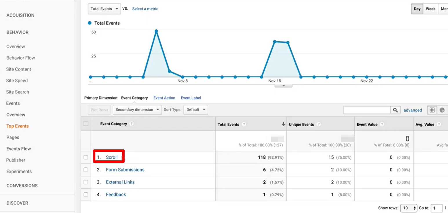
You can spend $500 and drive low-quality traffic to your website. This means that users will have a look at the first screen and leave because they are not interested in your offer.

For example, you sell expensive leather bags, and users driven to your website are looking for school bags. Though there is an influx of traffic to your website, it's not your target traffic. Even if some users end up buying from you, the cost per lead would be too high.

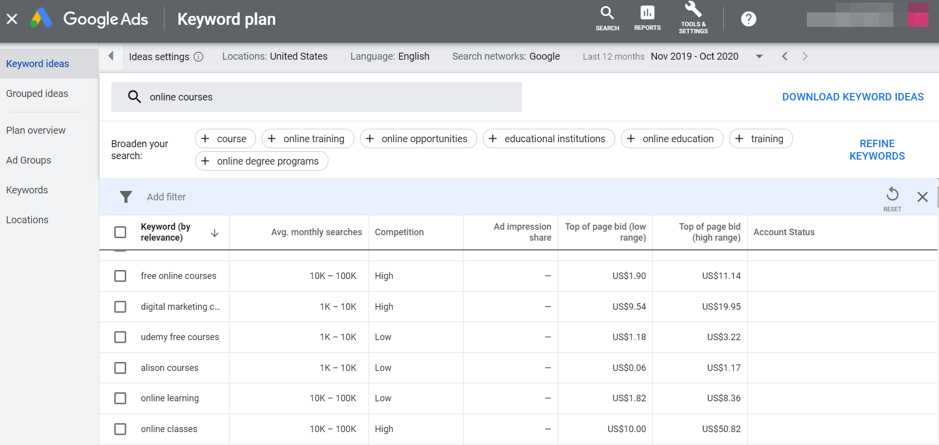
To improve the quality of traffic, think about the buyer personas we created in Chapter 2. On social media, we found people who may be interested in your offer. How can we find them with the help of advertising?
Alex promoted his website on social media. He targeted the ads at the subscribers of PR groups. Despite the steady flow of traffic to his website, there were few registrations.

Then, Alex tried to target a different audience. This time, he aimed at people attending event-management conferences, shows, seminars, etc. This audience was smaller and there was less traffic to the website. Yet, the number of registrations increased and the cost per lead became lower.
The Bounce Rate
The Bounce rate depends on the quality of traffic and the first screen. We already know how to improve the quality of traffic, let's now turn to the first screen. The offer should make the benefits for customers crystal clear. If users don't understand the benefits, they have no reason to stay on your website. Even if you manage to drive high-quality traffic, you'll see no rewards if the first screen is misleading.
Alex sees that, according to Google Analytics, his website Bounce rate is about 2-3% which is good.

The Scroll heatmap also shows that users interact with the first screen and scroll down. That means that his first screen and the offer are doing fine.
Website usability
You can attract the target audience to your website, grab its attention with the first screen, and still fail to get conversions. For example, users may fail to fill in the form or find the button, or they may get lost in the website navigation. You'll waste tons of money and drive zero conversions, and the cost per lead will be too high.

The Smarlook video reports may help you out. Here're some common mistakes on landing pages that may hinder conversions:
6.
The offer is vague and doesn’t explain what users can get on the website.
1.
The page is too long and people get tired of scrolling. If many people fail to reach the end of the page, make it shorter.
3.
Repetitive content. There’s too much text on the website and few photos. Browsing such pages is time-consuming and bores readers to death. Also, some users just don’t like reading.
Messy web design. Huge or tiny headlines, ugly icons, too many colors, and fonts. Such a page is sore to the eyes and makes it incredibly difficult to concentrate.
5.
Users don’t see buttons and links. If they get few clicks, they are likely just difficult to find.
2.
The text and the visuals are not relevant to each other. Users fail to understand what the text describes.
4.
The button and capture text isn’t action-oriented. Users don’t understand what they will get when they click on the button.
8.
An element seems clickable but it isn’t. A user may click on an icon several times and leave disappointed when nothing happens.
7.
On his website, Alex offered an Event Cost Estimate Template. Visitors read its description but didn't download it. The mouse pointer hovered over the Download button and then users moved on.

Alex assumed that users didn't see the Download button because it blended with the image next to it. That's why Alex added a link to the text and moved the button to leave more white space around it. The number of template downloads increased.
How Alex increased his website conversion
When Alex dug into Chapter 5, he already had a well-rounded website. The website had an easy-to-understand offer, structured text, and a lot of top-quality visuals, and examples. Yet, there are things to improve on every website. These can be just a few tweaks visitors won't even notice. Boosting your conversion rate usually involves website tweaks and improving traffic.
1
Alex modified the block dedicated to course curriculum.

Before. Long list of lessons and topics.

After. Short module descriptions. As a result, the Scroll heatmap shows that users read this block more.
2
He moved the "Sign up" button away from an eye-catching image.

Before. The Smartlook recording revealed that users ignored the button as it blended with the image.

After. Alex moved the button to make it stand out. As a result, the button started getting more clicks.
3
Alex picked a new target audience for his advertising campaigns and started posting on Instagram more often.

Before. Google Analytics revealed that there was little traffic from Instagram but the Bounce rate was also very low. It meant that Instagram campaigns attracted the right visitors interested in the website.

After. Alex started posting on Instagram more. As a result, the website traffic increased, while the Bounce Rate remained the same.
4
Alex tested different offers on his website.

Before. The website offer promised online learning and homework.

After. Alex tested his old offer against a new one emphasizing staying within budget and wasting no money. As a result, the second offer helped decrease the bounce rate.
Without making dramatic changes to his website, Alex has managed to achieve some tangible results:

  • The Bounce rate has decreased by 1%. More people interested in Alex's offer are coming to his website. They find the new offer compelling.

  • On average, people are spending 30 seconds less on the website but the number of conversions has increased. This means that it has become easier for visitors to understand the benefits and take the desired action.

  • The cost per lead has decreased. Alex spends the same amount of money on advertising, and people buy the course more often.
Homework
1
Sign up for Google Analytics and Smartlook and integrate them with your Tilda website.
2
Optimize your website for SEO. Select relevant keywords in Google Keyword Planner, create a compelling title and description for your website.
3
Get your website ready for being shared on social media. Pick an image and rewrite the title and the description if necessary.
4
Study the reports in Google Analytics and heatmaps in Smartlook. Don't be afraid to do something wrong, it's not possible.
5
Take a close look at the Scroll heatmap. What are the parts of the website that your visitors fail to reach?
6
Study the Click heatmap. Discover the links and buttons that get no clicks.
7
Watch the Smartlook video reports. Identify the areas in which users get confused and lost on your website.
8
Set your website goals.
9
Identify the elements you want to test on your website and run the A/B tests.
10
Calculate cost per lead. In other words, count the amount of money spent on advertising and the number of conversions you've got as a result.
Did you find this chapter useful? Share it with friends and colleagues!
Text: Phillip Brazgovsky, Natalia Tsevtkova
Illustrations and design: Yulia Zass

Read other chapters of the coursebook:
Create a Landing Page for Your Business
Build your landing page on Tilda: It's easy, fast, and free