In the previous chapter, you learned how to prepare for designing a landing page: How to analyze your competitors and audience, how to write text, and how to sketch a prototype. In this chapter, we'll walk you through visualizing your prototype using Tilda functional blocks.
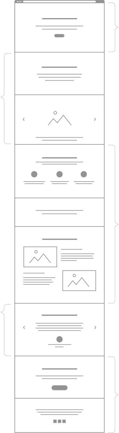
We analyzed a huge number of landing pages and identified recurring features which allowed us to create an algorithm for building an effective landing page. The sections that make up the landing page are what we call functional blocks:
Since there are quite a lot of blocks, we have divided them into 5 categories, according to their function and message they convey: cover, about the project, comprehensive advantages, integrity blocks, and call to action.
High Converting Landing Page Formula
Design is a narrative. If you want to build a landing page that converts, you have to come up with a clear and convincing narrative.
While you can arrange and edit blocks as you like, it is essential that the page contains at least one block from each category. That way you will end up with a well-rounded narrative.
This can include any of the following block categories: About, steps, pricing plans, target audience, gallery, video
2
3
4
Advantages
This can include any of the following block categories: Advantages, list of benefits, user journey and product features
This can include any of the following block categories: Reviews, certificates and commendations, partners, success stories, team, FAQs
5
Call to action (CTA)
This can include any of the following block categories: Submission form, call to action button, contacts
Cover. Its main task is to make the right impression, to inform the visitor what exactly this website is about, and to motivate them to scroll down.
About the project. This is a detailed description of the product or service: What is it, how does it work, who is it for, and how much it costs? You simply can't ignore talking about the project. Before diving into the benefits and calls to action, you must first make sure the customer understands what you are offering.
Comprehensive advantages. This section allows you to lay out exactly how and why you are better than your competitors. You are likely to experience fierce competition in most markets, which makes it essential to let your customers know why they should choose you.
Integrity blocks. This block group allows you to establish and build trust between you and your customers. Reviews, success stories, certificates and commendations, partners, and even your office address and phone number—all these will show that your business is real and that the visitors can trust you.
Call to action (CTA). Your business needs clients, which is why your landing page should contain blocks that generate leads. These include sign-up forms, subscription forms, contact forms, or even phone numbers.
Landing Page Functional Blocks
Let's take a closer look at the blocks.
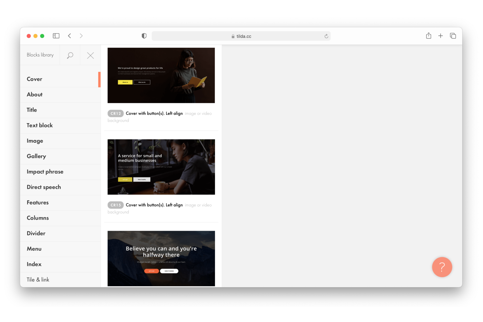
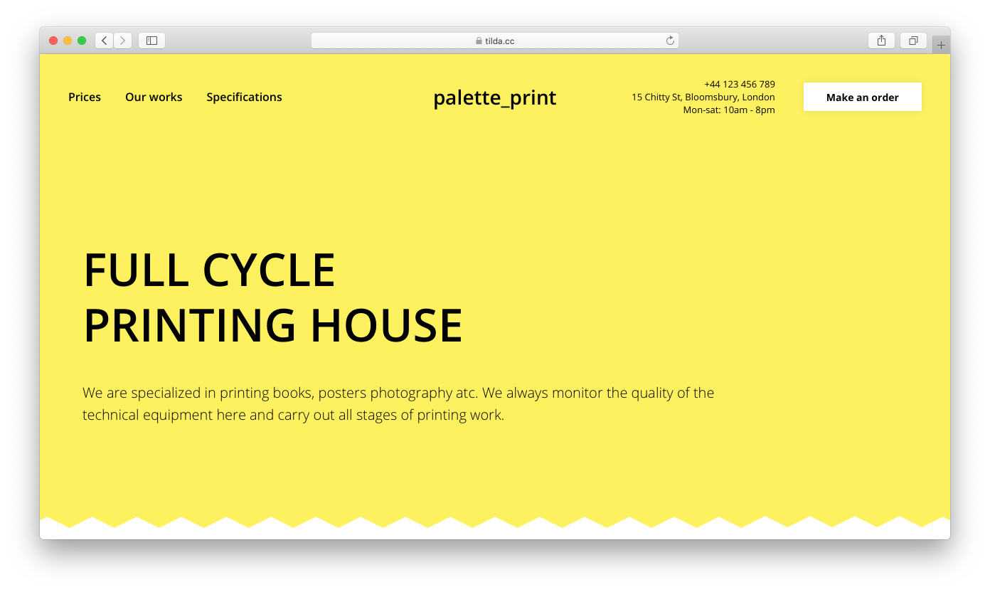
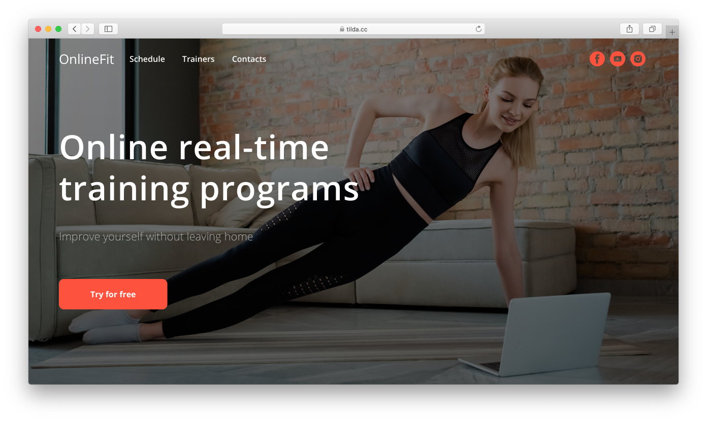
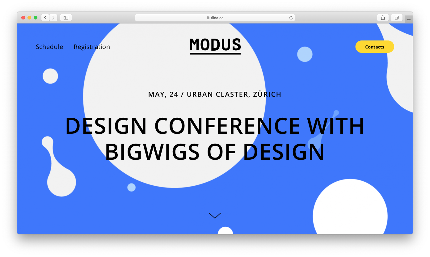
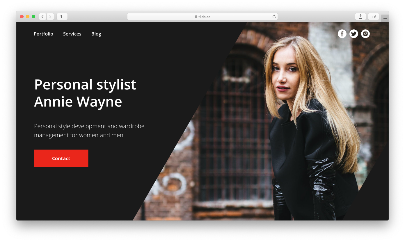
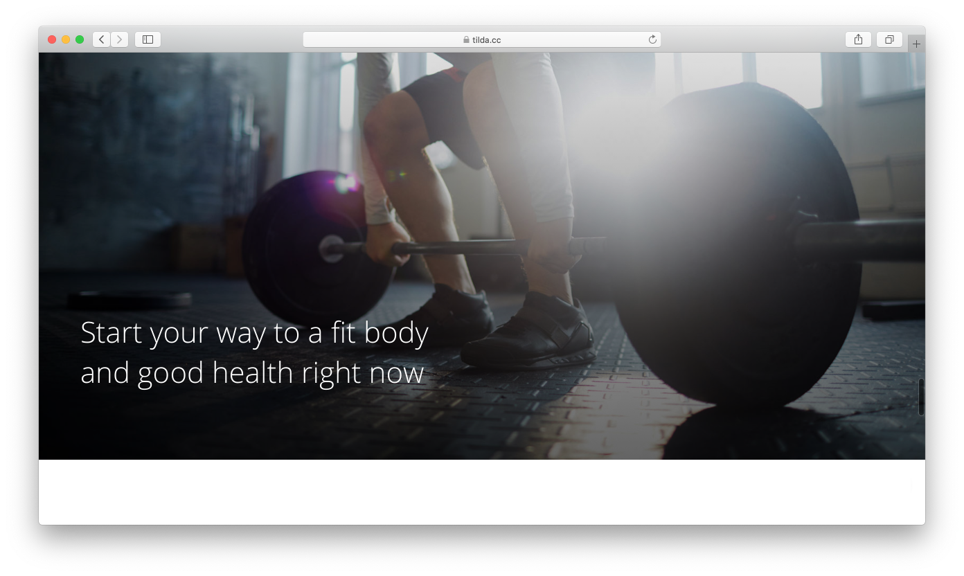
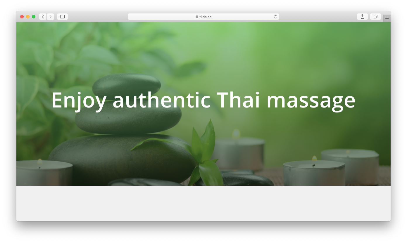
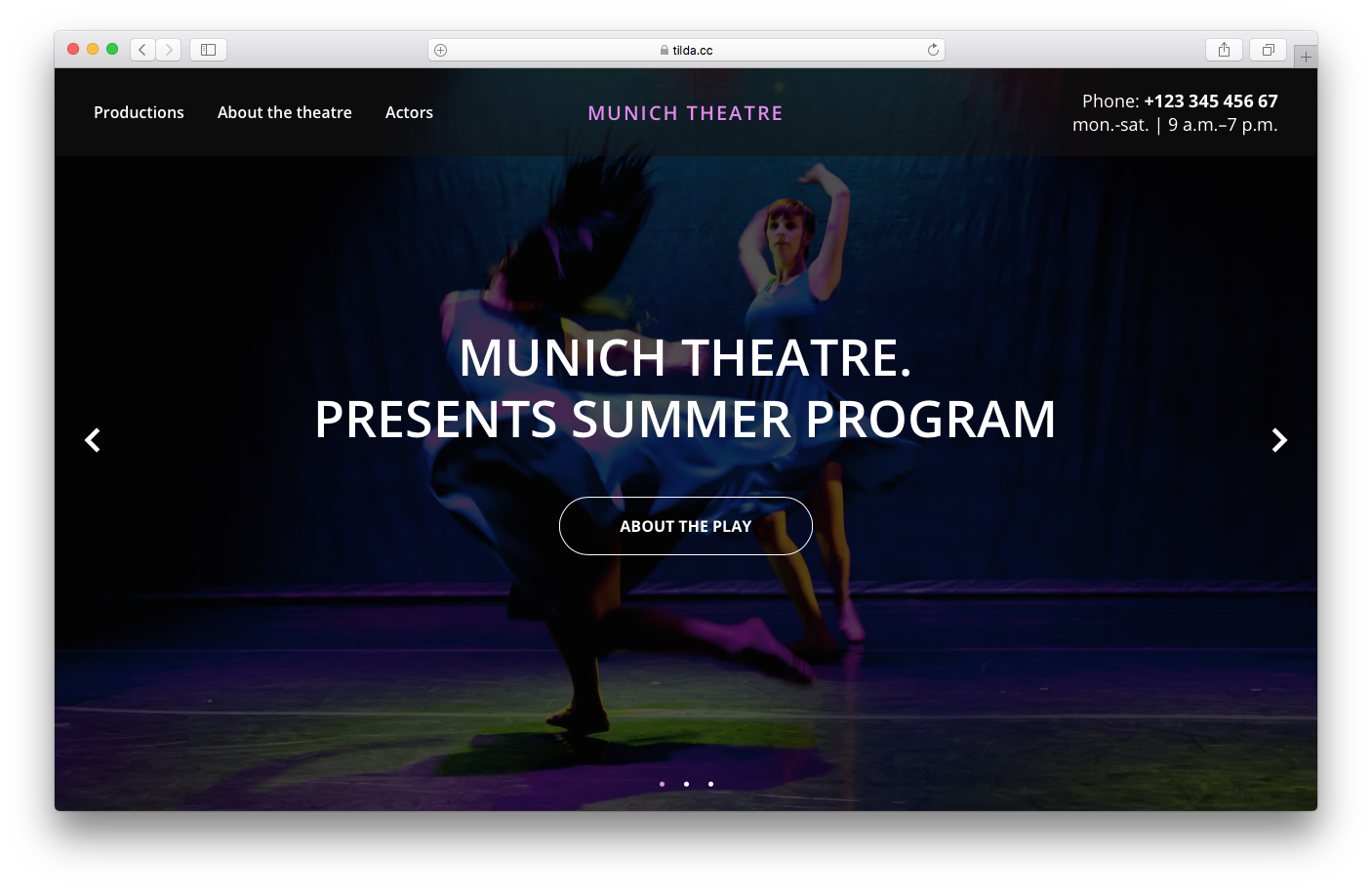
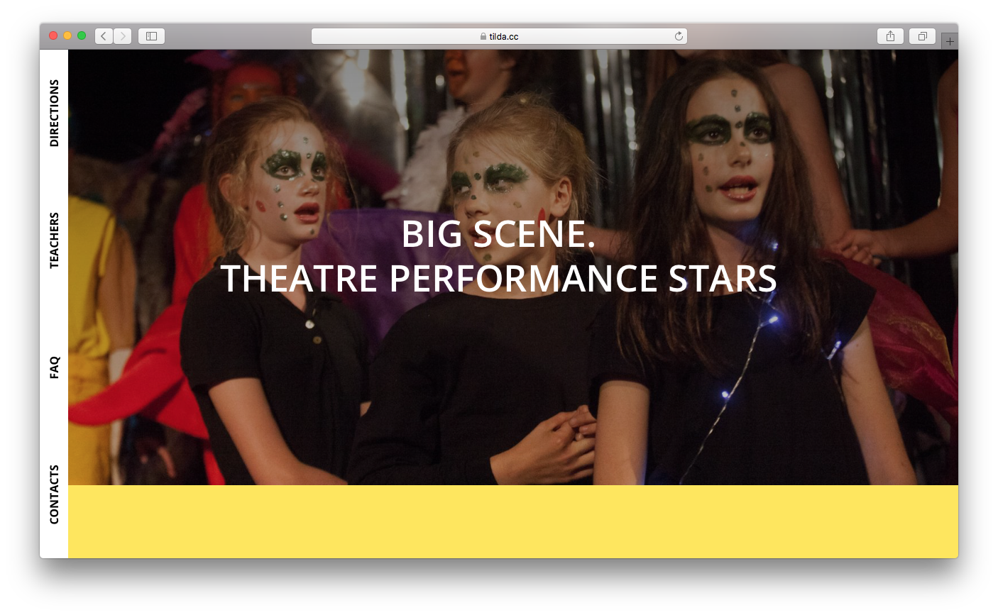
Cover page
The cover gives a first impression about your business. You only have a few seconds to convince the visitor to stay on your page.
For this task, you have a rather small toolkit: heading, subheading, a button or form, logo, background color or image, menu, and a downward arrow.
On Tilda, you can find the blocks for the first screen under the "Cover" category.
Use the heading and subheading to present your unique selling proposition (USP): an inspirational quote or phrase that sets the tone for the entire project. Usually, the heading is more emotive, while the subheading clearly conveys an idea. We looked in detail at how to write a compelling offer in the previous chapter.
Form or button: for those users who became instantly interested or those who are making a return visit, the call-to-action button can be added to the cover.
The cover background may be an impressive photograph, a stunning video, just a color, a gradient, or an illustration. Pay attention to how well the background fits the text: the image itself may be great but if it is too bright or discordant, it won't work well with the text. Your video should, first of all, be filmed smoothly, and, second of all, with an expanded focus so that objects appear slightly larger.
Your logo should be seen, not only on the cover but also in the navigation bar section.
Downward arrow. This is an optional feature for the cover. Keep your audience in mind, and if you find it to be more old-fashioned then, you should probably add it. Younger generations are used to scrolling; however, some may still get confused.
Navigation menu. Also an optional feature but if you need it to help navigate the site, then you should identify key sections to which you would like to have quick access.
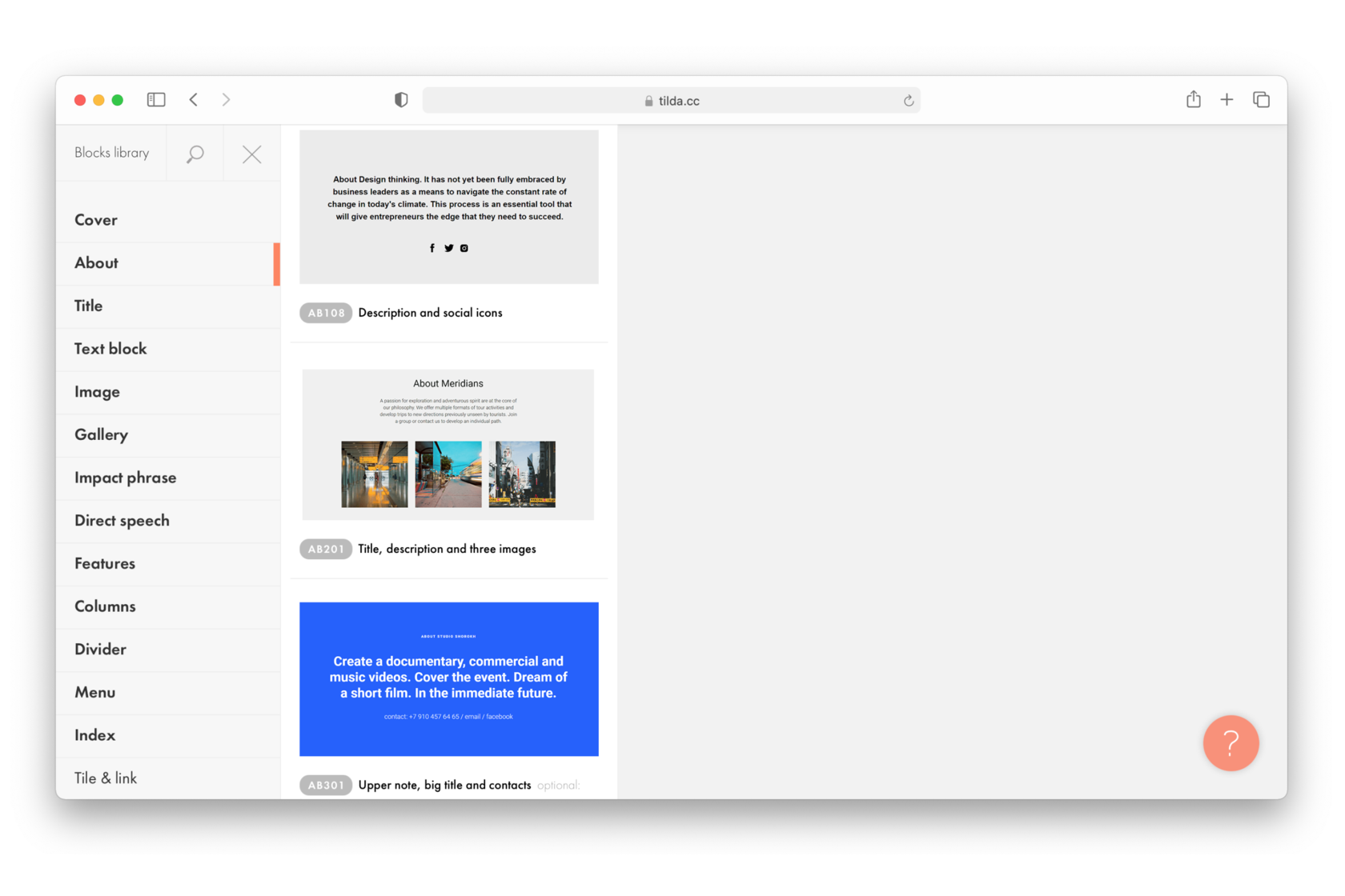
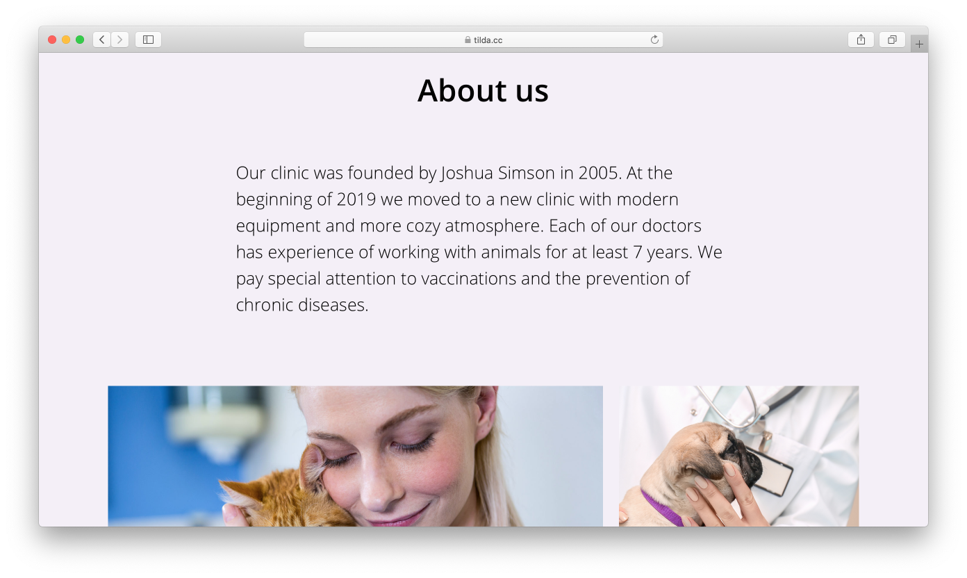
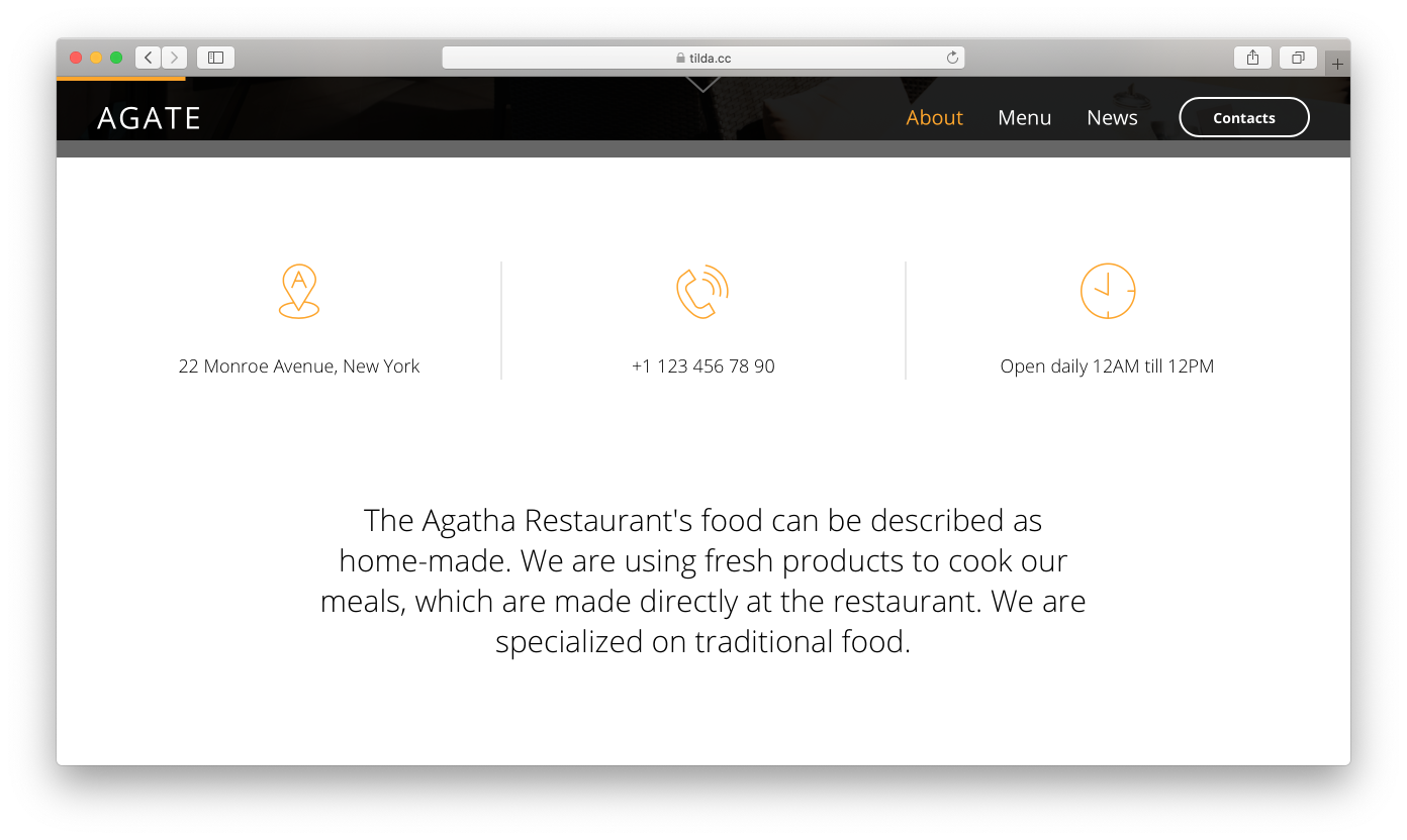
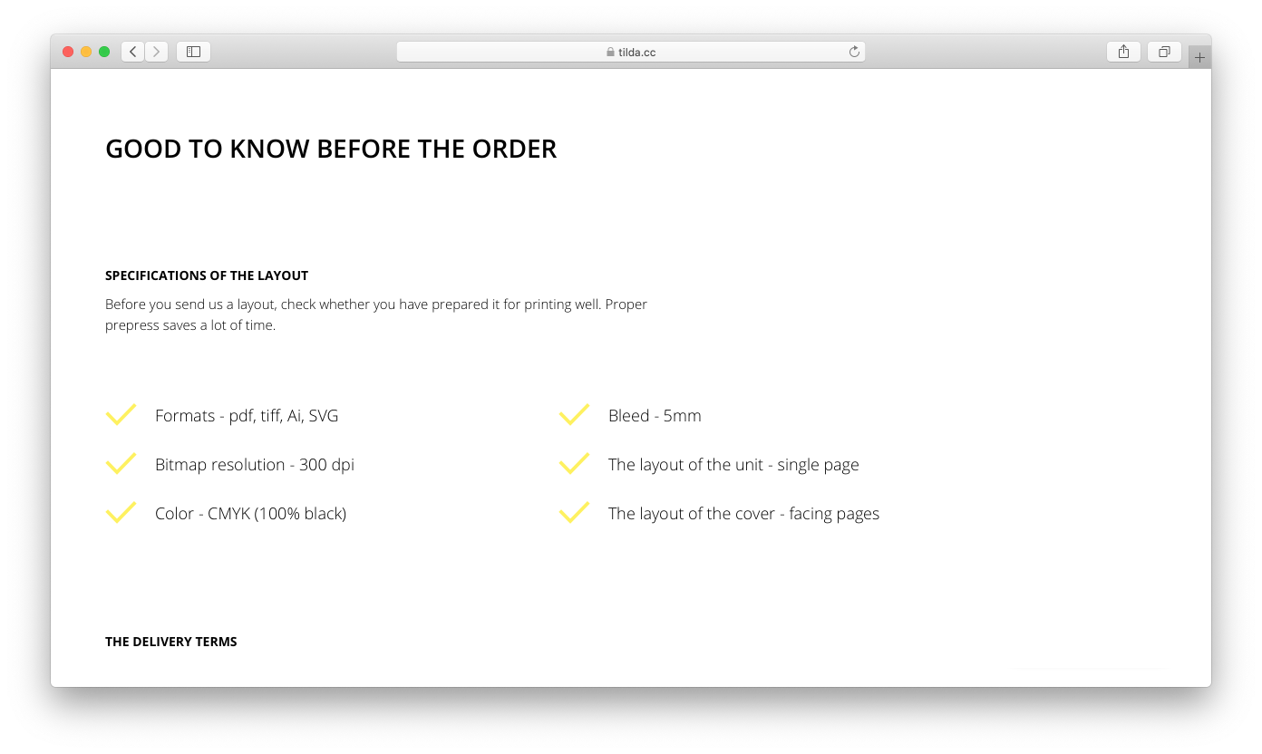
The main purpose of this section is to provide a clear and detailed description of what exactly you're offering.
This is a general description of the product or service. It can be purely in text, but you can also choose to add an image. It makes sense to position this block right after the cover. That way you can ensure that every visitor will know that they have ended up at the right place and that they can find what they're looking for.
You can find the "About" category featuring a variety of different blocks in Tilda's Block Library.
Even though you will have a description on the cover, it won't be a bad idea to add it as a separate block. The description on the cover serves more of an emotional purpose to impress your visitors. However, when in a separate block, it works to actually inform the visitor.
Your website visitor will likely see your product or service for the first time. That is why you have to be able to describe in one simple sentence what you're offering.
The "About" block should, above all, convey information. I get to see a great many websites and, in my experience, most of them either completely ignore this block, assuming that everything is clear enough as it is (which is just not true), or they try to use the "Trust our expertise and get ready for impressive results" sales pitch. Sure, it looks nice but it doesn't really mean anything. When you are really immersed in the product and know every inch and detail, a simple explanation can seem insufficient. Trust me, a simple explanation with a couple of easy-to-understand facts is all it takes to give a clear idea of your product to someone who is unfamiliar with it.
The "About" block should, above all, convey information. I get to see a great many websites and, in my experience, most of them either completely ignore this block, assuming that everything is clear enough as it is (which is just not true), or they try to use the "Trust our expertise and get ready for impressive results" sales pitch. Sure, it looks nice but it doesn't really mean anything. When you are really immersed in the product and know every inch and detail, a simple explanation can seem insufficient. Trust me, a simple explanation with a couple of easy-to-understand facts is all it takes to give a clear idea of your product to someone who is unfamiliar with it.
Examples of project descriptions:
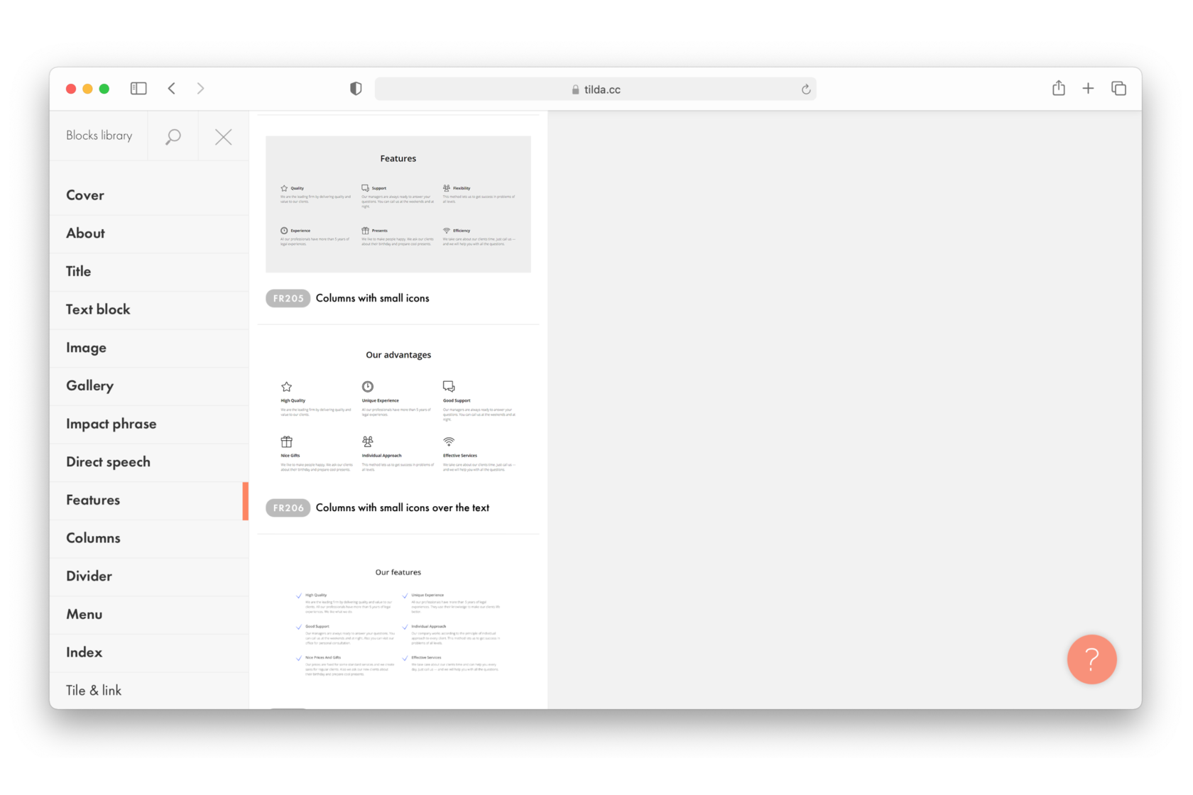
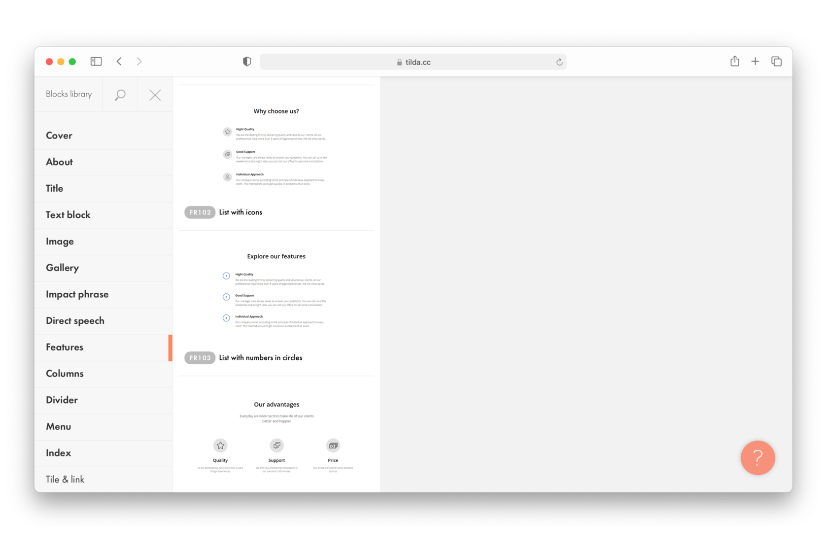
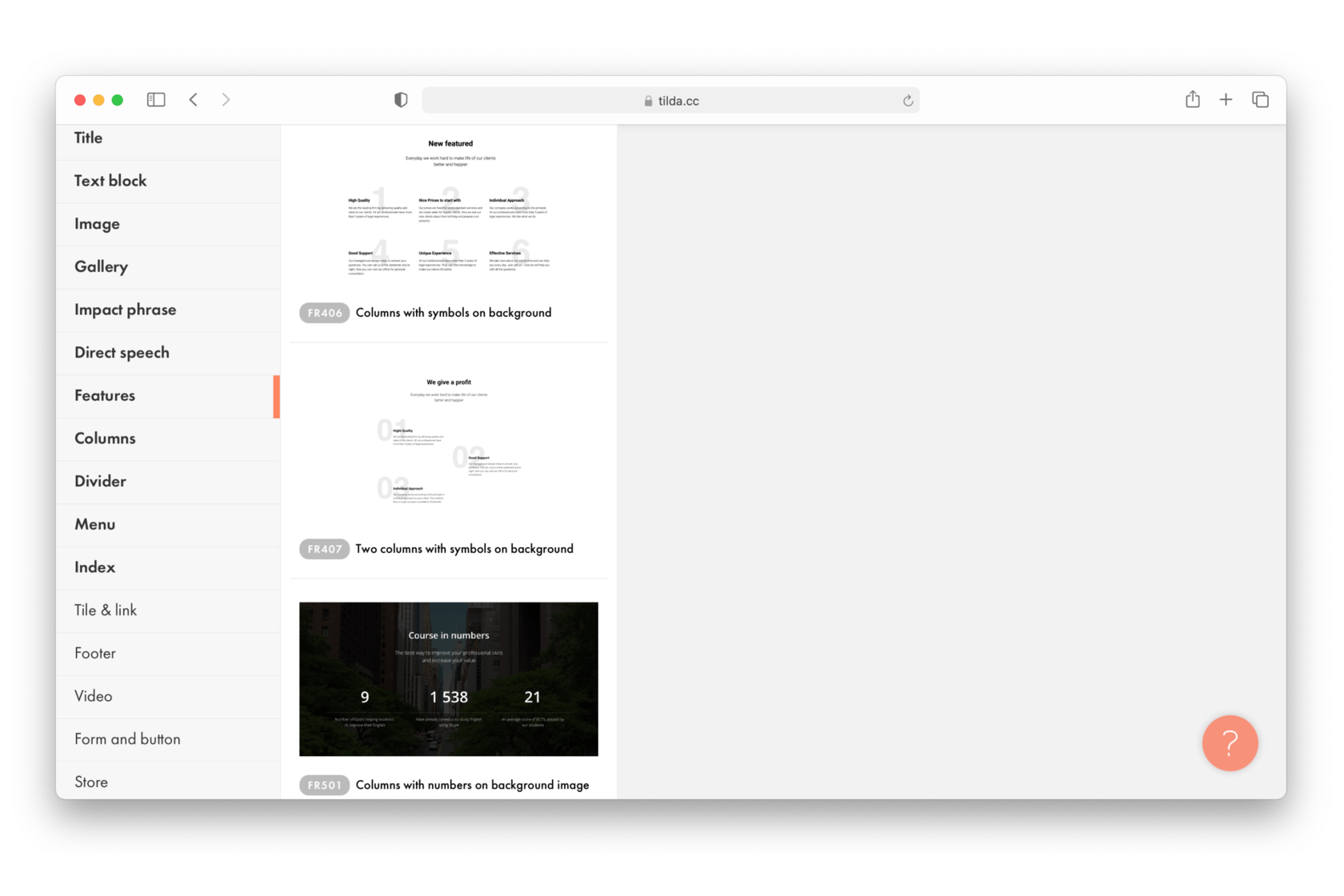
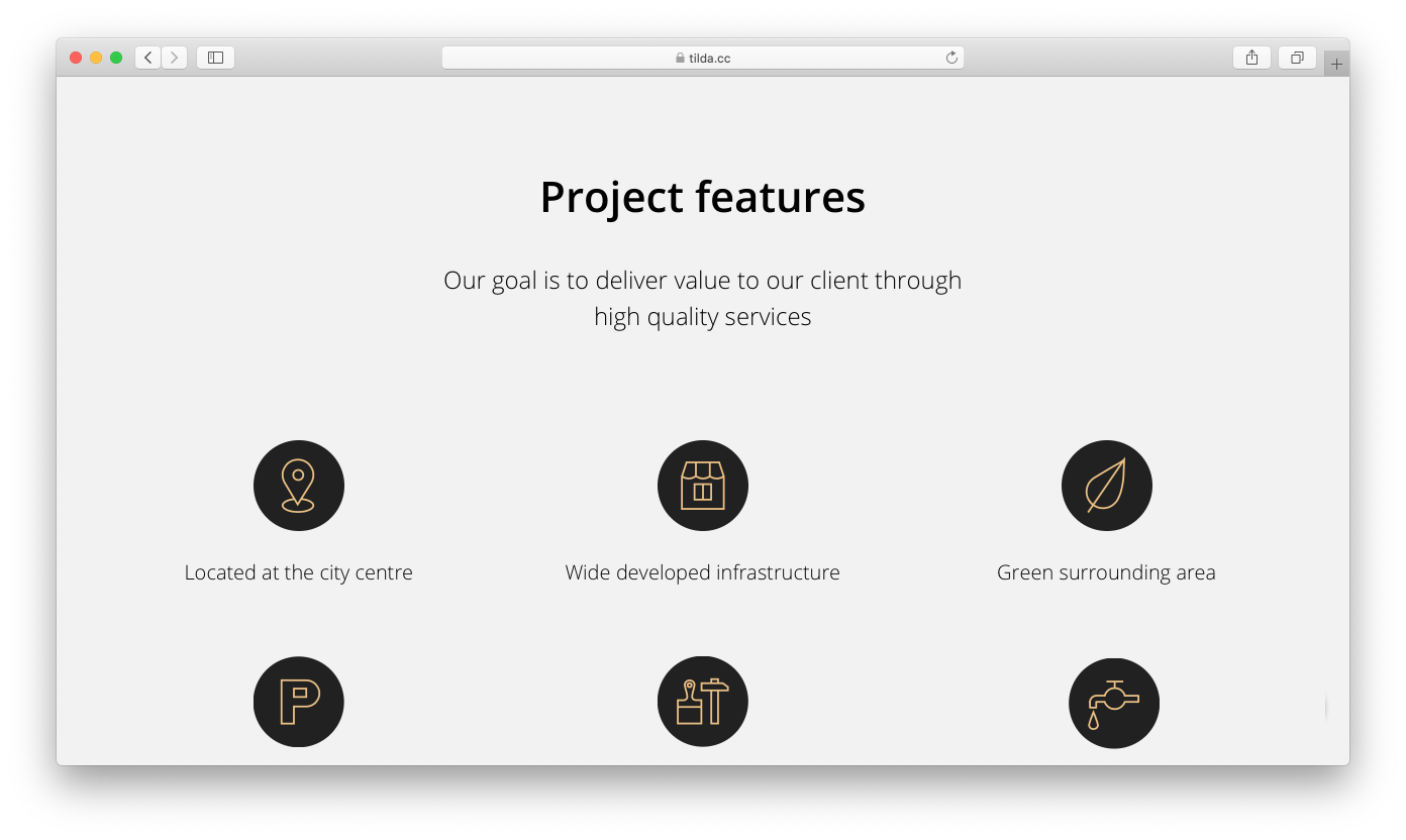
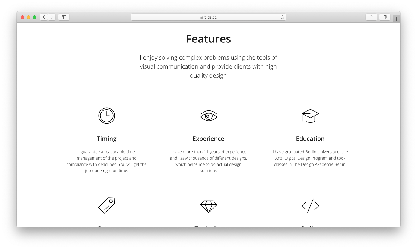
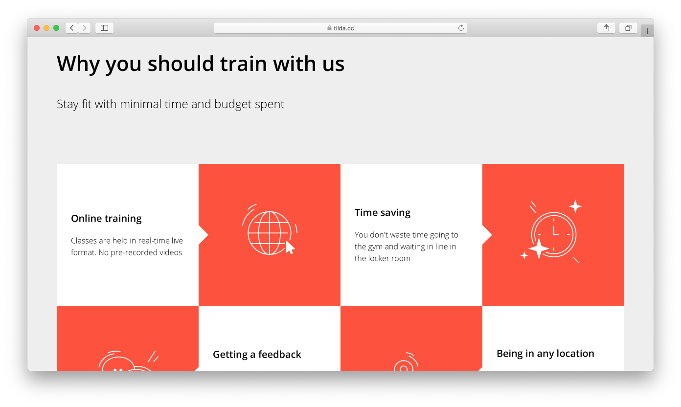
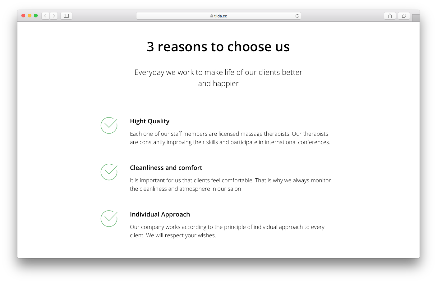
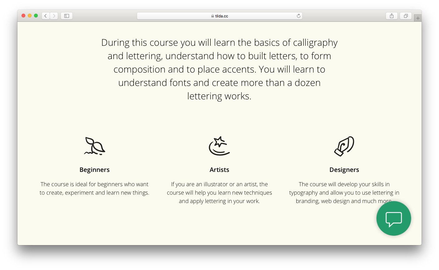
Advantages
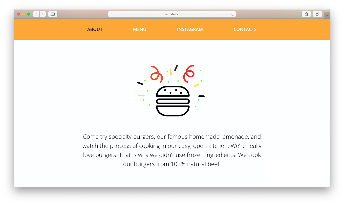
Advantages make your product or service cool and unique.
Usually, several short sentences are enough to outline your advantages. They are often accompanied by icons, simple illustrations, or images.
Use the "Features" block category for advantages on Tilda.
The title and image on the cover are meant to immediately capture the visitor's attention. Should that work, the description should further inform the visitor.
It is very important to carefully consider the icons you're using as it's really easy to make mistakes. Users just can't focus on standard icons from regular templates that they see everywhere (you can call it "interface blindness"). It should be clear from your icon style that you haven't just copied the very first clip art on the Internet. When it comes to icons, everything matters: the drawing style, the thickness of the lines, how well they fit into the website design, and how well they attract attention. You should never add icons just for the sake of icons, they should always be unique.
It is very important to carefully consider the icons you're using as it's really easy to make mistakes. Users just can't focus on standard icons from regular templates that they see everywhere (you can call it "interface blindness"). It should be clear from your icon style that you haven't just copied the very first clip art on the Internet. When it comes to icons, everything matters: the drawing style, the thickness of the lines, how well they fit into the website design, and how well they attract attention. You should never add icons just for the sake of icons, they should always be unique.
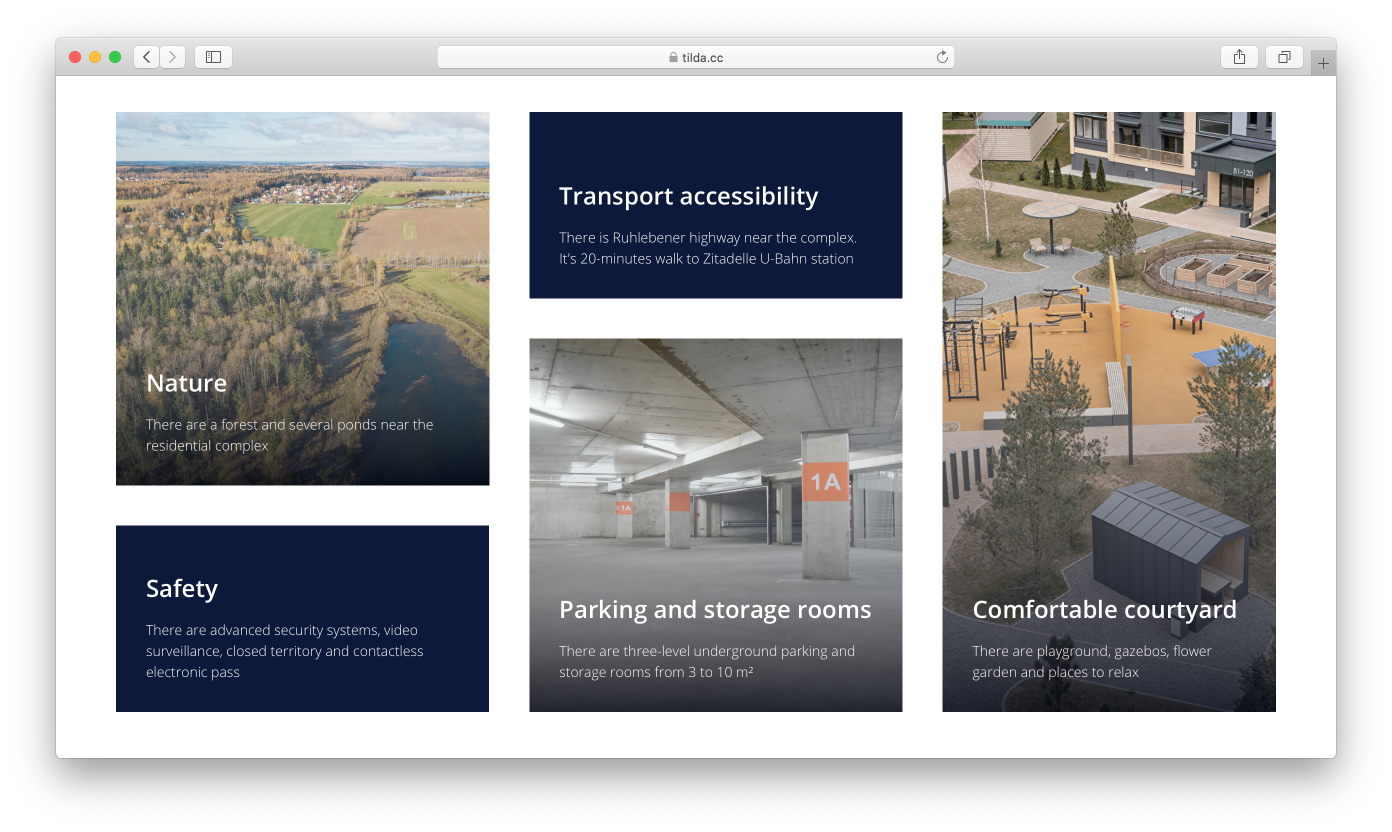
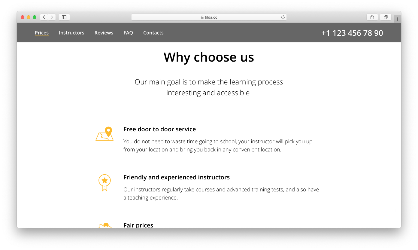
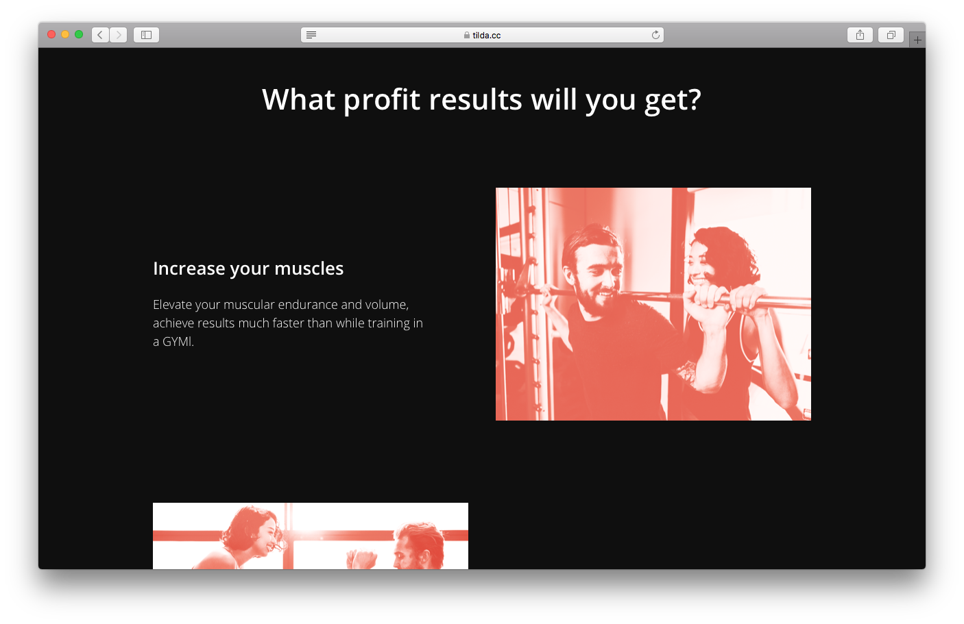
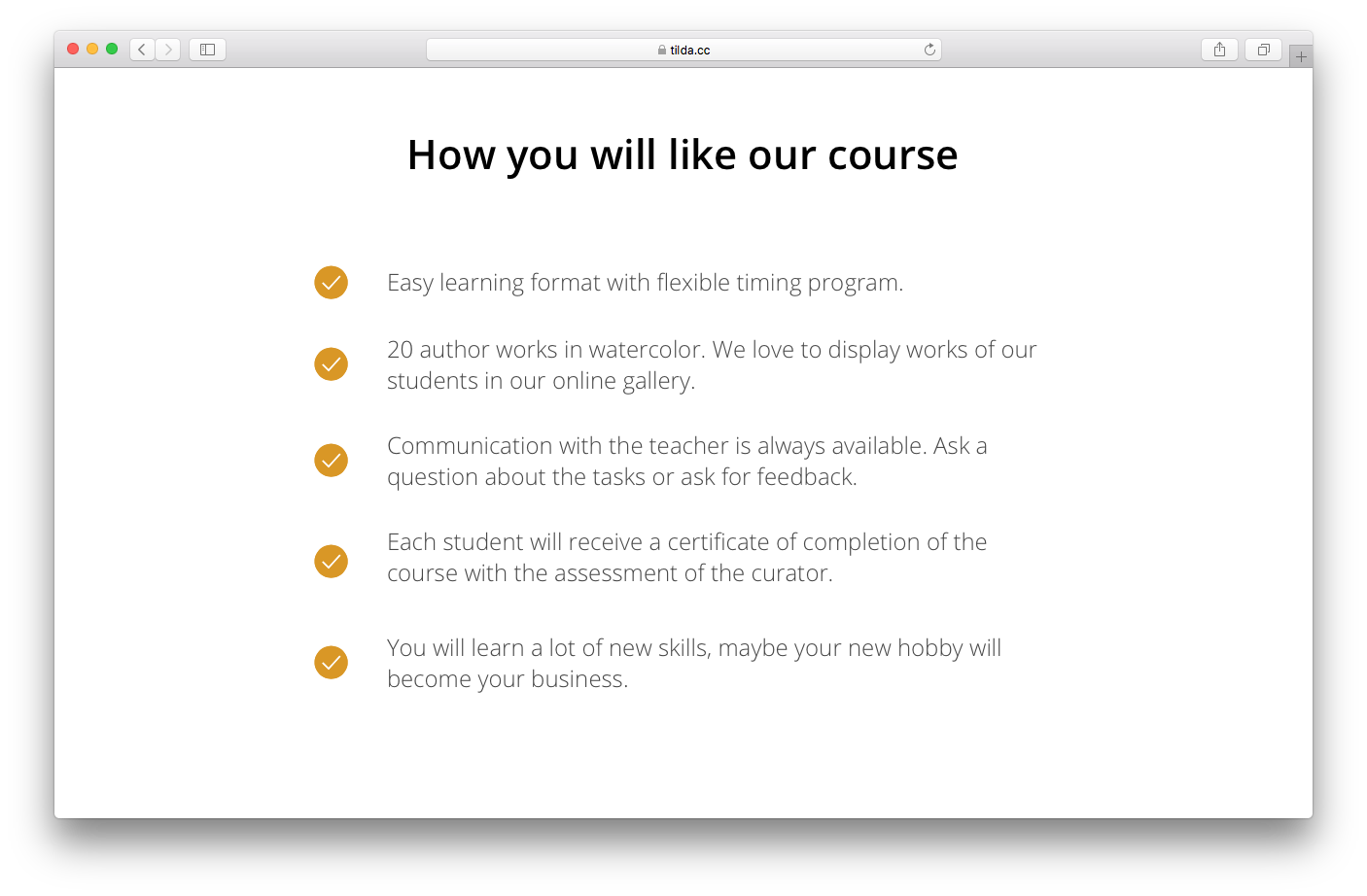
These scenarios show examples of the situations when your product or service can be useful. Benefits stand for all the good things clients will get after purchasing your product or service.
Here we use a similar to the advantages section format: Heading, description, image.
Find relevant blocks in the "Features" category
Benefits and advantages may look alike. However, the difference is that advantages highlight main features of the product, while benefits and user scenarios reflect your customers' gains.
Looking at the benefits, the visitor should understand what problem your business solves and how exactly your product or service will improve their life.
For example, suppose you run a subscription service for fresh fruits delivery. Your advantages are the quality of the fruits, the below-supermarket-level prices, and guaranteed delivery within 2 hours. Now, the client's benefits here are getting more vitamins, saving money on groceries, and no need to remember to place an order.
Examples of benefits and user scenarios:
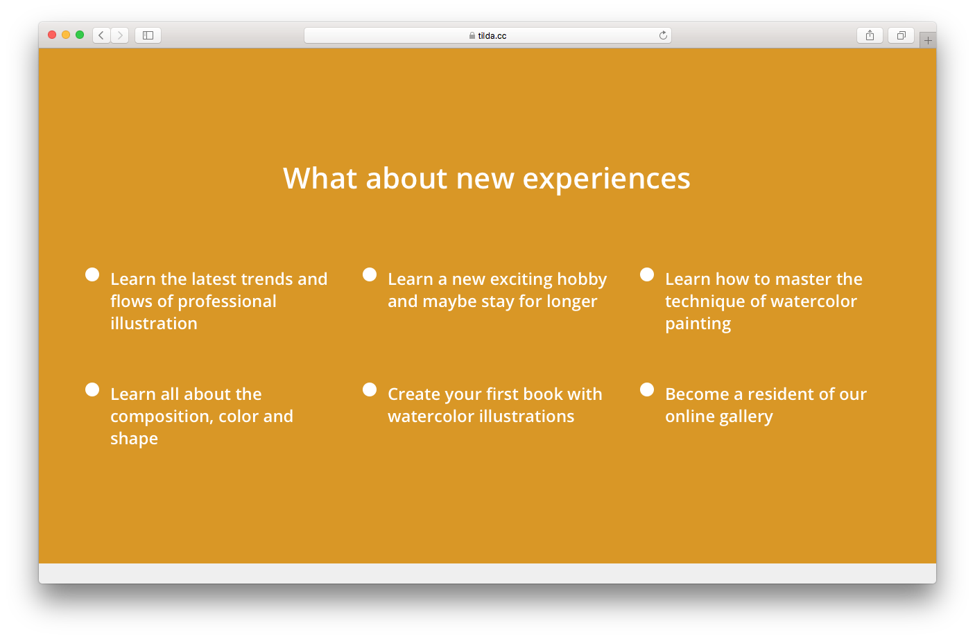
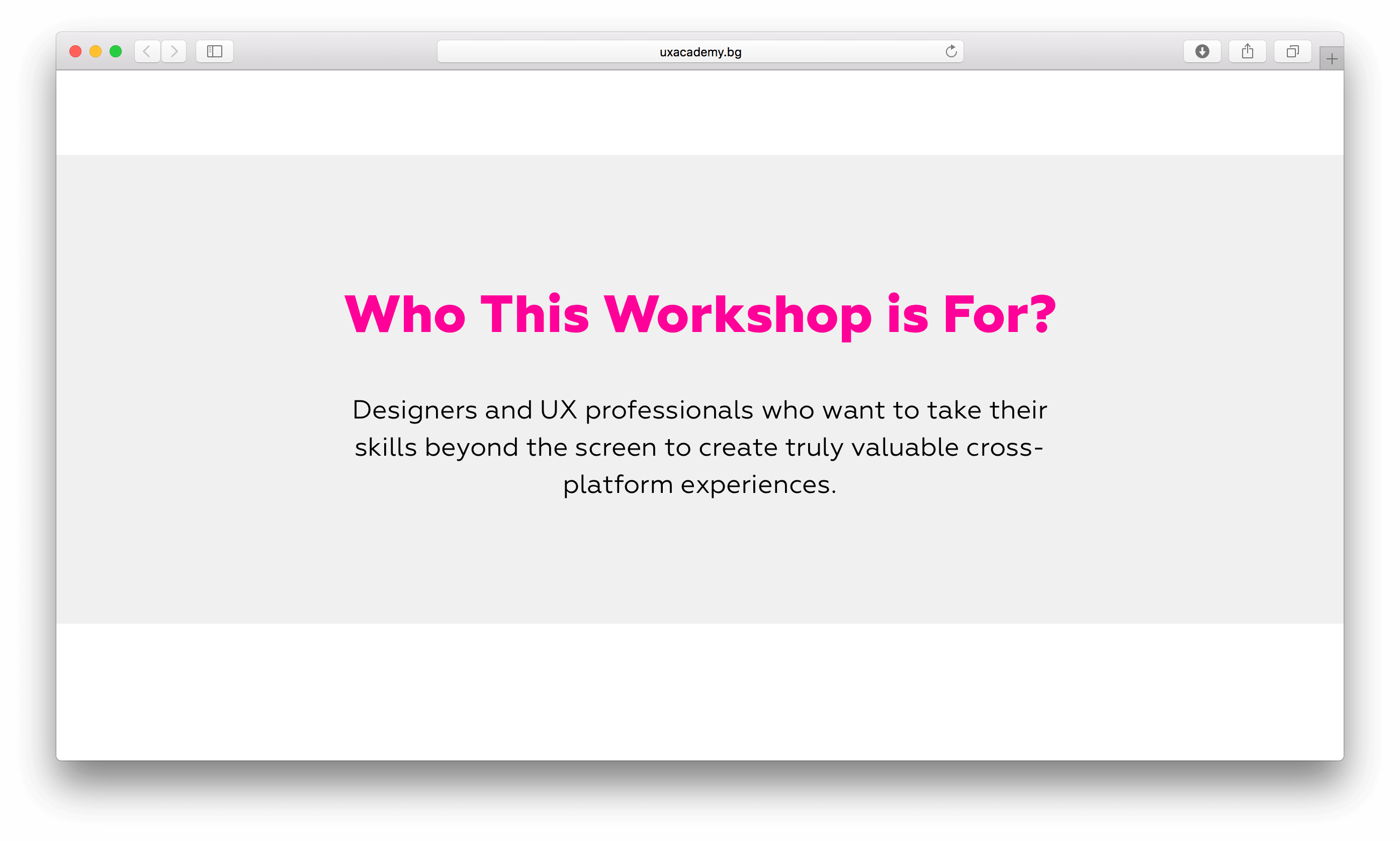
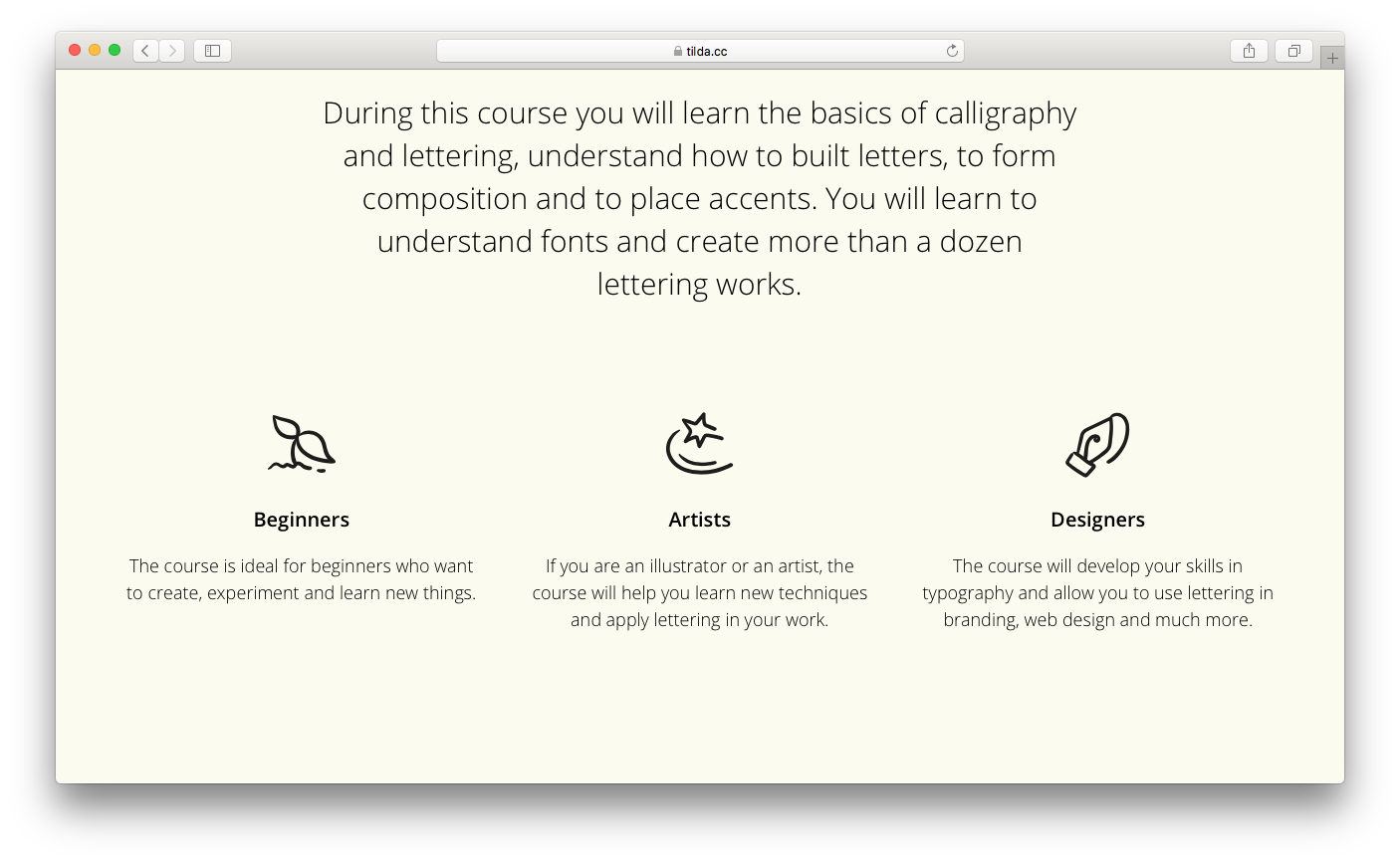
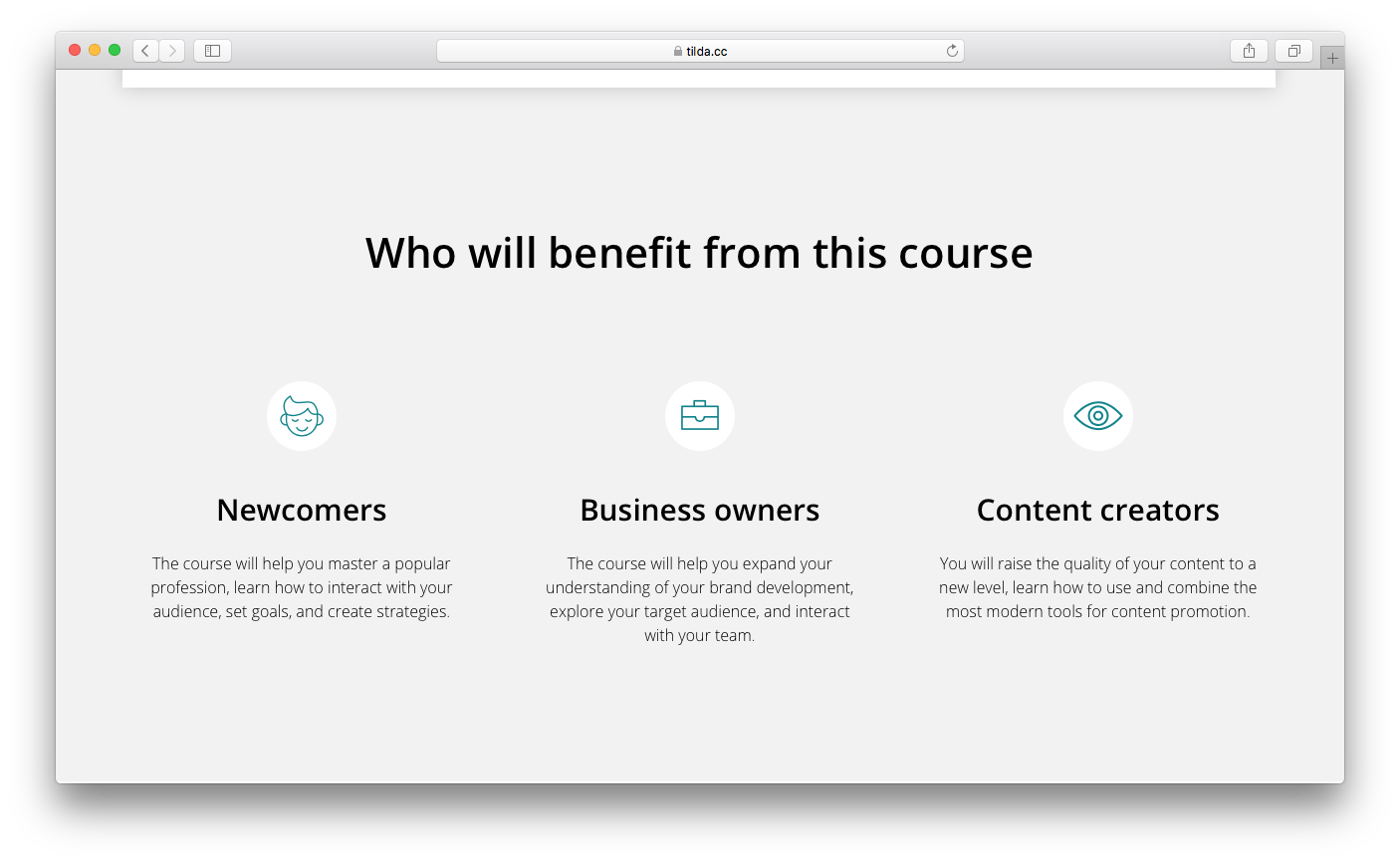
Target audience
In the previous chapter, we learned how to identify your target audience. On your landing page, you could include the groups which are most likely to consume your product or service and describe how each of these groups can benefit from it.
For this part, it’s up to you to choose the best format. You can simply write some text, or add some icons, or a tiled gallery.
Examples of target audience:
uxacademy.bg
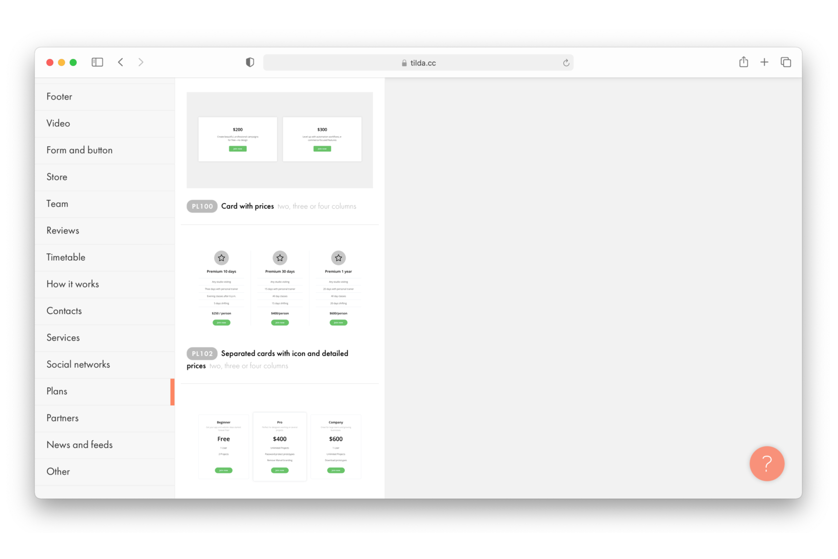
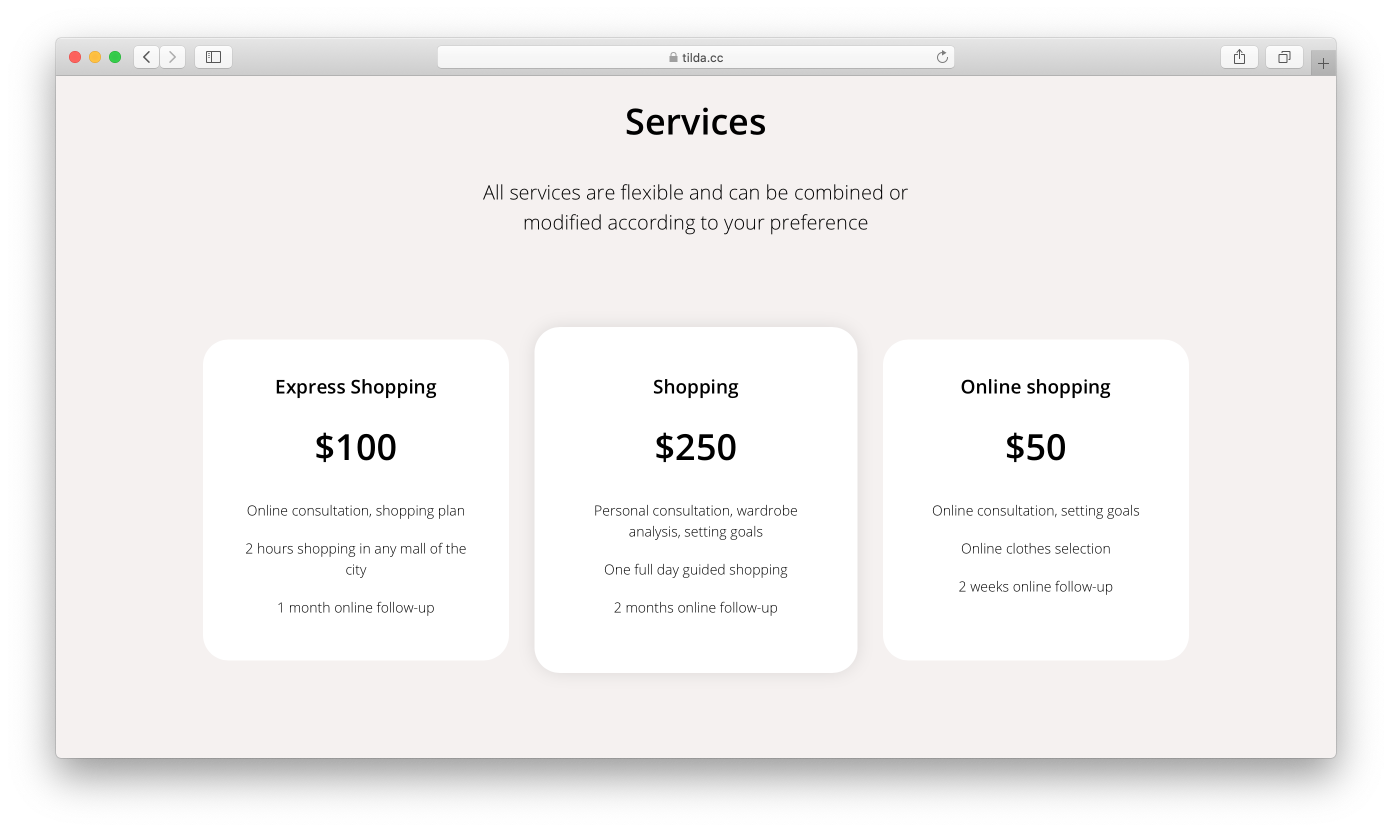
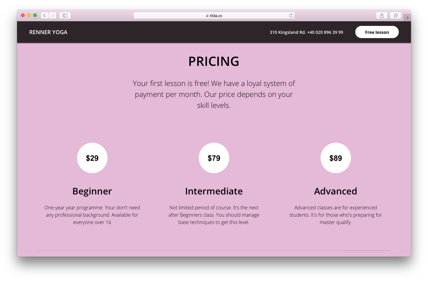
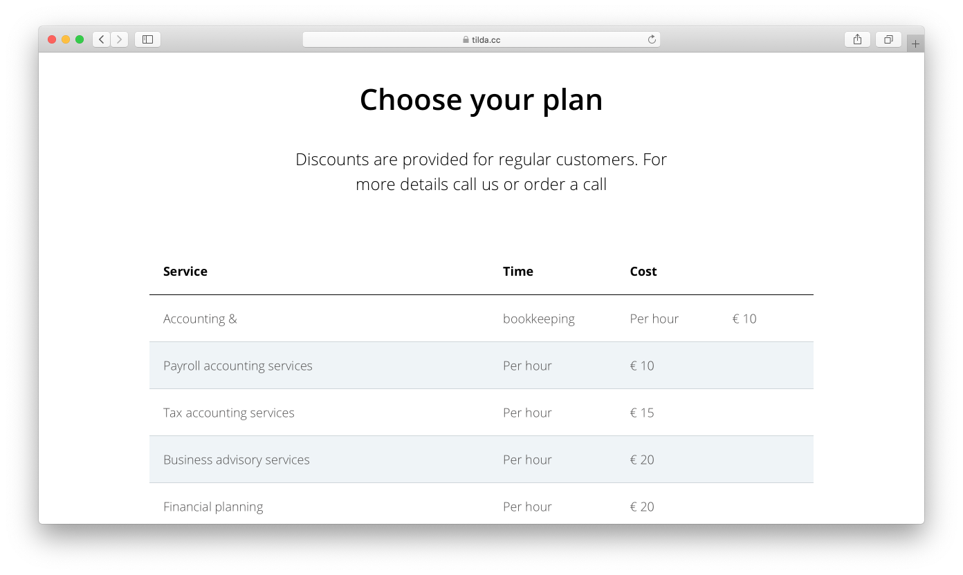
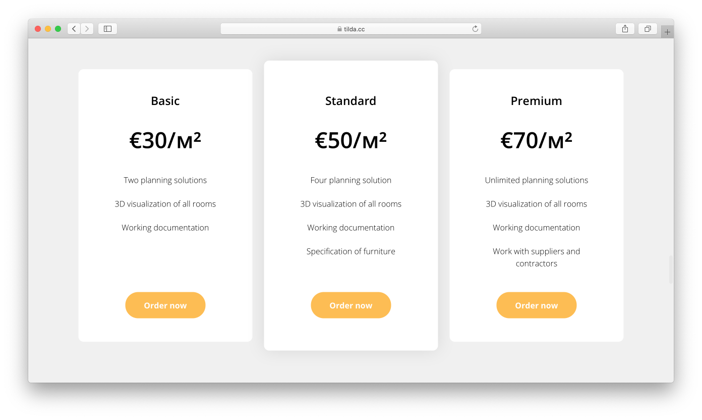
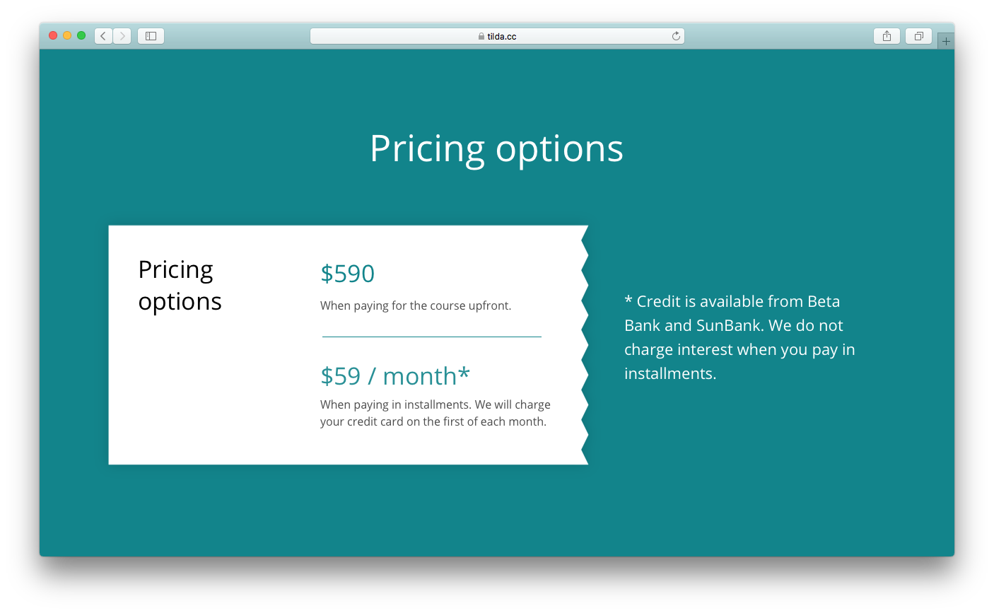
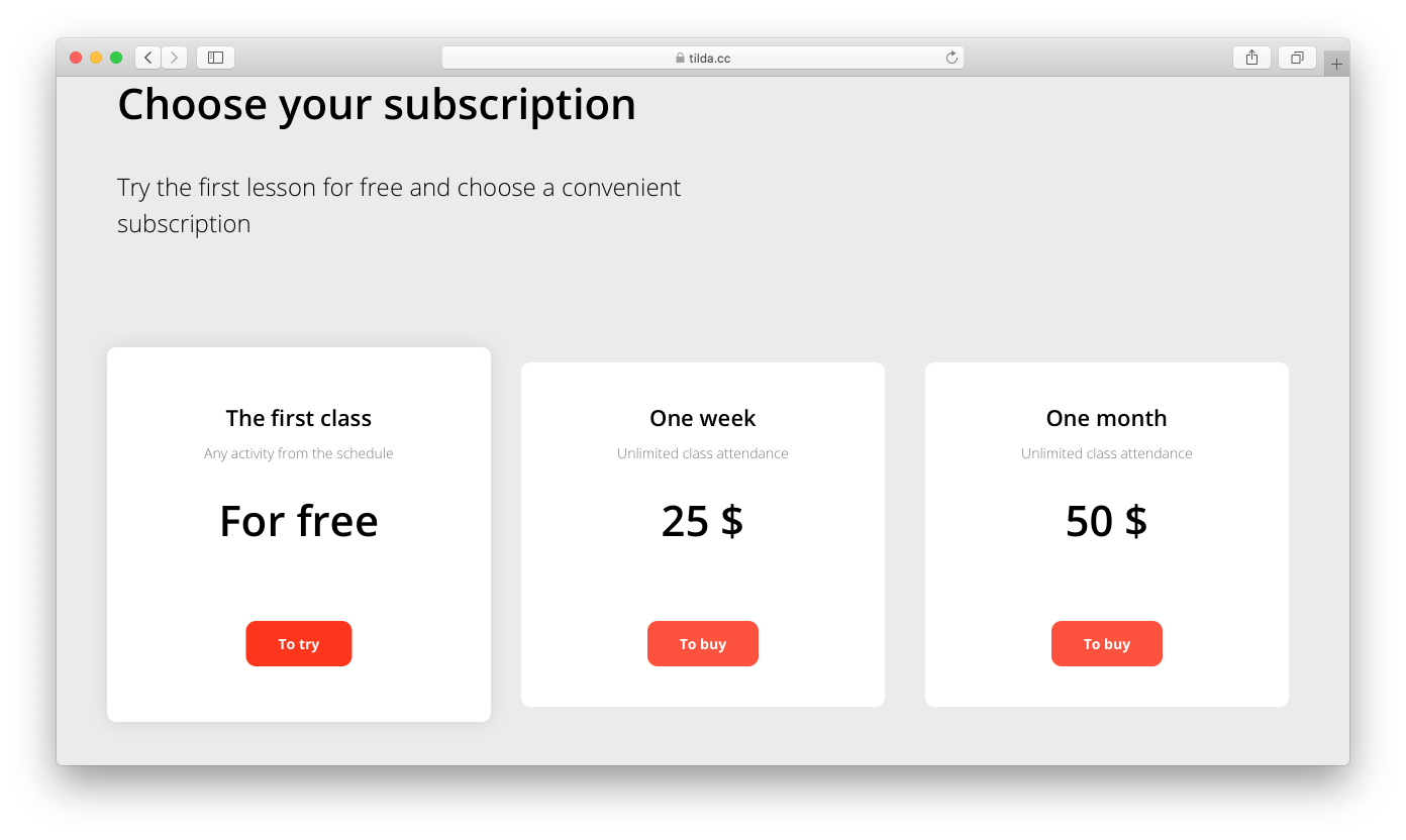
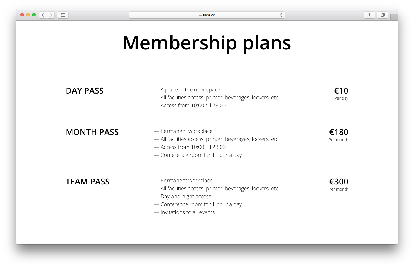
Pricing plans
Pricing plans are usually added when the product or service is offered in several pricing options including a free one. It's easy to understand the option differences when the plans are presented in columns or on separate cards.
The "Plans" category in the Block Library.
A classic move is to highlight the most popular fee option. First of all, since it's the most popular option, chances are that it will fit most visitors' needs. Secondly, you make the client's life easier, as they no longer have to compare and analyze different options. Most of the time, people tend to make decisions on the assumption that the majority can't be wrong. Therefore, by highlighting the most popular plan, you are making their choice easier.
Always put the real prices on your website. If someone is turned off by it, they're simply not the clients you're looking for. If you decide not to include prices at all, hoping that customers will call you to inquire, then all you're doing is just losing the clients who are ready to purchase the product at a price you've set. Any unnecessary move results in conversion losses.
Examples of pricing plans:
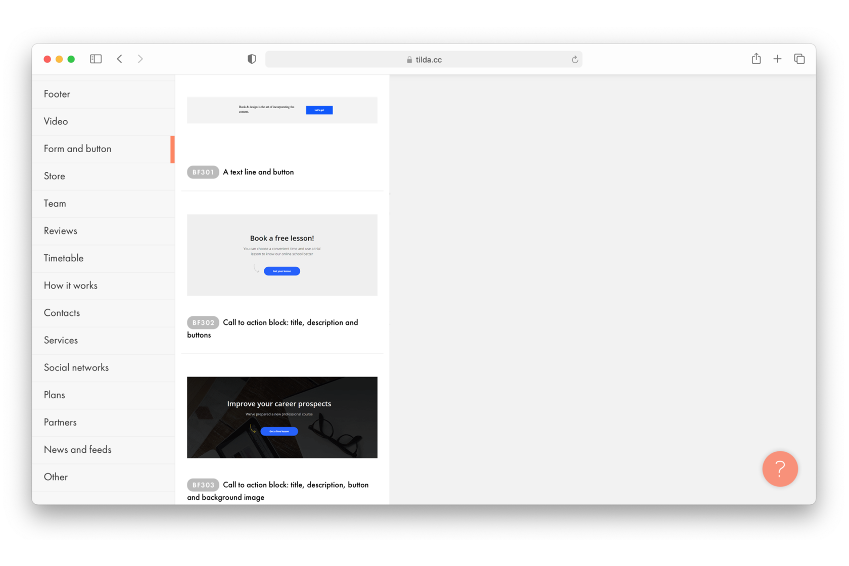
Call-to-action (CTA)
This is essentially the most important block to have on your landing page as the main purpose of a landing page is to motivate the user to do something. That's why this block must always be visible. As for the background, you can use color or add an image.
You can find blocks with CTA under the "Form and button" category.
It can usually be found at the end of a page; however if your web page is quite long, call-to-action buttons can be added to several parts of it. You can consider adding a panel with a button that is always visible in the upper right corner of the page. This could work well but it's important not to overdo it. Putting buttons after every block could get rather annoying.
You don't have to write the same thing on every button. It's better to phrase the offer differently every time, using phrases like "sign up," "try for free," or "register now." That is certainly better than having all your buttons read "buy," "buy," "buy."
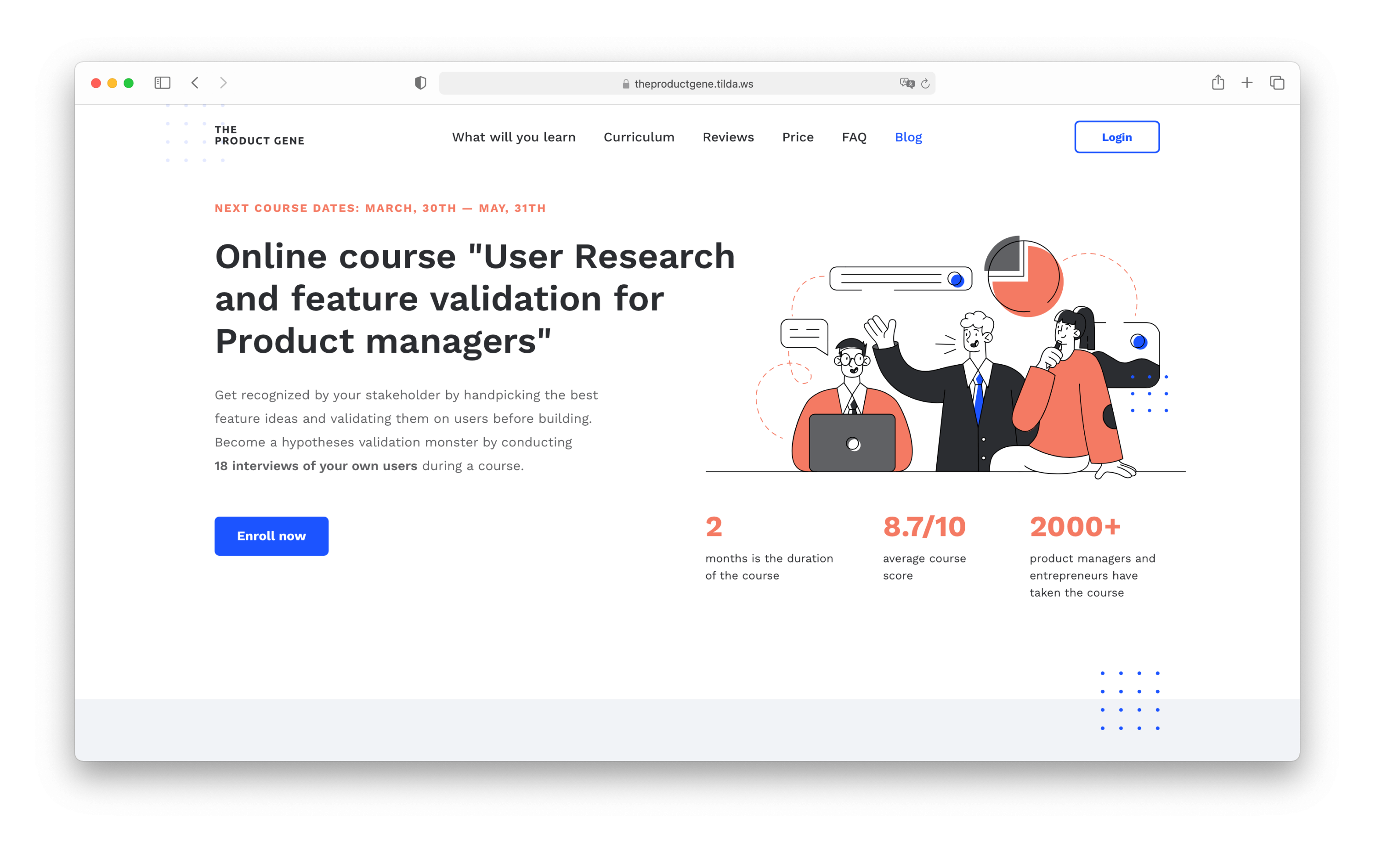
Examples of call-to-action buttons:
theproductgene.tilda.ws
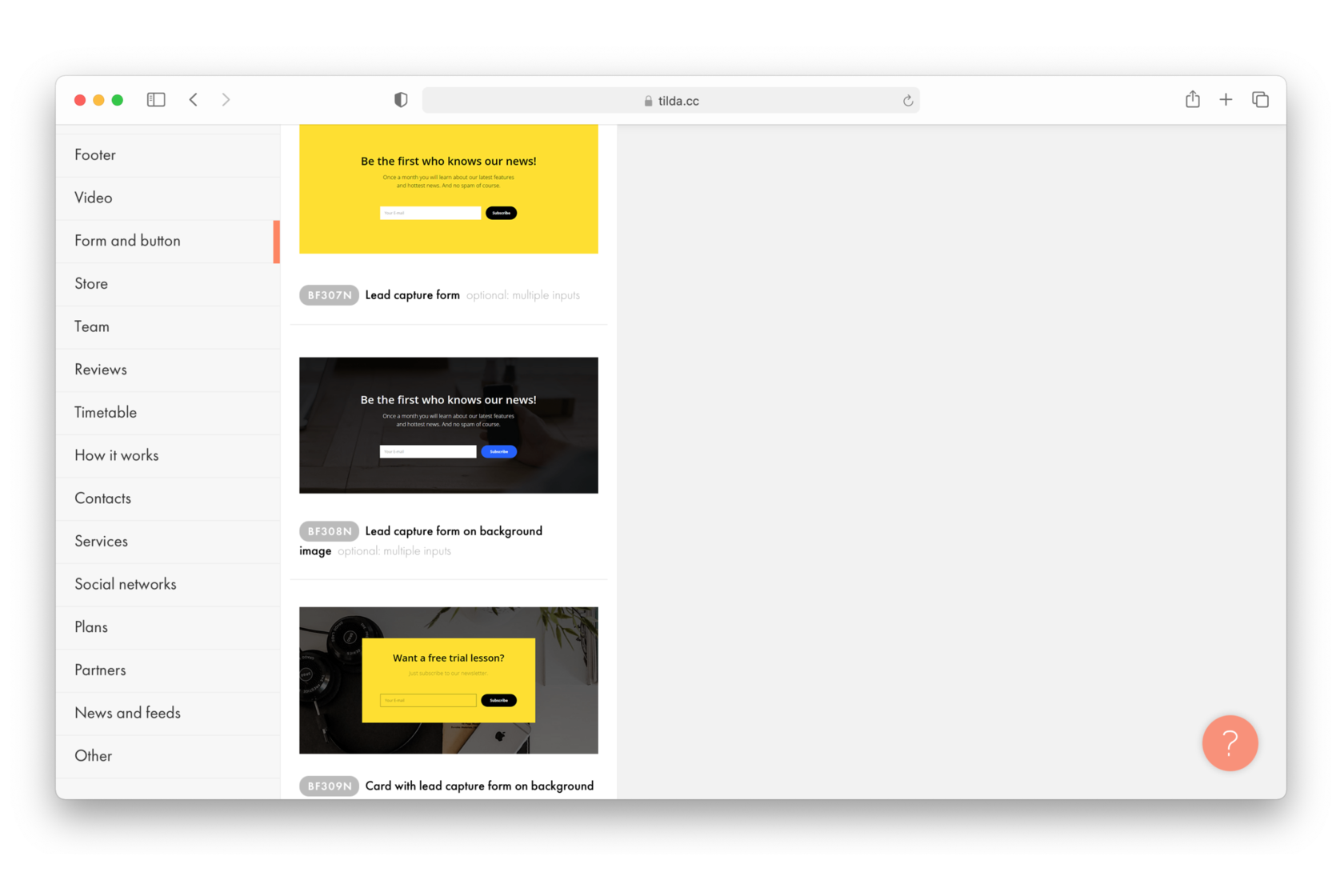
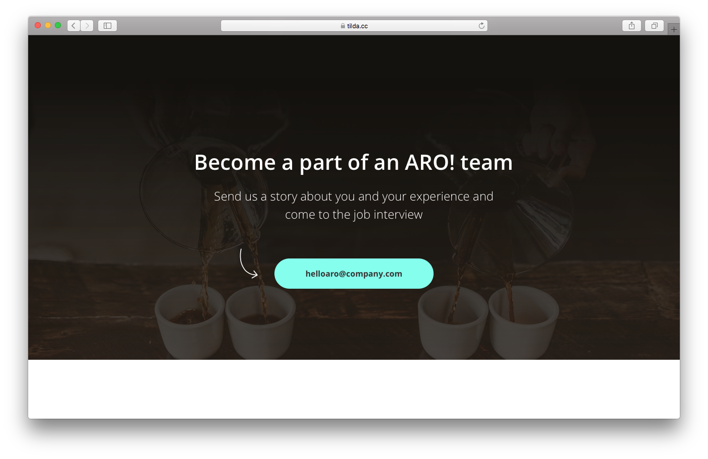
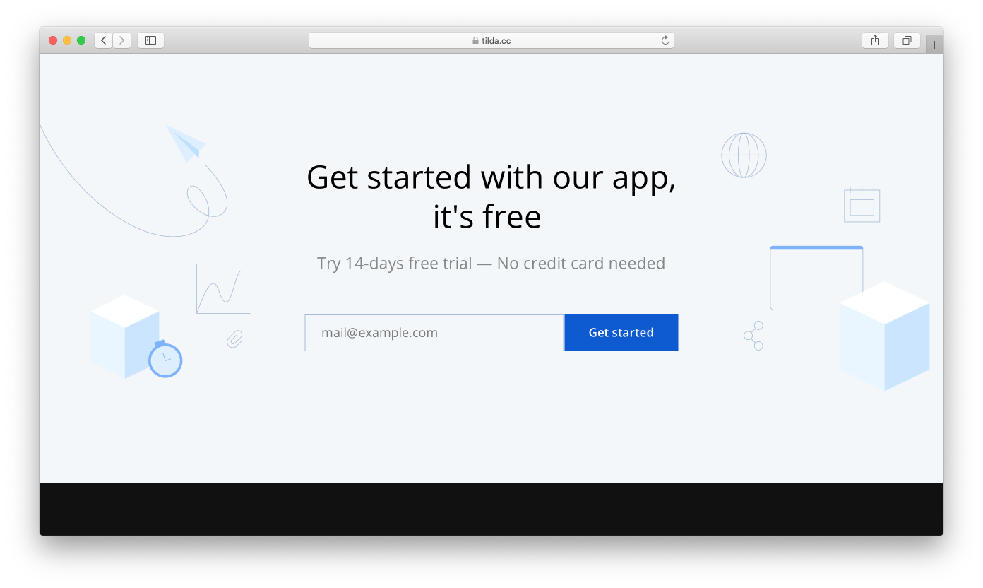
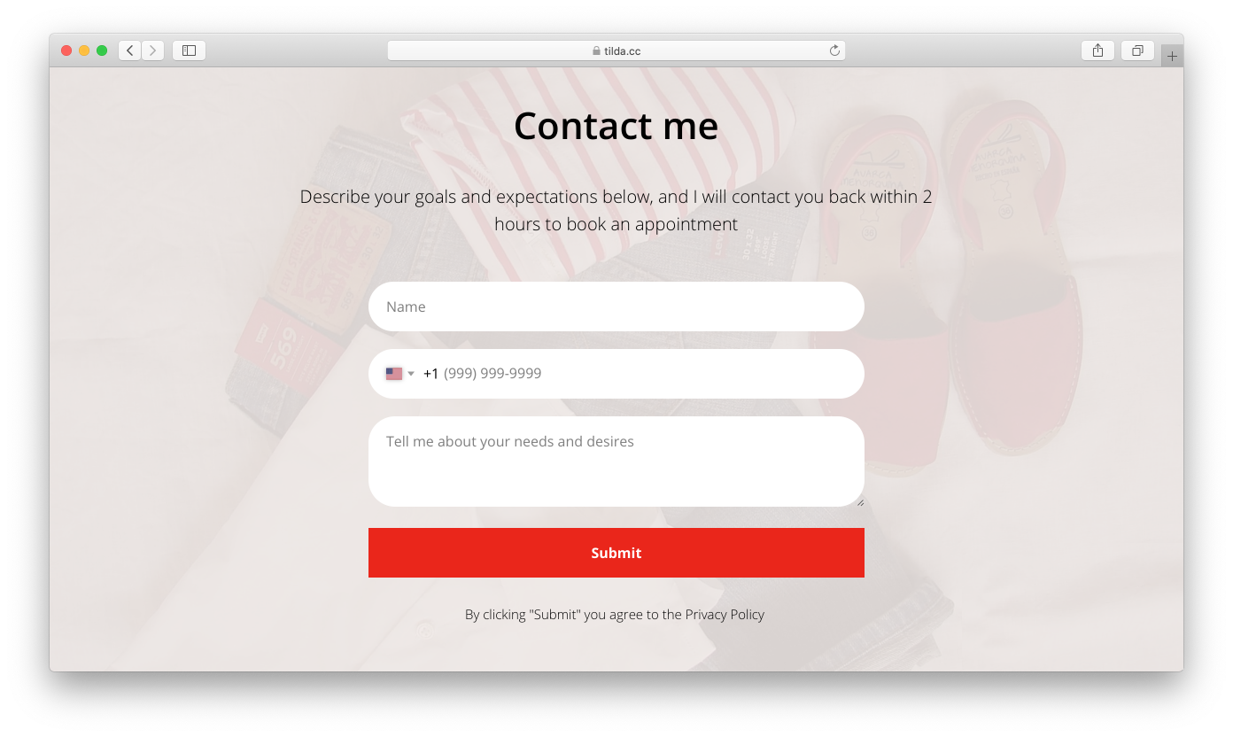
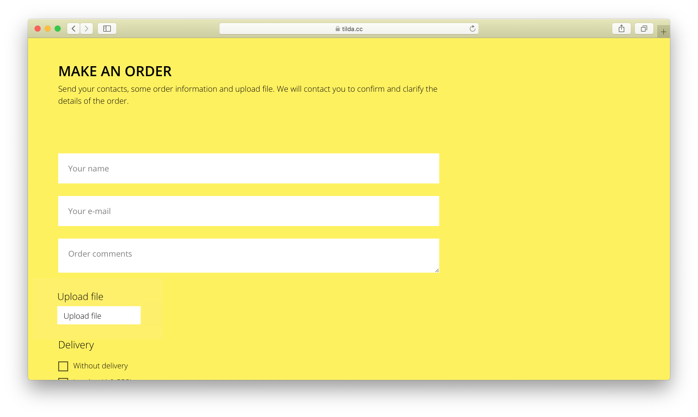
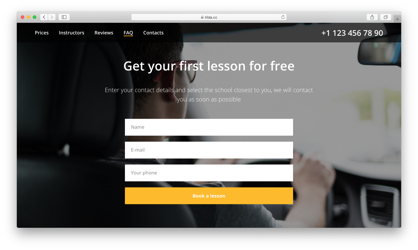
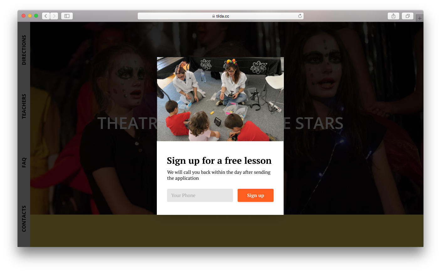
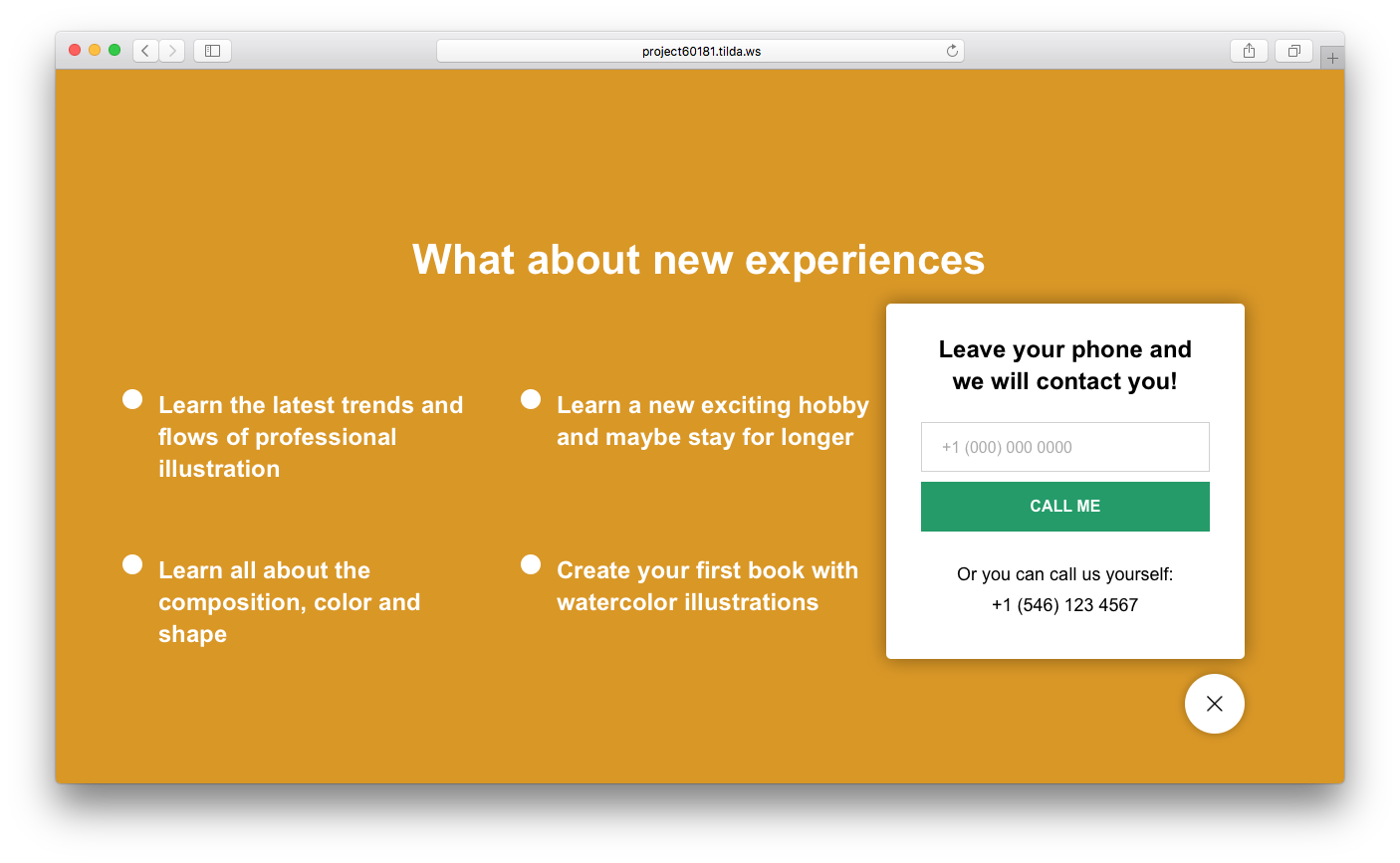
Submission form
This feature is similar to the previous one but includes a form. If the purpose of your landing page is to get someone new to subscribe or sign up for a webinar, this block becomes a key section.
It is usually made up of a heading, a subheading, and a form itself.
Find a variety of forms in the "Form and button" category.
Don't use the offer already mentioned on the cover but make sure that this one is just as inspiring. Analyze the things that could stop someone from wanting to sign up; come up with a motivation phrase. Perhaps, all you need to do is just tell your visitors what happens after they've signed up.
Put together a "Thank You" page or message that appears after the user has signed up. For example: "Thanks, your submission is well received! We will contact you within 1 hour to confirm your order," or "Thank you! You have now signed up for the conference."
Examples of forms:
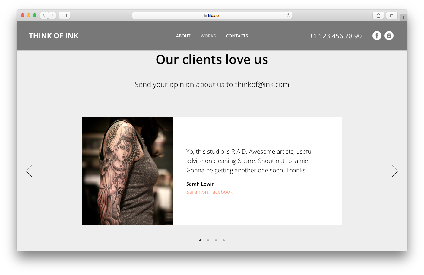
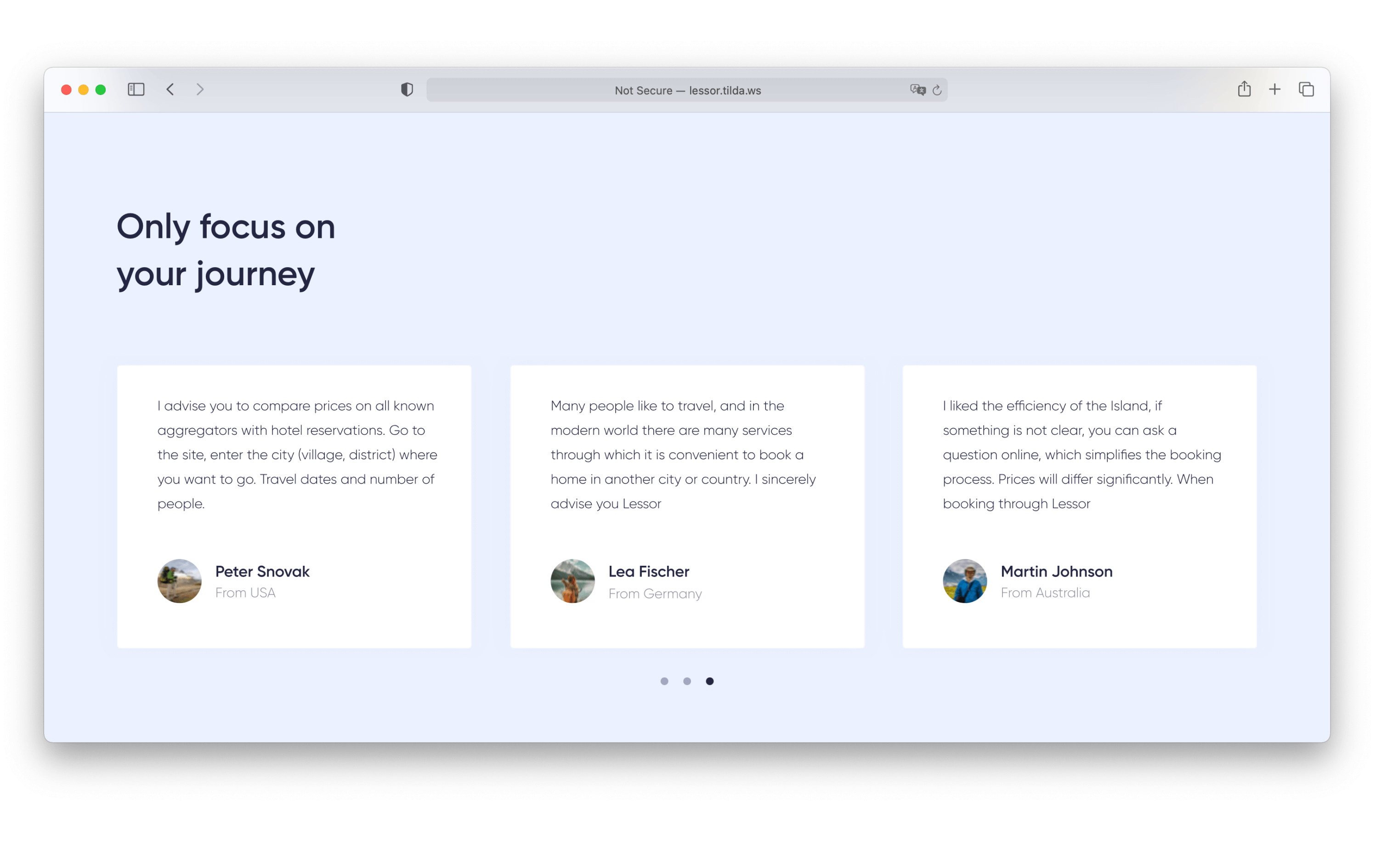
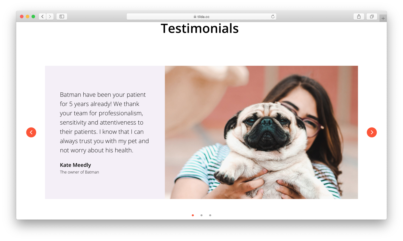
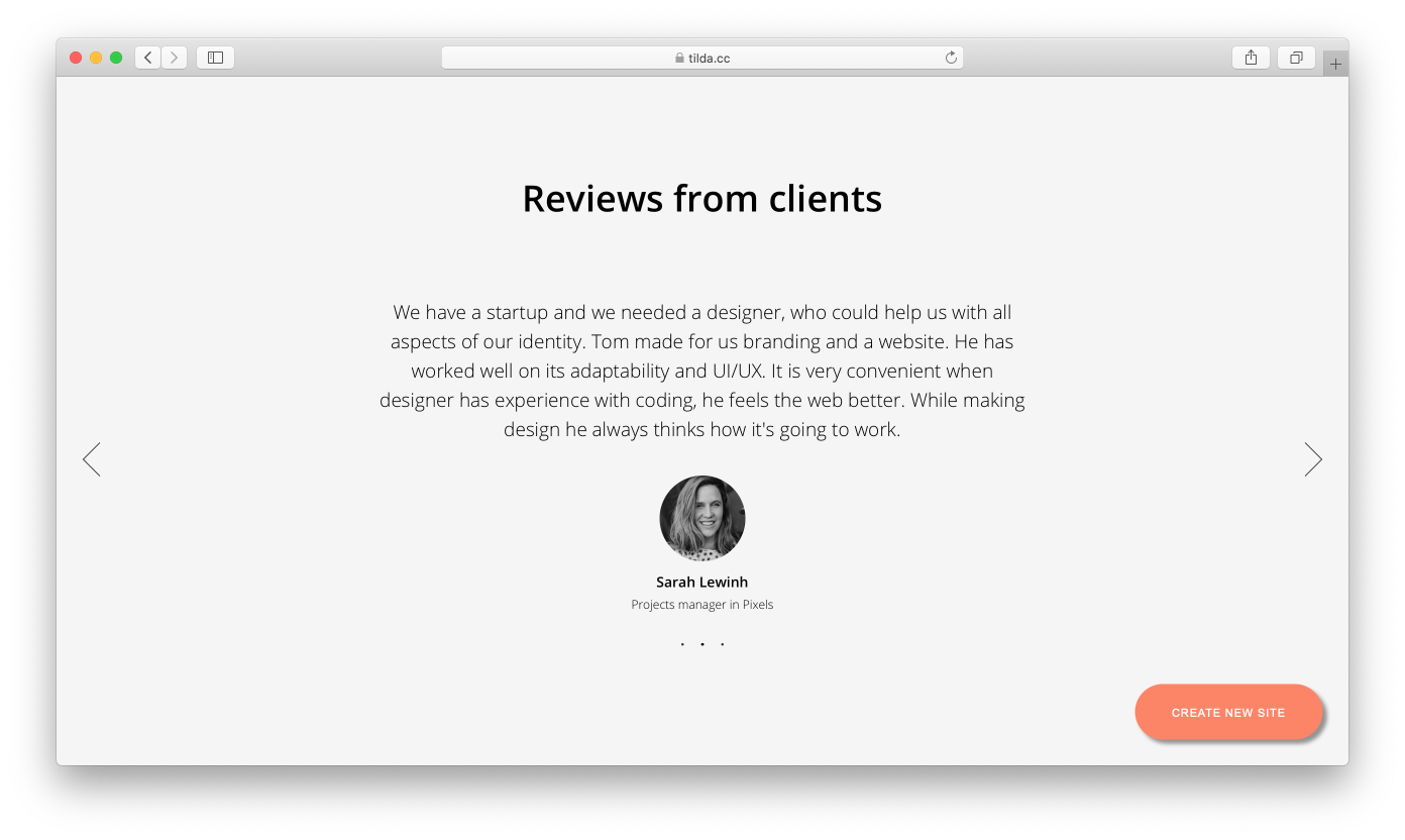
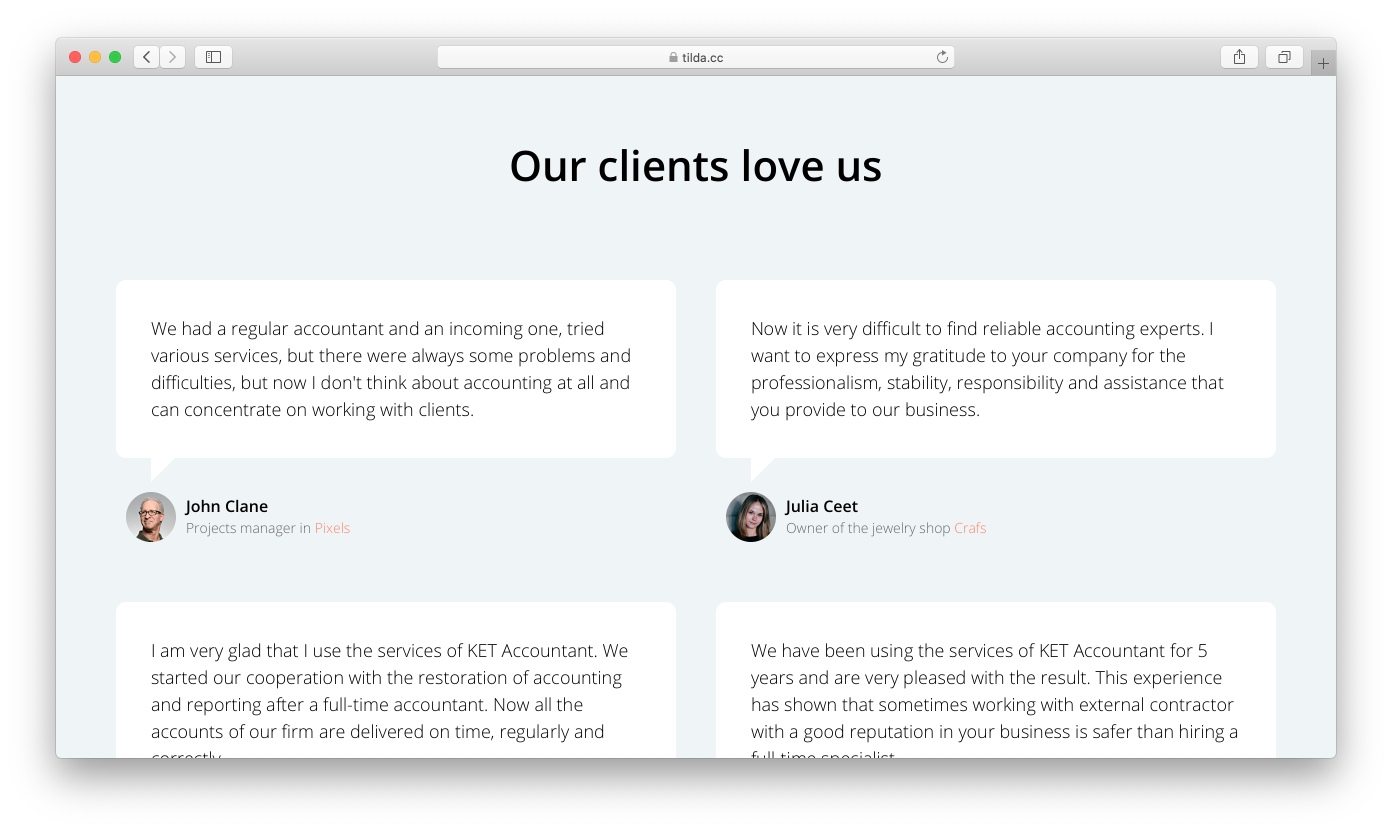
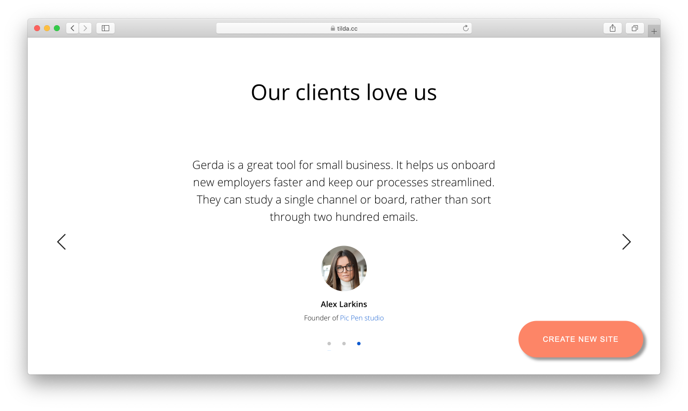
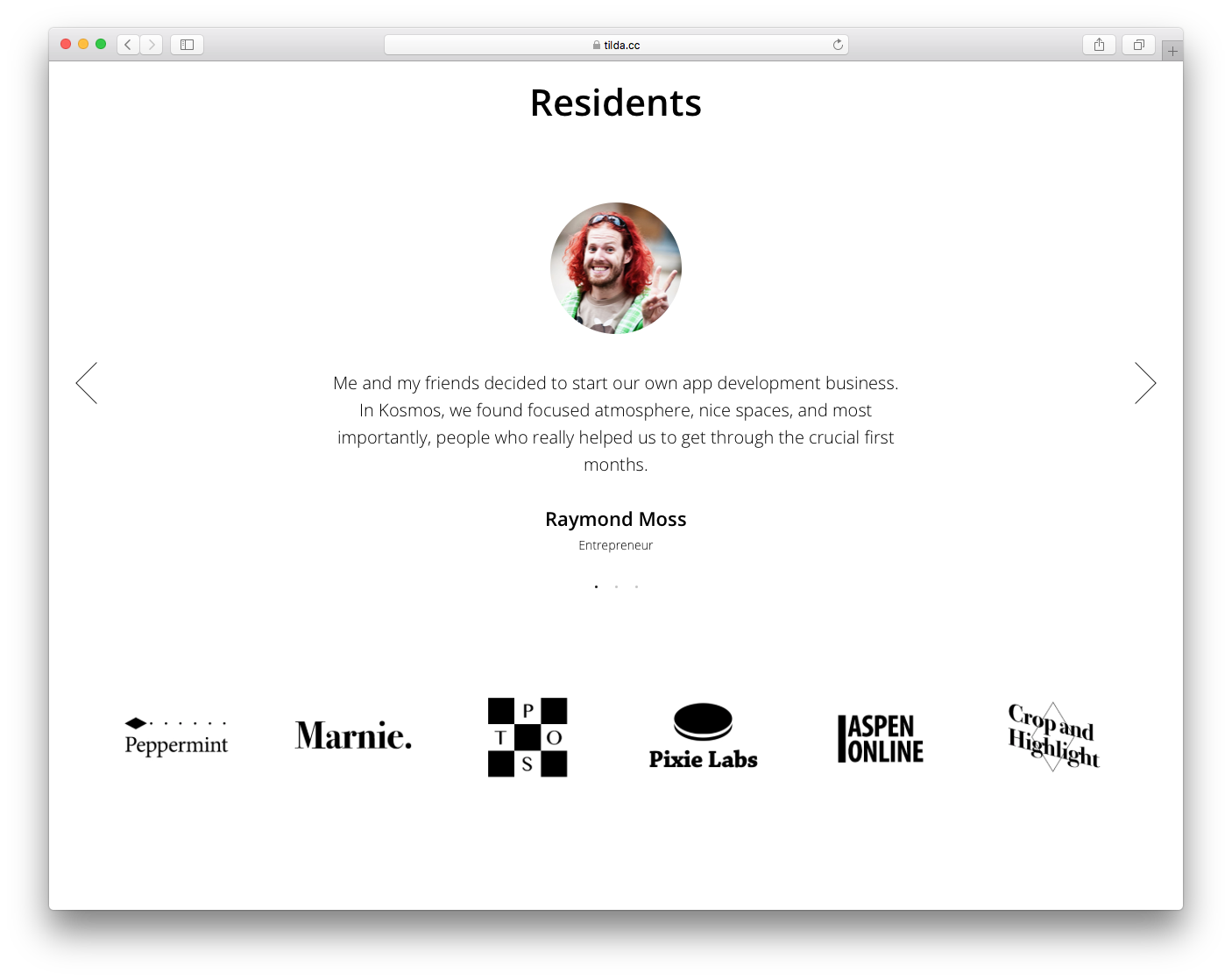
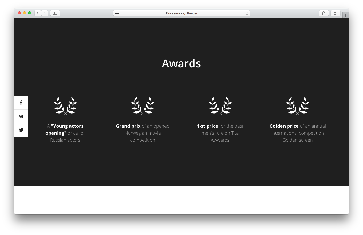
Reviews
Other people's opinions influence our decisions. It convinces us that if other people have tried a product and liked it then we can trust it, too.
The most popular format: heading, the review text, photo, full name, position, and the company.
The "Reviews" category in Tilda's Block Library.
The problem is that the Internet is full of fake reviews. That’s why many users are skeptical about the reviews they encounter. In order to overcome this, make sure that you seek reviews from those who can truly claim to represent an industry: a famous brand, or a well-known industry expert. Consider including links to the reviewers' social media profiles and add their photographs to the reviews. Needless to say, all your reviews should be real.
I love asking Tilda users for their reviews. At first, I felt awkward having to distract them from their day-to-day work. However, everyone I asked turned out to be very receptive and were more than happy to provide their feedback. Whenever I ask for a review I always specify where it will be posted and how long it should be. I also ask a specific question, for example, “Why have you decided to stay on Tilda?”
I love asking Tilda users for their reviews. At first, I felt awkward having to distract them from their day-to-day work. However, everyone I asked turned out to be very receptive and were more than happy to provide their feedback. Whenever I ask for a review I always specify where it will be posted and how long it should be. I also ask a specific question, for example, “Why have you decided to stay on Tilda?”
Examples of reviews:
lessor.tilda.ws
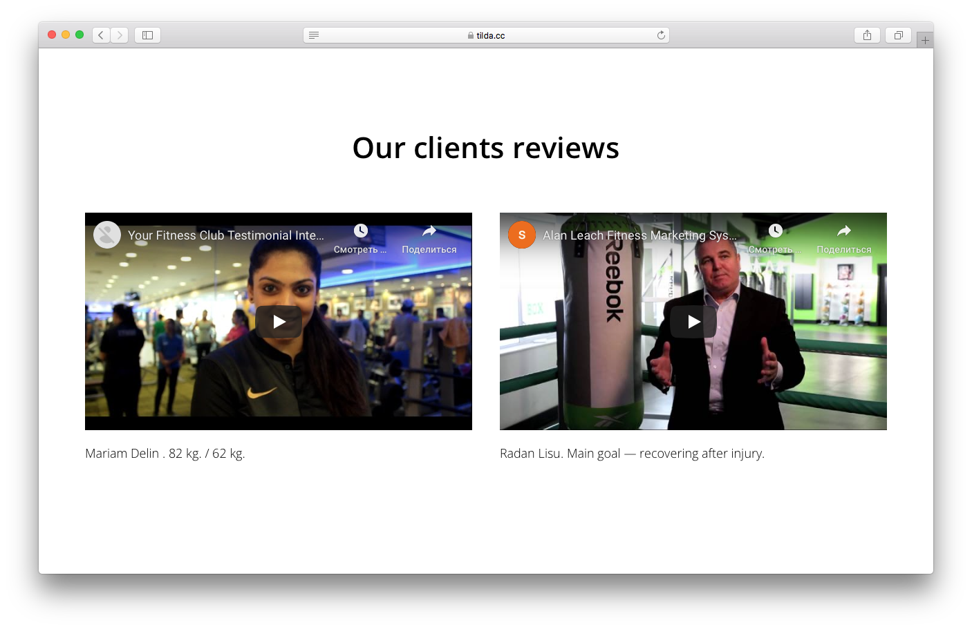
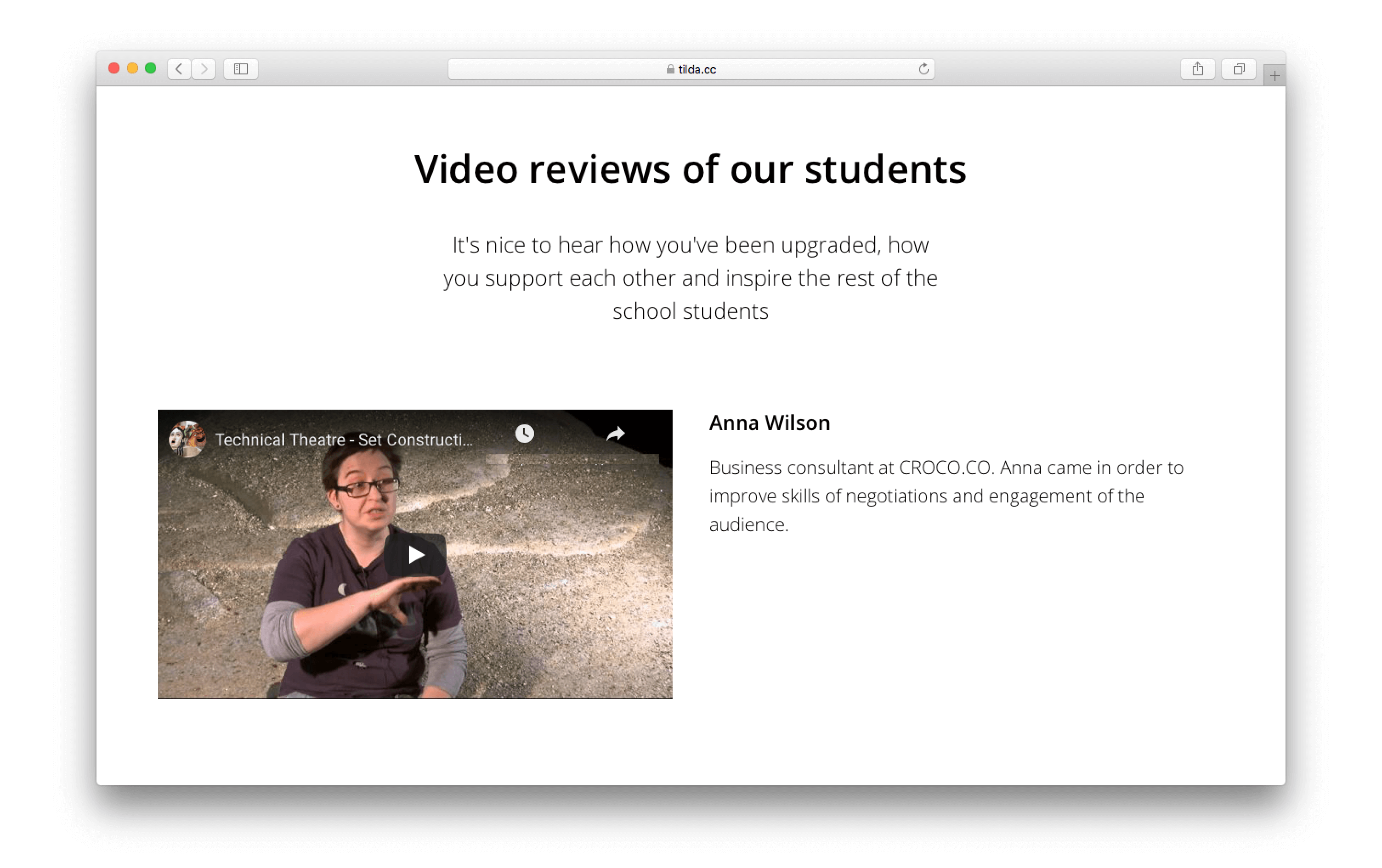
You can also think of producing video reviews. Real people sharing their experiences and commending a service or a product inspire and motivate others.
Examples of video reviews:
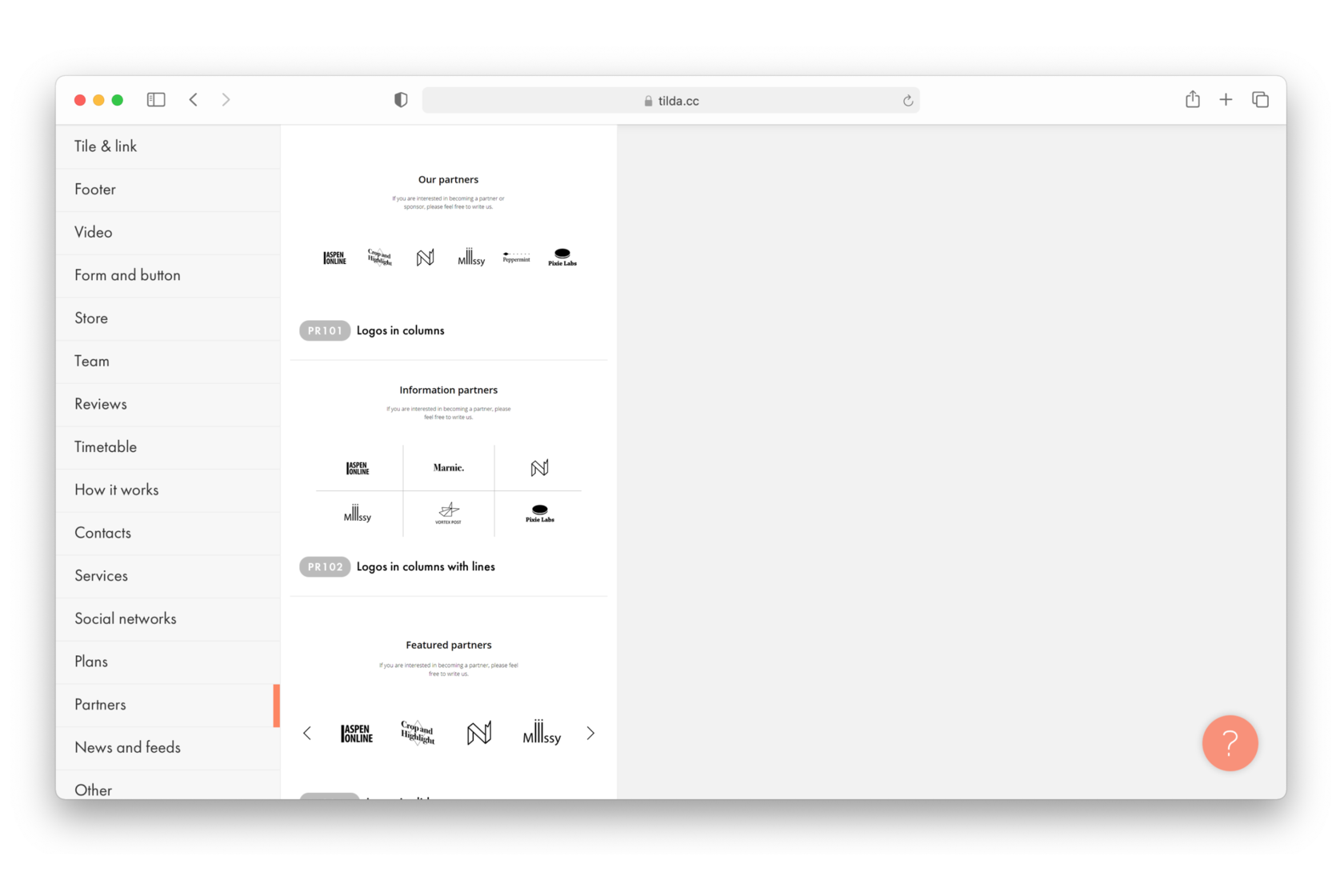
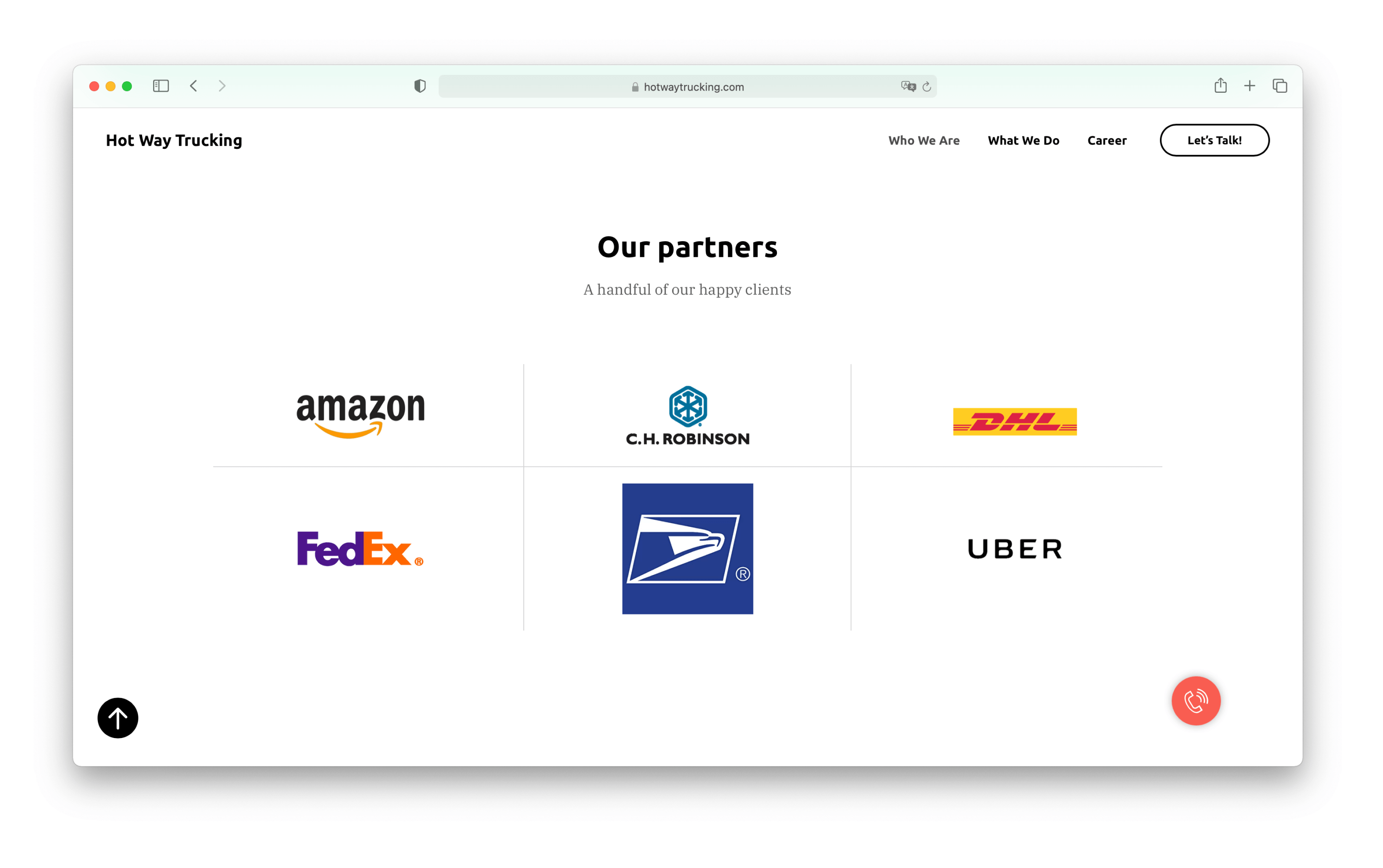
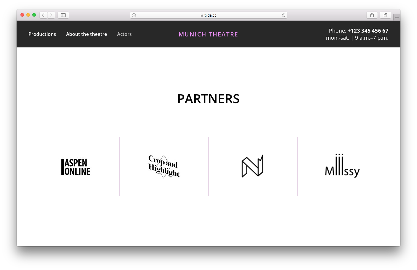
Partners and clients
If there are well-known companies among your partners or clients, you should include their logos in a separate block. New clients are much more likely to trust you if they see that big-name brands already do.
Blocks for partner's logos can be found under the “Partners” category.
Client and partner logos can be impressive. However, these companies must be easily recognized. Mentioning brands and names that no one knows is pointless: This way, you clutter up your page.
There is, however, one problem you might encounter: different logos have different styles and thus, it could be hard to group them in a way that they look nice together. The solution would be to have the logos displayed in a single color that would revert to its original color on hover. You should also pay attention to the size of the logos as you want your block to look neat. Therefore, make sure that all the logos are roughly the same size.
Examples of partners:
hotwaytrucking.com
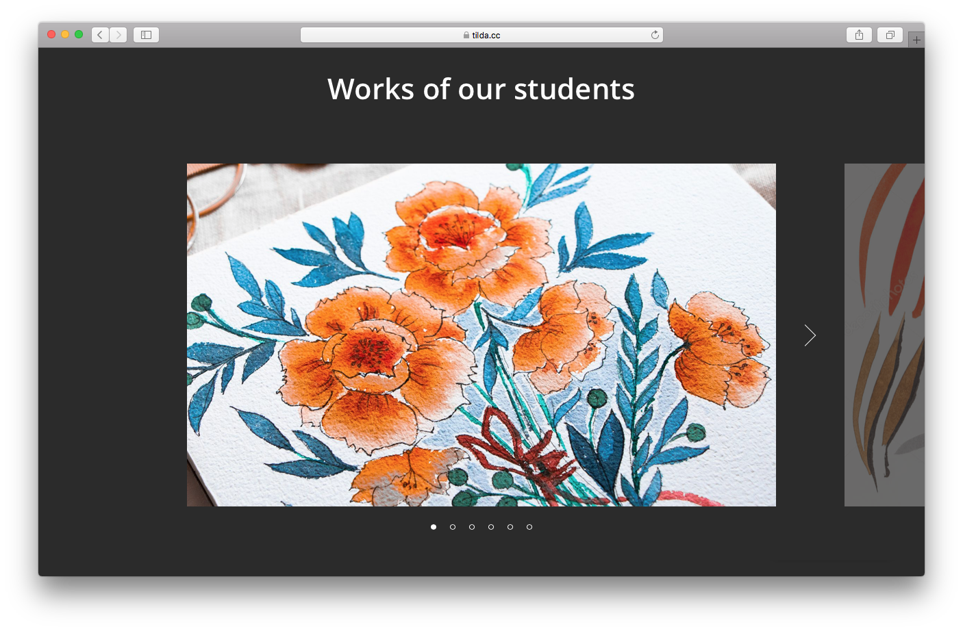
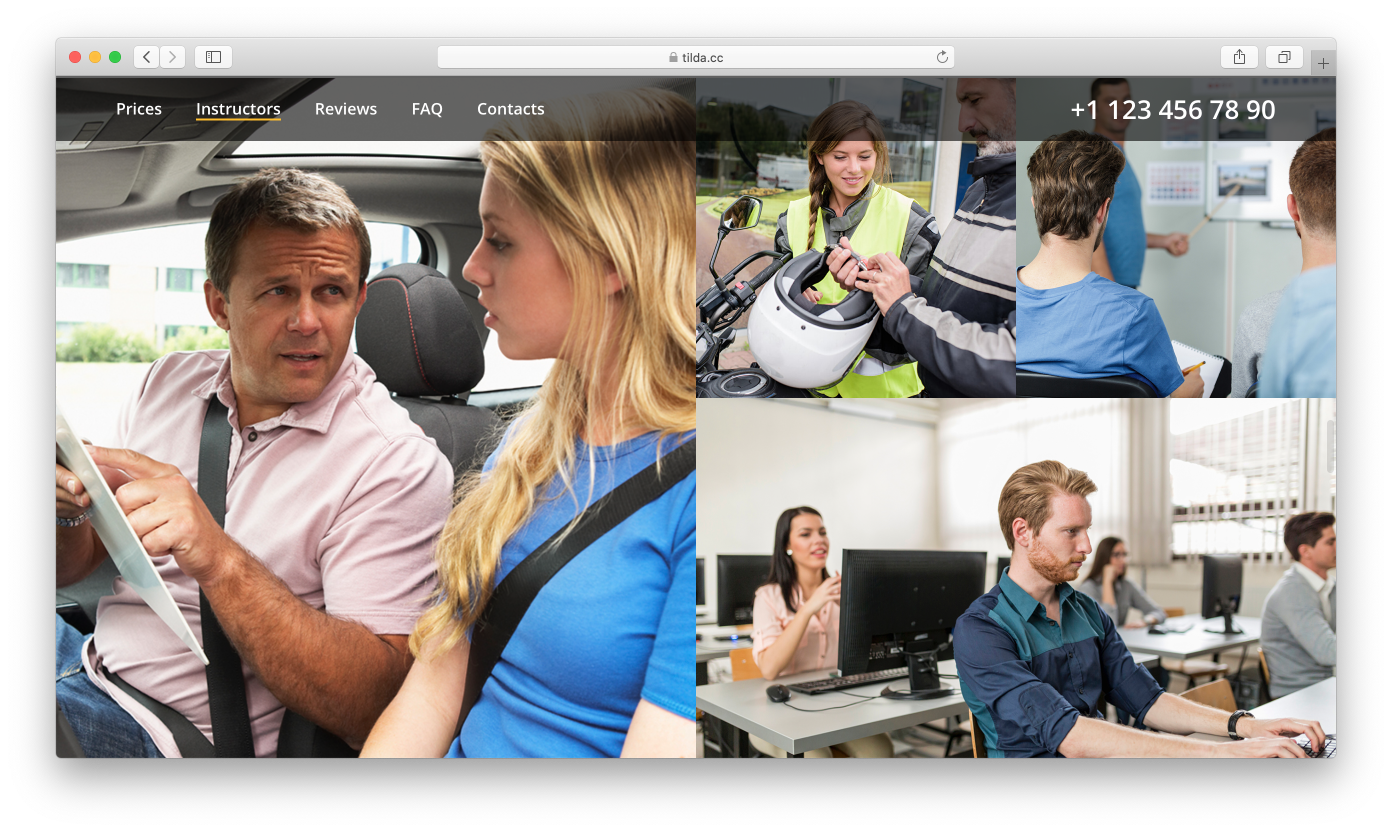
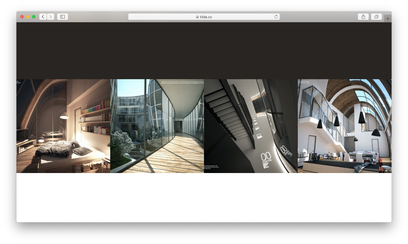
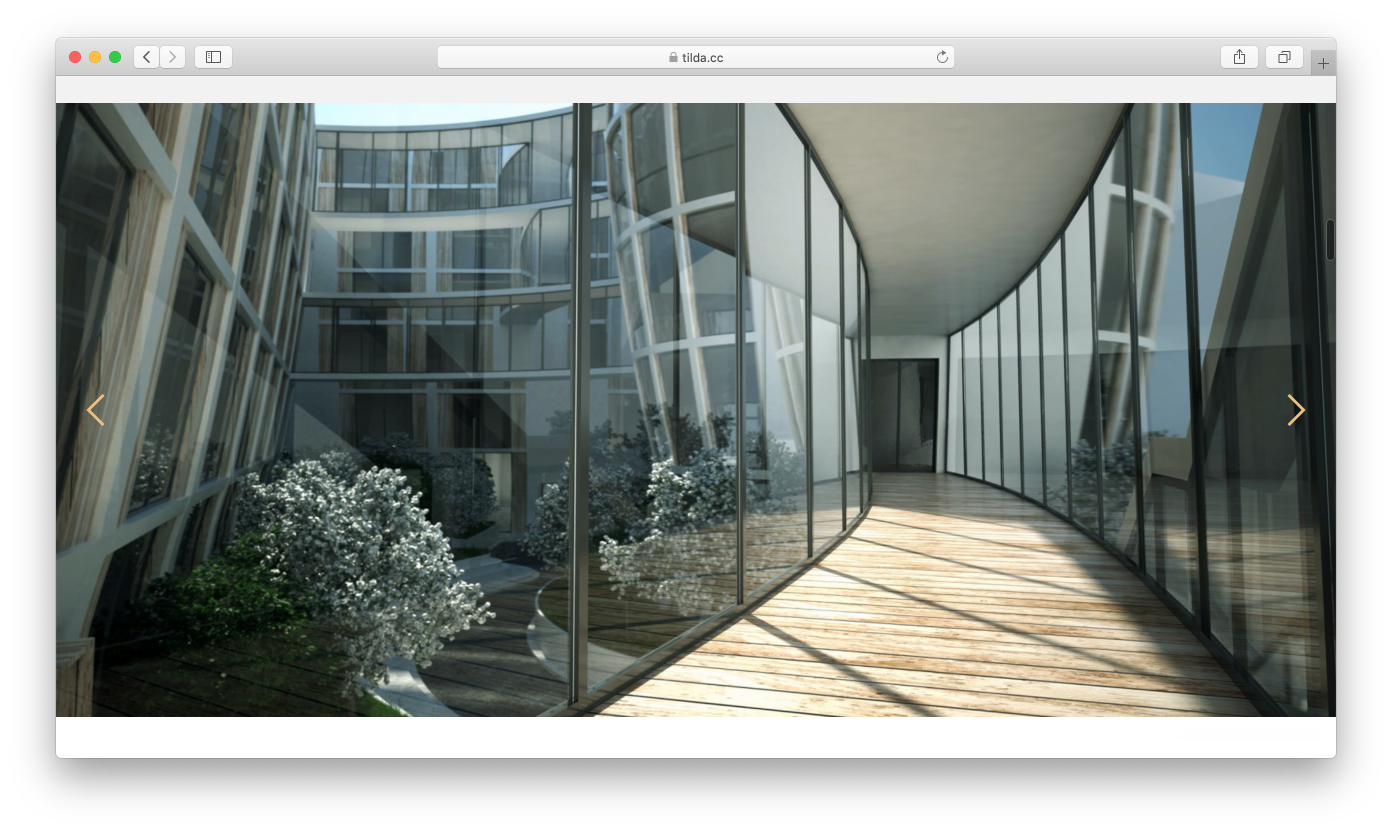
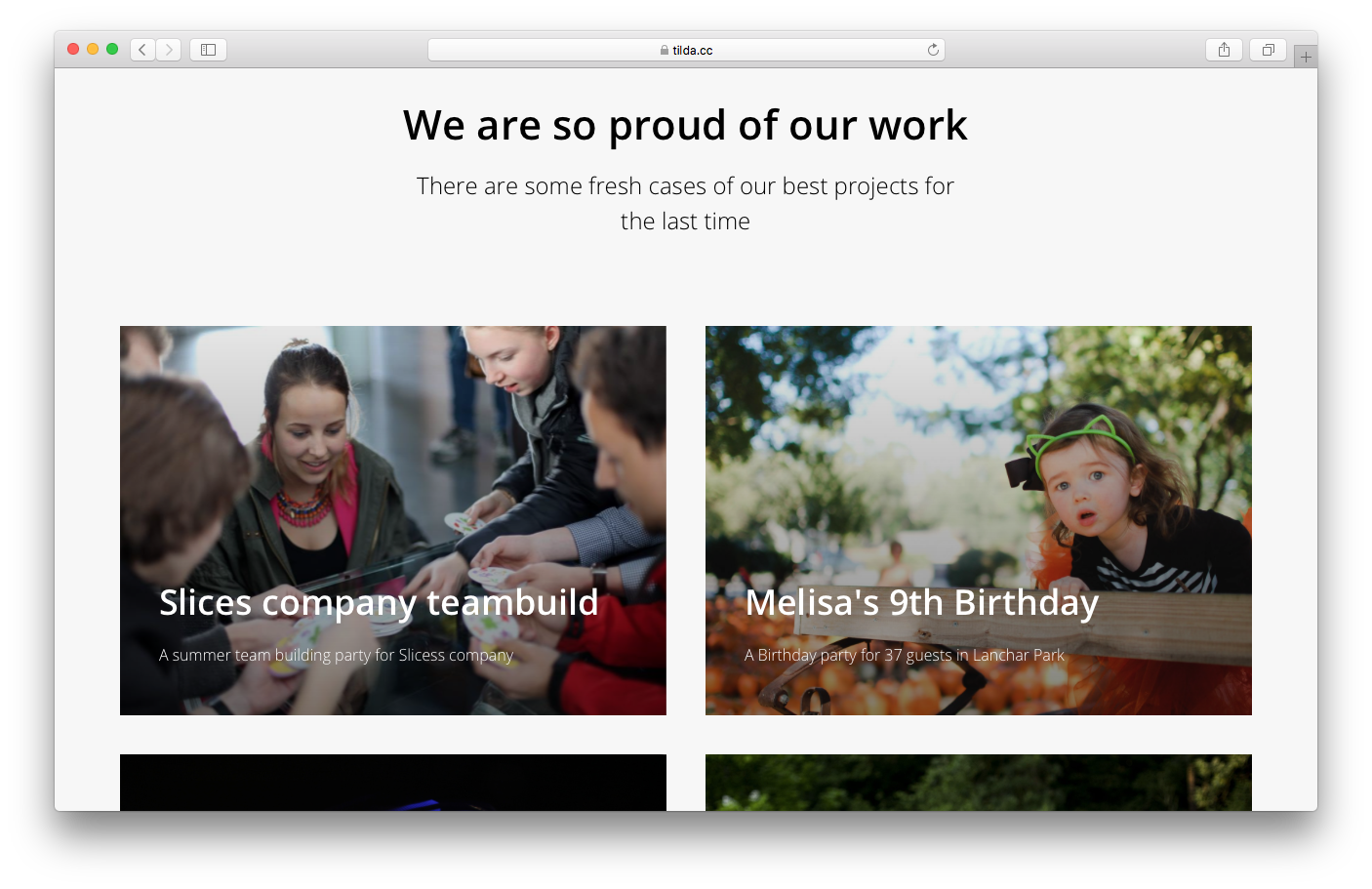
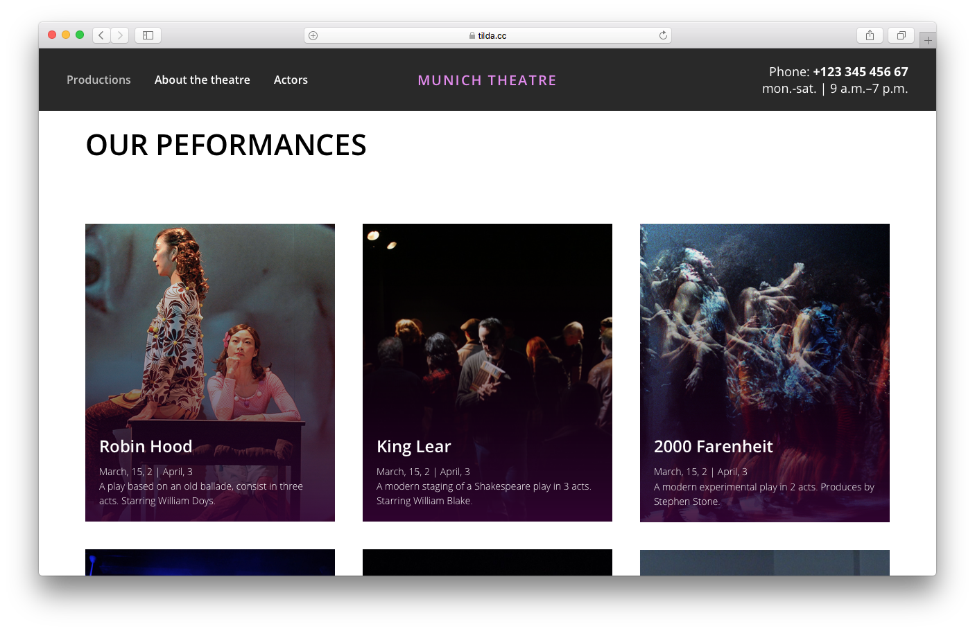
Gallery
The Internet is a very visual medium, and it's a great advantage if your business can be presented using photographs.
The gallery doesn't necessarily have to look like a slideshow. In fact, every click is a small decision that users are usually reluctant to make. There are plenty of other ways to effectively combine and group your photographs.
There are 20+ types of galleries in the Tilda Block Library.
Make sure you only use high-quality photographs: your visitors expect to see photos that have no issues with focus, brightness, contrast, or color.
Examples of galleries:
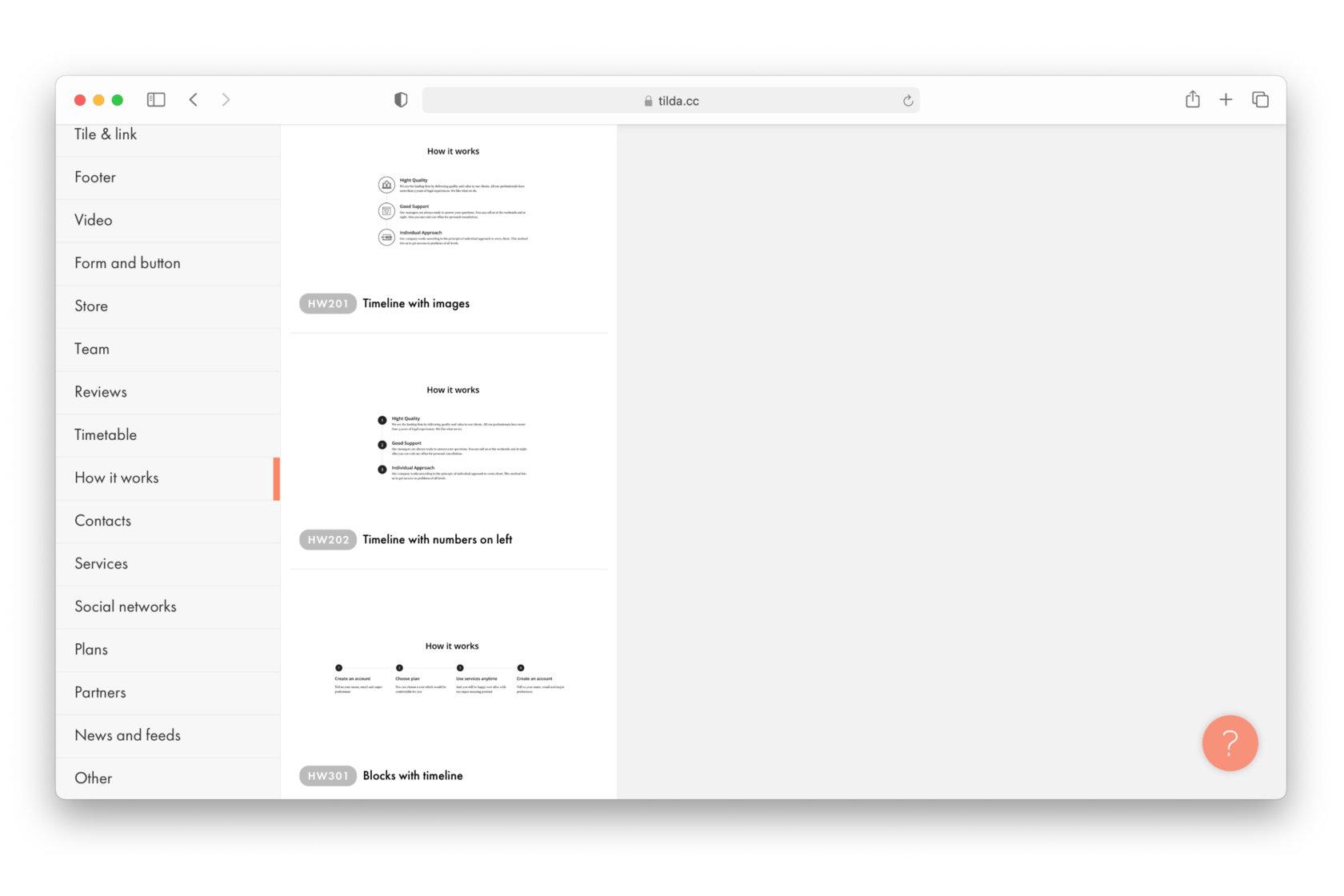
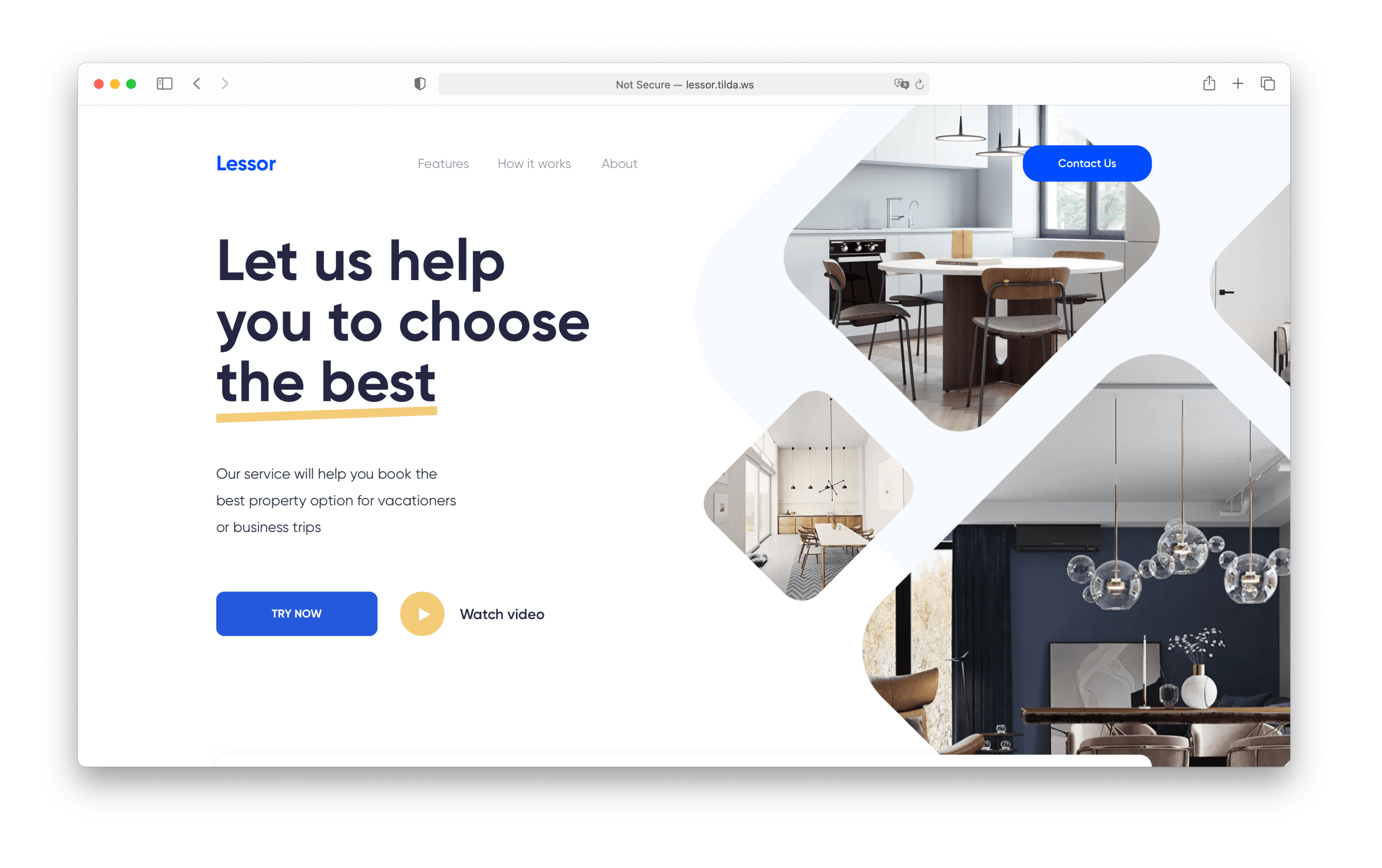
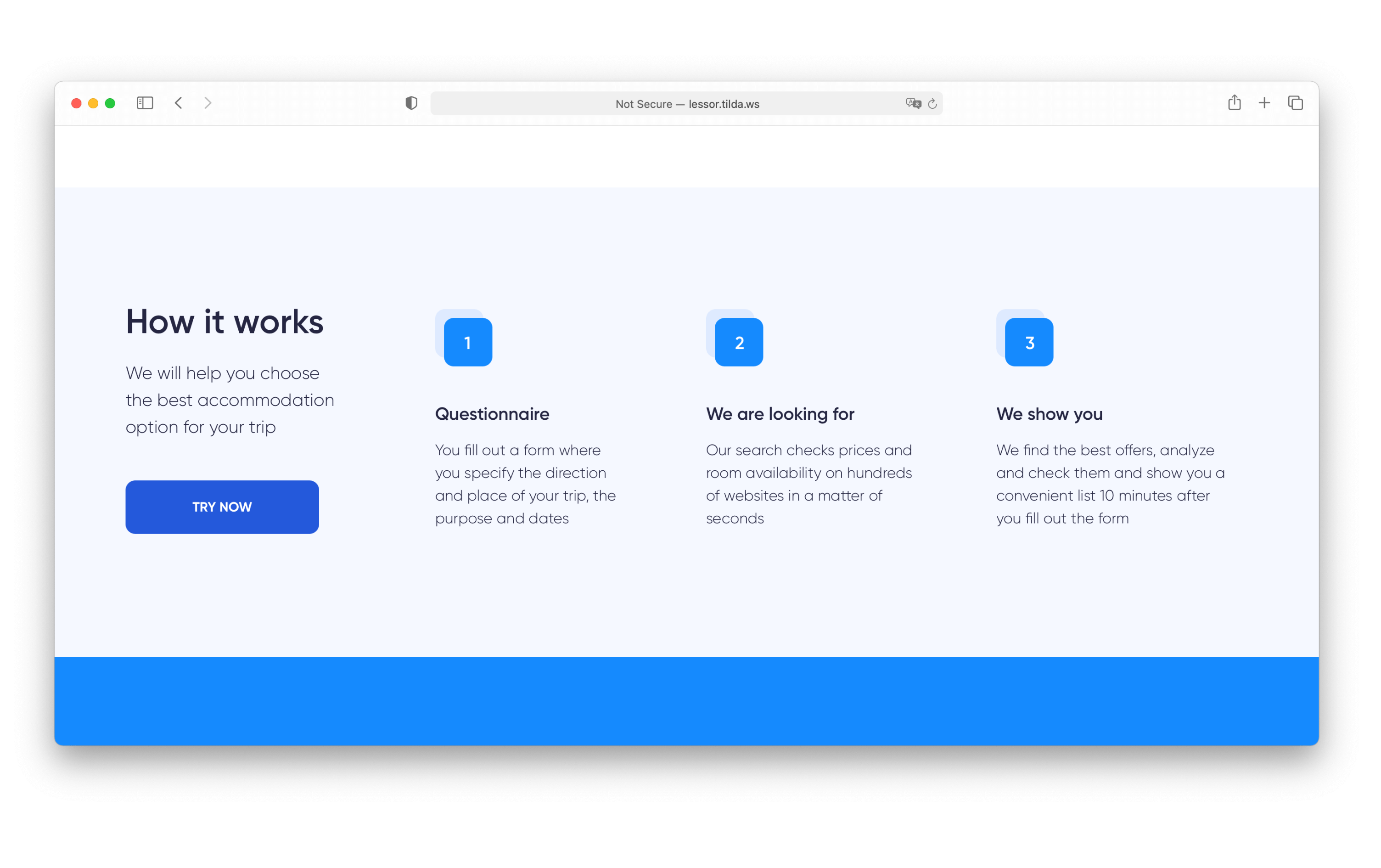
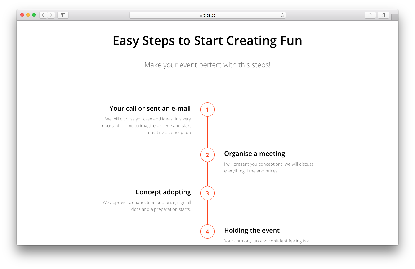
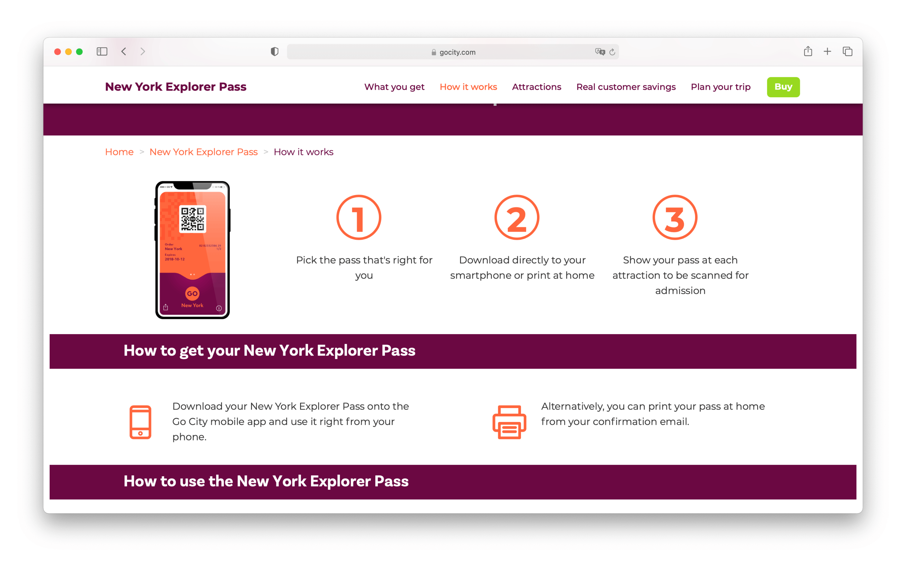
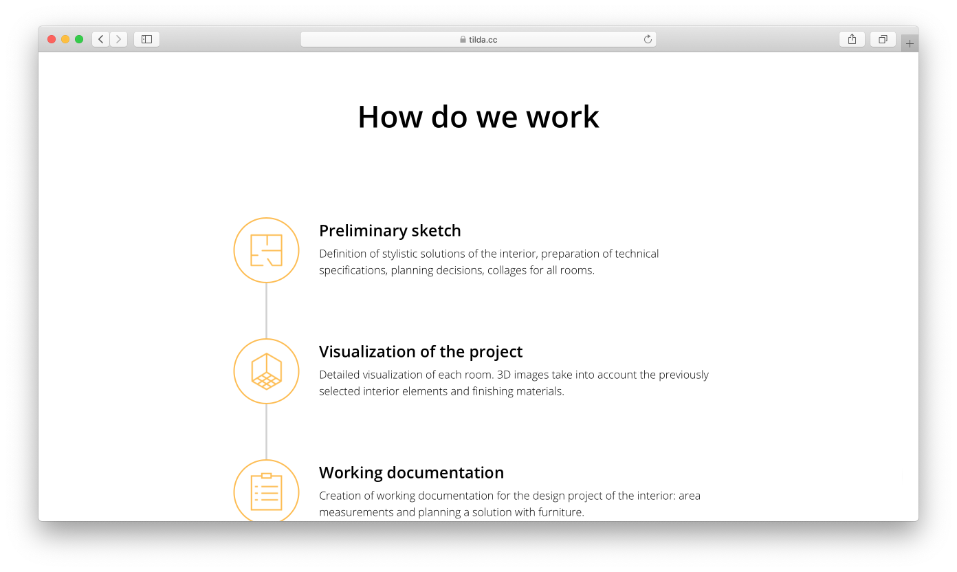
How it works
If it's important to show how exactly a product or service works, you can divide the description into several phases or steps.
This could be designed in the form of vertical or horizontal diagrams, bullet points, or columns.
The "How it works" category in the Tilda Library.
For example, a design studio could use this block to highlight workflow milestones and present a roadmap to the client: brief, meeting, contract, prepayment, first draft, revisions, second draft, revisions, final version, remaining payment.
Examples of "How it works" sections:
lessor.tilda.ws
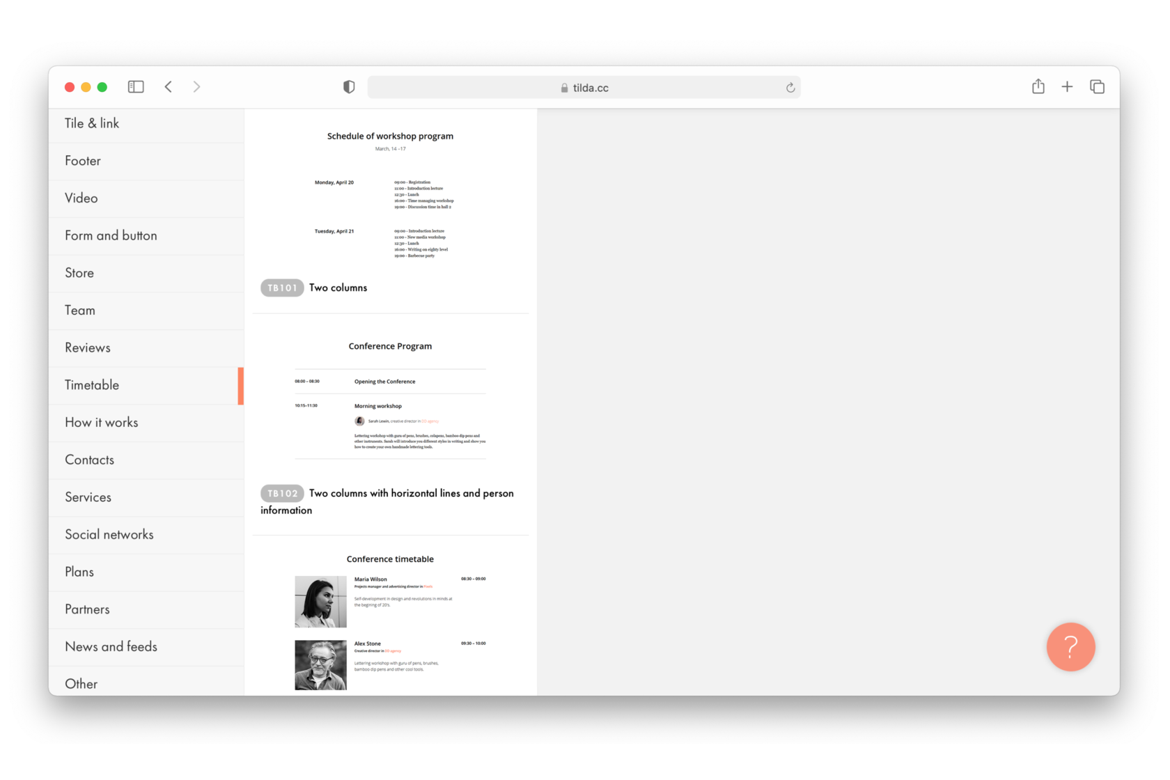
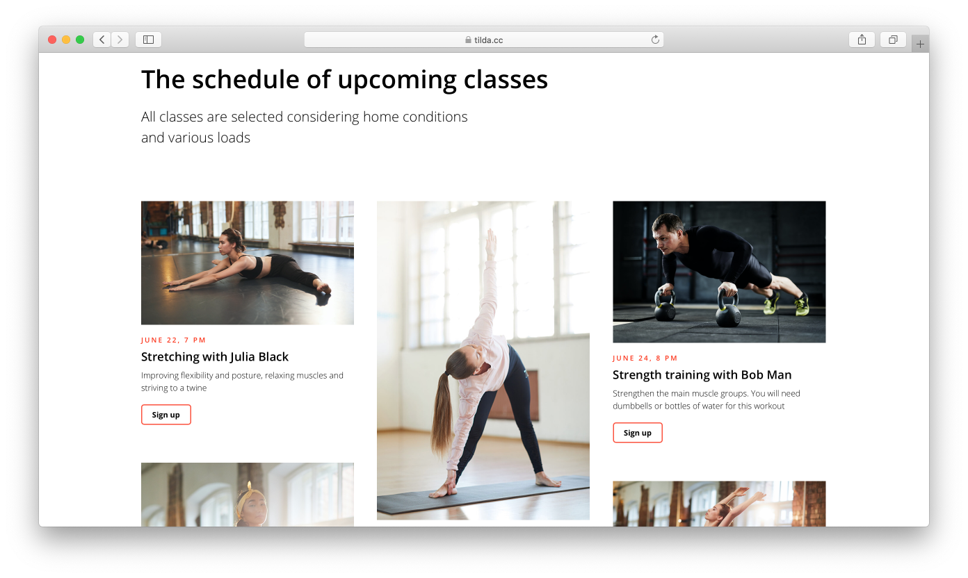
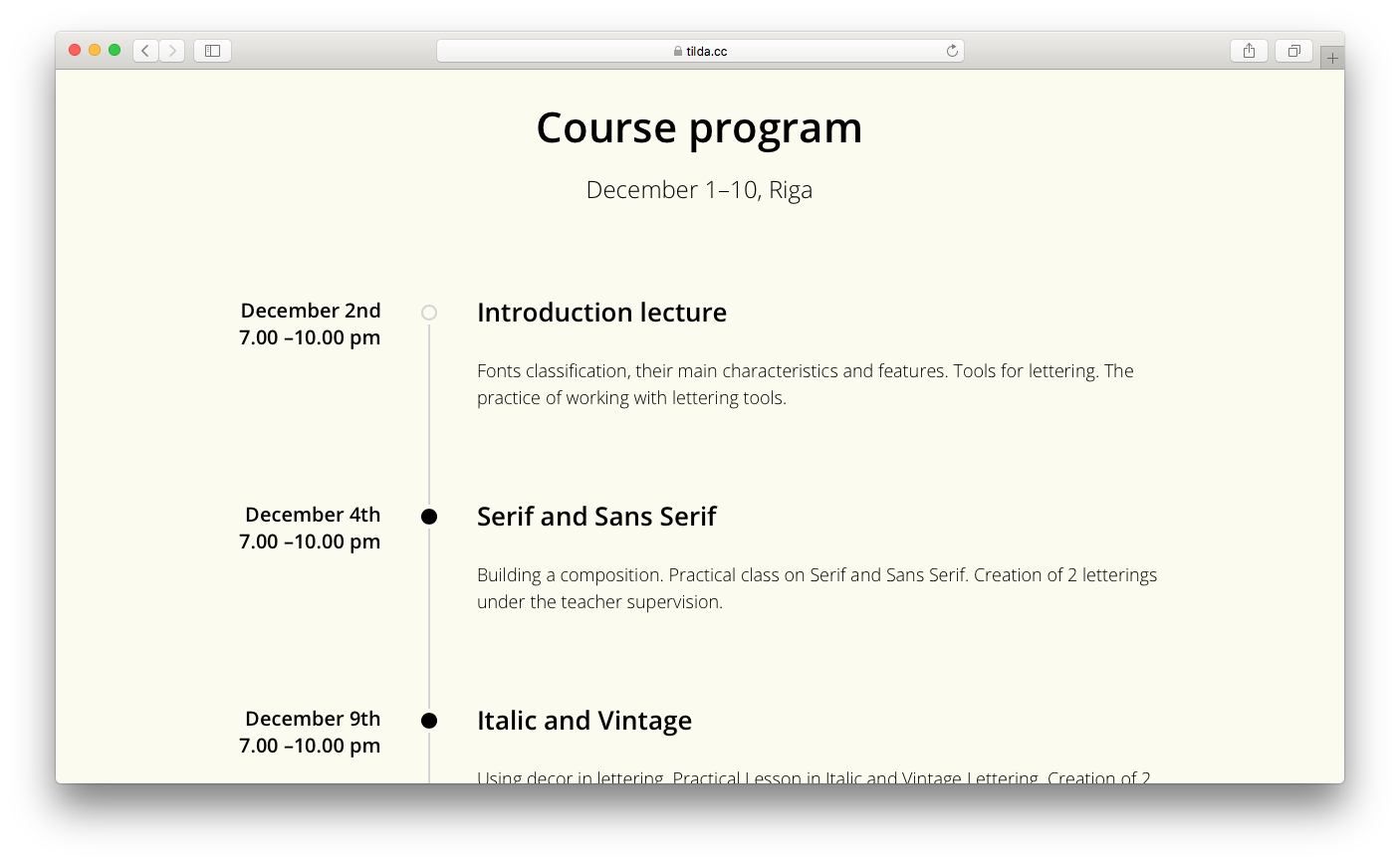
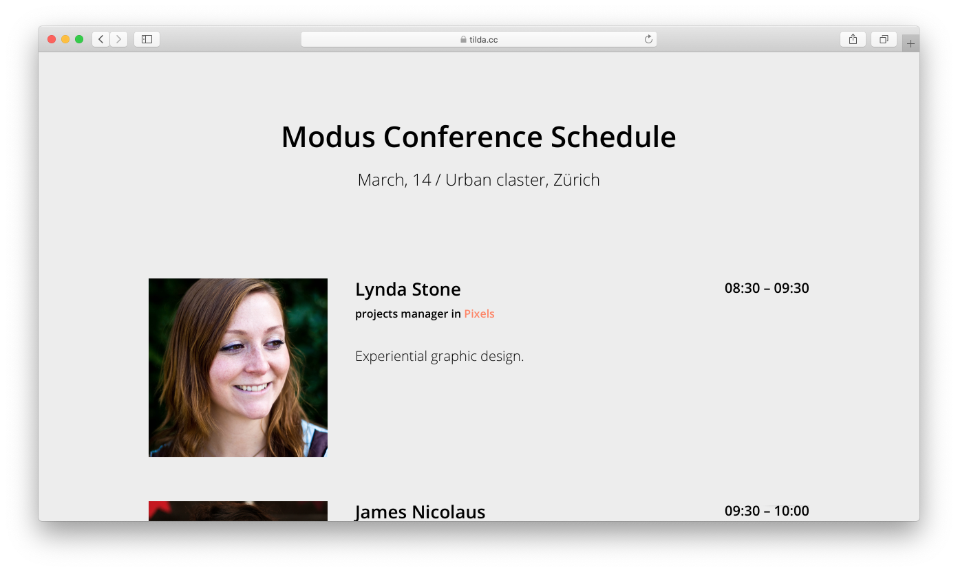
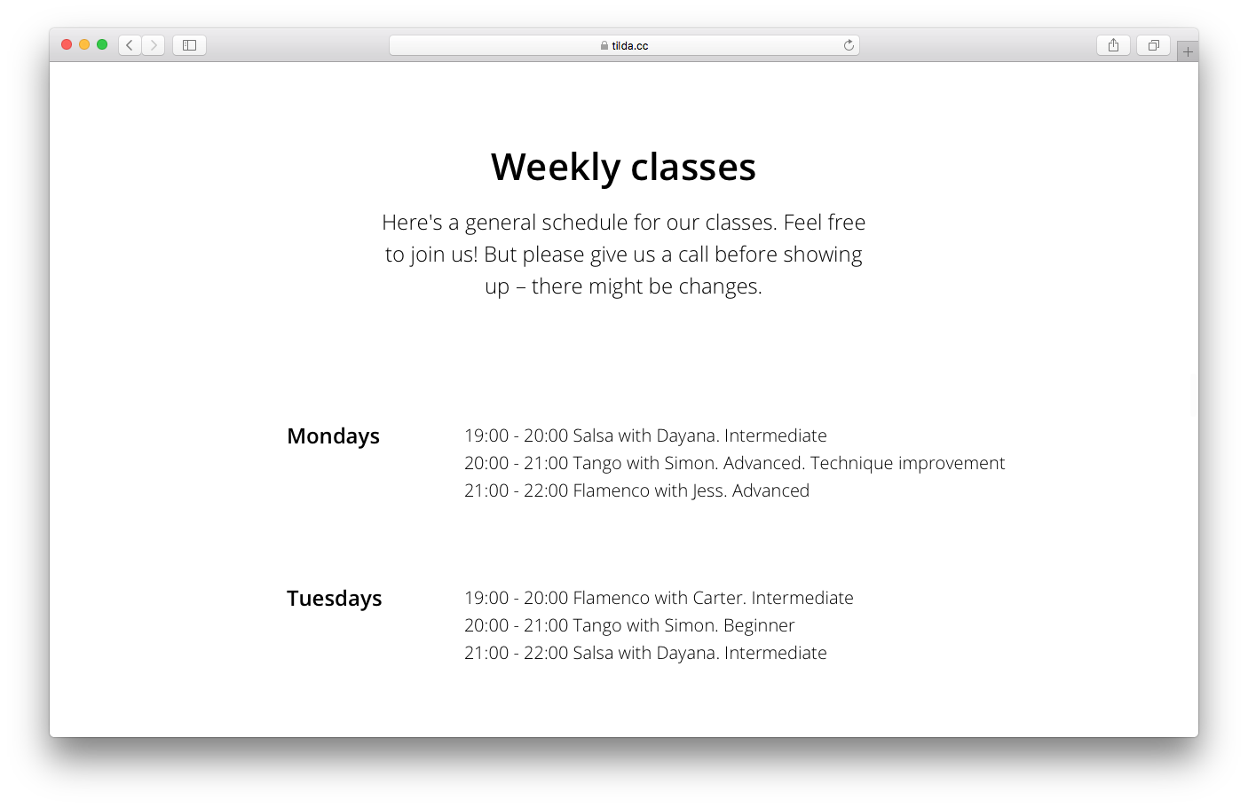
Schedule
This section is used when the landing page represents an event that lasts over time and consists of several parts.
The schedule is usually shown in the form of a timetable or a timeline. If there are speakers taking part in the event, it's a nice idea to add their photos to the schedule.
The “Timetable” block category in the Tilda Library.
Show a conference schedule, the order of the talks and speaker presentations, a daily timetable in a summer camp, or a music festival lineup.
Examples of schedules:
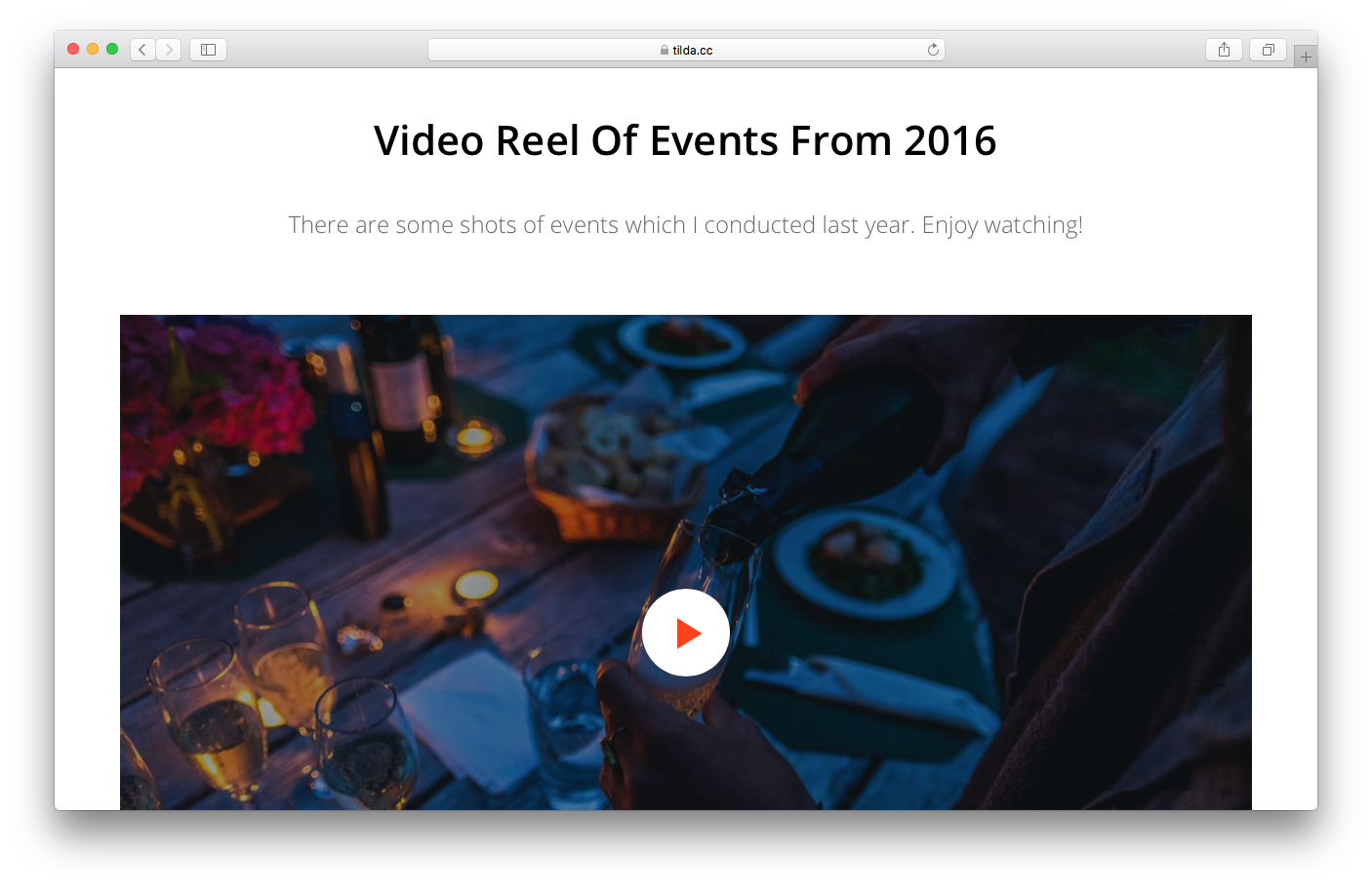
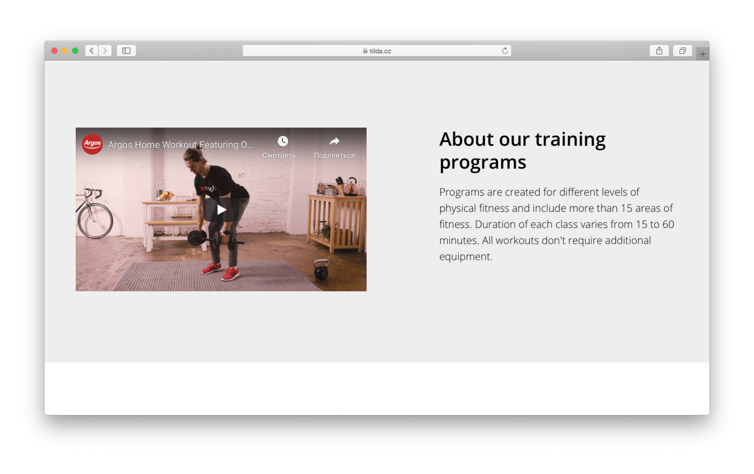
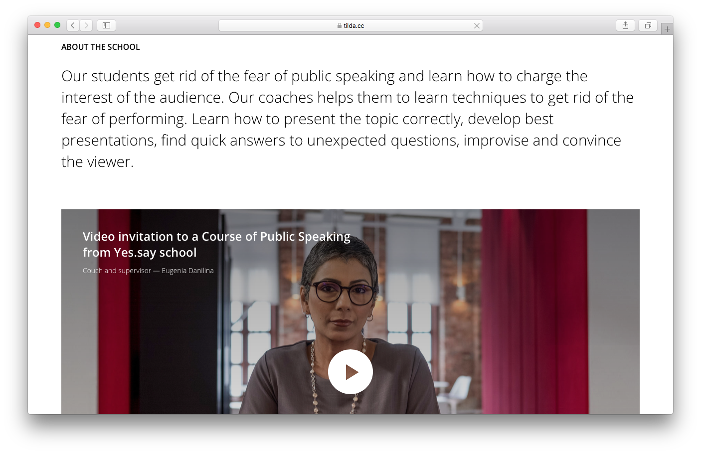
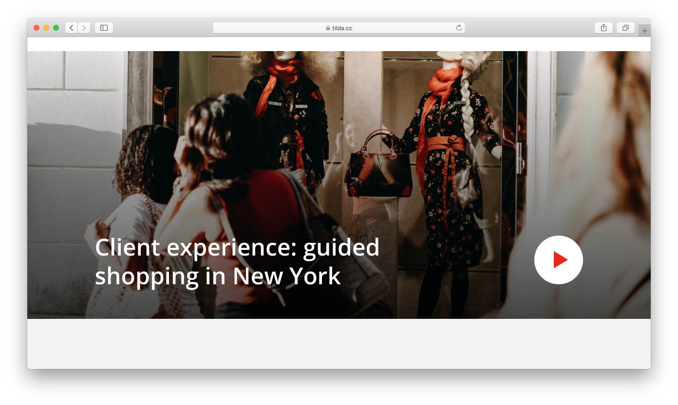
Video
A promotional video or a screencast is an effective way to demonstrate the idea behind your project as well as to show how your product works, share impressive client success stories or put together reviews.
The video can be introduced in several ways: It can be played in the background, shown in the gallery, appear as a pop-up, or be included in a layout featuring text and images.
The “Video” block category in the Block Library.
Watching a video requires less effort, that’s why most people prefer video to a written instruction.
The drawback is that it's not always convenient to watch a video, so make sure that you include thumbnails, descriptions, and comments that will accompany your video. This way you can ensure that the information contained in the video won’t be lost.
Examples of videos:
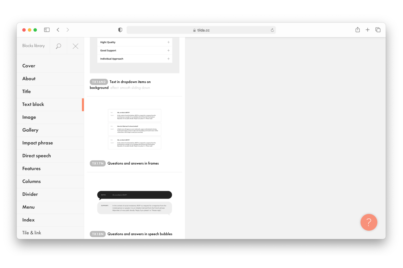
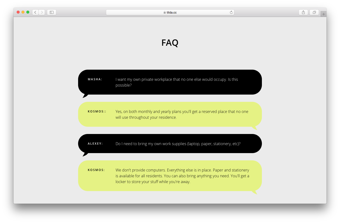
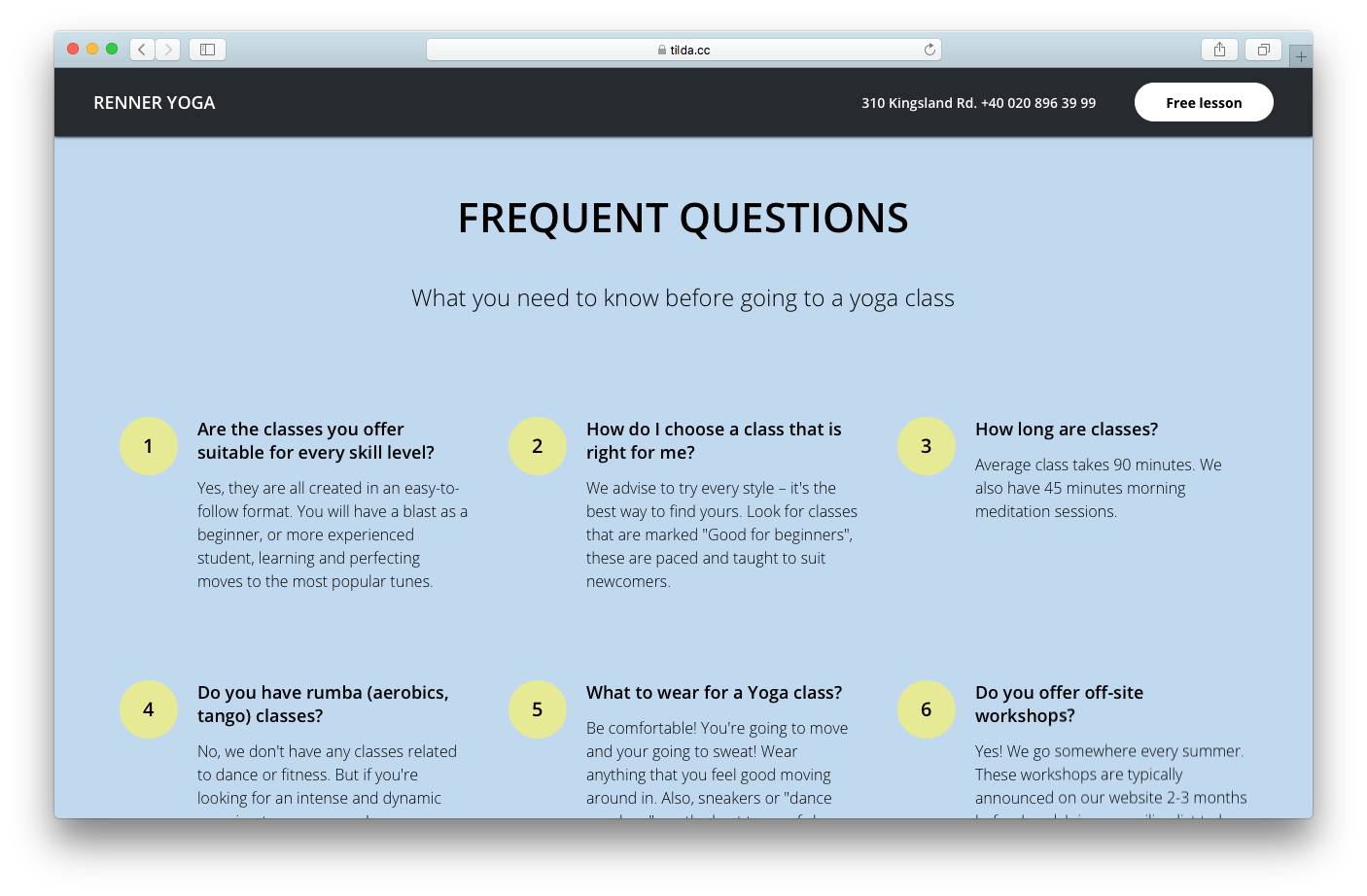
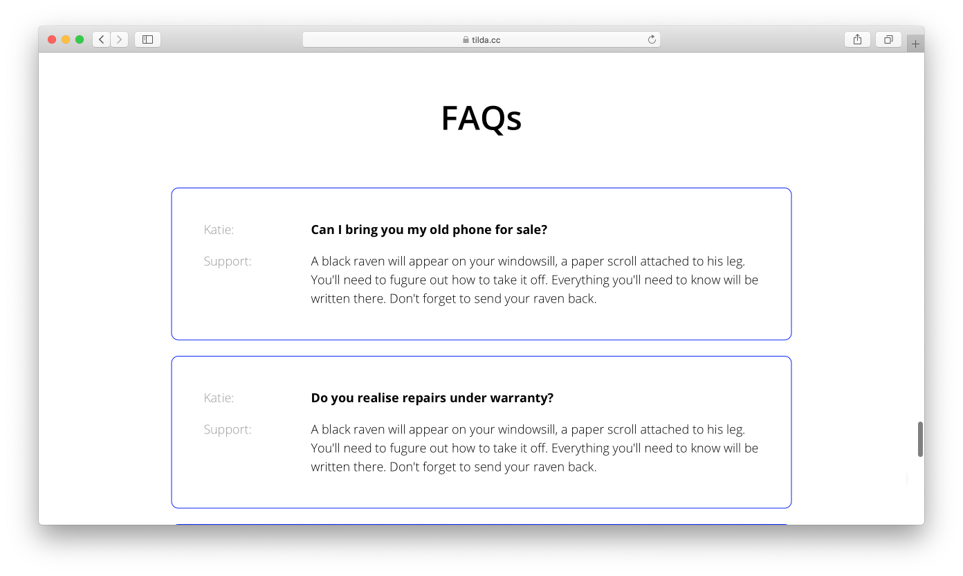
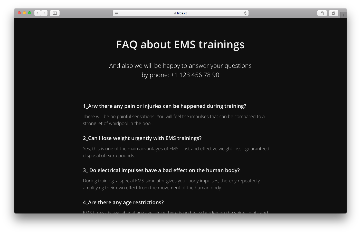
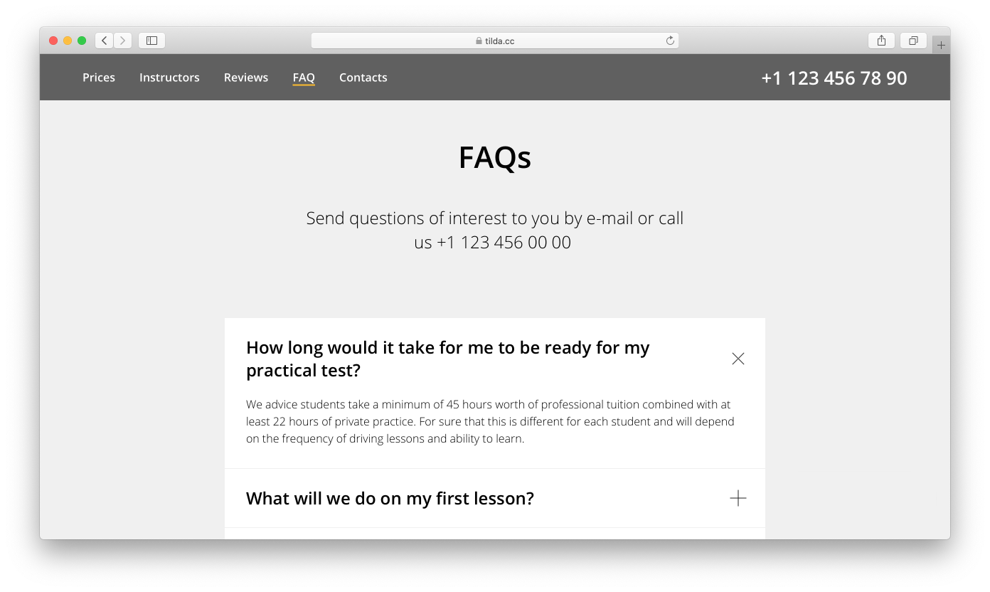
FAQs
This section helps you work with possible issues or negative feedback. It would be a smart move to get to know your clients' doubts and concerns, then put them into questions, and provide thorough answers.
These blocks are usually designed as an interview or a chat.
You can find a number of blocks with different questions-and-answers layouts under the “Text block” category.
FAQs can also be used to structure information. For example, if you want to describe your delivery options, you can break down the narrative into questions and answers. This will make it easier to grasp the details.
Examples of FAQs:
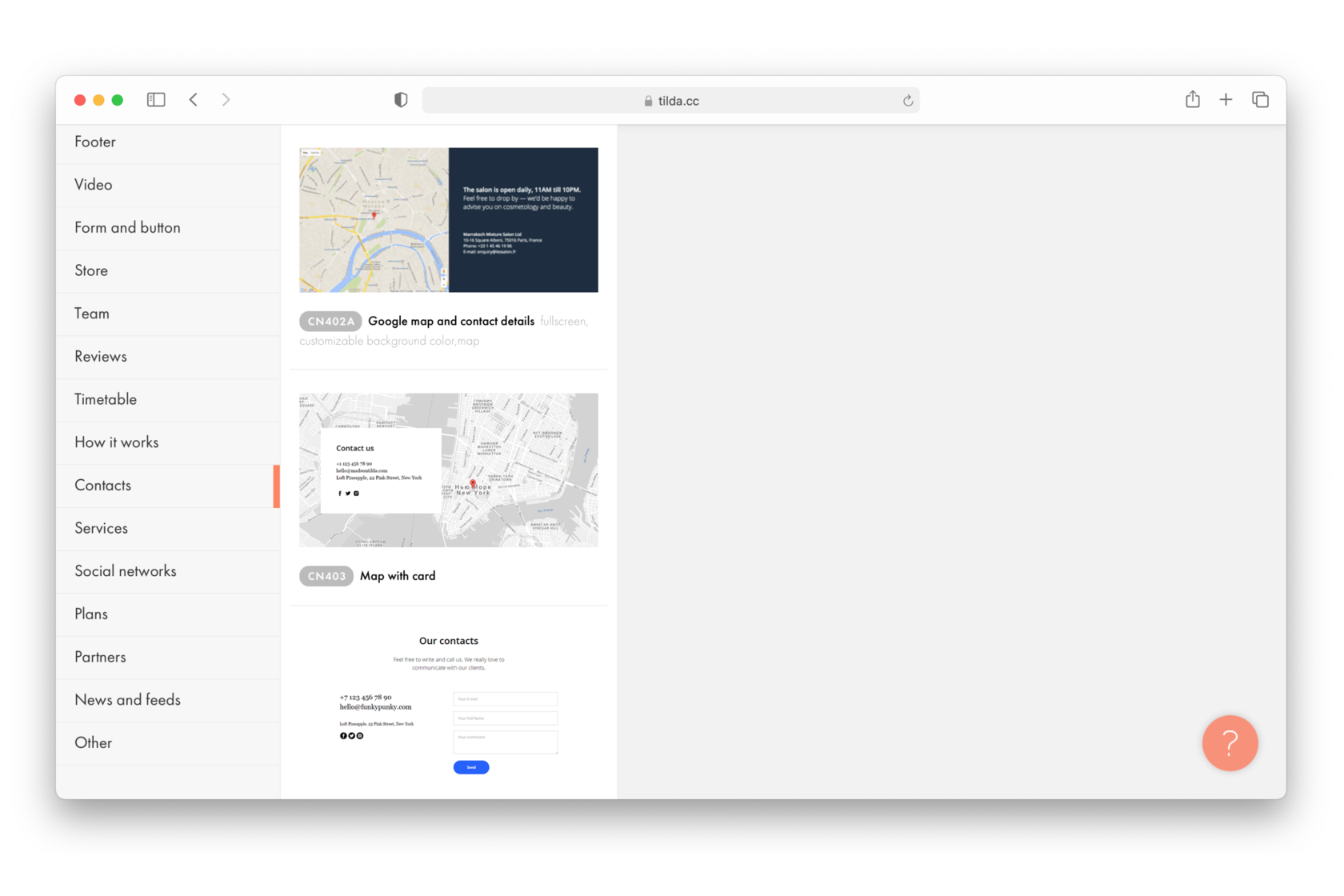
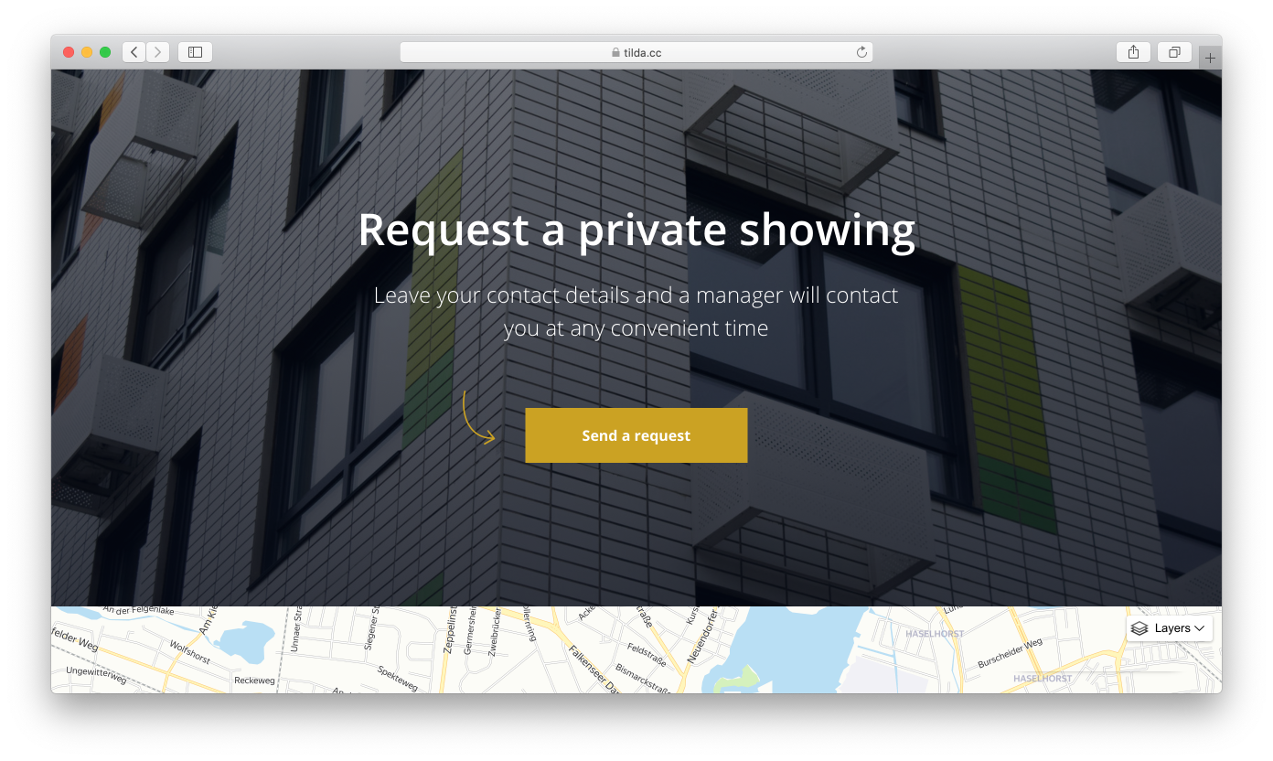
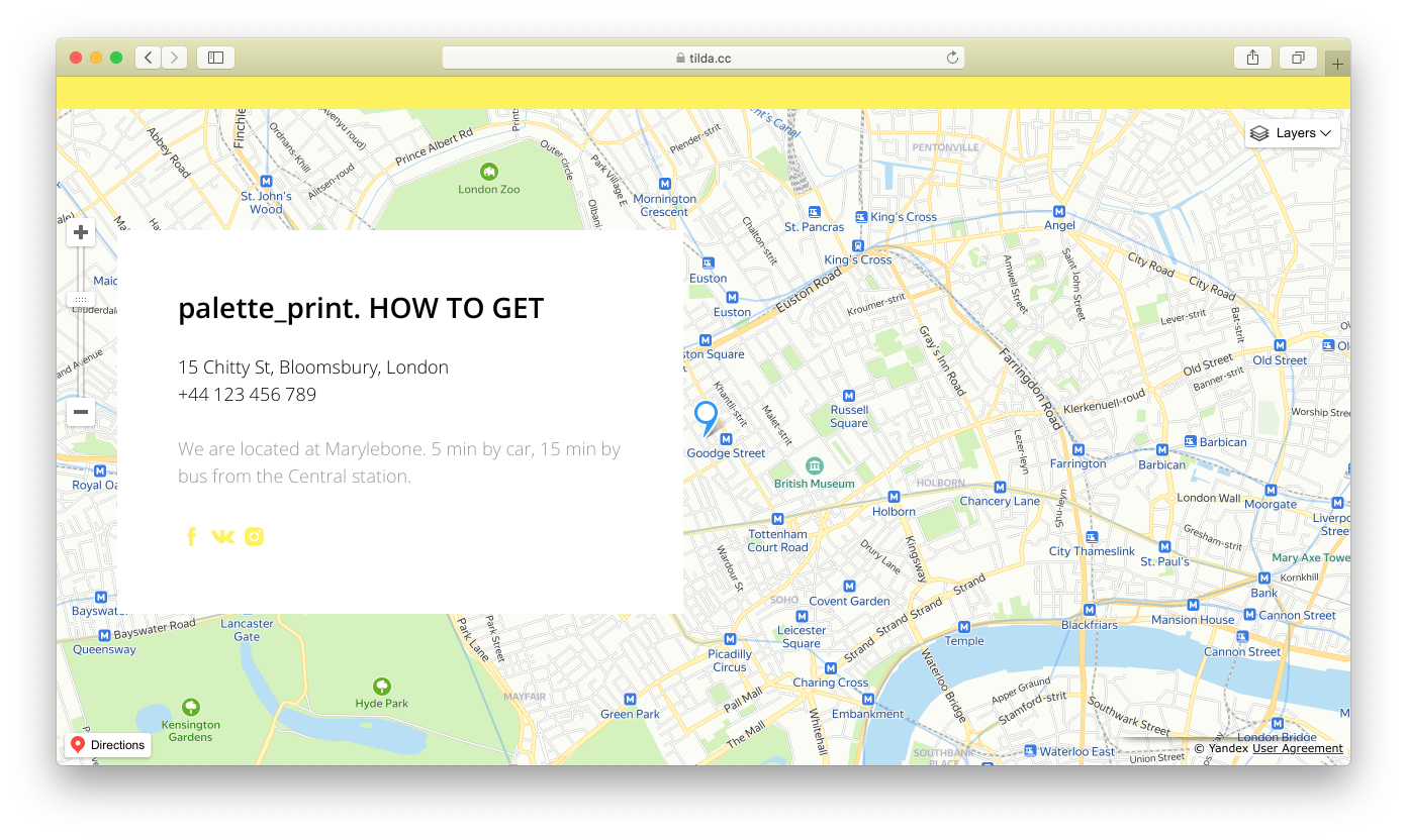
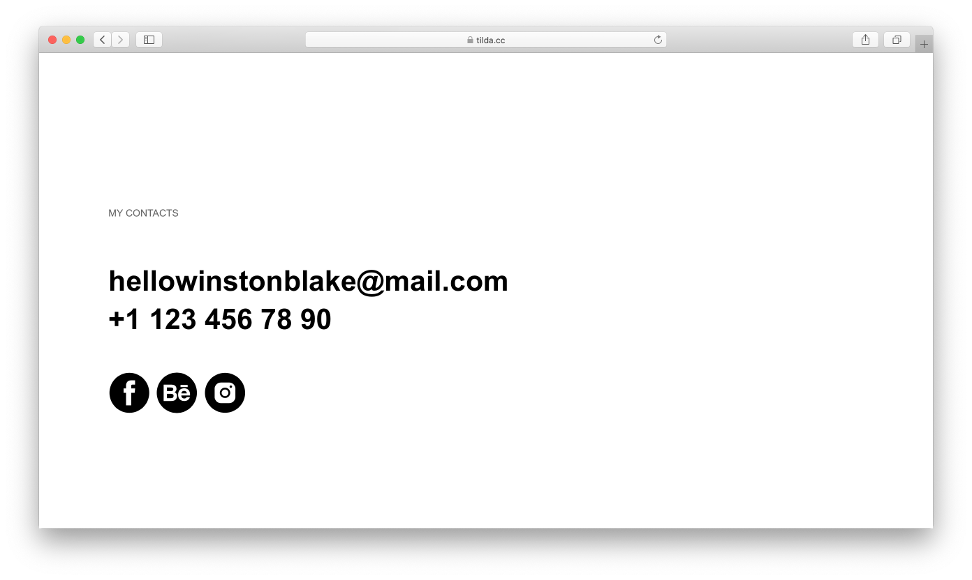
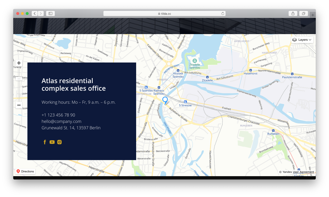
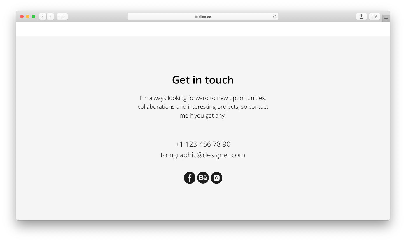
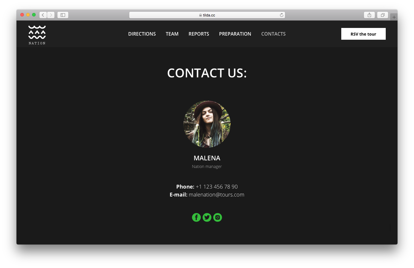
Contacts
The contacts block is usually the last one on a landing page.
Contacts can include your business address, email, phone number, map, links to social media, and photos.
The “Contacts” block category in the Tilda Library.
A map is usually accompanied by detailed directions (i.e., how to get there by car or on foot).
Examples of contacts:
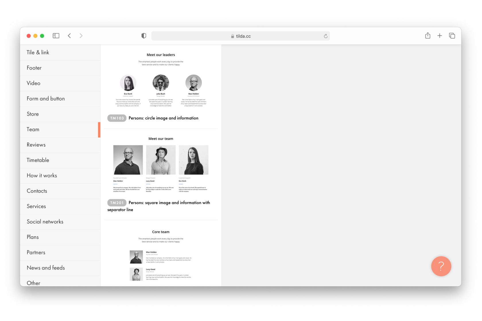
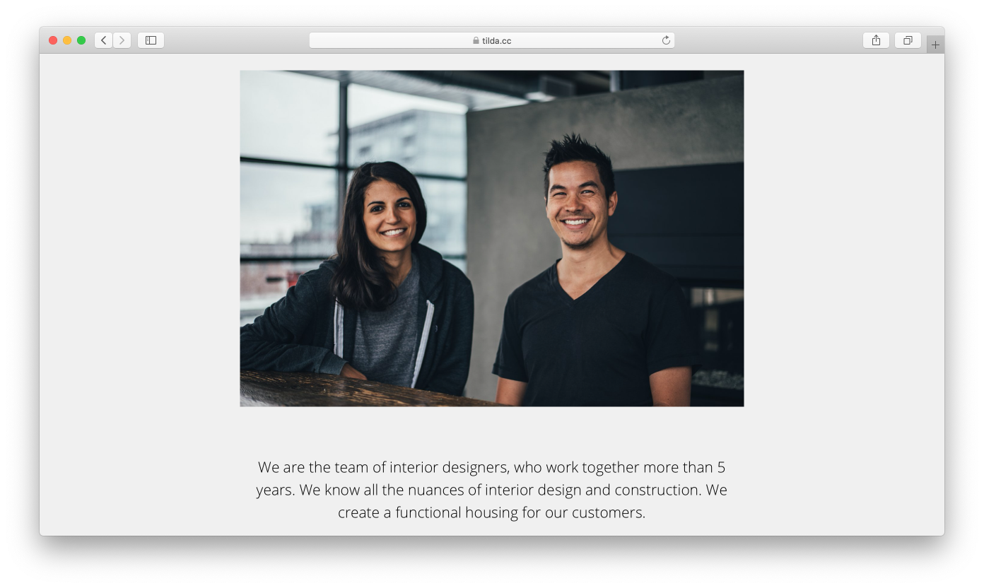
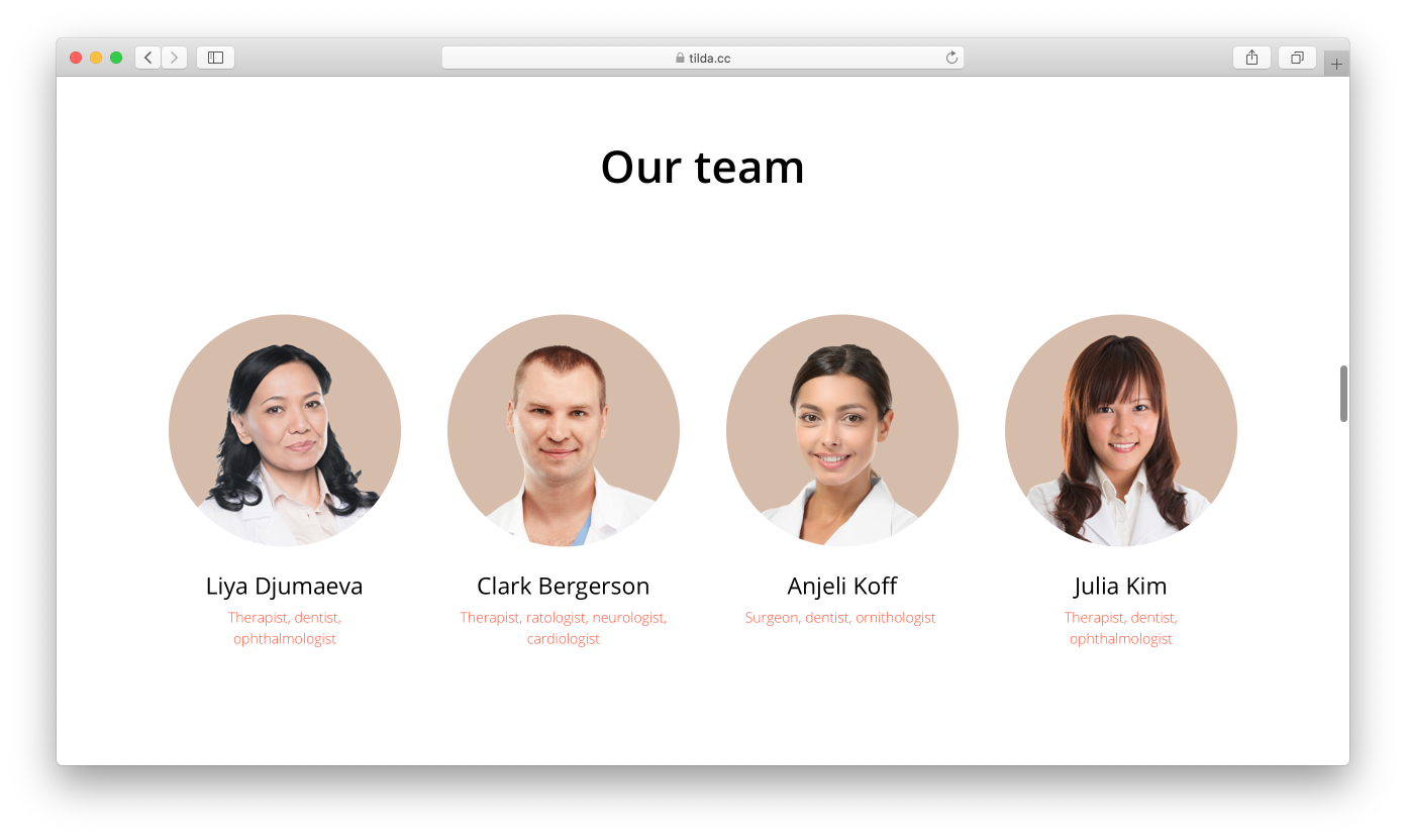
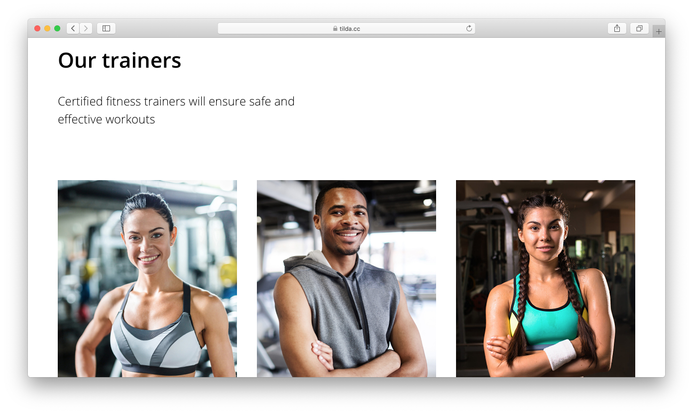
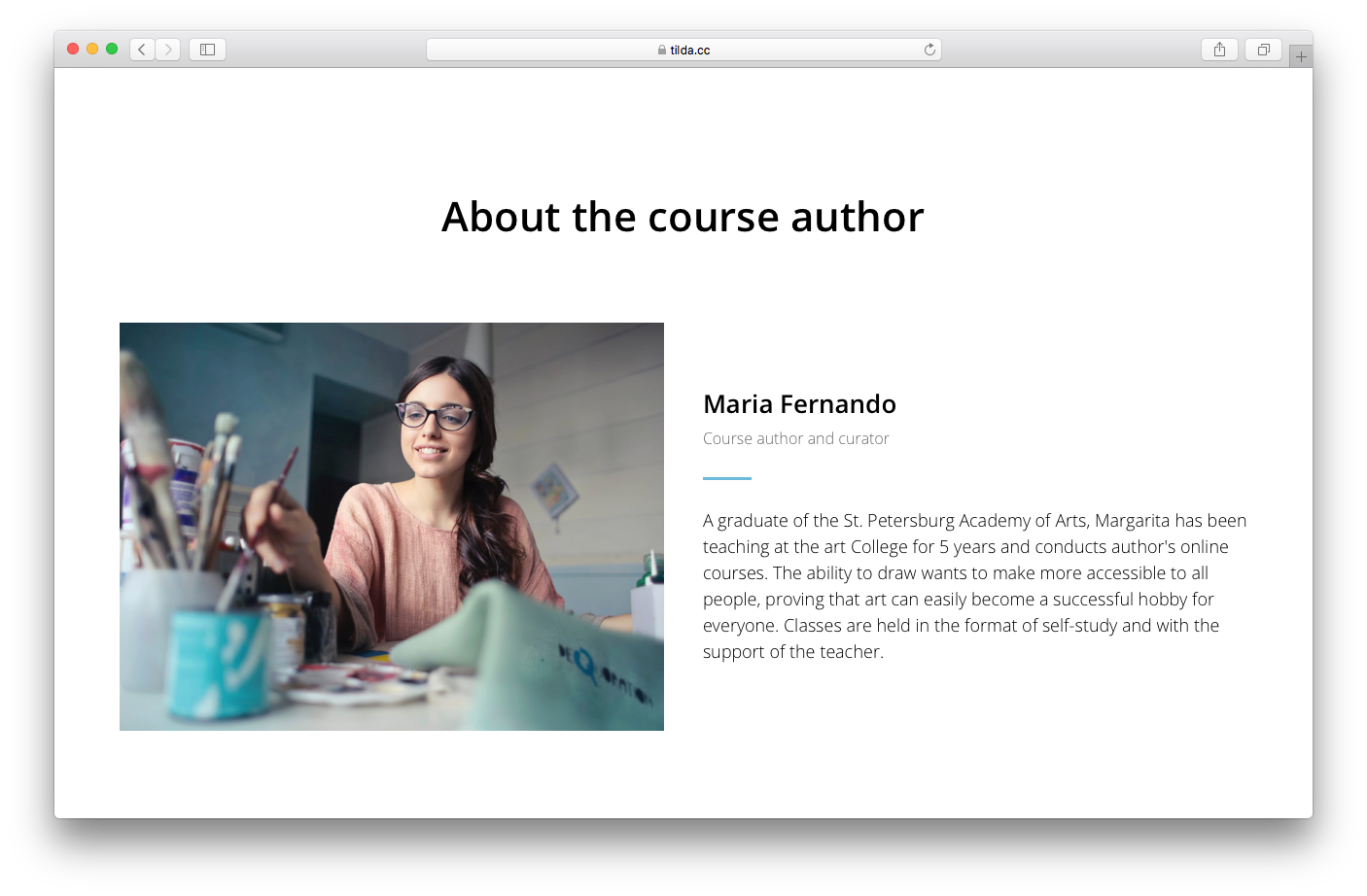
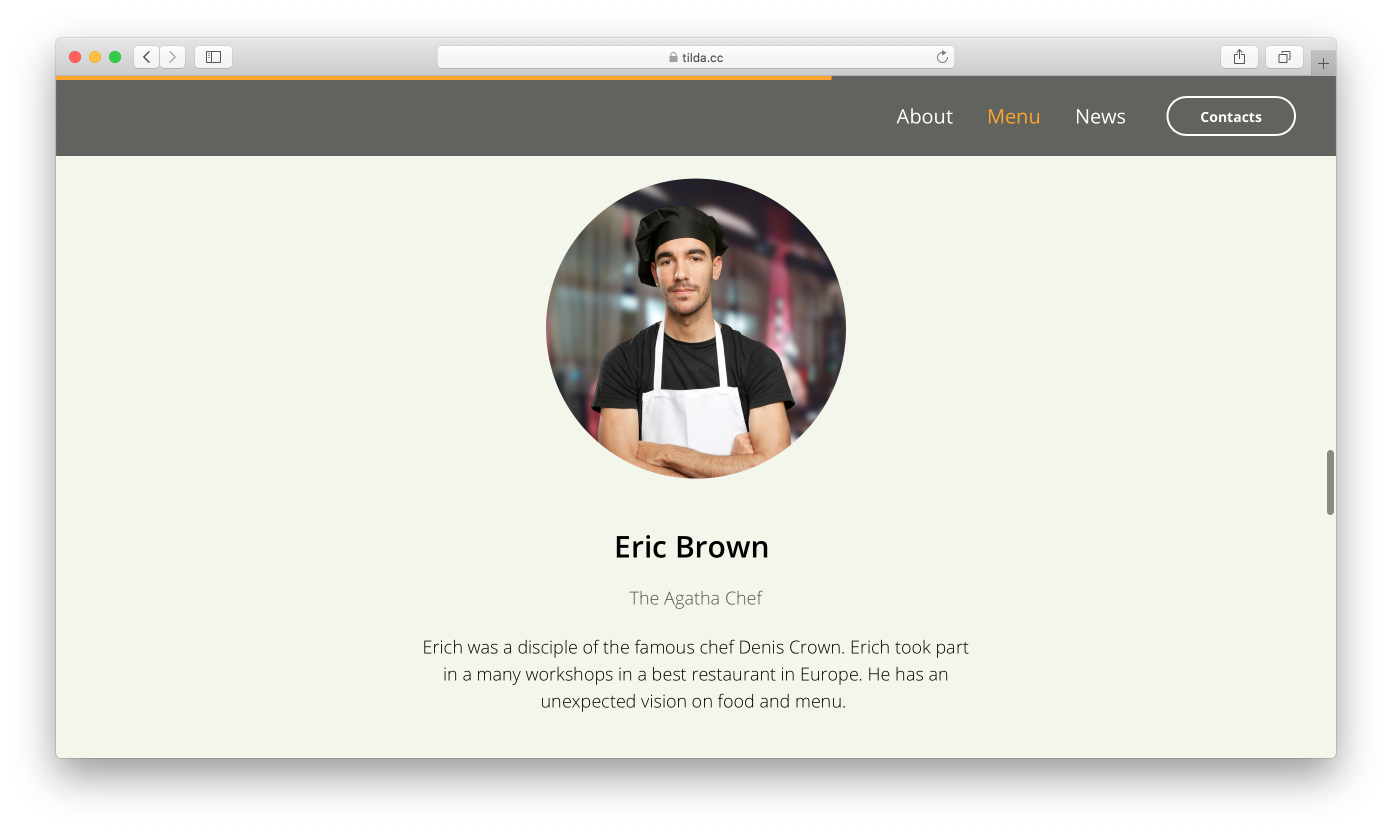
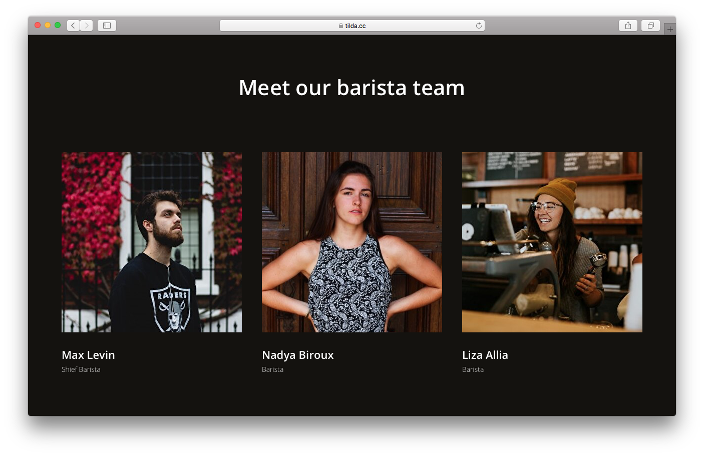
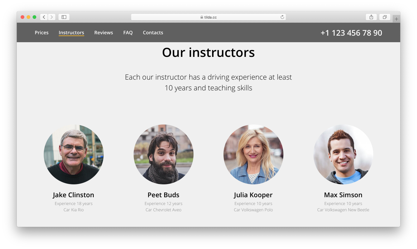
Team
People trust someone they know. It's always nice to remember that even a single photo makes a difference.
The format is simple: a team member's photo, their name, role in the company, and sometimes even a quote.
The “Team” block category in the Tilda Library.
It's best if the visual style of the headshots matches the overall landing page style. Also, consider the sphere of your business when choosing a style: Photos taken during expeditions may be appropriate for a travel guide, while doctors should opt for a more professional, neutral background.
Don't worry if you are the only person on the team. Feel free to tell a bit more about yourself.
Examples of teams:
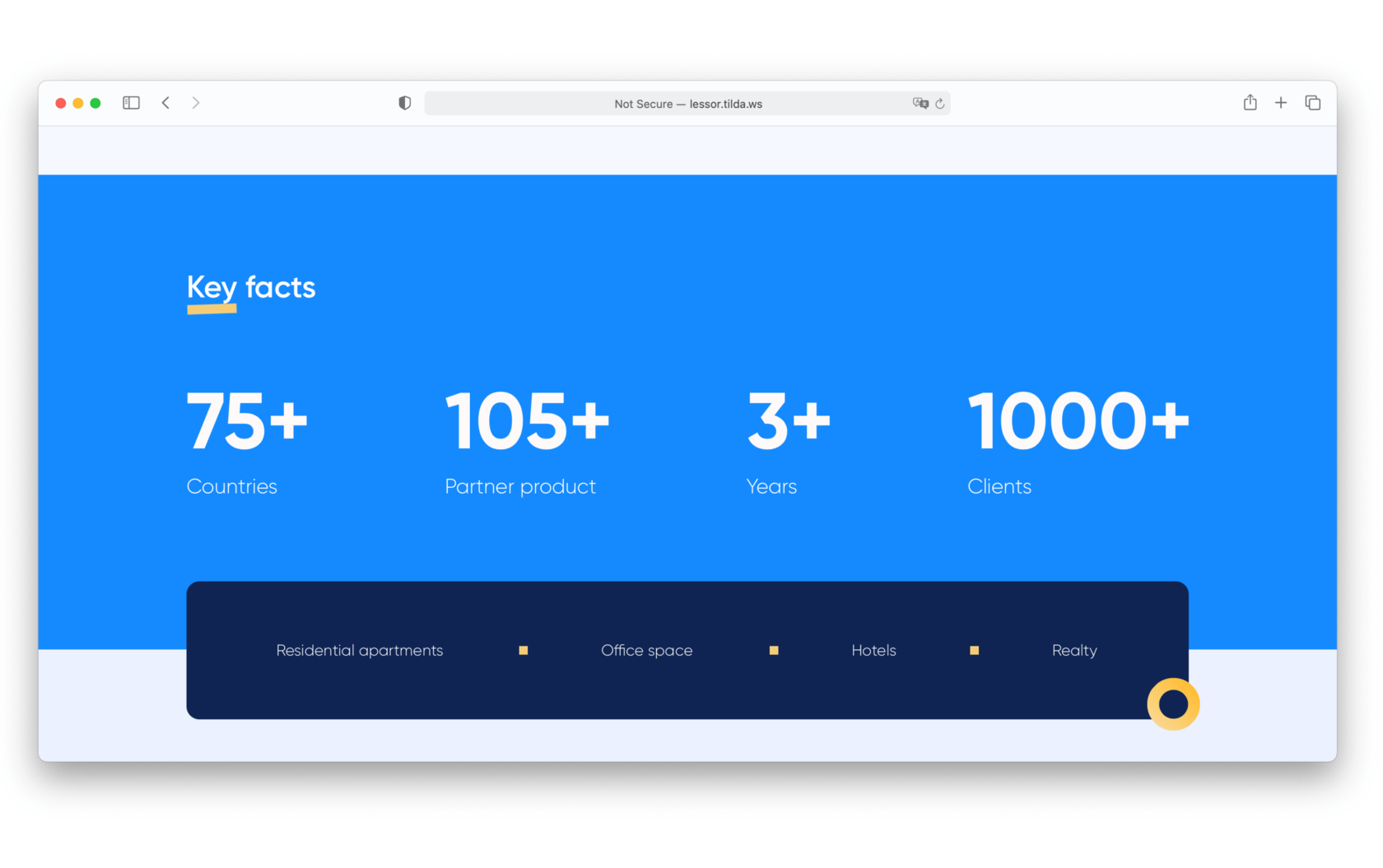
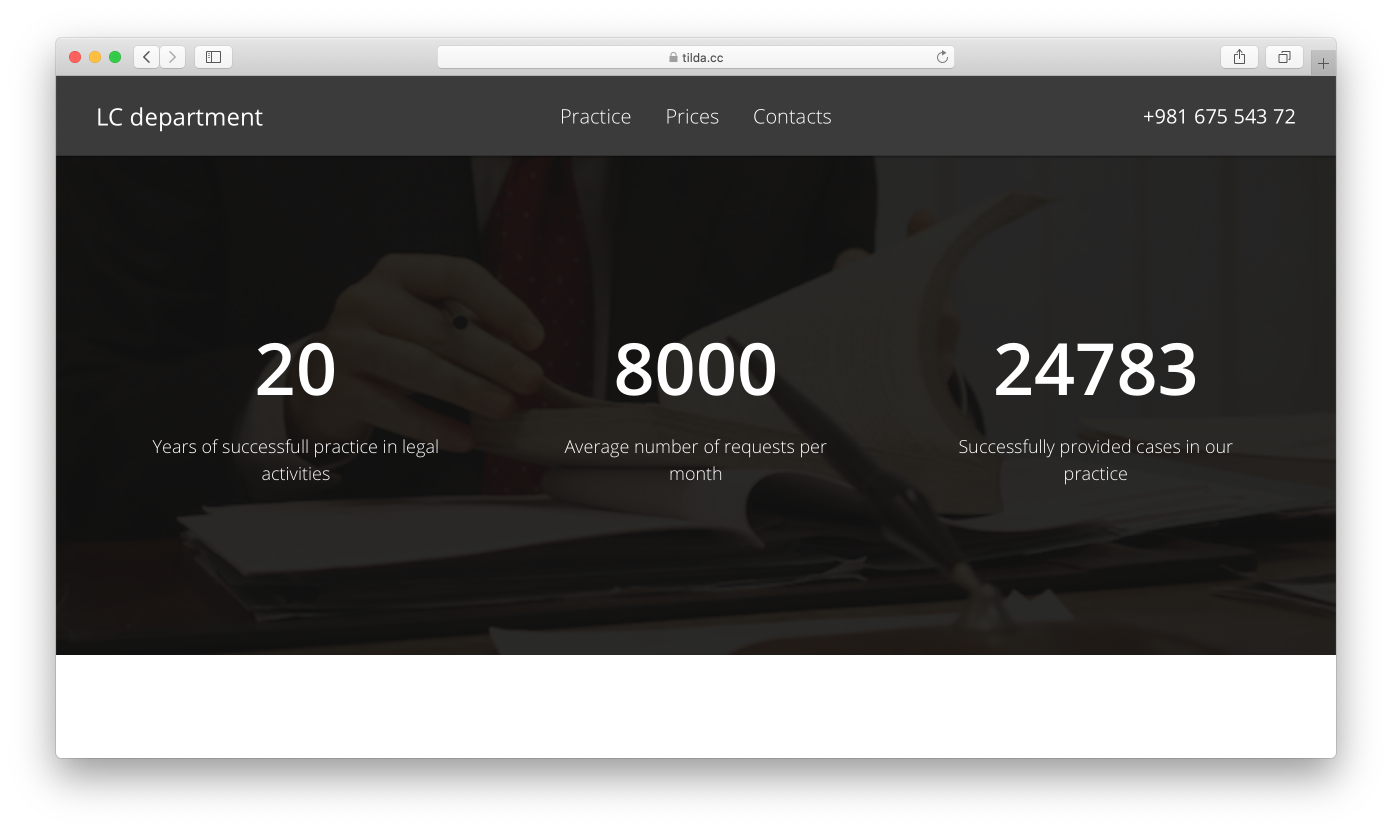
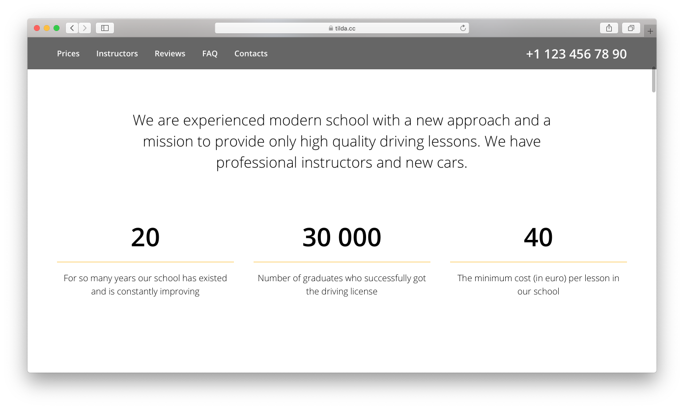
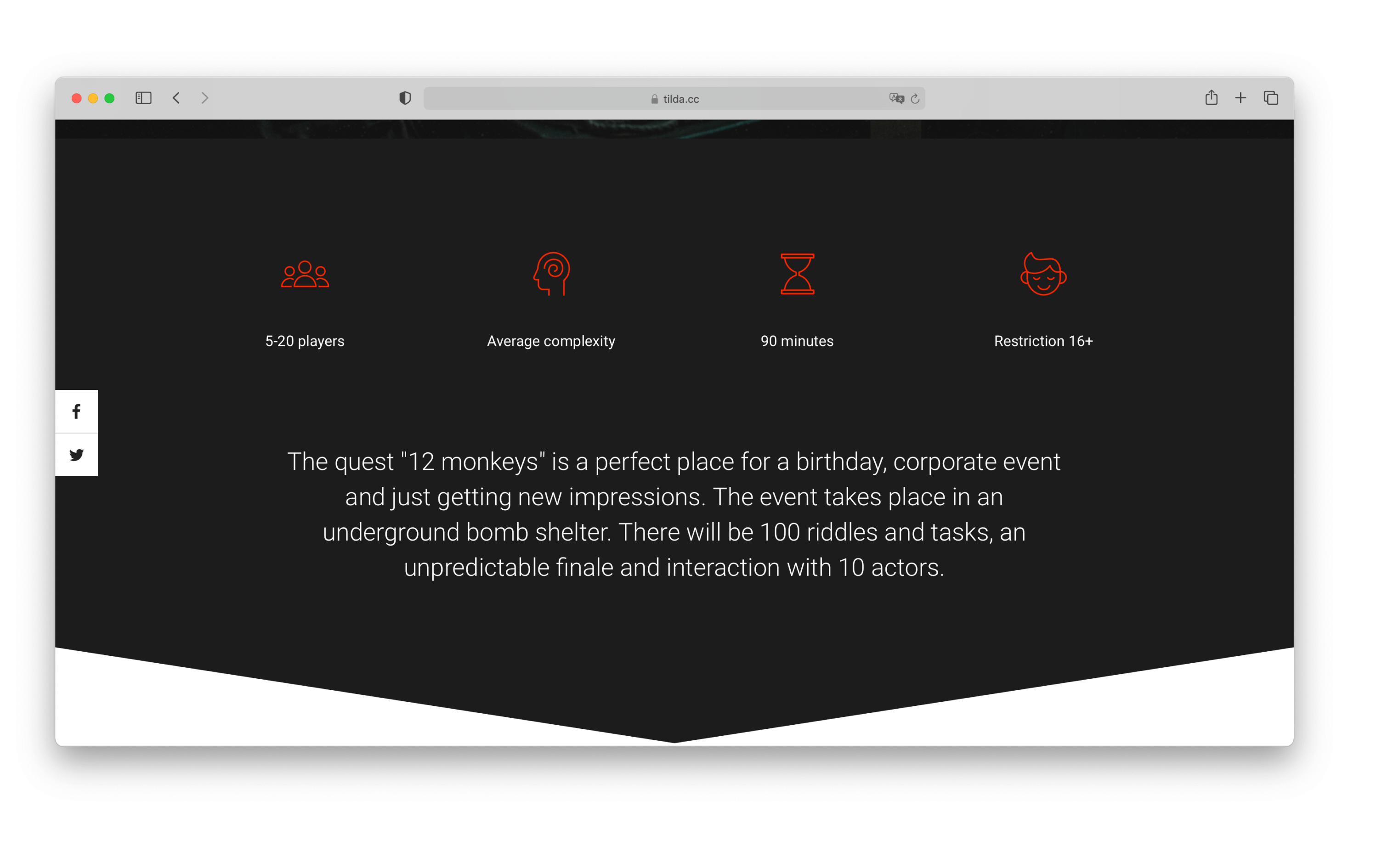
Facts and figures
Why do numbers work so well? They are easy to understand and often attract attention, as our brain is always looking for something familiar and simple.
It's best to use 3 to 4 figures with a short description for each one.
Blocks that help present figures can be found in the “Features” category.
Figures should clearly outline key facts about your business. It's not obvious to everyone what every figure means. For example, "Our company has 6000 employees," is an easily interpretable statement: it means the company is quite big. However, "Last year we sold 3000 gift sets" is a much more ambiguous use of figures, and it isn't immediately clear whether the company is doing well or is in fact on the verge of bankruptcy.
Examples of facts and figures:
lessor.tilda.ws
List of key features
This block is a variation of advantages and benefits. However, its format is different. While benefits and advantages are 3-4 bullet points with icons and images, the list of key features is exactly what it sounds like, a list. For example, 5 reasons to book our cover band, the reasons our backpack is a hiking essential, working with us means, etc.
Examples of key feature lists:
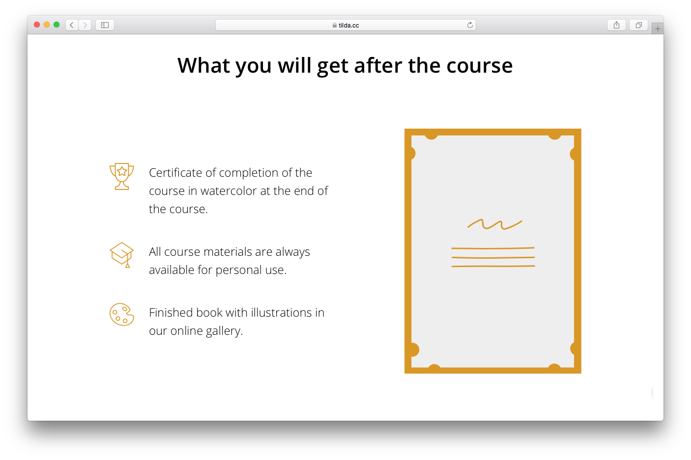
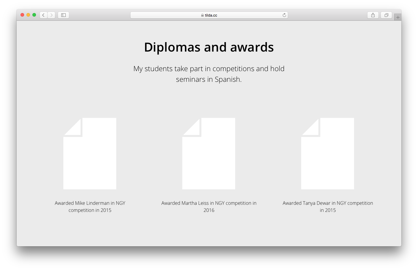
Certificates and commendations
Professional certificates or commendations work to increase trust in your product or service. In some areas, such as education, law, or medicine they are not only useful but also essential.
Another type of certificate is a certificate that you present to your clients, for example, upon completing an online course. Show the certificate sample and explain how it will strengthen their CV and why it will be useful in the future.
Examples of certificates and commendations:
Case studies and client success stories
These are essentially your business case studies, or your clients' stories showcasing how your product, courses, or event contributed to their success.
For case studies, describe how you were able to successfully solve your clients' problems. Select several cases and show what solutions you came up with and how you tailored them to your clients' needs. If all your projects are similar and follow the same pattern, it would make sense to create a "what we do" section and describe your workflow roadmap for your clients. Likewise, you could divide your case studies into two blocks. If your success stories can be presented visually, use the "before/after" block.
Suppose you are an interior designer. In your case studies section, you could show "before/after" photos of home interiors and provide a short description of the tasks you were given. In the "what we do" block, you could share the process of the blueprint development and approval, and expand on working with clients and contractors.
Examples of case studies:
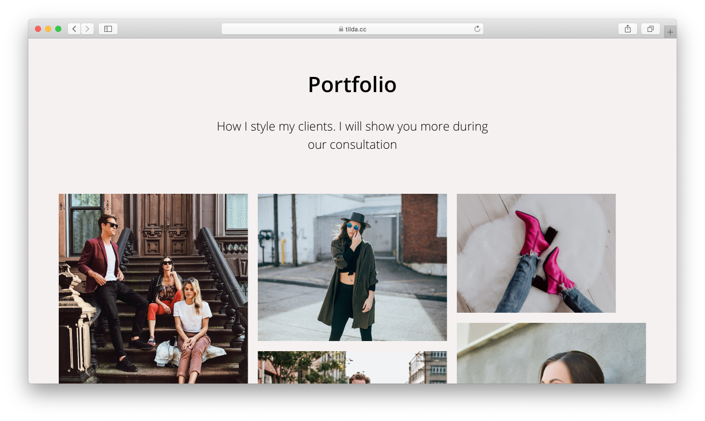
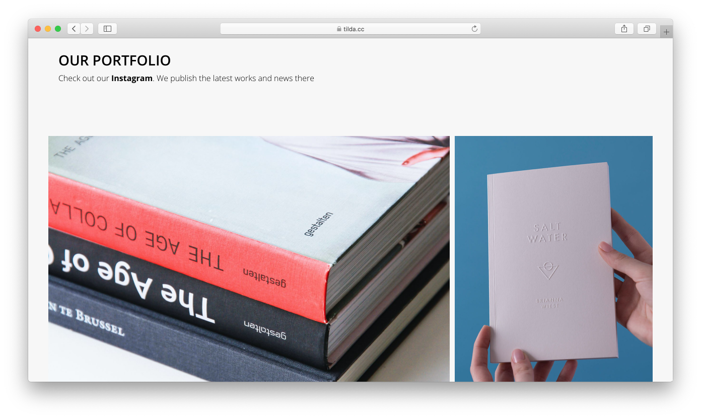
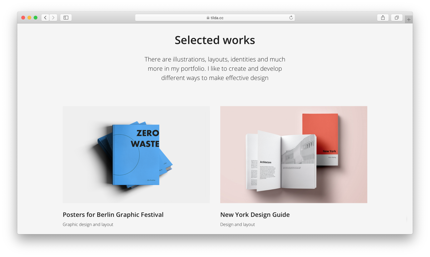
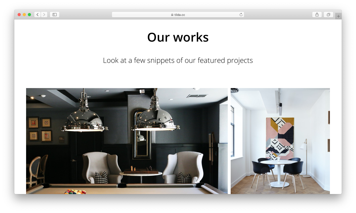
Portfolio
The projects featured on a landing page are usually a selection of your best work. Let the visitors see the details on other pages of your website.
Examples of portfolios:
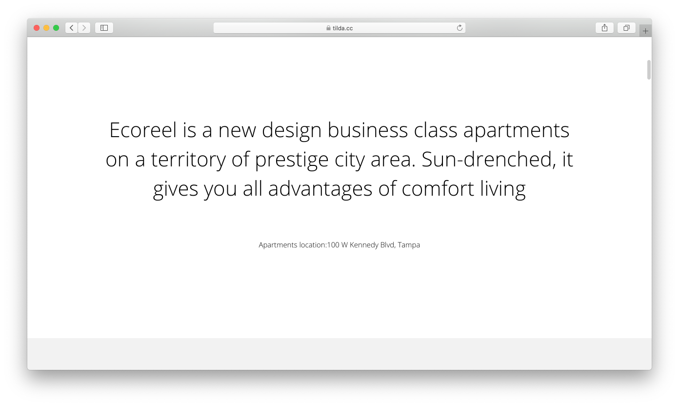
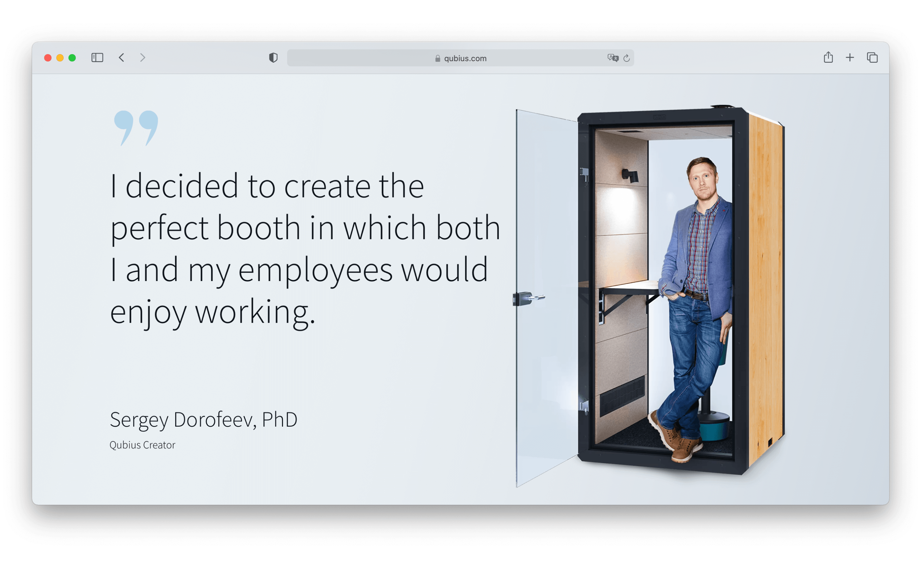
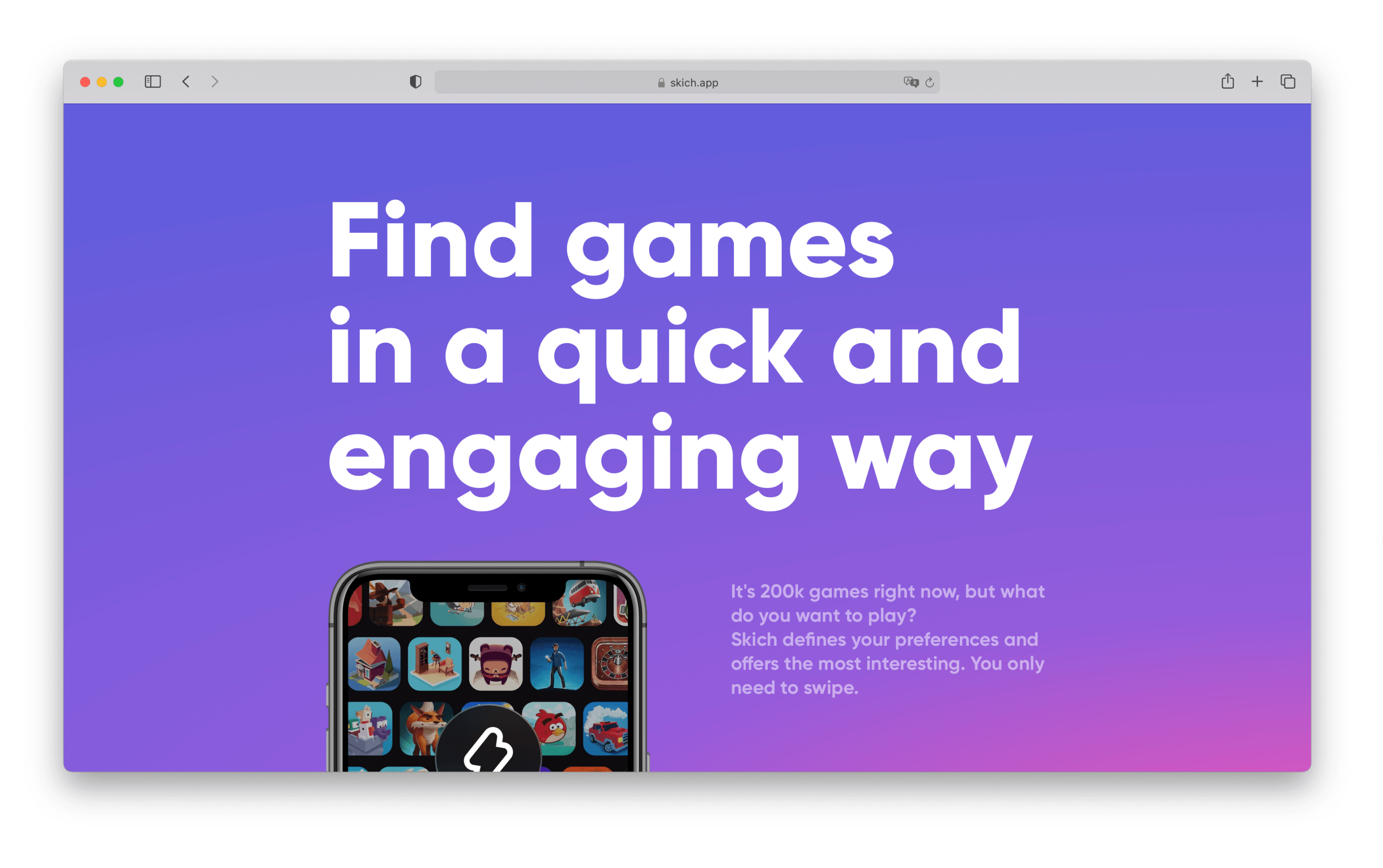
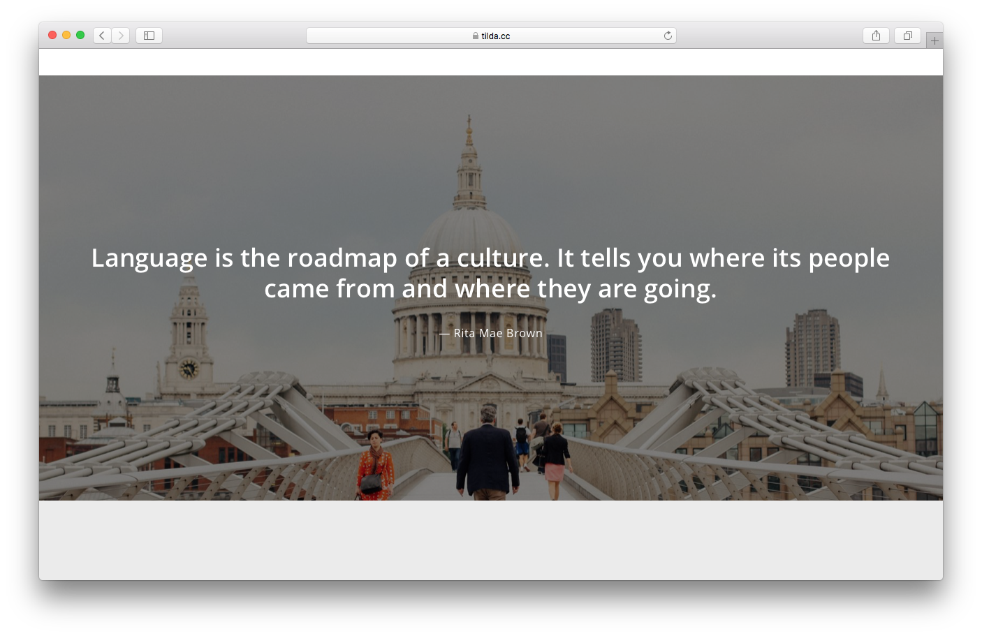
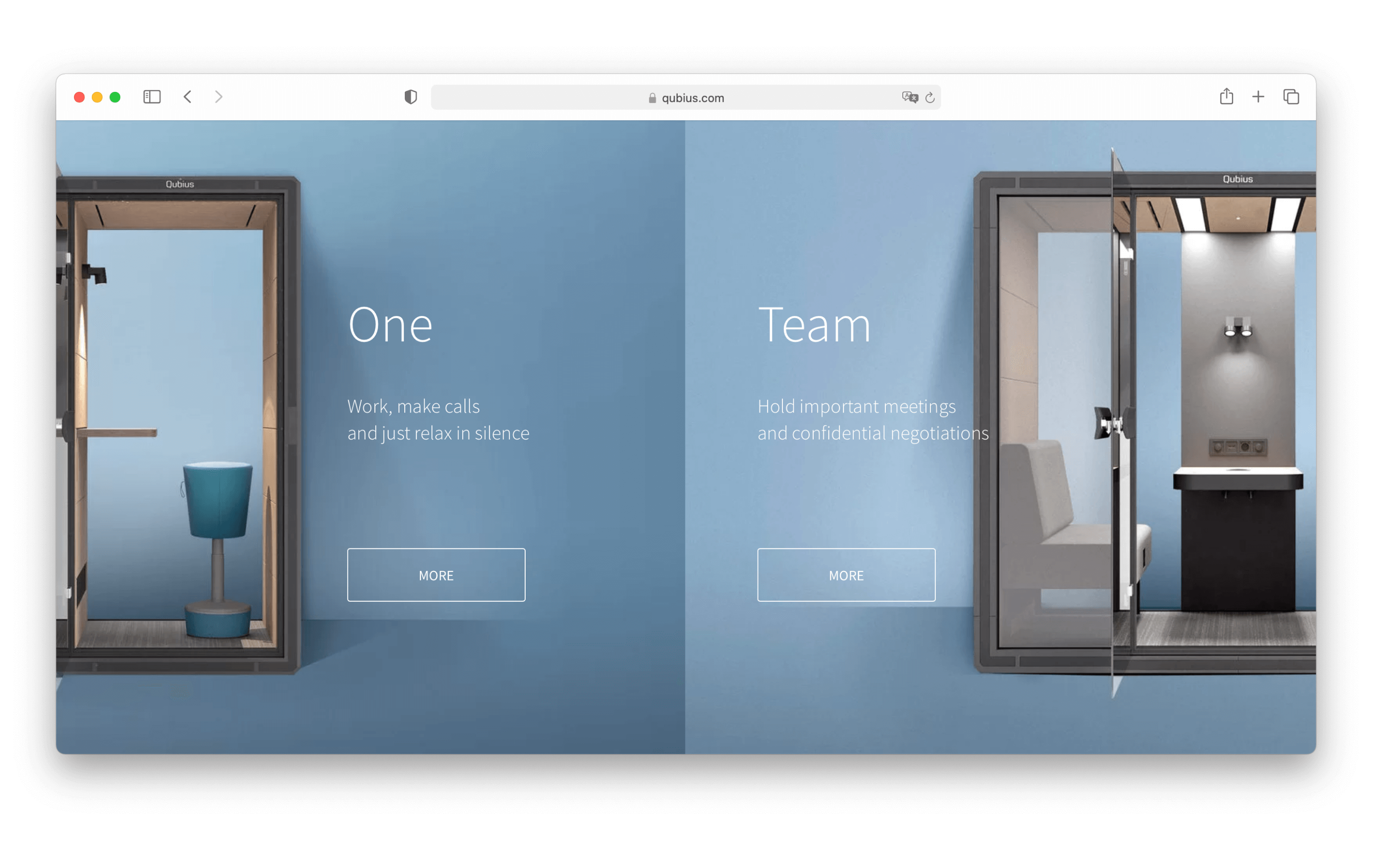
Inspirational quote
A motivational phrase or inspirational quote against the backdrop of a stunning video, photo, or color triggers an emotional response to your website.
This allows for a break from the blocks filled with numbers and makes your landing page less formal.
Examples of inspirational quotes:
qubius.com
skich.app
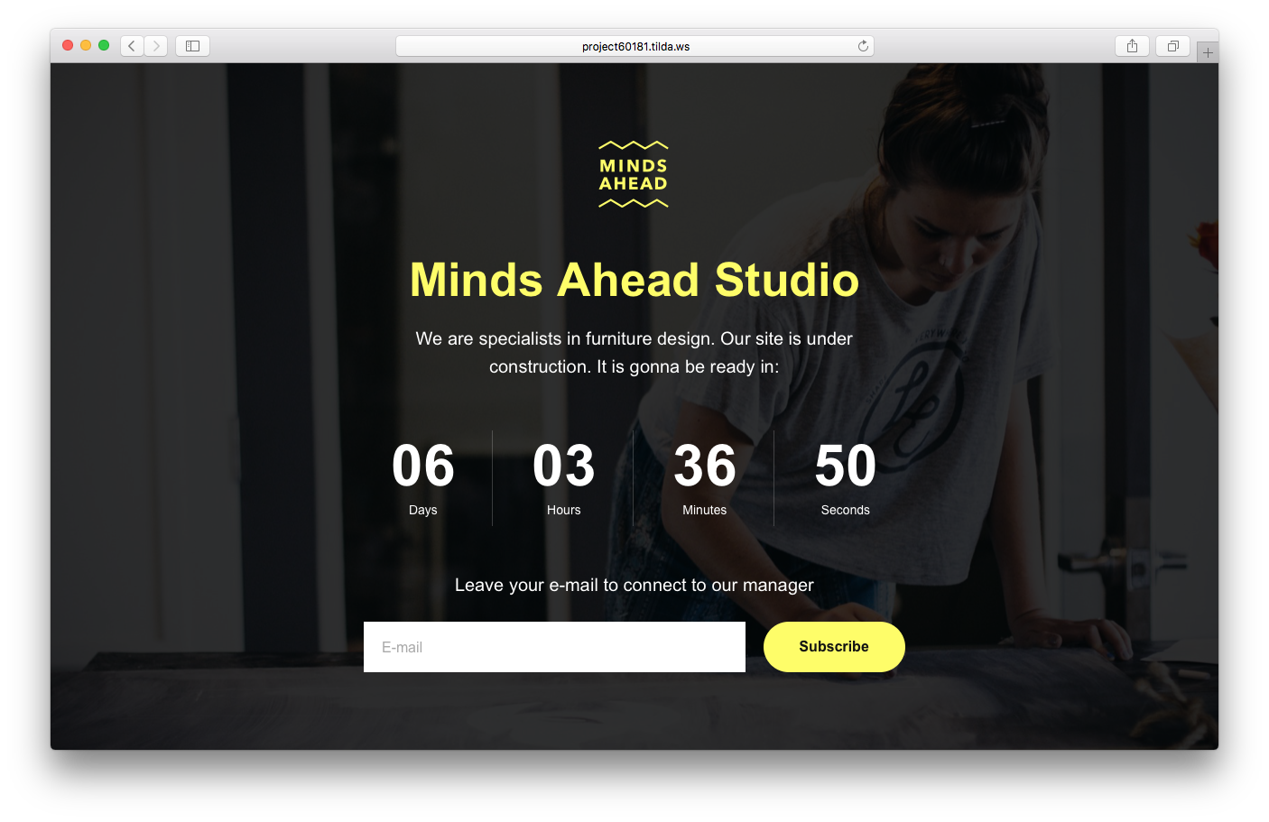
Countdown timer
A countdown timer highlight upcoming events or deadlines on your website. Its main purpose is to motivate a potential customer to make their choice quicker.
Countdowns can display time as well as quantity.
The timer (countdown) blocks can be found under the "Cover" category.
If the event has both a registration deadline and limited capacity, the countdown serves both a motivational and informative purpose. Thus, its presence on the landing page is fully justified.
There are also fake countdowns urging you to "hurry up and get a discount until the end of April," "limited edition," "last hours to get 50% off," etc. These are obvious marketing techniques that reduce the credibility of your brand and make your offering less attractive overall.
Countdowns can also inform customers about an upcoming launch of a new product. If the product is not yet available but you want to start building up a potential customer base, you can create a landing page that contains only a submit form and a countdown.
Example of countdown:
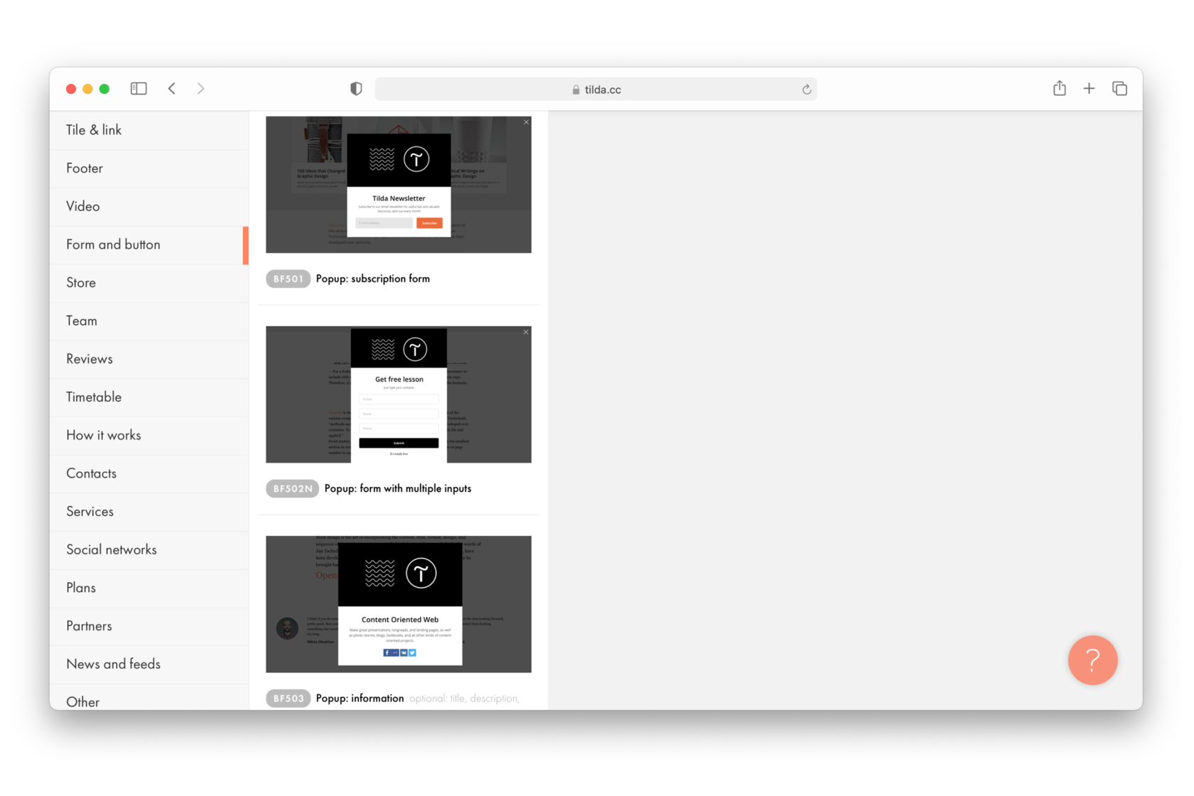
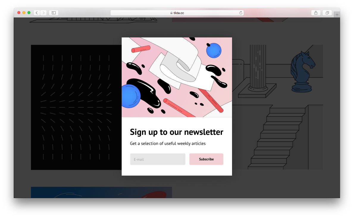
Pop-up windows
Pop-ups are used to convey information about promotions or invitations to subscribe to the newsletter.
You can find pop-ups in the "Form and button" category.
Pop-ups can also appear as a result of a specific action taken by the visitor. These can include: clicking a button, moving the mouse towards the "close page" icon, or scrolling down to a certain point on the page. Likewise, they can also appear automatically after a certain period of time.
Examples of pop-up windows:
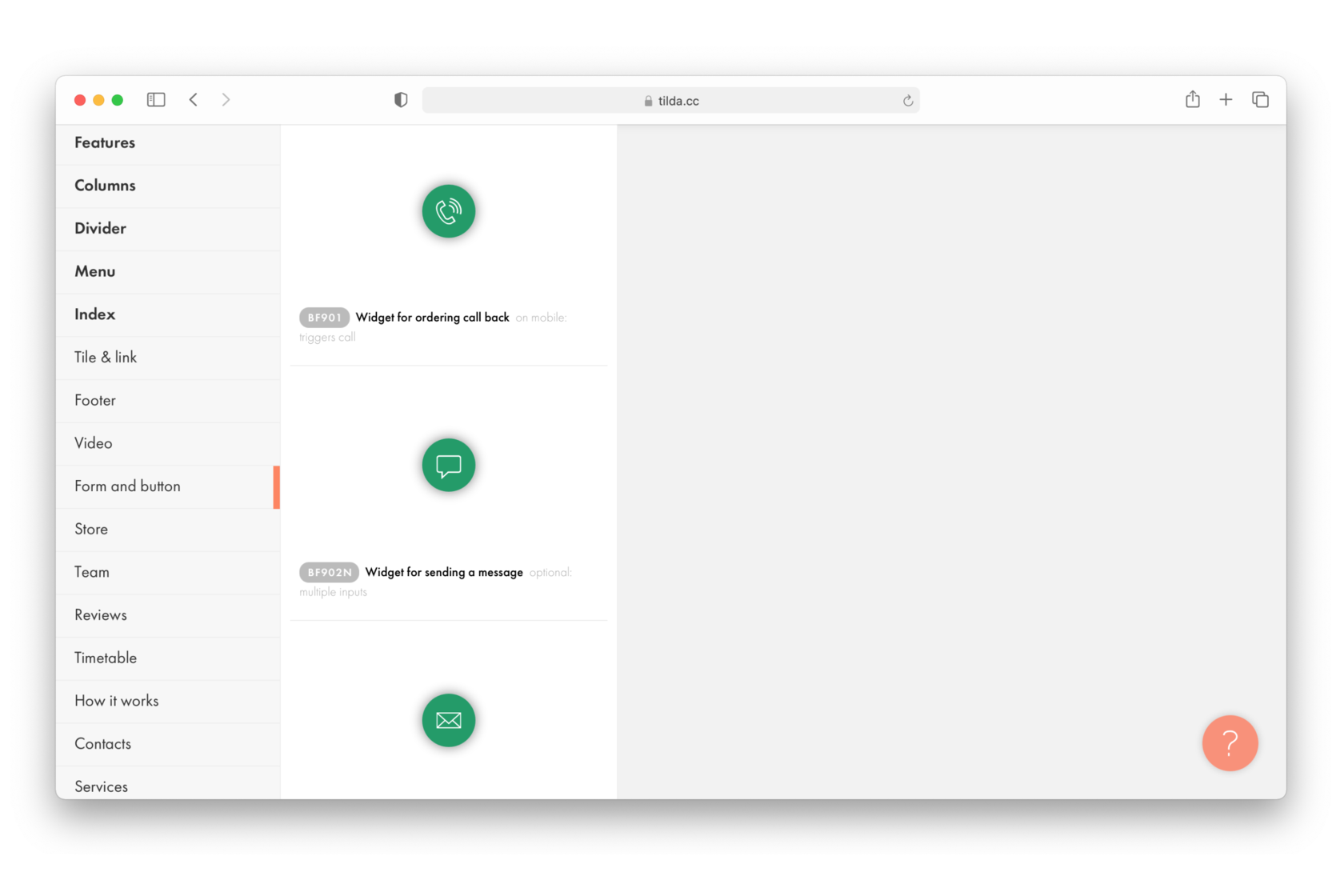
Widgets
"Get-in-touch" widgets increase user engagement. The easier it is for someone to contact you, the more likely they will actually reach out to you.
Widgets are usually located in the lower right corner of the page and open up into a chat, or a form suggesting to send a message or leave your phone number.
Contact widgets can be found under the "Form and button" category.
A chat or call window is in itself a rather annoying element on the page. That is why you shouldn't make it worse by adding animated icons or stock photos of consultants ready to take your call.
Examples of widgets:
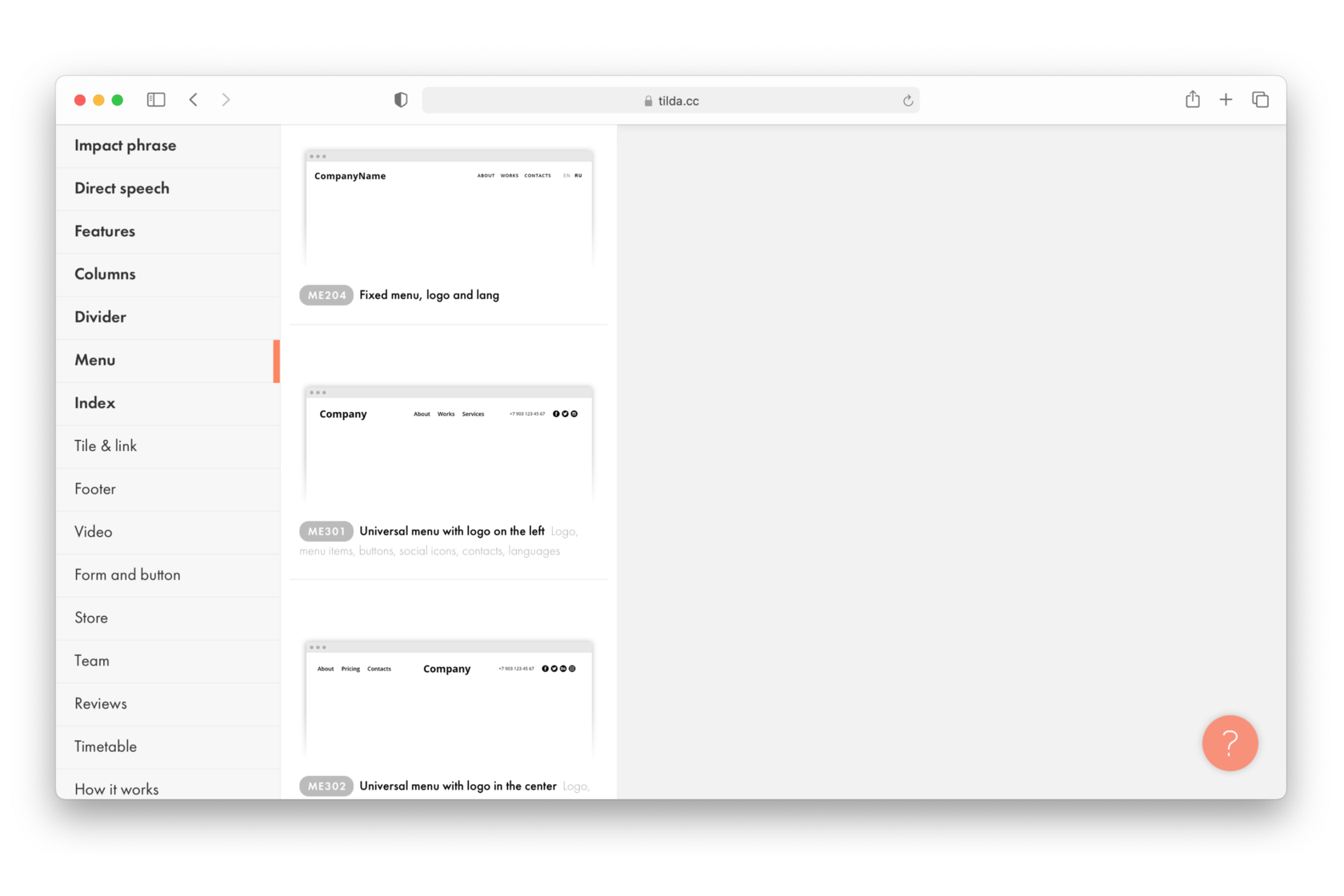
Menu
If you have a long page you could add a fixed navigation menu with hyperlinks to the main sections of the website along with a call-to-action button.
Another way to help your visitors navigate the website is to add a side navigation menu. The sidebar is less distracting and allows visitors to quickly jump to any part of the website.
The "Menu" category offers a wide range of layouts.
A common problem with navigation menus is that they are often overloaded and instead of helping the user, they distract them from the content. To avoid this, make sure to include no more than 5-7 items in short words. The menu is there as a support element, what matters is the content.
Menu examples:
The menu could also take the form of tiles & links: this way, you first show the complete list of items and then let your visitors see the details on click or on hover. For example, if your landing page is about job opportunities, first, list all of them with hyperlinks to each one (make sure the opportunities can be found further down the page), and then provide a detailed description of each one.
Navigation examples featuring tiles:
qubius.com
muylocal.es
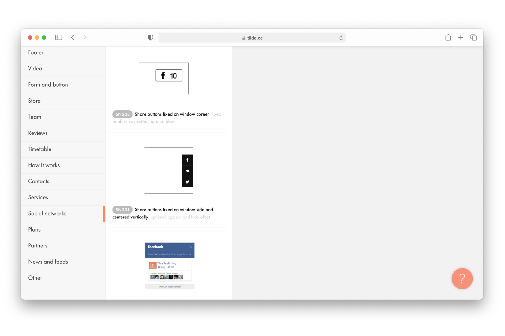
Social media buttons
There are two types of such buttons: direct links to social media profiles and share buttons.
Buttons can be added as a separate block or can be included in the navigation menu, or footer, appear in a pop-up, or be found in the contacts section.
A set of social media blocks in the Tilda Library.
Strictly speaking, social media buttons distract users from the main purpose of a landing page (unless the purpose of your landing page is to grow your Facebook group). At the same time, a large number of followers and likes (about 100 people for a landing page) tend to inspire trust. Most people are very selective about what they share on social media so if a page has a lot of shares, it's worth checking it out.
Examples of social media buttons:
Now you know what makes up a landing page and can decide which features you find most useful for your projects. Bear in mind that you don't have to use them in the same order as they appear in this chapter. Design is a narrative, so make sure your landing page provides a consistent narrative about your project.
Homework
1
Explore the Tilda Block Library.
2
Make a list of the most suitable blocks for your landing page.
3
Decide which navigation elements you will use.
4
Take your personas through your prototype and make a note of where it would be best to put the call-to-action blocks.
Did you enjoy this chapter? Share it with friends!
Text: Nikita Obukhov, Masha Belaya, Ira Smirnova Illustrations and design: Julia Zass

 Course
Landing Page Course
Course
Landing Page Course
 3. Landing Page Anatomy: Functional ElementsChapters