Журнал Тильды
/
Библиотека промптов
/
Заголовок и 4 динамические фигуры-графика с иконкой, фактом и описанием
Заголовок и 4 динамические фигуры-графика с иконкой, фактом и описанием
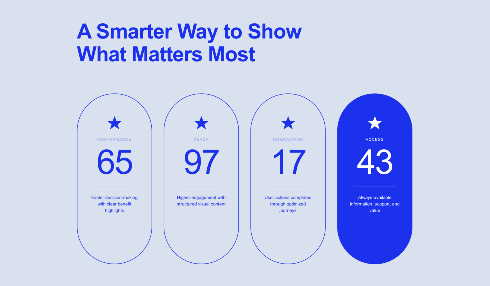
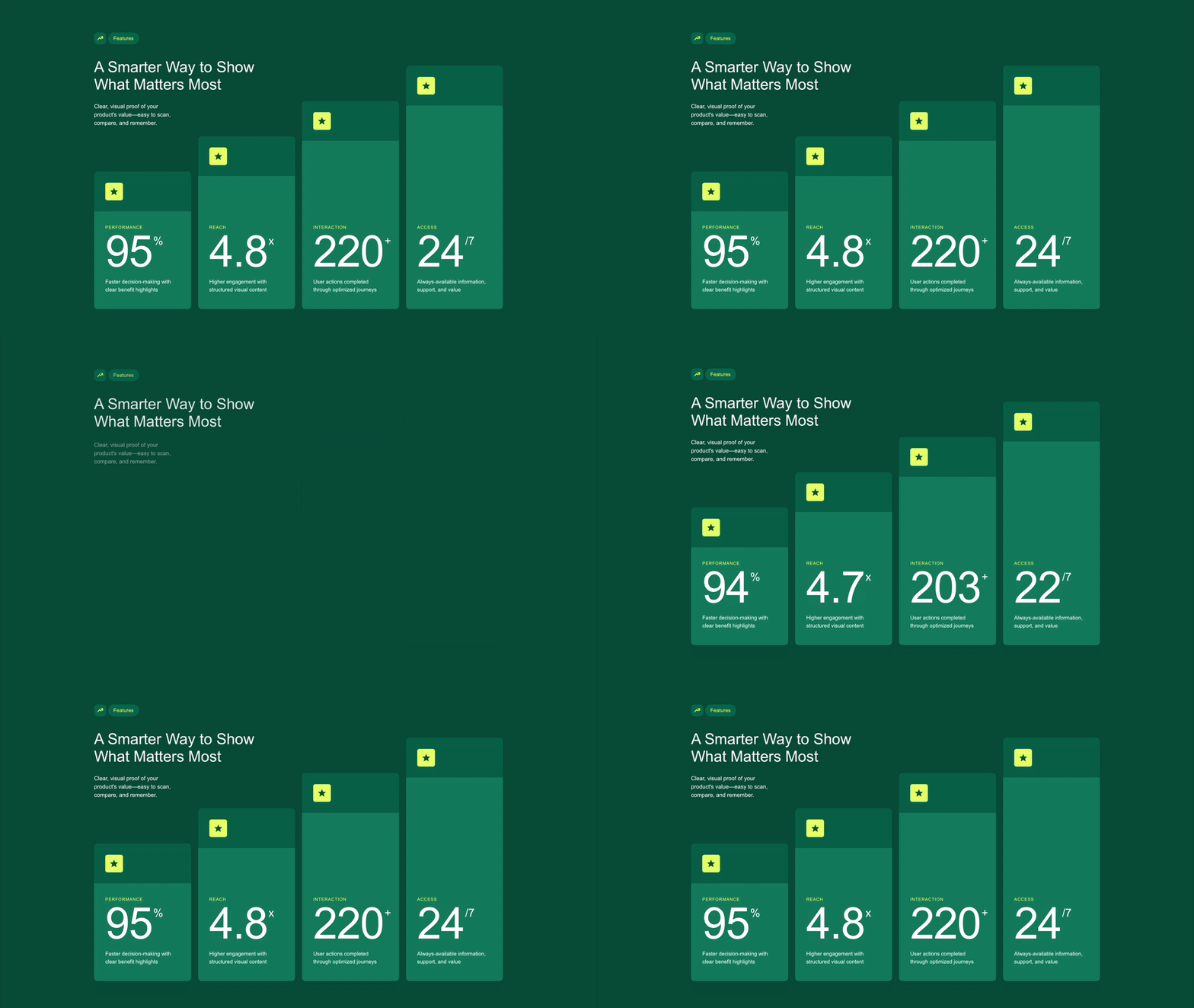
Ключевые цифры в карточках-ступенях: при появлении числа отсчитываются от нуля, а при наведении карточка приподнимается и выделяется среди остальных.
Промпт
Вы можете скопировать промпт и вставить его в вайб блок в поле ввода. Подробнее в инструкции.
Создай 4 карточки метрик ступенями.
Контент в HTML: карточки, тексты/числа/суффиксы data-tilda-edit="y", иконки inline SVG. Без генерации контента через JS/массивы/innerHTML/canvas. JS лишь анимирует элементы; целевые числа читает из редактируемых span. В редакторе конечные числа и все тексты доступны для правок, эффекты/перехват кликов отключены.
Фон #004B3D, Arial, контейнер max-width:1200px центр, padding:120px 20px 100px. Сверху слева метка: квадрат 34px, radius:10px, фон #006657, внутри лаймовая SVG-стрелка роста 18px; рядом через 6px капсула «Features», высота 34px, padding:0 15px, фон #006657, текст #E5FF63 14px.
Через 40px белый заголовок «A Smarter Way to Show
What Matters Most»: 43px regular/1.17, max-width:520px. Через 26px описание «Clear, visual proof of your
product's value—easy to scan,
compare, and remember.»: 16px/1.5, #F3FFF8, max-width:250px.
Десктоп: ряд flex:1, gap:20px, низ на одной линии. Высоты 390/490/590/690px. Ряд margin-top:-175px: высокие правые карточки рядом с вводным текстом. Radius:10px, overflow:hidden.
Верхняя панель каждой высотой 113px, #006151; на top/left:32px лаймовый квадрат 50×50px #E9FF69, radius:6px, тёмно-зелёная звезда 26px.
Низ #087A66, flex-column, контент снизу, padding:0 32px 44px. Метка uppercase 12px, трекинг .1em, #E5FF63, margin-bottom:8px. Число белое 124px regular/.88, трекинг -.02em, tabular-nums. Суффикс справа 32px, margin:8px 0 0 3px. Описание через 20px, 15px/1.5 #F2FFF8, max-width:220px.
Метка | число | суффикс | описание:
Performance | 95 | % | Faster decision-making with clear benefit highlights
Reach | 4.8 | x | Higher engagement with structured visual content
Interaction | 220 | + | User actions completed through optimized journeys
Access | 24 | /7 | Always-available information, support, and value
При видимости 5% секции однократный вход: метка сразу, заголовок через 120ms, описание через 280ms; opacity 0→1, Y соответственно 14/22/16px→0, длительности 550/750/650ms. Карточки через 480+i*150ms: opacity 0→1, translateY(55px) scale(.96)→0/1 за 820ms cubic-bezier(.22,1,.36,1). Через 200ms — счёт 0→значение, rAF/easeOutExpo, duration=clamp(value*7,1200,1800)ms; у 4.8 один десятичный знак, остальные целые.
Hover >640px: карточка вверх на 12px, scale(1.012), остальные opacity:.55; звезда rotate(3deg) scale(1.06), число вверх 2px, переход 300ms. Уход сбрасывает. Параллакс за мышью: lerp .06, depth=.8+i*.5, X=mouseX*depth*5px, Y=mouseY*depth*3px; вводный текст X*2px/Y*1.5px.
≤960px: padding:80px 20px, до ряда 40px, margin-top:0. Высоты 310/390/470/550px, числа 80px, суффиксы 22px, описания 13px; верх 90px, иконка 42px, body padding:0 20px 28px.
≤640px: padding:60px 16px, заголовок 34px, карточки одной колонкой по 300px, gap:20px. Верх 80px, иконка 40px, body padding:0 24px 28px, числа 72px, суффиксы 20px, описание 13px с отступом 12px. Без hover/параллакса. ≤380px: заголовок 28px, числа 60px, суффиксы 17px.
Изолируй CSS/JS. Reduced-motion: конечные числа, без перемещений.
Контент в HTML: карточки, тексты/числа/суффиксы data-tilda-edit="y", иконки inline SVG. Без генерации контента через JS/массивы/innerHTML/canvas. JS лишь анимирует элементы; целевые числа читает из редактируемых span. В редакторе конечные числа и все тексты доступны для правок, эффекты/перехват кликов отключены.
Фон #004B3D, Arial, контейнер max-width:1200px центр, padding:120px 20px 100px. Сверху слева метка: квадрат 34px, radius:10px, фон #006657, внутри лаймовая SVG-стрелка роста 18px; рядом через 6px капсула «Features», высота 34px, padding:0 15px, фон #006657, текст #E5FF63 14px.
Через 40px белый заголовок «A Smarter Way to Show
What Matters Most»: 43px regular/1.17, max-width:520px. Через 26px описание «Clear, visual proof of your
product's value—easy to scan,
compare, and remember.»: 16px/1.5, #F3FFF8, max-width:250px.
Десктоп: ряд flex:1, gap:20px, низ на одной линии. Высоты 390/490/590/690px. Ряд margin-top:-175px: высокие правые карточки рядом с вводным текстом. Radius:10px, overflow:hidden.
Верхняя панель каждой высотой 113px, #006151; на top/left:32px лаймовый квадрат 50×50px #E9FF69, radius:6px, тёмно-зелёная звезда 26px.
Низ #087A66, flex-column, контент снизу, padding:0 32px 44px. Метка uppercase 12px, трекинг .1em, #E5FF63, margin-bottom:8px. Число белое 124px regular/.88, трекинг -.02em, tabular-nums. Суффикс справа 32px, margin:8px 0 0 3px. Описание через 20px, 15px/1.5 #F2FFF8, max-width:220px.
Метка | число | суффикс | описание:
Performance | 95 | % | Faster decision-making with clear benefit highlights
Reach | 4.8 | x | Higher engagement with structured visual content
Interaction | 220 | + | User actions completed through optimized journeys
Access | 24 | /7 | Always-available information, support, and value
При видимости 5% секции однократный вход: метка сразу, заголовок через 120ms, описание через 280ms; opacity 0→1, Y соответственно 14/22/16px→0, длительности 550/750/650ms. Карточки через 480+i*150ms: opacity 0→1, translateY(55px) scale(.96)→0/1 за 820ms cubic-bezier(.22,1,.36,1). Через 200ms — счёт 0→значение, rAF/easeOutExpo, duration=clamp(value*7,1200,1800)ms; у 4.8 один десятичный знак, остальные целые.
Hover >640px: карточка вверх на 12px, scale(1.012), остальные opacity:.55; звезда rotate(3deg) scale(1.06), число вверх 2px, переход 300ms. Уход сбрасывает. Параллакс за мышью: lerp .06, depth=.8+i*.5, X=mouseX*depth*5px, Y=mouseY*depth*3px; вводный текст X*2px/Y*1.5px.
≤960px: padding:80px 20px, до ряда 40px, margin-top:0. Высоты 310/390/470/550px, числа 80px, суффиксы 22px, описания 13px; верх 90px, иконка 42px, body padding:0 20px 28px.
≤640px: padding:60px 16px, заголовок 34px, карточки одной колонкой по 300px, gap:20px. Верх 80px, иконка 40px, body padding:0 24px 28px, числа 72px, суффиксы 20px, описание 13px с отступом 12px. Без hover/параллакса. ≤380px: заголовок 28px, числа 60px, суффиксы 17px.
Изолируй CSS/JS. Reduced-motion: конечные числа, без перемещений.
Код
Вы можете скопировать код и вставить его в вайб блок в раздел код. Подробнее в инструкции.
<style>
/* ============================================================
BLOCK RESET
============================================================ */
.sm-block,
.sm-block * { box-sizing: border-box; }
.sm-block input,
.sm-block textarea,
.sm-block select { font: inherit; }
/* ============================================================
SECTION
============================================================ */
.sm-block {
width: 100%;
background-color: #004B3D;
overflow: hidden;
position: relative;
font-family: Arial, sans-serif;
}
.sm-block__inner {
max-width: 1200px;
margin: 0 auto;
padding: 120px 20px 100px;
display: flex;
flex-direction: column;
gap: 0;
}
/* ============================================================
TOP ROW — tag + heading + description
============================================================ */
.sm-block__top {
display: flex;
flex-direction: column;
align-items: flex-start;
gap: 0;
}
/* TAG */
.sm-tag {
display: flex;
align-items: center;
gap: 6px;
opacity: 0;
transform: translateY(14px);
transition: opacity 0.55s ease-out, transform 0.55s ease-out;
}
.sm-tag--visible {
opacity: 1;
transform: translateY(0);
}
.sm-tag__icon {
width: 34px;
height: 34px;
background-color: #006657;
border-radius: 10px;
display: flex;
align-items: center;
justify-content: center;
flex-shrink: 0;
}
.sm-tag__pill {
height: 34px;
padding: 0 15px;
background-color: #006657;
border-radius: 100px;
display: flex;
align-items: center;
font-family: Arial, sans-serif;
font-size: 14px;
font-weight: 400;
color: #E5FF63;
letter-spacing: 0.02em;
}
/* HEADING */
.sm-block__heading {
font-family: Arial, sans-serif;
font-size: 43px;
font-weight: 400;
line-height: 1.17;
color: #FFFFFF;
margin: 40px 0 0 0;
max-width: 520px;
opacity: 0;
transform: translateY(22px);
transition: opacity 0.75s cubic-bezier(0.22,1,0.36,1), transform 0.75s cubic-bezier(0.22,1,0.36,1);
}
.sm-block__heading--visible {
opacity: 1;
transform: translateY(0);
}
/* DESCRIPTION */
.sm-block__desc {
font-family: Arial, sans-serif;
font-size: 16px;
font-weight: 400;
line-height: 1.5;
color: #F3FFF8;
margin: 26px 0 0 0;
max-width: 250px;
opacity: 0;
transform: translateY(16px);
transition: opacity 0.65s cubic-bezier(0.22,1,0.36,1), transform 0.65s cubic-bezier(0.22,1,0.36,1);
}
.sm-block__desc--visible {
opacity: 1;
transform: translateY(0);
}
/* ============================================================
CARDS ROW — desktop default
============================================================ */
.sm-block__cards {
display: flex;
align-items: flex-end;
gap: 20px;
width: 100%;
margin-top: -175px;
}
/* ============================================================
CARD BASE
============================================================ */
.sm-card {
flex: 1 1 0;
min-width: 0;
border-radius: 10px;
overflow: hidden;
display: flex;
flex-direction: column;
opacity: 0;
transform: translateY(55px) scale(0.96);
transition:
opacity 0.82s cubic-bezier(0.22,1,0.36,1),
transform 0.82s cubic-bezier(0.22,1,0.36,1);
will-change: transform, opacity;
cursor: default;
}
.sm-card--visible {
opacity: 1;
transform: translateY(0) scale(1);
}
.sm-card--hovered {
transform: translateY(-12px) scale(1.012) !important;
transition:
transform 0.3s ease-out,
opacity 0.3s ease-out !important;
}
.sm-card--dimmed {
opacity: 0.55 !important;
transition: opacity 0.3s ease-out !important;
}
/* Stepped heights — desktop */
.sm-card:nth-child(1) { height: 390px; }
.sm-card:nth-child(2) { height: 490px; }
.sm-card:nth-child(3) { height: 590px; }
.sm-card:nth-child(4) { height: 690px; }
/* TOP PANEL */
.sm-card__top {
height: 113px;
background-color: #006151;
flex-shrink: 0;
position: relative;
}
.sm-card__icon-tile {
position: absolute;
top: 32px;
left: 32px;
width: 50px;
height: 50px;
background-color: #E9FF69;
border-radius: 6px;
display: flex;
align-items: center;
justify-content: center;
}
.sm-card--hovered .sm-card__icon-tile svg {
transform: rotate(3deg) scale(1.06);
transition: transform 0.3s ease-out;
}
/* BODY */
.sm-card__body {
flex: 1 1 auto;
background-color: #087A66;
display: flex;
flex-direction: column;
justify-content: flex-end;
padding: 0 32px 44px;
}
/* LABEL */
.sm-card__label {
font-family: Arial, sans-serif;
font-size: 12px;
font-weight: 400;
letter-spacing: 0.1em;
text-transform: uppercase;
color: #E5FF63;
margin: 0 0 8px 0;
line-height: 1;
}
/* NUMBER ROW */
.sm-card__number-row {
display: flex;
align-items: flex-start;
line-height: 0.88;
margin: 0;
transition: transform 0.3s ease-out;
}
.sm-card--hovered .sm-card__number-row {
transform: translateY(-2px);
}
.sm-card__number {
font-family: Arial, sans-serif;
font-size: 124px;
font-weight: 400;
color: #FFFFFF;
line-height: 0.88;
letter-spacing: -0.02em;
display: block;
font-variant-numeric: tabular-nums;
}
.sm-card__suffix {
font-family: Arial, sans-serif;
font-size: 32px;
font-weight: 400;
color: #FFFFFF;
line-height: 1;
margin-top: 8px;
margin-left: 3px;
display: block;
flex-shrink: 0;
}
.sm-card__desc {
font-family: Arial, sans-serif;
font-size: 15px;
font-weight: 400;
line-height: 1.5;
color: #F2FFF8;
max-width: 220px;
margin: 20px 0 0 0;
}
/* ============================================================
TABLET — 641px … 960px
============================================================ */
@media (max-width: 960px) {
.sm-block__inner {
padding: 80px 20px 80px;
gap: 40px;
}
.sm-block__cards {
margin-top: 0;
}
.sm-card:nth-child(1) { height: 310px; }
.sm-card:nth-child(2) { height: 390px; }
.sm-card:nth-child(3) { height: 470px; }
.sm-card:nth-child(4) { height: 550px; }
.sm-card__number { font-size: 80px; }
.sm-card__suffix { font-size: 22px; }
.sm-card__body { padding: 0 20px 28px; }
.sm-card__top { height: 90px; }
.sm-card__icon-tile {
width: 42px;
height: 42px;
top: 24px;
left: 20px;
}
.sm-card__desc { font-size: 13px; }
}
/* ============================================================
MOBILE — до 640px включительно
============================================================ */
@media (max-width: 640px) {
.sm-block__inner {
padding: 60px 16px 60px;
gap: 40px;
}
.sm-block__heading {
font-size: 34px;
}
.sm-block__cards {
flex-direction: column;
align-items: stretch;
gap: 20px;
margin-top: 0;
}
.sm-card:nth-child(1),
.sm-card:nth-child(2),
.sm-card:nth-child(3),
.sm-card:nth-child(4) {
height: 300px;
flex: none;
width: 100%;
}
.sm-card__top { height: 80px; }
.sm-card__icon-tile {
width: 40px;
height: 40px;
top: 20px;
left: 20px;
}
.sm-card__body {
padding: 0 24px 28px;
justify-content: flex-end;
}
.sm-card__number { font-size: 72px; }
.sm-card__suffix { font-size: 20px; margin-top: 6px; }
.sm-card__desc {
font-size: 13px;
margin: 12px 0 0 0;
}
.sm-card--hovered {
transform: none !important;
opacity: 1 !important;
}
.sm-card--dimmed {
opacity: 1 !important;
}
}
/* ============================================================
VERY SMALL — до 380px
============================================================ */
@media (max-width: 380px) {
.sm-block__heading { font-size: 28px; }
.sm-card__number { font-size: 60px; }
.sm-card__suffix { font-size: 17px; }
}
/* ============================================================
REDUCED MOTION
============================================================ */
@media (prefers-reduced-motion: reduce) {
.sm-tag,
.sm-block__heading,
.sm-block__desc,
.sm-card {
transition: opacity 0.4s ease !important;
transform: none !important;
}
.sm-card--visible,
.sm-tag--visible,
.sm-block__heading--visible,
.sm-block__desc--visible { opacity: 1; }
.sm-card--hovered { transform: none !important; }
}
</style>
<section class="sm-block" id="sm-section" aria-label="Key benefits metrics">
<div class="sm-block__inner" id="sm-inner">
<div class="sm-block__top">
<div class="sm-tag" id="sm-tag">
<div class="sm-tag__icon">
<svg width="18" height="18" viewBox="0 0 18 18" fill="none" xmlns="http://www.w3.org/2000/svg" aria-hidden="true">
<polyline points="2,13 7,7 11,10 16,4" stroke="#DFFF5A" stroke-width="2" stroke-linecap="round" stroke-linejoin="round" fill="none"></polyline>
<polyline points="11,4 16,4 16,9" stroke="#DFFF5A" stroke-width="2" stroke-linecap="round" stroke-linejoin="round" fill="none"></polyline>
</svg>
</div>
<div class="sm-tag__pill">Features</div>
</div>
<h2 class="sm-block__heading" id="sm-heading">
A Smarter Way to Show<br>What Matters Most
</h2>
<p class="sm-block__desc" id="sm-desc">
Clear, visual proof of your<br>product's value—easy to scan,<br>compare, and remember.
</p>
</div>
<div class="sm-block__cards" id="sm-cards-row">
<!-- Card 1 -->
<!-- data-decimal: кол-во знаков после запятой (0 = целое число) -->
<div class="sm-card" id="sm-card-0" data-index="0">
<div class="sm-card__top">
<div class="sm-card__icon-tile">
<svg width="26" height="26" viewBox="0 0 26 26" fill="none" xmlns="http://www.w3.org/2000/svg" aria-hidden="true">
<path d="M13 2L15.9 9.26L23.8 9.93L18.15 14.87L19.9 22.6L13 18.52L6.1 22.6L7.85 14.87L2.2 9.93L10.1 9.26L13 2Z" fill="#004B3D" stroke="#004B3D" stroke-width="0.5" stroke-linejoin="round"></path>
</svg>
</div>
</div>
<div class="sm-card__body">
<p class="sm-card__label">Performance</p>
<div class="sm-card__number-row">
<!-- ↓ меняйте только это число -->
<span class="sm-card__number" data-decimal="0">95</span>
<!-- ↓ меняйте суффикс: %, x, +, /7 … -->
<span class="sm-card__suffix">%</span>
</div>
<p class="sm-card__desc">Faster decision-making with clear benefit highlights</p>
</div>
</div>
<!-- Card 2 -->
<div class="sm-card" id="sm-card-1" data-index="1">
<div class="sm-card__top">
<div class="sm-card__icon-tile">
<svg width="26" height="26" viewBox="0 0 26 26" fill="none" xmlns="http://www.w3.org/2000/svg" aria-hidden="true">
<path d="M13 2L15.9 9.26L23.8 9.93L18.15 14.87L19.9 22.6L13 18.52L6.1 22.6L7.85 14.87L2.2 9.93L10.1 9.26L13 2Z" fill="#004B3D" stroke="#004B3D" stroke-width="0.5" stroke-linejoin="round"></path>
</svg>
</div>
</div>
<div class="sm-card__body">
<p class="sm-card__label">Reach</p>
<div class="sm-card__number-row">
<!-- ↓ data-decimal="1" → анимирует с одним знаком (4.8) -->
<span class="sm-card__number" data-decimal="1">4.8</span>
<span class="sm-card__suffix">x</span>
</div>
<p class="sm-card__desc">Higher engagement with structured visual content</p>
</div>
</div>
<!-- Card 3 -->
<div class="sm-card" id="sm-card-2" data-index="2">
<div class="sm-card__top">
<div class="sm-card__icon-tile">
<svg width="26" height="26" viewBox="0 0 26 26" fill="none" xmlns="http://www.w3.org/2000/svg" aria-hidden="true">
<path d="M13 2L15.9 9.26L23.8 9.93L18.15 14.87L19.9 22.6L13 18.52L6.1 22.6L7.85 14.87L2.2 9.93L10.1 9.26L13 2Z" fill="#004B3D" stroke="#004B3D" stroke-width="0.5" stroke-linejoin="round"></path>
</svg>
</div>
</div>
<div class="sm-card__body">
<p class="sm-card__label">Interaction</p>
<div class="sm-card__number-row">
<span class="sm-card__number" data-decimal="0">220</span>
<span class="sm-card__suffix">+</span>
</div>
<p class="sm-card__desc">User actions completed through optimized journeys</p>
</div>
</div>
<!-- Card 4 -->
<div class="sm-card" id="sm-card-3" data-index="3">
<div class="sm-card__top">
<div class="sm-card__icon-tile">
<svg width="26" height="26" viewBox="0 0 26 26" fill="none" xmlns="http://www.w3.org/2000/svg" aria-hidden="true">
<path d="M13 2L15.9 9.26L23.8 9.93L18.15 14.87L19.9 22.6L13 18.52L6.1 22.6L7.85 14.87L2.2 9.93L10.1 9.26L13 2Z" fill="#004B3D" stroke="#004B3D" stroke-width="0.5" stroke-linejoin="round"></path>
</svg>
</div>
</div>
<div class="sm-card__body">
<p class="sm-card__label">Access</p>
<div class="sm-card__number-row">
<span class="sm-card__number" data-decimal="0">24</span>
<span class="sm-card__suffix">/7</span>
</div>
<p class="sm-card__desc">Always-available information, support, and value</p>
</div>
</div>
</div>
</div>
</section>
<script>
(function () {
'use strict';
var section = document.getElementById('sm-section');
var tag = document.getElementById('sm-tag');
var heading = document.getElementById('sm-heading');
var desc = document.getElementById('sm-desc');
var cards = Array.prototype.slice.call(document.querySelectorAll('.sm-card'));
var hasReduced = window.matchMedia('(prefers-reduced-motion: reduce)').matches;
var isMobile = window.matchMedia('(max-width: 640px)').matches;
var revealed = false;
function easeOutExpo(t) {
return t >= 1 ? 1 : 1 - Math.pow(2, -10 * t);
}
function animateCount(card) {
var numEl = card.querySelector('.sm-card__number');
var decimal = parseInt(numEl.getAttribute('data-decimal'), 10);
/*
Читаем целевое значение прямо из текста спана.
Именно это число редактор показывает в панели — меняйте его там.
*/
var target = parseFloat(numEl.textContent.trim());
/* Защита: если текст оказался не числом — ничего не делать */
if (isNaN(target)) return;
if (hasReduced) {
numEl.textContent = target.toFixed(decimal);
return;
}
var duration = Math.max(1200, Math.min(1800, target * 7));
var start = null;
/* Сбрасываем отображение в 0 перед стартом анимации */
numEl.textContent = (0).toFixed(decimal);
function step(ts) {
if (!start) start = ts;
var progress = Math.min((ts - start) / duration, 1);
var eased = easeOutExpo(progress);
numEl.textContent = (eased * target).toFixed(decimal);
if (progress < 1) {
requestAnimationFrame(step);
} else {
numEl.textContent = target.toFixed(decimal);
}
}
requestAnimationFrame(step);
}
function revealSection() {
if (revealed) return;
revealed = true;
setTimeout(function () { tag.classList.add('sm-tag--visible'); }, 0);
setTimeout(function () { heading.classList.add('sm-block__heading--visible'); }, 120);
setTimeout(function () { desc.classList.add('sm-block__desc--visible'); }, 280);
cards.forEach(function (card, i) {
setTimeout(function () {
card.classList.add('sm-card--visible');
setTimeout(function () { animateCount(card); }, 200);
}, 480 + i * 150);
});
}
if ('IntersectionObserver' in window) {
var observer = new IntersectionObserver(function (entries) {
entries.forEach(function (entry) {
if (entry.isIntersecting) {
revealSection();
observer.disconnect();
}
});
}, { threshold: 0.05 });
observer.observe(section);
} else {
revealSection();
}
if (!isMobile && !hasReduced) {
cards.forEach(function (card) {
card.addEventListener('mouseenter', function () {
cards.forEach(function (c) {
if (c === card) {
c.classList.remove('sm-card--dimmed');
c.classList.add('sm-card--hovered');
} else {
c.classList.remove('sm-card--hovered');
c.classList.add('sm-card--dimmed');
}
});
});
card.addEventListener('mouseleave', function () {
cards.forEach(function (c) {
c.classList.remove('sm-card--hovered', 'sm-card--dimmed');
});
});
});
}
if (!isMobile && !hasReduced) {
var mouseX = 0, mouseY = 0;
var raftX = 0, raftY = 0;
var rafRunning = false;
function lerp(a, b, t) { return a + (b - a) * t; }
section.addEventListener('mousemove', function (e) {
var rect = section.getBoundingClientRect();
mouseX = ((e.clientX - rect.left) / rect.width - 0.5) * 2;
mouseY = ((e.clientY - rect.top) / rect.height - 0.5) * 2;
if (!rafRunning) {
rafRunning = true;
requestAnimationFrame(parallaxLoop);
}
});
section.addEventListener('mouseleave', function () {
mouseX = 0;
mouseY = 0;
});
function parallaxLoop() {
raftX = lerp(raftX, mouseX, 0.06);
raftY = lerp(raftY, mouseY, 0.06);
cards.forEach(function (card, i) {
if (!card.classList.contains('sm-card--hovered') &&
card.classList.contains('sm-card--visible')) {
var depth = 0.8 + i * 0.5;
var dx = raftX * depth * 5;
var dy = raftY * depth * 3;
card.style.transform =
'translateY(' + dy.toFixed(2) + 'px) translateX(' + dx.toFixed(2) + 'px) scale(1)';
}
});
var topBlock = document.querySelector('.sm-block__top');
if (topBlock) {
topBlock.style.transform =
'translate(' + (raftX * 2).toFixed(2) + 'px, ' + (raftY * 1.5).toFixed(2) + 'px)';
}
if (Math.abs(raftX) > 0.0005 || Math.abs(raftY) > 0.0005 ||
Math.abs(mouseX - raftX) > 0.0005 || Math.abs(mouseY - raftY) > 0.0005) {
requestAnimationFrame(parallaxLoop);
} else {
rafRunning = false;
}
}
section.addEventListener('mouseleave', function () {
var topBlock = document.querySelector('.sm-block__top');
if (topBlock) topBlock.style.transform = '';
cards.forEach(function (card) {
if (!card.classList.contains('sm-card--hovered')) {
card.style.transform = '';
}
});
});
}
})();
</script>
/* ============================================================
BLOCK RESET
============================================================ */
.sm-block,
.sm-block * { box-sizing: border-box; }
.sm-block input,
.sm-block textarea,
.sm-block select { font: inherit; }
/* ============================================================
SECTION
============================================================ */
.sm-block {
width: 100%;
background-color: #004B3D;
overflow: hidden;
position: relative;
font-family: Arial, sans-serif;
}
.sm-block__inner {
max-width: 1200px;
margin: 0 auto;
padding: 120px 20px 100px;
display: flex;
flex-direction: column;
gap: 0;
}
/* ============================================================
TOP ROW — tag + heading + description
============================================================ */
.sm-block__top {
display: flex;
flex-direction: column;
align-items: flex-start;
gap: 0;
}
/* TAG */
.sm-tag {
display: flex;
align-items: center;
gap: 6px;
opacity: 0;
transform: translateY(14px);
transition: opacity 0.55s ease-out, transform 0.55s ease-out;
}
.sm-tag--visible {
opacity: 1;
transform: translateY(0);
}
.sm-tag__icon {
width: 34px;
height: 34px;
background-color: #006657;
border-radius: 10px;
display: flex;
align-items: center;
justify-content: center;
flex-shrink: 0;
}
.sm-tag__pill {
height: 34px;
padding: 0 15px;
background-color: #006657;
border-radius: 100px;
display: flex;
align-items: center;
font-family: Arial, sans-serif;
font-size: 14px;
font-weight: 400;
color: #E5FF63;
letter-spacing: 0.02em;
}
/* HEADING */
.sm-block__heading {
font-family: Arial, sans-serif;
font-size: 43px;
font-weight: 400;
line-height: 1.17;
color: #FFFFFF;
margin: 40px 0 0 0;
max-width: 520px;
opacity: 0;
transform: translateY(22px);
transition: opacity 0.75s cubic-bezier(0.22,1,0.36,1), transform 0.75s cubic-bezier(0.22,1,0.36,1);
}
.sm-block__heading--visible {
opacity: 1;
transform: translateY(0);
}
/* DESCRIPTION */
.sm-block__desc {
font-family: Arial, sans-serif;
font-size: 16px;
font-weight: 400;
line-height: 1.5;
color: #F3FFF8;
margin: 26px 0 0 0;
max-width: 250px;
opacity: 0;
transform: translateY(16px);
transition: opacity 0.65s cubic-bezier(0.22,1,0.36,1), transform 0.65s cubic-bezier(0.22,1,0.36,1);
}
.sm-block__desc--visible {
opacity: 1;
transform: translateY(0);
}
/* ============================================================
CARDS ROW — desktop default
============================================================ */
.sm-block__cards {
display: flex;
align-items: flex-end;
gap: 20px;
width: 100%;
margin-top: -175px;
}
/* ============================================================
CARD BASE
============================================================ */
.sm-card {
flex: 1 1 0;
min-width: 0;
border-radius: 10px;
overflow: hidden;
display: flex;
flex-direction: column;
opacity: 0;
transform: translateY(55px) scale(0.96);
transition:
opacity 0.82s cubic-bezier(0.22,1,0.36,1),
transform 0.82s cubic-bezier(0.22,1,0.36,1);
will-change: transform, opacity;
cursor: default;
}
.sm-card--visible {
opacity: 1;
transform: translateY(0) scale(1);
}
.sm-card--hovered {
transform: translateY(-12px) scale(1.012) !important;
transition:
transform 0.3s ease-out,
opacity 0.3s ease-out !important;
}
.sm-card--dimmed {
opacity: 0.55 !important;
transition: opacity 0.3s ease-out !important;
}
/* Stepped heights — desktop */
.sm-card:nth-child(1) { height: 390px; }
.sm-card:nth-child(2) { height: 490px; }
.sm-card:nth-child(3) { height: 590px; }
.sm-card:nth-child(4) { height: 690px; }
/* TOP PANEL */
.sm-card__top {
height: 113px;
background-color: #006151;
flex-shrink: 0;
position: relative;
}
.sm-card__icon-tile {
position: absolute;
top: 32px;
left: 32px;
width: 50px;
height: 50px;
background-color: #E9FF69;
border-radius: 6px;
display: flex;
align-items: center;
justify-content: center;
}
.sm-card--hovered .sm-card__icon-tile svg {
transform: rotate(3deg) scale(1.06);
transition: transform 0.3s ease-out;
}
/* BODY */
.sm-card__body {
flex: 1 1 auto;
background-color: #087A66;
display: flex;
flex-direction: column;
justify-content: flex-end;
padding: 0 32px 44px;
}
/* LABEL */
.sm-card__label {
font-family: Arial, sans-serif;
font-size: 12px;
font-weight: 400;
letter-spacing: 0.1em;
text-transform: uppercase;
color: #E5FF63;
margin: 0 0 8px 0;
line-height: 1;
}
/* NUMBER ROW */
.sm-card__number-row {
display: flex;
align-items: flex-start;
line-height: 0.88;
margin: 0;
transition: transform 0.3s ease-out;
}
.sm-card--hovered .sm-card__number-row {
transform: translateY(-2px);
}
.sm-card__number {
font-family: Arial, sans-serif;
font-size: 124px;
font-weight: 400;
color: #FFFFFF;
line-height: 0.88;
letter-spacing: -0.02em;
display: block;
font-variant-numeric: tabular-nums;
}
.sm-card__suffix {
font-family: Arial, sans-serif;
font-size: 32px;
font-weight: 400;
color: #FFFFFF;
line-height: 1;
margin-top: 8px;
margin-left: 3px;
display: block;
flex-shrink: 0;
}
.sm-card__desc {
font-family: Arial, sans-serif;
font-size: 15px;
font-weight: 400;
line-height: 1.5;
color: #F2FFF8;
max-width: 220px;
margin: 20px 0 0 0;
}
/* ============================================================
TABLET — 641px … 960px
============================================================ */
@media (max-width: 960px) {
.sm-block__inner {
padding: 80px 20px 80px;
gap: 40px;
}
.sm-block__cards {
margin-top: 0;
}
.sm-card:nth-child(1) { height: 310px; }
.sm-card:nth-child(2) { height: 390px; }
.sm-card:nth-child(3) { height: 470px; }
.sm-card:nth-child(4) { height: 550px; }
.sm-card__number { font-size: 80px; }
.sm-card__suffix { font-size: 22px; }
.sm-card__body { padding: 0 20px 28px; }
.sm-card__top { height: 90px; }
.sm-card__icon-tile {
width: 42px;
height: 42px;
top: 24px;
left: 20px;
}
.sm-card__desc { font-size: 13px; }
}
/* ============================================================
MOBILE — до 640px включительно
============================================================ */
@media (max-width: 640px) {
.sm-block__inner {
padding: 60px 16px 60px;
gap: 40px;
}
.sm-block__heading {
font-size: 34px;
}
.sm-block__cards {
flex-direction: column;
align-items: stretch;
gap: 20px;
margin-top: 0;
}
.sm-card:nth-child(1),
.sm-card:nth-child(2),
.sm-card:nth-child(3),
.sm-card:nth-child(4) {
height: 300px;
flex: none;
width: 100%;
}
.sm-card__top { height: 80px; }
.sm-card__icon-tile {
width: 40px;
height: 40px;
top: 20px;
left: 20px;
}
.sm-card__body {
padding: 0 24px 28px;
justify-content: flex-end;
}
.sm-card__number { font-size: 72px; }
.sm-card__suffix { font-size: 20px; margin-top: 6px; }
.sm-card__desc {
font-size: 13px;
margin: 12px 0 0 0;
}
.sm-card--hovered {
transform: none !important;
opacity: 1 !important;
}
.sm-card--dimmed {
opacity: 1 !important;
}
}
/* ============================================================
VERY SMALL — до 380px
============================================================ */
@media (max-width: 380px) {
.sm-block__heading { font-size: 28px; }
.sm-card__number { font-size: 60px; }
.sm-card__suffix { font-size: 17px; }
}
/* ============================================================
REDUCED MOTION
============================================================ */
@media (prefers-reduced-motion: reduce) {
.sm-tag,
.sm-block__heading,
.sm-block__desc,
.sm-card {
transition: opacity 0.4s ease !important;
transform: none !important;
}
.sm-card--visible,
.sm-tag--visible,
.sm-block__heading--visible,
.sm-block__desc--visible { opacity: 1; }
.sm-card--hovered { transform: none !important; }
}
</style>
<section class="sm-block" id="sm-section" aria-label="Key benefits metrics">
<div class="sm-block__inner" id="sm-inner">
<div class="sm-block__top">
<div class="sm-tag" id="sm-tag">
<div class="sm-tag__icon">
<svg width="18" height="18" viewBox="0 0 18 18" fill="none" xmlns="http://www.w3.org/2000/svg" aria-hidden="true">
<polyline points="2,13 7,7 11,10 16,4" stroke="#DFFF5A" stroke-width="2" stroke-linecap="round" stroke-linejoin="round" fill="none"></polyline>
<polyline points="11,4 16,4 16,9" stroke="#DFFF5A" stroke-width="2" stroke-linecap="round" stroke-linejoin="round" fill="none"></polyline>
</svg>
</div>
<div class="sm-tag__pill">Features</div>
</div>
<h2 class="sm-block__heading" id="sm-heading">
A Smarter Way to Show<br>What Matters Most
</h2>
<p class="sm-block__desc" id="sm-desc">
Clear, visual proof of your<br>product's value—easy to scan,<br>compare, and remember.
</p>
</div>
<div class="sm-block__cards" id="sm-cards-row">
<!-- Card 1 -->
<!-- data-decimal: кол-во знаков после запятой (0 = целое число) -->
<div class="sm-card" id="sm-card-0" data-index="0">
<div class="sm-card__top">
<div class="sm-card__icon-tile">
<svg width="26" height="26" viewBox="0 0 26 26" fill="none" xmlns="http://www.w3.org/2000/svg" aria-hidden="true">
<path d="M13 2L15.9 9.26L23.8 9.93L18.15 14.87L19.9 22.6L13 18.52L6.1 22.6L7.85 14.87L2.2 9.93L10.1 9.26L13 2Z" fill="#004B3D" stroke="#004B3D" stroke-width="0.5" stroke-linejoin="round"></path>
</svg>
</div>
</div>
<div class="sm-card__body">
<p class="sm-card__label">Performance</p>
<div class="sm-card__number-row">
<!-- ↓ меняйте только это число -->
<span class="sm-card__number" data-decimal="0">95</span>
<!-- ↓ меняйте суффикс: %, x, +, /7 … -->
<span class="sm-card__suffix">%</span>
</div>
<p class="sm-card__desc">Faster decision-making with clear benefit highlights</p>
</div>
</div>
<!-- Card 2 -->
<div class="sm-card" id="sm-card-1" data-index="1">
<div class="sm-card__top">
<div class="sm-card__icon-tile">
<svg width="26" height="26" viewBox="0 0 26 26" fill="none" xmlns="http://www.w3.org/2000/svg" aria-hidden="true">
<path d="M13 2L15.9 9.26L23.8 9.93L18.15 14.87L19.9 22.6L13 18.52L6.1 22.6L7.85 14.87L2.2 9.93L10.1 9.26L13 2Z" fill="#004B3D" stroke="#004B3D" stroke-width="0.5" stroke-linejoin="round"></path>
</svg>
</div>
</div>
<div class="sm-card__body">
<p class="sm-card__label">Reach</p>
<div class="sm-card__number-row">
<!-- ↓ data-decimal="1" → анимирует с одним знаком (4.8) -->
<span class="sm-card__number" data-decimal="1">4.8</span>
<span class="sm-card__suffix">x</span>
</div>
<p class="sm-card__desc">Higher engagement with structured visual content</p>
</div>
</div>
<!-- Card 3 -->
<div class="sm-card" id="sm-card-2" data-index="2">
<div class="sm-card__top">
<div class="sm-card__icon-tile">
<svg width="26" height="26" viewBox="0 0 26 26" fill="none" xmlns="http://www.w3.org/2000/svg" aria-hidden="true">
<path d="M13 2L15.9 9.26L23.8 9.93L18.15 14.87L19.9 22.6L13 18.52L6.1 22.6L7.85 14.87L2.2 9.93L10.1 9.26L13 2Z" fill="#004B3D" stroke="#004B3D" stroke-width="0.5" stroke-linejoin="round"></path>
</svg>
</div>
</div>
<div class="sm-card__body">
<p class="sm-card__label">Interaction</p>
<div class="sm-card__number-row">
<span class="sm-card__number" data-decimal="0">220</span>
<span class="sm-card__suffix">+</span>
</div>
<p class="sm-card__desc">User actions completed through optimized journeys</p>
</div>
</div>
<!-- Card 4 -->
<div class="sm-card" id="sm-card-3" data-index="3">
<div class="sm-card__top">
<div class="sm-card__icon-tile">
<svg width="26" height="26" viewBox="0 0 26 26" fill="none" xmlns="http://www.w3.org/2000/svg" aria-hidden="true">
<path d="M13 2L15.9 9.26L23.8 9.93L18.15 14.87L19.9 22.6L13 18.52L6.1 22.6L7.85 14.87L2.2 9.93L10.1 9.26L13 2Z" fill="#004B3D" stroke="#004B3D" stroke-width="0.5" stroke-linejoin="round"></path>
</svg>
</div>
</div>
<div class="sm-card__body">
<p class="sm-card__label">Access</p>
<div class="sm-card__number-row">
<span class="sm-card__number" data-decimal="0">24</span>
<span class="sm-card__suffix">/7</span>
</div>
<p class="sm-card__desc">Always-available information, support, and value</p>
</div>
</div>
</div>
</div>
</section>
<script>
(function () {
'use strict';
var section = document.getElementById('sm-section');
var tag = document.getElementById('sm-tag');
var heading = document.getElementById('sm-heading');
var desc = document.getElementById('sm-desc');
var cards = Array.prototype.slice.call(document.querySelectorAll('.sm-card'));
var hasReduced = window.matchMedia('(prefers-reduced-motion: reduce)').matches;
var isMobile = window.matchMedia('(max-width: 640px)').matches;
var revealed = false;
function easeOutExpo(t) {
return t >= 1 ? 1 : 1 - Math.pow(2, -10 * t);
}
function animateCount(card) {
var numEl = card.querySelector('.sm-card__number');
var decimal = parseInt(numEl.getAttribute('data-decimal'), 10);
/*
Читаем целевое значение прямо из текста спана.
Именно это число редактор показывает в панели — меняйте его там.
*/
var target = parseFloat(numEl.textContent.trim());
/* Защита: если текст оказался не числом — ничего не делать */
if (isNaN(target)) return;
if (hasReduced) {
numEl.textContent = target.toFixed(decimal);
return;
}
var duration = Math.max(1200, Math.min(1800, target * 7));
var start = null;
/* Сбрасываем отображение в 0 перед стартом анимации */
numEl.textContent = (0).toFixed(decimal);
function step(ts) {
if (!start) start = ts;
var progress = Math.min((ts - start) / duration, 1);
var eased = easeOutExpo(progress);
numEl.textContent = (eased * target).toFixed(decimal);
if (progress < 1) {
requestAnimationFrame(step);
} else {
numEl.textContent = target.toFixed(decimal);
}
}
requestAnimationFrame(step);
}
function revealSection() {
if (revealed) return;
revealed = true;
setTimeout(function () { tag.classList.add('sm-tag--visible'); }, 0);
setTimeout(function () { heading.classList.add('sm-block__heading--visible'); }, 120);
setTimeout(function () { desc.classList.add('sm-block__desc--visible'); }, 280);
cards.forEach(function (card, i) {
setTimeout(function () {
card.classList.add('sm-card--visible');
setTimeout(function () { animateCount(card); }, 200);
}, 480 + i * 150);
});
}
if ('IntersectionObserver' in window) {
var observer = new IntersectionObserver(function (entries) {
entries.forEach(function (entry) {
if (entry.isIntersecting) {
revealSection();
observer.disconnect();
}
});
}, { threshold: 0.05 });
observer.observe(section);
} else {
revealSection();
}
if (!isMobile && !hasReduced) {
cards.forEach(function (card) {
card.addEventListener('mouseenter', function () {
cards.forEach(function (c) {
if (c === card) {
c.classList.remove('sm-card--dimmed');
c.classList.add('sm-card--hovered');
} else {
c.classList.remove('sm-card--hovered');
c.classList.add('sm-card--dimmed');
}
});
});
card.addEventListener('mouseleave', function () {
cards.forEach(function (c) {
c.classList.remove('sm-card--hovered', 'sm-card--dimmed');
});
});
});
}
if (!isMobile && !hasReduced) {
var mouseX = 0, mouseY = 0;
var raftX = 0, raftY = 0;
var rafRunning = false;
function lerp(a, b, t) { return a + (b - a) * t; }
section.addEventListener('mousemove', function (e) {
var rect = section.getBoundingClientRect();
mouseX = ((e.clientX - rect.left) / rect.width - 0.5) * 2;
mouseY = ((e.clientY - rect.top) / rect.height - 0.5) * 2;
if (!rafRunning) {
rafRunning = true;
requestAnimationFrame(parallaxLoop);
}
});
section.addEventListener('mouseleave', function () {
mouseX = 0;
mouseY = 0;
});
function parallaxLoop() {
raftX = lerp(raftX, mouseX, 0.06);
raftY = lerp(raftY, mouseY, 0.06);
cards.forEach(function (card, i) {
if (!card.classList.contains('sm-card--hovered') &&
card.classList.contains('sm-card--visible')) {
var depth = 0.8 + i * 0.5;
var dx = raftX * depth * 5;
var dy = raftY * depth * 3;
card.style.transform =
'translateY(' + dy.toFixed(2) + 'px) translateX(' + dx.toFixed(2) + 'px) scale(1)';
}
});
var topBlock = document.querySelector('.sm-block__top');
if (topBlock) {
topBlock.style.transform =
'translate(' + (raftX * 2).toFixed(2) + 'px, ' + (raftY * 1.5).toFixed(2) + 'px)';
}
if (Math.abs(raftX) > 0.0005 || Math.abs(raftY) > 0.0005 ||
Math.abs(mouseX - raftX) > 0.0005 || Math.abs(mouseY - raftY) > 0.0005) {
requestAnimationFrame(parallaxLoop);
} else {
rafRunning = false;
}
}
section.addEventListener('mouseleave', function () {
var topBlock = document.querySelector('.sm-block__top');
if (topBlock) topBlock.style.transform = '';
cards.forEach(function (card) {
if (!card.classList.contains('sm-card--hovered')) {
card.style.transform = '';
}
});
});
}
})();
</script>
Что выбрать, промпт или код?
Копируйте промпт, если хотите получить похожий результат, но ввести информацию о своём бизнесе и задать свои требования. Например, изменить кнопки, тексты, цвета, фотографии или другие элементы.
Копируйте код, если хотите получить точно такой же блок. Чтобы его изменить, придётся отредактировать html-код.